Preview image. Unlock full-res
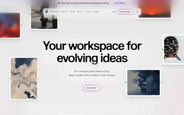
Frosted glass network — a cool, translucent interface connecting modular, vivid ideas.
Color palette
Violet decorative accent for icons, marks, and small graphic details. Do not promote it to the primary CTA color
Link text, secondary interactive elements — a darker, more reserved violet for actions and navigation
Green decorative accent for icons, marks, and small graphic details. Use as a supporting accent, not as a status color
Subtle background wash for emphasized content blocks, indicating a gentle shift or focus
Outlined button borders, subtle interaction cues, providing a soft violet glow without high saturation
Subtle hover states or background hints, a very light violet that suggests interactivity
Background for hero sections and distinctive UI elements, providing a soft, ethereal gradient from warm pink to cool violet; Decorative background gradient, adding subtle depth and color variation
Decorative background gradient, a gentle shift from a desaturated purple to a nearly white lavender
Primary text, deep section backgrounds — provides high contrast for headlines and critical information
Secondary text, dark surface backgrounds, strong borders
Text on lighter surfaces, input borders — a dark gray that serves as primary text on lighter backgrounds
Subtle text, muted borders, dividing lines
Muted text, inactive icon fills, subtle borders
Placeholder text, secondary icon fills, muted UI details
Tertiary text, subtle dividers
Hairline borders, subtle background patterns, disabled states
Light border, decorative elements
Card backgrounds, elevated surfaces — creates a distinct layer above the canvas
Subtle button and card borders, light secondary backgrounds
Page background — the foundational, expansive white space
Component backgrounds, overlay surfaces — the brightest white for content blocks
Typography
- Weights
- 300, 400, 500, 600
- Sizes
- 10px, 12px, 13px, 14px, 16px, 18px, 24px, 30px, 36px
- Line height
- 0.8, 1, 1.1, 1.2, 1.25, 1.33, 1.4, 1.43, 1.5, 1.56, 1.71
- Letter spacing
- varies per size, e.g., -0.0250em for larger text, normal for body
- Fallback
- Inter
Body copy, UI labels, navigation, and functional text – Inter provides legibility and a modern, slightly technical feel across its variable weights.
- Weights
- 400, 450, 500, 600
- Sizes
- 14px, 16px, 17px, 18px, 20px, 22px, 24px, 30px, 48px, 96px
- Line height
- 1, 1.1, 1.4, 1.43, 1.5
- Letter spacing
- varies per size, e.g., -0.0500em for display, -0.0250em for subheadings
- Fallback
- Playfair Display
Headlines and prominent display text – a custom serif that grounds the interface with distinctiveness and a subtle, sophisticated tone. Its unique stylistic sets ('ss00', 'ss03') contribute significantly to branding.
Spacing & shape
Elevation
Components
Text-only button with 'Violet Impulse' (#312c85) as default text, transparent background. No explicit padding, text size set by context. Used for navigation and inline actions. Uses Inter Variable.
Background 'Paper White' (#fafafa), text 'Zinc' (#262626), border 1px 'Cloud' (#efefef). Border radius 6px. Padding 6px horizontal, 10px vertical. Uses Inter Variable.
Background transparent, text 'Violet Impulse' (#312c85), border 1px 'Dusk Orchid' (#a6a5fe). Border radius 6px. Padding 8px vertical, 0px horizontal. Uses Inter Variable.
Transparent background, text 'Zinc' (#262626), default border color 'Zinc' (#262626). Padding 0px vertical, 4px horizontal. Uses Inter Variable.
Transparent background, no shadow, 0px border radius. Used for floating images in the canvas view. Padding 0.
Background 'Paper White' (#fafafa). Border radius 16px. No border or shadow by default. Padding 12px.
Background 'Canvas' (#f5f5f5). Border radius 24px. Subtle shadow: `rgba(0, 0, 0, 0.1) 0px 10px 15px -3px, rgba(0, 0, 0, 0.1) 0px 4px 6px -4px`. No padding by default.
Background 'Sage Bloom' (#00c950) with high border radius (effectively pill-shaped). No padding by default. Text color typically 'Paper White' or 'Stormy Night'.
Guidelines
- Always use 'Canvas' (#f5f5f5) as the primary page background to maintain an expansive, light feel.
- Apply 'Deep Space Violet' (#432dd7) only to interactive icons and borders to signal interactivity and brand presence clearly.
- Ensure all cards, images, and interactive elements use a border-radius of at least 6px, and up to 24px for larger content cards, to maintain the soft, approachable aesthetic.
- Utilize Marund for all display-level typography (size 48px and above) with its specific letter-spacing and stylistic sets to convey brand distinctiveness.
- Create visual depth using 'Fog' (#e5e5e5) for card backgrounds, elevating them above the main page 'Canvas' (#f5f5f5).
- Employ the `rgba(0, 0, 0, 0.1) 0px 10px 15px -3px, rgba(0, 0, 0, 0.1) 0px 4px 6px -4px` shadow for cards requiring subtle elevation and interaction emphasis.
- Implement consistent `16px` element gaps for vertical stacking of related components and `12px` padding for internal card content.
- Avoid using highly saturated colors for large background areas; they should be reserved for small, functional accents like 'Deep Space Violet' (#432dd7) or 'Sage Bloom' (#00c950).
- Do not use Marund for body text; reserve it entirely for headlines and display text to preserve its unique impact and legibility at smaller sizes.
- Never introduce hard, 0px border-radii for interactive elements or containers; maintain the consistent soft cornering established by 6px minimal radius.
- Refrain from using strong, dark shadows on navigation or primary action elements; elevation should be subtle and primarily for content grouping.
- Do not vary line-height significantly from the established semantic type scale; maintaining the rhythm of `1.2` for headings and `1.5` for body text ensures a cohesive reading experience.
- Avoid arbitrary custom letter-spacing; adhere to the defined `letterSpacing` values for Inter and Marund to control visual density.
- Do not use dark backgrounds for primary sections unless specifically integrating a full-bleed visual or hero where a dark gradient is explicitly defined.
About this system
ShowHide
Fuser establishes a crisp, expansive canvas for AI workflow orchestration. Its visual system prioritizes clarity and a sense of depth, achieved through a subtle, cool-toned gray scale as the primary surface treatment, punctuated by vivid violets and vibrant greens for interactive elements. Imagery is encased in soft-cornered cards that float above a sparse, grid-like background, suggesting modularity and precision. Typography combines a sharp, modern sans-serif with a distinctive display serif for headlines, creating an aesthetic that is both functional and subtly artistic.
The page primarily uses a max-width contained layout for core content. The hero section is full-bleed, featuring a central headline over an ethereal gradient background, with modular image cards floating within a subtle grid. Sections beneath maintain a consistent vertical rhythm with 32px spacing. Content is largely arranged in centered stacks or alternating text-left / image-right patterns. A subtle, light grid pattern (likely repeating lines or dots) underlays the canvas, hinting at the product's node-based or generative nature. Navigation is a sticky top bar with ghost buttons and a distinct outlined accent button.
The site employs a mix of crisp product photography and artistic, abstract visuals. Product photos are often contained within soft-cornered cards, showcasing objects (like garments or machinery) in isolation against neutral backgrounds, emphasizing detail and form. Abstract imagery, sometimes with gradient overlays, is used for atmospheric depth, particularly in the hero section. There's also evident use of AI-generated content (e.g., stylized topographical maps, dynamic compositions) within these card frames, serving as both decorative elements and visual demonstrations of the product's capabilities. Icons are primarily outlined or subtle fills, maintaining a lightweight feel, often in black or the 'Deep Space Violet' accent. The density is moderate; imagery works to break up text and provide visual anchors, often floating in the canvas rather than being integrated full-bleed.
Reminiscent of Framer, Linear, Retool, Miro, Raycast.
# Fuser — Style Reference
> Frosted glass network — a cool, translucent interface connecting modular, vivid ideas.

**Theme:** light

**Site:** https://fuser.studio

Fuser establishes a crisp, expansive canvas for AI workflow orchestration. Its visual system prioritizes clarity and a sense of depth, achieved through a subtle, cool-toned gray scale as the primary surface treatment, punctuated by vivid violets and vibrant greens for interactive elements. Imagery is encased in soft-cornered cards that float above a sparse, grid-like background, suggesting modularity and precision. Typography combines a sharp, modern sans-serif with a distinctive display serif for headlines, creating an aesthetic that is both functional and subtly artistic.

## Tokens — Colors

| Name | Value | Token | Role |
|------|------|------|------|
| Deep Space Violet | `#432dd7` | `--color-deep-space-violet` | Violet decorative accent for icons, marks, and small graphic details. Do not promote it to the primary CTA color |
| Violet Impulse | `#312c85` | `--color-violet-impulse` | Link text, secondary interactive elements — a darker, more reserved violet for actions and navigation |
| Sage Bloom | `#00c950` | `--color-sage-bloom` | Green decorative accent for icons, marks, and small graphic details. Use as a supporting accent, not as a status color |
| Lavender Haze | `#c6d2ff` | `--color-lavender-haze` | Subtle background wash for emphasized content blocks, indicating a gentle shift or focus |
| Dusk Orchid | `#a6a5fe` | `--color-dusk-orchid` | Outlined button borders, subtle interaction cues, providing a soft violet glow without high saturation |
| Lavender Whisper | `#d7defd` | `--color-lavender-whisper` | Subtle hover states or background hints, a very light violet that suggests interactivity |
| Gradient Aura | `#c679c4` | `--color-gradient-aura` | Background for hero sections and distinctive UI elements, providing a soft, ethereal gradient from warm pink to cool violet; Decorative background gradient, adding subtle depth and color variation |
| Gradient Ascent | `#cf9cdf` | `--color-gradient-ascent` | Decorative background gradient, a gentle shift from a desaturated purple to a nearly white lavender |
| Stormy Night | `#0a0a0a` | `--color-stormy-night` | Primary text, deep section backgrounds — provides high contrast for headlines and critical information |
| Graphite | `#171717` | `--color-graphite` | Secondary text, dark surface backgrounds, strong borders |
| Zinc | `#262626` | `--color-zinc` | Text on lighter surfaces, input borders — a dark gray that serves as primary text on lighter backgrounds |
| Ash Charcoal | `#404040` | `--color-ash-charcoal` | Subtle text, muted borders, dividing lines |
| Slate | `#525252` | `--color-slate` | Muted text, inactive icon fills, subtle borders |
| Medium Gray | `#737373` | `--color-medium-gray` | Placeholder text, secondary icon fills, muted UI details |
| Stone | `#828282` | `--color-stone` | Tertiary text, subtle dividers |
| Silver Mist | `#b7b7b7` | `--color-silver-mist` | Hairline borders, subtle background patterns, disabled states |
| Light Heather | `#d4d4d4` | `--color-light-heather` | Light border, decorative elements |
| Fog | `#e5e5e5` | `--color-fog` | Card backgrounds, elevated surfaces — creates a distinct layer above the canvas |
| Cloud | `#efefef` | `--color-cloud` | Subtle button and card borders, light secondary backgrounds |
| Canvas | `#f5f5f5` | `--color-canvas` | Page background — the foundational, expansive white space |
| Paper White | `#fafafa` | `--color-paper-white` | Component backgrounds, overlay surfaces — the brightest white for content blocks |

## Tokens — Typography

### Inter Variable
- **Substitute:** Inter
- **Weights:** 300, 400, 500, 600
- **Sizes:** 10px, 12px, 13px, 14px, 16px, 18px, 24px, 30px, 36px
- **Line height:** 0.8, 1, 1.1, 1.2, 1.25, 1.33, 1.4, 1.43, 1.5, 1.56, 1.71
- **Letter spacing:** varies per size, e.g., -0.0250em for larger text, normal for body
- **Role:** Body copy, UI labels, navigation, and functional text – Inter provides legibility and a modern, slightly technical feel across its variable weights.

### Marund
- **Substitute:** Playfair Display
- **Weights:** 400, 450, 500, 600
- **Sizes:** 14px, 16px, 17px, 18px, 20px, 22px, 24px, 30px, 48px, 96px
- **Line height:** 1, 1.1, 1.4, 1.43, 1.5
- **Letter spacing:** varies per size, e.g., -0.0500em for display, -0.0250em for subheadings
- **Role:** Headlines and prominent display text – a custom serif that grounds the interface with distinctiveness and a subtle, sophisticated tone. Its unique stylistic sets ('ss00', 'ss03') contribute significantly to branding.

## Tokens — Type Scale

Augmented Fourth (1.414) from 14px base.

| Role | Size | Line height | Letter spacing |
|------|------|------|------|
| caption | 10px | 12px | — |
| body | 14px | 22px | -0.14px |
| body-lg | 16px | 24px | — |
| subheading | 18px | 27px | -0.18px |
| heading-sm | 24px | 29px | — |
| heading | 36px | 43px | -0.36px |
| display | 48px | 53px | -0.48px |
| display-lg | 96px | 96px | -0.96px |

## Tokens — Spacing

- **Section gap:** 32px
- **Card padding:** 12px
- **Element gap:** 16px

## Tokens — Radius

- **Default:** 6px
- **Cards:** 16px
- **Images:** 12px
- **tags:** 24px

## Tokens — Elevation

- **Content Card - Highlighted:** `rgba(0, 0, 0, 0.1) 0px 10px 15px -3px, rgba(0, 0, 0, 0.1) 0px 4px 6px -4px`
- **Inner Modal / Input Focus:** `oklch(0 0 0 / 0.3) 0px 0px 2px 0px inset, oklch(0 0 0 / 0.1) 0px 1px 0px 0px inset`

## Layout

The page primarily uses a max-width contained layout for core content. The hero section is full-bleed, featuring a central headline over an ethereal gradient background, with modular image cards floating within a subtle grid. Sections beneath maintain a consistent vertical rhythm with 32px spacing. Content is largely arranged in centered stacks or alternating text-left / image-right patterns. A subtle, light grid pattern (likely repeating lines or dots) underlays the canvas, hinting at the product's node-based or generative nature. Navigation is a sticky top bar with ghost buttons and a distinct outlined accent button.

## Imagery

The site employs a mix of crisp product photography and artistic, abstract visuals. Product photos are often contained within soft-cornered cards, showcasing objects (like garments or machinery) in isolation against neutral backgrounds, emphasizing detail and form. Abstract imagery, sometimes with gradient overlays, is used for atmospheric depth, particularly in the hero section. There's also evident use of AI-generated content (e.g., stylized topographical maps, dynamic compositions) within these card frames, serving as both decorative elements and visual demonstrations of the product's capabilities. Icons are primarily outlined or subtle fills, maintaining a lightweight feel, often in black or the 'Deep Space Violet' accent. The density is moderate; imagery works to break up text and provide visual anchors, often floating in the canvas rather than being integrated full-bleed.

## Components

### Ghost Navigation Button
*Primary navigation and subtle actions*

Text-only button with 'Violet Impulse' (#312c85) as default text, transparent background. No explicit padding, text size set by context. Used for navigation and inline actions. Uses Inter Variable.

### Small Contained Button
*Secondary calls to action, form actions*

Background 'Paper White' (#fafafa), text 'Zinc' (#262626), border 1px 'Cloud' (#efefef). Border radius 6px. Padding 6px horizontal, 10px vertical. Uses Inter Variable.

### Outline Accent Button
*Emphasis action, 'Get Started' button*

Background transparent, text 'Violet Impulse' (#312c85), border 1px 'Dusk Orchid' (#a6a5fe). Border radius 6px. Padding 8px vertical, 0px horizontal. Uses Inter Variable.

### Prominent Text Input
*Main form fields*

Transparent background, text 'Zinc' (#262626), default border color 'Zinc' (#262626). Padding 0px vertical, 4px horizontal. Uses Inter Variable.

### Content Card - Minimal
*Basic display of content, images, or media*

Transparent background, no shadow, 0px border radius. Used for floating images in the canvas view. Padding 0.

### Content Card - Elevated
*Standard content display, modal backgrounds*

Background 'Paper White' (#fafafa). Border radius 16px. No border or shadow by default. Padding 12px.

### Content Card - Highlighted
*Featured content blocks, interactive elements*

Background 'Canvas' (#f5f5f5). Border radius 24px. Subtle shadow: `rgba(0, 0, 0, 0.1) 0px 10px 15px -3px, rgba(0, 0, 0, 0.1) 0px 4px 6px -4px`. No padding by default.

### Decorative Tag - Round
*Informational labels, status indicators*

Background 'Sage Bloom' (#00c950) with high border radius (effectively pill-shaped). No padding by default. Text color typically 'Paper White' or 'Stormy Night'.

## Guidelines

### Do

- Always use 'Canvas' (#f5f5f5) as the primary page background to maintain an expansive, light feel.
- Apply 'Deep Space Violet' (#432dd7) only to interactive icons and borders to signal interactivity and brand presence clearly.
- Ensure all cards, images, and interactive elements use a border-radius of at least 6px, and up to 24px for larger content cards, to maintain the soft, approachable aesthetic.
- Utilize Marund for all display-level typography (size 48px and above) with its specific letter-spacing and stylistic sets to convey brand distinctiveness.
- Create visual depth using 'Fog' (#e5e5e5) for card backgrounds, elevating them above the main page 'Canvas' (#f5f5f5).
- Employ the `rgba(0, 0, 0, 0.1) 0px 10px 15px -3px, rgba(0, 0, 0, 0.1) 0px 4px 6px -4px` shadow for cards requiring subtle elevation and interaction emphasis.
- Implement consistent `16px` element gaps for vertical stacking of related components and `12px` padding for internal card content.

### Don't

- Avoid using highly saturated colors for large background areas; they should be reserved for small, functional accents like 'Deep Space Violet' (#432dd7) or 'Sage Bloom' (#00c950).
- Do not use Marund for body text; reserve it entirely for headlines and display text to preserve its unique impact and legibility at smaller sizes.
- Never introduce hard, 0px border-radii for interactive elements or containers; maintain the consistent soft cornering established by 6px minimal radius.
- Refrain from using strong, dark shadows on navigation or primary action elements; elevation should be subtle and primarily for content grouping.
- Do not vary line-height significantly from the established semantic type scale; maintaining the rhythm of `1.2` for headings and `1.5` for body text ensures a cohesive reading experience.
- Avoid arbitrary custom letter-spacing; adhere to the defined `letterSpacing` values for Inter and Marund to control visual density.
- Do not use dark backgrounds for primary sections unless specifically integrating a full-bleed visual or hero where a dark gradient is explicitly defined.

## Agent Prompt Guide

Quick Color Reference:
text: #0a0a0a
background: #f5f5f5
border: #e5e5e5
accent: #432dd7
primary action: #d7defd (filled action)

Example Component Prompts:
1. Create a `Hero Section`: full-bleed background using `Gradient Aura` linear-gradient, centered 'Marund' display-lg headline in `Stormy Night` (#0a0a0a), followed by 'Inter Variable' body-lg subtext in `Slate` (#525252). Include several `Content Card - Highlighted` elements floating in the foreground.
2. Create a Primary Action Button: #d7defd background, #000000 text, 9999px radius, compact pill padding. Use this filled treatment for the main CTA.
3. Build a `Feature Card` (Content Card - Elevated): `Fog` (#e5e5e5) background, `16px` radius. Headline 'Marund' heading-sm in `Stormy Night` (#0a0a0a), body text 'Inter Variable' body in `Zinc` (#262626). Include a small square image with `12px` radius and a `Decorative Tag - Round` in 'Sage Bloom' (#00c950) for a unique feature.
4. Produce an `Image Grid`: a 3-column grid of `Content Card - Highlighted` elements, each containing an image with `12px` radius and minimal associated text in 'Inter Variable' body-sm. The grid items should have `16px` element gaps vertically and horizontally.
More like this









Keep what you find
A free account saves references to boards and can send you a weekly email of picks based on what you save.
To see every result, go Pro.