Preview image. Unlock full-res
Architectural blueprint on white marble
Color palette
Primary action buttons, active links, and interactive elements – a clear signal for user engagement
Light background for informational cards or highlighted sections, adding a subtle touch of color
Background for specific card variants or content blocks
Decorative illustration accents, adding a soft, colorful touch to graphics
Background for specific card variants or content blocks
Subtle background gradient for hero sections or prominent feature blocks, creating a soft, luminous feel
Page backgrounds, card surfaces, ghost button backgrounds, primary text on dark elements
Subtle background for alternating sections and secondary card surfaces, providing visual separation without strong contrast
Primary text, headings, icons, and strong borders. Provides high contrast
Secondary text, subheadings, and muted borders
Tertiary text, helper text, and inactive UI elements. Soft, low-contrast information
Typography
- Weights
- 400
- Sizes
- 12px
- Line height
- 1.2
sans-serif — detected in extracted data but not described by AI
- Weights
- 400, 500, 600, 700
- Sizes
- 12px, 13px, 15px, 16px, 17px, 18px, 21px, 22px, 24px
- Line height
- 1.2, 1.3, 1.4, 1.5, 1.65
- Letter spacing
- normal
- Fallback
- system-ui, sans-serif
Primary typeface for all body text, links, and most headings. Its varied weights and legibility provide a robust foundation for content hierarchy.
- Weights
- 400
- Sizes
- 20px, 22px, 30px, 38px, 60px
- Line height
- 1.3, 1.4
- Letter spacing
- normal
- Fallback
- Inter, system-ui, sans-serif
Used for larger headings and display text, allowing for granular control over sizing and giving a modern, slightly expanded feel without being overly decorative.
- Weights
- 600
- Sizes
- 14px
- Line height
- 1.5
- Letter spacing
- normal
- Fallback
- Inter, system-ui, sans-serif
A distinct, heavier weight for specific callouts or labels, providing emphasis and a subtly different textual texture from the main Inter body.
Spacing & shape
Components
Filled button with `Ocean Blue` background, `Canvas White` text. `Inter` font, bold (`600` weight), `16px` size. `17px` border radius creating a slightly rounded rectangular shape. `12px` vertical padding, `26px` horizontal padding.
Ghost button with `Canvas White` background and `Ink Black` border and text. `Inter` font, bold (`600` weight), `16px` size. `17px` border radius. `12px` vertical padding, `26px` horizontal padding.
Card with `Greige Canvas` background, `6px` border radius, no shadow. `40px` padding on all sides. Content uses `Ink Black` for headings and `Storm Gray` for body text.
Card with `Greige Canvas` background. `8px` border radius, no shadow. `16px` padding on all sides.
Card with `Sky Tint` background, `6px` border radius, no shadow. `40px` padding on all sides. Primarily used for informational prompts or feature highlights.
Cards with `d6f2ff` (Pale Aqua), `ffffbd` (Soft Yellow), `294dba` (dark violet), `ba9ffc` (bright violet), `fcc2cd` (muted red), `fced9f` (moderate yellow), `3388ff` (blue) backgrounds. All use `6px` border radius and `40px` padding. This provides a diverse palette for feature differentiation.
Guidelines
- Always use `Ink Black` (#000000) for primary headlines and body text to ensure maximum readability and brand consistency.
- Utilize `Greige Canvas` (#f7f7f1) for alternating section backgrounds and `Canvas White` (#ffffff) for primary page backgrounds and cards to create clear visual separation.
- Reserve `Ocean Blue` (#244cff) exclusively for primary call-to-action button backgrounds and active states to guide user interaction.
- Apply `6px` border radius for generic cards and content containers, `17px` for buttons, and `100px` for pill-shaped elements.
- Employ `10px` as the default `elementGap` for horizontal and vertical spacing between small UI elements, establishing a comfortable density.
- Maintain `40px` padding within cards and for major section gaps to give content adequate breathing room.
- Use `Inter Variable` at larger sizes for headings to leverage its precise shaping and expressive range.
- Do not use `Ocean Blue` (#244cff) for decorative elements or non-interactive text; its purpose is strictly functional for actions.
- Avoid arbitrary color choices for backgrounds; stick to `Canvas White`, `Greige Canvas`, `Sky Tint`, or `Pale Aqua` for content surfaces.
- Do not use letter-spacing on body text or standard links; maintain `normal` letter-spacing for these elements.
- Do not introduce sharp corners or excessively large radii; adhere to the `6px`, `17px`, and `100px` radii for a consistent, approachable feel.
- Avoid cluttering the layout; maintain `40px` section gaps and `10px` element gaps for comfortable content presentation.
- Do not use generic system fonts for critical UI elements if `Inter` or `Geist` are available, as they define the brand's typographic tone.
- Do not deviate from the established type scale; respect predefined `size` and `lineHeight` for each text role to maintain hierarchy.
About this system
ShowHide
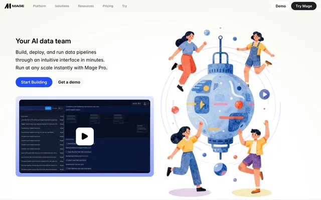
Mage.ai presents a clear, functional interface resembling an architectural blueprint on a light canvas. The visual style prioritizes information and direct interaction through subtle surface variations and a single primary blue accent color. Typography is precise and organized, creating clear hierarchy without excessive embellishment. Components are lightweight with defined edges and moderate rounded corners, contributing to an overall structured and modern feel.
The layout is primarily a contained, centered `max-width` structure with `Greige Canvas` (#f7f7f1) as the dominant background for body content, interspersed with `Canvas White` (#ffffff) sections. The hero features a split design: prominent centered headline and body text left, and a large, colorful, organic illustration on the right. Content sections generally alternate between `Canvas White` and `Greige Canvas` backgrounds, with consistent vertical `40px` section gaps. Text-heavy blocks often appear alongside product screenshots in a two-column `text-left/image-right` arrangement. Navigation is a sticky top bar with `Ink Black` text and a `Ghost Secondary Button` alongside a `Primary Action Button` for key actions. A grid of company logos is utilized for social proof, maintaining the centered content structure.
The site uses a mix of flat, slightly dimensional illustrations and high-fidelity product screenshots. Illustrations feature organic shapes, often depicting stylized characters working with abstract data elements, using bright, moderate accent colors like `Lavender Haze`. Product screenshots are dark-themed UI captures, placed within rounded-corner device mocks, acting as literal content anchors. Imagery is contained within cards or defined sections, never full-bleed, and serves both decorative and explanatory roles. Icons are predominantly filled and monochromatic, consistent with the `Ink Black` or `Silver Mist` palette, indicating a functional approach.
Reminiscent of Vercel, Segment, Figma, Linear.
# Mage — Style Reference
> Architectural blueprint on white marble

**Theme:** light

**Site:** https://www.mage.ai

Mage.ai presents a clear, functional interface resembling an architectural blueprint on a light canvas. The visual style prioritizes information and direct interaction through subtle surface variations and a single primary blue accent color. Typography is precise and organized, creating clear hierarchy without excessive embellishment. Components are lightweight with defined edges and moderate rounded corners, contributing to an overall structured and modern feel.

## Tokens — Colors

| Name | Value | Token | Role |
|------|------|------|------|
| Ocean Blue | `#244cff` | `--color-ocean-blue` | Primary action buttons, active links, and interactive elements – a clear signal for user engagement |
| Sky Tint | `#e8f8ff` | `--color-sky-tint` | Light background for informational cards or highlighted sections, adding a subtle touch of color |
| Pale Aqua | `#d6f2ff` | `--color-pale-aqua` | Background for specific card variants or content blocks |
| Lavender Haze | `#c3aeff` | `--color-lavender-haze` | Decorative illustration accents, adding a soft, colorful touch to graphics |
| Soft Yellow | `#ffffbd` | `--color-soft-yellow` | Background for specific card variants or content blocks |
| Bright Cyan Gradient | `#e3e8ff` | `--color-bright-cyan-gradient` | Subtle background gradient for hero sections or prominent feature blocks, creating a soft, luminous feel |
| Canvas White | `#ffffff` | `--color-canvas-white` | Page backgrounds, card surfaces, ghost button backgrounds, primary text on dark elements |
| Greige Canvas | `#f7f7f1` | `--color-greige-canvas` | Subtle background for alternating sections and secondary card surfaces, providing visual separation without strong contrast |
| Ink Black | `#000000` | `--color-ink-black` | Primary text, headings, icons, and strong borders. Provides high contrast |
| Storm Gray | `#2b2b2b` | `--color-storm-gray` | Secondary text, subheadings, and muted borders |
| Silver Mist | `#b0b0b0` | `--color-silver-mist` | Tertiary text, helper text, and inactive UI elements. Soft, low-contrast information |

## Tokens — Typography

### sans-serif
- **Weights:** 400
- **Sizes:** 12px
- **Line height:** 1.2
- **Role:** sans-serif — detected in extracted data but not described by AI

### Inter
- **Substitute:** system-ui, sans-serif
- **Weights:** 400, 500, 600, 700
- **Sizes:** 12px, 13px, 15px, 16px, 17px, 18px, 21px, 22px, 24px
- **Line height:** 1.2, 1.3, 1.4, 1.5, 1.65
- **Letter spacing:** normal
- **Role:** Primary typeface for all body text, links, and most headings. Its varied weights and legibility provide a robust foundation for content hierarchy.

### Inter Variable
- **Substitute:** Inter, system-ui, sans-serif
- **Weights:** 400
- **Sizes:** 20px, 22px, 30px, 38px, 60px
- **Line height:** 1.3, 1.4
- **Letter spacing:** normal
- **Role:** Used for larger headings and display text, allowing for granular control over sizing and giving a modern, slightly expanded feel without being overly decorative.

### Geist
- **Substitute:** Inter, system-ui, sans-serif
- **Weights:** 600
- **Sizes:** 14px
- **Line height:** 1.5
- **Letter spacing:** normal
- **Role:** A distinct, heavier weight for specific callouts or labels, providing emphasis and a subtly different textual texture from the main Inter body.

## Tokens — Type Scale

Perfect Fourth (1.333) from 16px base.

| Role | Size | Line height | Letter spacing |
|------|------|------|------|
| caption | 12px | 1.2 | — |
| body | 16px | 1.5 | — |
| subheading | 18px | 1.5 | — |
| heading-sm | 22px | 1.4 | — |
| heading | 30px | 1.4 | — |
| heading-lg | 38px | 1.3 | — |
| display | 60px | 1.3 | — |

## Tokens — Spacing

- **Section gap:** 40px
- **Card padding:** 40px
- **Element gap:** 10px

## Tokens — Radius

- **Default:** 6px
- **Buttons:** 17px
- **Cards:** 6px
- **pills:** 100px
- **smallComponents:** 16px

## Layout

The layout is primarily a contained, centered `max-width` structure with `Greige Canvas` (#f7f7f1) as the dominant background for body content, interspersed with `Canvas White` (#ffffff) sections. The hero features a split design: prominent centered headline and body text left, and a large, colorful, organic illustration on the right. Content sections generally alternate between `Canvas White` and `Greige Canvas` backgrounds, with consistent vertical `40px` section gaps. Text-heavy blocks often appear alongside product screenshots in a two-column `text-left/image-right` arrangement. Navigation is a sticky top bar with `Ink Black` text and a `Ghost Secondary Button` alongside a `Primary Action Button` for key actions. A grid of company logos is utilized for social proof, maintaining the centered content structure.

## Imagery

The site uses a mix of flat, slightly dimensional illustrations and high-fidelity product screenshots. Illustrations feature organic shapes, often depicting stylized characters working with abstract data elements, using bright, moderate accent colors like `Lavender Haze`. Product screenshots are dark-themed UI captures, placed within rounded-corner device mocks, acting as literal content anchors. Imagery is contained within cards or defined sections, never full-bleed, and serves both decorative and explanatory roles. Icons are predominantly filled and monochromatic, consistent with the `Ink Black` or `Silver Mist` palette, indicating a functional approach.

## Components

### Primary Action Button
*Call-to-action button for initiating key user flows.*

Filled button with `Ocean Blue` background, `Canvas White` text. `Inter` font, bold (`600` weight), `16px` size. `17px` border radius creating a slightly rounded rectangular shape. `12px` vertical padding, `26px` horizontal padding.

### Ghost Secondary Button
*Secondary action button, providing a less prominent option.*

Ghost button with `Canvas White` background and `Ink Black` border and text. `Inter` font, bold (`600` weight), `16px` size. `17px` border radius. `12px` vertical padding, `26px` horizontal padding.

### Default Content Card
*General purpose card for grouping content and features.*

Card with `Greige Canvas` background, `6px` border radius, no shadow. `40px` padding on all sides. Content uses `Ink Black` for headings and `Storm Gray` for body text.

### Compact Info Card
*Smaller card for lists or minor content blocks.*

Card with `Greige Canvas` background. `8px` border radius, no shadow. `16px` padding on all sides.

### Highlight Card
*Card with a subtle accent colored background.*

Card with `Sky Tint` background, `6px` border radius, no shadow. `40px` padding on all sides. Primarily used for informational prompts or feature highlights.

### Feature Card with Mixed Backgrounds
*Modular cards for distinctive feature presentation, using various accent colors.*

Cards with `d6f2ff` (Pale Aqua), `ffffbd` (Soft Yellow), `294dba` (dark violet), `ba9ffc` (bright violet), `fcc2cd` (muted red), `fced9f` (moderate yellow), `3388ff` (blue) backgrounds. All use `6px` border radius and `40px` padding. This provides a diverse palette for feature differentiation.

## Guidelines

### Do

- Always use `Ink Black` (#000000) for primary headlines and body text to ensure maximum readability and brand consistency.
- Utilize `Greige Canvas` (#f7f7f1) for alternating section backgrounds and `Canvas White` (#ffffff) for primary page backgrounds and cards to create clear visual separation.
- Reserve `Ocean Blue` (#244cff) exclusively for primary call-to-action button backgrounds and active states to guide user interaction.
- Apply `6px` border radius for generic cards and content containers, `17px` for buttons, and `100px` for pill-shaped elements.
- Employ `10px` as the default `elementGap` for horizontal and vertical spacing between small UI elements, establishing a comfortable density.
- Maintain `40px` padding within cards and for major section gaps to give content adequate breathing room.
- Use `Inter Variable` at larger sizes for headings to leverage its precise shaping and expressive range.

### Don't

- Do not use `Ocean Blue` (#244cff) for decorative elements or non-interactive text; its purpose is strictly functional for actions.
- Avoid arbitrary color choices for backgrounds; stick to `Canvas White`, `Greige Canvas`, `Sky Tint`, or `Pale Aqua` for content surfaces.
- Do not use letter-spacing on body text or standard links; maintain `normal` letter-spacing for these elements.
- Do not introduce sharp corners or excessively large radii; adhere to the `6px`, `17px`, and `100px` radii for a consistent, approachable feel.
- Avoid cluttering the layout; maintain `40px` section gaps and `10px` element gaps for comfortable content presentation.
- Do not use generic system fonts for critical UI elements if `Inter` or `Geist` are available, as they define the brand's typographic tone.
- Do not deviate from the established type scale; respect predefined `size` and `lineHeight` for each text role to maintain hierarchy.

## Agent Prompt Guide

Quick Color Reference:
- text: #000000
- background: #ffffff
- border: #000000
- accent: #c3aeff
- primary action: no distinct CTA color

Example Component Prompts:
No distinct primary action color was observed; use the extracted neutral button treatments instead of inventing a filled CTA color.
- Create a `Default Content Card` with the headline 'Power analytics...' at `heading-sm` size, `Ink Black` text, and body copy at `body` size, `Storm Gray` text. The card should have `40px` padding and sit on a `Greige Canvas` background.
- Create a `Highlight Card` with a heading like 'Key Feature' at `subheading` size, `Ink Black` text, and body copy at `body` size, `Storm Gray` text, using a `Sky Tint` background. The card padding should be `40px` and radius `6px`.
More like this








Keep what you find
A free account saves references to boards and can send you a weekly email of picks based on what you save.
To see every result, go Pro.