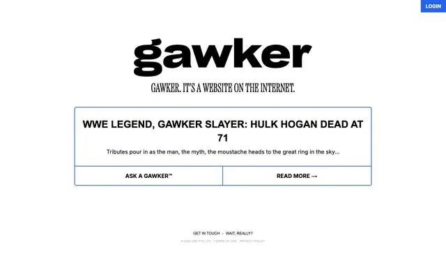
Preview image. Unlock full-res
monochromatic newsprint, stark and direct
Color palette
Primary action backgrounds, interactive borders, and accent highlights
Page backgrounds, surface fills for text blocks and cards
Primary text, headings, button text, and icon fills
Subtle dividers, card borders, and ghost button outlines
Typography
- Weights
- 400, 700
- Sizes
- 16px, 18px
- Line height
- 1.5, 1.56
- Letter spacing
- normal
- Fallback
- system-ui, sans-serif
Body text, navigation links, and button labels. Its versatility maintains consistency across various text-heavy elements.
- Weights
- 300, 700
- Sizes
- 10px, 12px, 32px
- Line height
- 1.33, 1.38, 1.6
- Letter spacing
- normal
- Fallback
- Helvetica Neue, Helvetica, sans-serif
Captions, legal text, and secondary headings. The smaller sizes provide fine print readability.
- Weights
- 400
- Sizes
- 40px
- Line height
- 0.85
- Letter spacing
- normal
Distinctive headlines for articles and key product statements, utilizing a custom condensed style for impact.
Spacing & shape
Components
A filled button with Electric Blue background, Canvas White text (Inter, 400), and 0px border-radius. Padding of 8px vertical and 16px horizontal.
Transparent background, Midnight Ink text (Inter, 400), and a thin, 0px radiused border using Faded Silver. Top-border only makes it feel like it's part of a table or list.
Transparent background, Midnight Ink text (Inter, 400), and a thin, 0px radiused border in Electric Blue. Top-border only emphasizes a relationship to preceding content or a group of controls.
Canvas White background with a 2px solid Faded Silver border and 0px border-radius. Contains a prominent headline and a body snippet, with ghost-like action buttons below separated by a top border.
Midnight Ink text (Arial, 300, 10px), with 4px horizontal padding.
Guidelines
- Use Midnight Ink (#000000) for all primary text and headlines to maintain high contrast and readability.
- Apply Canvas White (#ffffff) as the primary background for all page sections and content cards.
- Utilize Electric Blue (#2563eb) exclusively for primary interactive elements, such as filled buttons or distinct action borders.
- Employ Faded Silver (#e5e7eb) for subtle separation, such as card borders or thin dividers, keeping the visual hierarchy clear without heavy lines.
- Maintain a consistent 0px border-radius for all interactive components and content blocks to preserve the sharp, direct aesthetic.
- Use 'etna-x-condensed' for impactful display headlines (40px, weight 400) and 'Inter' for all body text and general UI (16px, weight 400).
- Employ `sectionGap` of `86px` for vertical separation between major content blocks.
- Do not introduce additional saturated colors beyond Electric Blue (#2563eb) for interactive states or accents; maintain a primarily achromatic palette.
- Avoid decorative shadows or complex gradients; the system relies on flat surfaces and clean lines.
- Do not use rounded corners beyond the specified 6px radius for general elements inside the card, if any, or any component for which the radius is specified to be 0px.
- Refrain from using more than two font families; 'Inter', 'Arial', and 'etna-x-condensed' are sufficient for all typographic needs.
- Do not vary line-height inconsistently; adhere to the specified values for each text size to ensure consistent vertical rhythm.
- Avoid placing text directly on top of images or complex backgrounds; content should always reside on clear white or solid surfaces.
- Do not implement extensive iconography; use minimal, functional icons that are single-color if needed.
About this system
ShowHide
Gawker presents a stark, high-contrast visual system built on black text on a white canvas, reminiscent of traditional newsprint. The design prioritizes readability and directness with minimal embellishment—borders are thin and rectangular, and color is used sparingly, primarily as an electrifying blue accent for interactive elements. Typography is robust and sans-serif, anchoring the content without distraction while a bold, custom headline font injects personality. The overall tone is functional and no-nonsense, with clear visual separation for content blocks.
The page adheres to a centered, max-width contained layout for core content. The hero area is currently text-based with a large headline. Sections are defined by generous vertical spacing (86px `sectionGap`) and often feature a card-like structure with distinct borders. Content is primarily stacked vertically, with some grid-like arrangements for interactive elements such (seen in the two-column buttons inside the article card). The navigation is a top-bar with a simple 'Login' button. The overall density is comfortable, with ample whitespace.
This site predominantly features UI elements and typography over imagery. When images or graphics are present, they are either product-focused screenshots or abstract representations, fitting within the stark, direct interface. Icons are likely minimal and monochromatic, serving functional rather than decorative roles. The density is text-dominant.
Reminiscent of The New York Times, Washington Post, Medium.
# Gawker — Style Reference
> monochromatic newsprint, stark and direct

**Theme:** light

**Site:** https://www.gawker.com

Gawker presents a stark, high-contrast visual system built on black text on a white canvas, reminiscent of traditional newsprint. The design prioritizes readability and directness with minimal embellishment—borders are thin and rectangular, and color is used sparingly, primarily as an electrifying blue accent for interactive elements. Typography is robust and sans-serif, anchoring the content without distraction while a bold, custom headline font injects personality. The overall tone is functional and no-nonsense, with clear visual separation for content blocks.

## Tokens — Colors

| Name | Value | Token | Role |
|------|------|------|------|
| Electric Blue | `#2563eb` | `--color-electric-blue` | Primary action backgrounds, interactive borders, and accent highlights |
| Canvas White | `#ffffff` | `--color-canvas-white` | Page backgrounds, surface fills for text blocks and cards |
| Midnight Ink | `#000000` | `--color-midnight-ink` | Primary text, headings, button text, and icon fills |
| Faded Silver | `#e5e7eb` | `--color-faded-silver` | Subtle dividers, card borders, and ghost button outlines |

## Tokens — Typography

### Inter
- **Substitute:** system-ui, sans-serif
- **Weights:** 400, 700
- **Sizes:** 16px, 18px
- **Line height:** 1.5, 1.56
- **Letter spacing:** normal
- **Role:** Body text, navigation links, and button labels. Its versatility maintains consistency across various text-heavy elements.

### Arial
- **Substitute:** Helvetica Neue, Helvetica, sans-serif
- **Weights:** 300, 700
- **Sizes:** 10px, 12px, 32px
- **Line height:** 1.33, 1.38, 1.6
- **Letter spacing:** normal
- **Role:** Captions, legal text, and secondary headings. The smaller sizes provide fine print readability.

### etna-x-condensed
- **Weights:** 400
- **Sizes:** 40px
- **Line height:** 0.85
- **Letter spacing:** normal
- **Role:** Distinctive headlines for articles and key product statements, utilizing a custom condensed style for impact.

## Tokens — Type Scale

Augmented Fourth (1.414) from 16px base.

| Role | Size | Line height | Letter spacing |
|------|------|------|------|
| caption | 10px | 1.33 | — |
| body | 16px | 1.5 | — |
| subheading | 18px | 1.56 | — |
| heading | 32px | 1.6 | — |
| display | 40px | 0.85 | — |

## Tokens — Spacing

- **Section gap:** 86px
- **Card padding:** 16px
- **Element gap:** 16px

## Tokens — Radius

- **Default:** 6px

## Layout

The page adheres to a centered, max-width contained layout for core content. The hero area is currently text-based with a large headline. Sections are defined by generous vertical spacing (86px `sectionGap`) and often feature a card-like structure with distinct borders. Content is primarily stacked vertically, with some grid-like arrangements for interactive elements such (seen in the two-column buttons inside the article card). The navigation is a top-bar with a simple 'Login' button. The overall density is comfortable, with ample whitespace.

## Imagery

This site predominantly features UI elements and typography over imagery. When images or graphics are present, they are either product-focused screenshots or abstract representations, fitting within the stark, direct interface. Icons are likely minimal and monochromatic, serving functional rather than decorative roles. The density is text-dominant.

## Components

### Navigation Login Button (Filled)
*Primary call to action in the navigation.*

A filled button with Electric Blue background, Canvas White text (Inter, 400), and 0px border-radius. Padding of 8px vertical and 16px horizontal.

### Ghost Action Button
*Secondary action button within content areas.*

Transparent background, Midnight Ink text (Inter, 400), and a thin, 0px radiused border using Faded Silver. Top-border only makes it feel like it's part of a table or list.

### Outlined Action Button
*Prominent, interactive action that uses brand color for emphasis.*

Transparent background, Midnight Ink text (Inter, 400), and a thin, 0px radiused border in Electric Blue. Top-border only emphasizes a relationship to preceding content or a group of controls.

### Article Card
*Container for article previews or featured content.*

Canvas White background with a 2px solid Faded Silver border and 0px border-radius. Contains a prominent headline and a body snippet, with ghost-like action buttons below separated by a top border.

### Legal Footer Link
*Informational links in the footer.*

Midnight Ink text (Arial, 300, 10px), with 4px horizontal padding.

## Guidelines

### Do

- Use Midnight Ink (#000000) for all primary text and headlines to maintain high contrast and readability.
- Apply Canvas White (#ffffff) as the primary background for all page sections and content cards.
- Utilize Electric Blue (#2563eb) exclusively for primary interactive elements, such as filled buttons or distinct action borders.
- Employ Faded Silver (#e5e7eb) for subtle separation, such as card borders or thin dividers, keeping the visual hierarchy clear without heavy lines.
- Maintain a consistent 0px border-radius for all interactive components and content blocks to preserve the sharp, direct aesthetic.
- Use 'etna-x-condensed' for impactful display headlines (40px, weight 400) and 'Inter' for all body text and general UI (16px, weight 400).
- Employ `sectionGap` of `86px` for vertical separation between major content blocks.

### Don't

- Do not introduce additional saturated colors beyond Electric Blue (#2563eb) for interactive states or accents; maintain a primarily achromatic palette.
- Avoid decorative shadows or complex gradients; the system relies on flat surfaces and clean lines.
- Do not use rounded corners beyond the specified 6px radius for general elements inside the card, if any, or any component for which the radius is specified to be 0px.
- Refrain from using more than two font families; 'Inter', 'Arial', and 'etna-x-condensed' are sufficient for all typographic needs.
- Do not vary line-height inconsistently; adhere to the specified values for each text size to ensure consistent vertical rhythm.
- Avoid placing text directly on top of images or complex backgrounds; content should always reside on clear white or solid surfaces.
- Do not implement extensive iconography; use minimal, functional icons that are single-color if needed.

## Agent Prompt Guide

Quick Color Reference:
text: #000000
background: #ffffff
border: #e5e7eb
accent: #2563eb
primary action: #2563eb (filled action)

Example Component Prompts:
1. Create a Primary Action Button: #2563eb background, #000000 text, 9999px radius, compact pill padding. Use this filled treatment for the main CTA.
2. Design an article headline: 'WWE LEGEND, GAWKER SLAYER...' using etna-x-condensed font 40px weight 400, line-height 0.85, color #000000.
3. Produce an 'Ask A Gawker™' ghost button: transparent background, text #000000, Inter font 16px weight 400, 0px border-radius, top border 2px solid #e5e7eb, 16px vertical padding.
4. Create a footer copyright text: '© 2025 GMI Pte Ltd -' using Arial font 10px weight 300, color #000000.
More like this







Keep what you find
A free account saves references to boards and can send you a weekly email of picks based on what you save.
To see every result, go Pro.