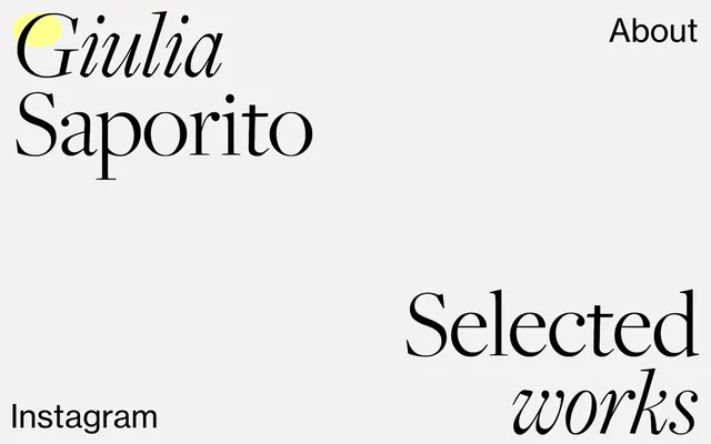
Preview image. Unlock full-res
typographical gallery on a stark canvas
Color palette
Decorative background fills, sometimes used for prominent text color in specific headings
Outlined action borders, active link text, interactive elements
Highlight accent, decorative graphic element. (Identified from screenshot)
Page background, primary neutral surface
Primary text color, link default, accent borders
Subtle border lines, secondary link borders
Typography
- Weights
- 200
- Sizes
- 84px, 198px
- Line height
- 0.8, 1
- Fallback
- Playfair Display
Hero display text and very large headings — its ultra-light weight at massive sizes creates a delicate yet commanding presence.
- Weights
- 400
- Sizes
- 38px, 65px, 66px
- Line height
- 1.1
- Fallback
- Inter
Primary headings, sub-headings, and uppercase text sections conveying direct information. Its clean, sharp forms provide contrast to serif elements.
- Weights
- 400
- Sizes
- 38px
- Line height
- 1.1
- Fallback
- Lora
Decorative and contextual sub-headings, often paired with sans-serif larger text. Its classic serif form adds a touch of elegance and editorial feel.
- Weights
- 400
- Sizes
- 13px
- Line height
- 1.2
- Fallback
- Times New Roman
Small body text, labels, and secondary information. Its presence is minimal but functional.
Spacing & shape
Components
Defined purely by text color 'Nightfall' (#000000) against the 'Canvas' (#f2f2f2) background. No background, border, or padding. Active states or specific branding might use 'Electric Indigo' (#698fff) as a text or border color.
Background transparency with no visible borders or shadows. Relies on negative space for definition. Padding on the bottom can be significant at 212px, creating large vertical gaps between content sections.
A circular shape using 'Solar Flare' (#fcf572). Used sparingly to draw attention or for graphic embellishment.
Guidelines
- Prioritize typography as the primary visual element on any page.
- Use 'Canvas' (#f2f2f2) as the default background for all page sections.
- Employ 'Nightfall' (#000000) for all primary text, ensuring maximum contrast.
- Reserve 'Electric Indigo' (#698fff) exclusively for interactive link text or thin borders on actionable items, never for large background fills.
- When using 'Freight Big', ensure it takes up significant visual space, leveraging its large sizes (84px, 198px) and thin weight (200) for impact.
- Embrace a minimal aesthetic by avoiding unnecessary borders, shadows, or background fills on content blocks and components.
- Use 'Solar Flare' (#fcf572) as a small, circular, primary accent point, positioned to complement text blocks.
- Do not use heavy, filled buttons; all primary interaction should be conveyed through outlined or text-only links.
- Avoid gradients or complex background patterns; maintain a flat, stark background.
- Do not introduce additional font families or weights beyond the defined system.
- Refrain from using 'Lavender Haze' (#cfabef) as a default background or text color unless explicitly for a decorative section or specific heading.
- Do not apply drop shadows or elevation effects to any components; maintain a flat UI.
- Avoid dense UI elements; instead, use generous whitespace and large vertical gaps to separate content.
- Do not use photographic imagery; prefer abstract shapes or clean product/text displays.
About this system
ShowHide
This design system presents a high-contrast, text-dominant aesthetic that feels like a curated typographical exhibition. Bold, expressive serif headlines dance with restrained sans-serif details, all set against a minimalist, almost stark, light background. A single vibrant yellow accent color acts as a playful, yet precise, point of focus and interaction against the otherwise monochrome palette. Components are virtually invisible, relying on text and whitespace for their definition rather than overt borders or shadows, giving the impression of content floating on an ethereal canvas.
Reminiscent of AIGA Eye on Design, Actual Source, Jiaqi Wang (Designer Portfolio).
# Giulia Saporito — Style Reference
> typographical gallery on a stark canvas

**Theme:** light

**Site:** https://giuliasaporito.com

This design system presents a high-contrast, text-dominant aesthetic that feels like a curated typographical exhibition. Bold, expressive serif headlines dance with restrained sans-serif details, all set against a minimalist, almost stark, light background. A single vibrant yellow accent color acts as a playful, yet precise, point of focus and interaction against the otherwise monochrome palette. Components are virtually invisible, relying on text and whitespace for their definition rather than overt borders or shadows, giving the impression of content floating on an ethereal canvas.

## Tokens — Colors

| Name | Value | Token | Role |
|------|------|------|------|
| Lavender Haze | `#cfabef` | `--color-lavender-haze` | Decorative background fills, sometimes used for prominent text color in specific headings |
| Electric Indigo | `#698fff` | `--color-electric-indigo` | Outlined action borders, active link text, interactive elements |
| Solar Flare | `#fcf572` | `--color-solar-flare` | Highlight accent, decorative graphic element. (Identified from screenshot) |
| Canvas | `#f2f2f2` | `--color-canvas` | Page background, primary neutral surface |
| Nightfall | `#000000` | `--color-nightfall` | Primary text color, link default, accent borders |
| Pale Mist | `#e5e5e5` | `--color-pale-mist` | Subtle border lines, secondary link borders |

## Tokens — Typography

### Freight Big
- **Substitute:** Playfair Display
- **Weights:** 200
- **Sizes:** 84px, 198px
- **Line height:** 0.8, 1
- **Role:** Hero display text and very large headings — its ultra-light weight at massive sizes creates a delicate yet commanding presence.

### Neue Haas Grotesk
- **Substitute:** Inter
- **Weights:** 400
- **Sizes:** 38px, 65px, 66px
- **Line height:** 1.1
- **Role:** Primary headings, sub-headings, and uppercase text sections conveying direct information. Its clean, sharp forms provide contrast to serif elements.

### Freight Text
- **Substitute:** Lora
- **Weights:** 400
- **Sizes:** 38px
- **Line height:** 1.1
- **Role:** Decorative and contextual sub-headings, often paired with sans-serif larger text. Its classic serif form adds a touch of elegance and editorial feel.

### Times
- **Substitute:** Times New Roman
- **Weights:** 400
- **Sizes:** 13px
- **Line height:** 1.2
- **Role:** Small body text, labels, and secondary information. Its presence is minimal but functional.

## Tokens — Type Scale

| Role | Size | Line height | Letter spacing |
|------|------|------|------|
| heading-sm | 38px | 1.1 | — |
| heading | 65px | 1.1 | — |
| heading-lg | 84px | 0.8 | — |
| display | 198px | 1 | — |

## Tokens — Spacing

- **Section gap:** 48-80px
- **Card padding:** 212px
- **Element gap:** 4-26px

## Tokens — Radius

- **Default:** 0px

## Components

### Ghost Link
*Interactive text links and navigation items.*

Defined purely by text color 'Nightfall' (#000000) against the 'Canvas' (#f2f2f2) background. No background, border, or padding. Active states or specific branding might use 'Electric Indigo' (#698fff) as a text or border color.

### Minimal Card
*Container for content, appearing as a content block.*

Background transparency with no visible borders or shadows. Relies on negative space for definition. Padding on the bottom can be significant at 212px, creating large vertical gaps between content sections.

### Branded Highlight
*Decorative visual accents.*

A circular shape using 'Solar Flare' (#fcf572). Used sparingly to draw attention or for graphic embellishment.

## Guidelines

### Do

- Prioritize typography as the primary visual element on any page.
- Use 'Canvas' (#f2f2f2) as the default background for all page sections.
- Employ 'Nightfall' (#000000) for all primary text, ensuring maximum contrast.
- Reserve 'Electric Indigo' (#698fff) exclusively for interactive link text or thin borders on actionable items, never for large background fills.
- When using 'Freight Big', ensure it takes up significant visual space, leveraging its large sizes (84px, 198px) and thin weight (200) for impact.
- Embrace a minimal aesthetic by avoiding unnecessary borders, shadows, or background fills on content blocks and components.
- Use 'Solar Flare' (#fcf572) as a small, circular, primary accent point, positioned to complement text blocks.

### Don't

- Do not use heavy, filled buttons; all primary interaction should be conveyed through outlined or text-only links.
- Avoid gradients or complex background patterns; maintain a flat, stark background.
- Do not introduce additional font families or weights beyond the defined system.
- Refrain from using 'Lavender Haze' (#cfabef) as a default background or text color unless explicitly for a decorative section or specific heading.
- Do not apply drop shadows or elevation effects to any components; maintain a flat UI.
- Avoid dense UI elements; instead, use generous whitespace and large vertical gaps to separate content.
- Do not use photographic imagery; prefer abstract shapes or clean product/text displays.

## Agent Prompt Guide

Quick Color Reference:
text: #000000
background: #f2f2f2
border: #e5e5e5
accent: #fcf572
primary action: #698fff (outlined action border)

Example Component Prompts:
1. Create a hero section: 'Canvas' (#f2f2f2) background. Main headline: 'Freight Big' weight 200, 198px, lineHeight 1.0, 'Nightfall' (#000000). Sub-headline: 'Freight Text' weight 400, 38px, lineHeight 1.1, 'Nightfall' (#000000). Small circular 'Solar Flare' (#fcf572) graphic positioned near the headline.
2. Create a navigation link: 'Nightfall' (#000000) text. Font 'Neue Haas Grotesk' weight 400, 38px. On hover, change text color to 'Electric Indigo' (#698fff) and underline with a 1px 'Electric Indigo' (#698fff) border.
3. Create a project entry in a list: Left-aligned title in 'Neue Haas Grotesk' weight 400, 65px, 'Nightfall' (#000000). Below it, a descriptive text in 'Freight Text' weight 400, 38px, 'Nightfall' (#000000). Ensure generous vertical spacing (at least 48px) to the next entry.
More like this









Keep what you find
A free account saves references to boards and can send you a weekly email of picks based on what you save.
To see every result, go Pro.