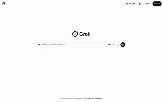
Preview image. Unlock full-res
Color palette
Page backgrounds, elevated card surfaces, text on dark buttons
Primary text, headings, icons, backgrounds for filled buttons
Muted text, secondary icons, placeholder text, descriptive captions
Borders for inactive fields, button outlines, subtle dividers
Typography
- Weights
- 400, 500, 550
- Sizes
- 13px, 14px, 16px
- Line height
- 1.2, 1.5, 1.75
- Letter spacing
- -0.0080em at 16px, -0.0070em at 14px, -0.0060em at 13px
- Fallback
- Inter
The primary typeface for all text content, from body text to interactive elements. The variety of subtle weight and letter-spacing adjustments allows for precise control of visual density and hierarchy within the predominantly monochrome interface.
Spacing & shape
Components
Text in Deep Space (#050505) on a transparent background, with a full-round radius (9999px). Padding is 8px vertical and 16px horizontal. Used for actions like 'Imagine' or 'Sign in'.
Text in Deep Space (#050505) on a transparent background, with a full-round radius (9999px) and a subtle 1px border in Outline Gray (#1d1d1d, which uses oklch(0.1157 0 none / 0.1) as borderTopColor). Padding is 8px vertical and 16px horizontal.
Text in Absolute Zero (#ffffff) on a Deep Space (#050505) background, with a full-round radius (9999px). Padding is 8px vertical and 16px horizontal. Used for 'Sign up'.
Text in Deep Space (#050505) on a transparent background, placeholder text in Shadowstone (#636363), with a full-round radius (9999px, likely an override from the 0px input variant). Features a subtle 1px border in Outline Gray (#1d1d1d, via oklch(0.1157 0 none / 0.06)). Padding is 16px vertical and 8px horizontal. Has internal element gaps of 8px for icons.
Guidelines
- Prioritize Deep Space (#050505) for all primary text and interactive elements to maintain high contrast against Absolute Zero (#ffffff) backgrounds.
- Utilize 9999px border-radius for all buttons and interactive input fields to support the soft, accessible aesthetic.
- Implement the Universal Sans font family with precise letter-spacing adjustments: -0.0080em for larger text (16px), -0.0070em for medium (14px), and -0.0060em for smaller text (13px).
- Maintain a clear functional hierarchy for buttons: transparent for ghost, subtle border for outlined secondary, and Deep Space (#050505) background for primary actions.
- Apply 8px as the default `elementGap` between internal components within an input or button group to ensure clear separation without excessive whitespace.
- Use Shadowstone (#636363) only for muted, secondary, or placeholder text, never for primary content or calls to action.
- Ensure all interactive elements have 8px vertical and 16px horizontal padding, adapting to the full-round radius.
- Do not introduce vibrant or highly saturated colors; the system is strictly achromatic.
- Avoid sharp corners; all interactive elements and contained components should use the specified large border radii.
- Do not use heavy shadows or gradients; elevation is subtly conveyed through borders or background tints, not complex visual effects.
- Refrain from using varied font families; Universal Sans is the sole typeface for all content.
- Do not apply excessive line height or loose letter spacing; the typography is compact and designed for efficiency.
- Avoid varying input field border styles; all should consistently use the 1px Outline Gray (#1d1d1d) border.
- Do not use `pageMaxWidth` as the layout is full-bleed, centering content without explicit max-width containment.
About this system
ShowHide
Grok employs a stark, minimalist aesthetic with a dominant achromatic palette, creating a quiet backdrop for AI interaction. The design emphasizes speed and clarity through compact typography and high-contrast elements. Surfaces are primarily clean white with subtle gray accents, while interactive elements are defined by their form and subtle border treatments rather than bold colors. The overall impression is one of crisp efficiency and focused utility.
The page exhibits a full-bleed layout, with content centered horizontally without a fixed maximum width. The hero section features the brand logo and primary input field centrally stacked on a clean white background. Navigation is handled by a minimal top bar with ghost and filled buttons. Section rhythm is sparse, emphasizing a clear, uncluttered 'canvas' for interaction, marked by generous vertical spacing between the main query input and footer. The overall density is low, prioritizing breathing room around key interactive elements.
This design system primarily relies on simple, monochromatic icons with a clean, outlined style. No photography, complex illustrations, or significant graphical elements are present. Imagery serves a purely functional role, such as the Grok logo and UI icons, maintaining a low visual density and supporting the text-dominant interface.
Reminiscent of ChatGPT, Google Search, Linear, Arc Browser.
# Grok — Style Reference
> Monochrome AI canvas

**Theme:** light

**Site:** https://grok.com

Grok employs a stark, minimalist aesthetic with a dominant achromatic palette, creating a quiet backdrop for AI interaction. The design emphasizes speed and clarity through compact typography and high-contrast elements. Surfaces are primarily clean white with subtle gray accents, while interactive elements are defined by their form and subtle border treatments rather than bold colors. The overall impression is one of crisp efficiency and focused utility.

## Tokens — Colors

| Name | Value | Token | Role |
|------|------|------|------|
| Absolute Zero | `#ffffff` | `--color-absolute-zero` | Page backgrounds, elevated card surfaces, text on dark buttons |
| Deep Space | `#050505` | `--color-deep-space` | Primary text, headings, icons, backgrounds for filled buttons |
| Shadowstone | `#636363` | `--color-shadowstone` | Muted text, secondary icons, placeholder text, descriptive captions |
| Outline Gray | `#1d1d1d` | `--color-outline-gray` | Borders for inactive fields, button outlines, subtle dividers |

## Tokens — Typography

### Universal Sans
- **Substitute:** Inter
- **Weights:** 400, 500, 550
- **Sizes:** 13px, 14px, 16px
- **Line height:** 1.2, 1.5, 1.75
- **Letter spacing:** -0.0080em at 16px, -0.0070em at 14px, -0.0060em at 13px
- **Role:** The primary typeface for all text content, from body text to interactive elements. The variety of subtle weight and letter-spacing adjustments allows for precise control of visual density and hierarchy within the predominantly monochrome interface.

## Tokens — Type Scale

Major Second (1.125) from 16px base.

| Role | Size | Line height | Letter spacing |
|------|------|------|------|
| caption | 13px | 1.5 | — |
| body-sm | 14px | 1.5 | — |
| body | 16px | 1.5 | — |

## Tokens — Spacing

- **Section gap:** 36px
- **Card padding:** 16px
- **Element gap:** 8px

## Tokens — Radius

- **Buttons:** 9999px
- **Inputs:** 9999px
- **links:** 8px

## Layout

The page exhibits a full-bleed layout, with content centered horizontally without a fixed maximum width. The hero section features the brand logo and primary input field centrally stacked on a clean white background. Navigation is handled by a minimal top bar with ghost and filled buttons. Section rhythm is sparse, emphasizing a clear, uncluttered 'canvas' for interaction, marked by generous vertical spacing between the main query input and footer. The overall density is low, prioritizing breathing room around key interactive elements.

## Imagery

This design system primarily relies on simple, monochromatic icons with a clean, outlined style. No photography, complex illustrations, or significant graphical elements are present. Imagery serves a purely functional role, such as the Grok logo and UI icons, maintaining a low visual density and supporting the text-dominant interface.

## Components

### Ghost Button
*Secondary actions and navigation items*

Text in Deep Space (#050505) on a transparent background, with a full-round radius (9999px). Padding is 8px vertical and 16px horizontal. Used for actions like 'Imagine' or 'Sign in'.

### Outlined Button
*Tertiary actions or subtle interactive elements*

Text in Deep Space (#050505) on a transparent background, with a full-round radius (9999px) and a subtle 1px border in Outline Gray (#1d1d1d, which uses oklch(0.1157 0 none / 0.1) as borderTopColor). Padding is 8px vertical and 16px horizontal.

### Filled Primary Button
*Primary calls to action*

Text in Absolute Zero (#ffffff) on a Deep Space (#050505) background, with a full-round radius (9999px). Padding is 8px vertical and 16px horizontal. Used for 'Sign up'.

### Minimal Input Field
*User input for search or queries*

Text in Deep Space (#050505) on a transparent background, placeholder text in Shadowstone (#636363), with a full-round radius (9999px, likely an override from the 0px input variant). Features a subtle 1px border in Outline Gray (#1d1d1d, via oklch(0.1157 0 none / 0.06)). Padding is 16px vertical and 8px horizontal. Has internal element gaps of 8px for icons.

## Guidelines

### Do

- Prioritize Deep Space (#050505) for all primary text and interactive elements to maintain high contrast against Absolute Zero (#ffffff) backgrounds.
- Utilize 9999px border-radius for all buttons and interactive input fields to support the soft, accessible aesthetic.
- Implement the Universal Sans font family with precise letter-spacing adjustments: -0.0080em for larger text (16px), -0.0070em for medium (14px), and -0.0060em for smaller text (13px).
- Maintain a clear functional hierarchy for buttons: transparent for ghost, subtle border for outlined secondary, and Deep Space (#050505) background for primary actions.
- Apply 8px as the default `elementGap` between internal components within an input or button group to ensure clear separation without excessive whitespace.
- Use Shadowstone (#636363) only for muted, secondary, or placeholder text, never for primary content or calls to action.
- Ensure all interactive elements have 8px vertical and 16px horizontal padding, adapting to the full-round radius.

### Don't

- Do not introduce vibrant or highly saturated colors; the system is strictly achromatic.
- Avoid sharp corners; all interactive elements and contained components should use the specified large border radii.
- Do not use heavy shadows or gradients; elevation is subtly conveyed through borders or background tints, not complex visual effects.
- Refrain from using varied font families; Universal Sans is the sole typeface for all content.
- Do not apply excessive line height or loose letter spacing; the typography is compact and designed for efficiency.
- Avoid varying input field border styles; all should consistently use the 1px Outline Gray (#1d1d1d) border.
- Do not use `pageMaxWidth` as the layout is full-bleed, centering content without explicit max-width containment.

## Agent Prompt Guide

Quick Color Reference:
text: #050505
background: #ffffff
border: #1d1d1d
accent: no distinct accent color
primary action: no distinct CTA color

Example Component Prompts:
Create a primary 'Sign up' button: Fill with Deep Space (#050505), text in Absolute Zero (#ffffff), 9999px radius, 8px vertical padding, 16px horizontal padding. Font Universal Sans, weight 400, size 16px, letter-spacing -0.0080em.
Create a ghost 'Sign in' button: Transparent background, text in Deep Space (#050505), 9999px radius, 8px vertical padding, 16px horizontal padding. Font Universal Sans, weight 400, size 16px, letter-spacing -0.0080em.
Create an interactive minimal input field: Transparent background, 1px Outline Gray (#1d1d1d) border, 9999px radius. Placeholder text in Shadowstone (#636363). Internal element gap 8px. Padding 16px vertical, 8px horizontal. Font Universal Sans, weight 400, size 16px, letter-spacing -0.0080em.
Create a footer link for 'Terms': Text in Shadowstone (#636363), font Universal Sans, weight 400, size 13px, letter-spacing -0.0060em.
More like this





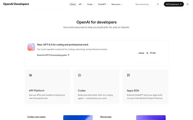




Keep what you find
A free account saves references to boards and can send you a weekly email of picks based on what you save.
To see every result, go Pro.