Preview image. Unlock full-res
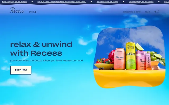
Pastel Cloud Dreamscape — like sipping an airy drink while floating amongst sweet-colored clouds on a clear day.
Color palette
Primary text, navigation links, button text, input text — a grounding, muted violet-blue that reads as sophisticated neutral rather than cold.
Footer background, secondary text — a deeper, more saturated violet-blue providing contrast and depth for structural elements.
Primary button backgrounds, highlight elements, subtle graphic accents — a moderate violet with a soft, inviting energy.
Secondary brand accent, used for prominent headlines — a brighter, vivid violet that draws attention without being aggressive.
Button backgrounds, subtle surface highlights — a very light, warm off-white adding a soft glow.
Page backgrounds, card surfaces, text elements on dark backgrounds, icons — the primary achromatic background.
Icons, subtle graphic elements, some borders — used minimally for sharp definition.
Secondary text, subtle borders, list item separators — a soft, almost lavender-tinted gray for understated detail.
Background gradient for hero sections and key content blocks — transitioning from a cool cyan to a soft violet and then a warm rose.
Transitional and softer gradients, often used for masks or subtle background variations.
Transitional and softer gradients, often used for masks or subtle background variations.
Alerts, special promotions — a vivid red used sparingly for high-emphasis elements.
Typography
- Weights
- 400
- Sizes
- 14px, 15px, 16px, 18px
- Line height
- 1.33, 1.38, 1.4, 1.63
- Fallback
- Montserrat
Body text, navigation items, button text, input text — the primary typeface providing a clean, contemporary feel with good legibility.
- Weights
- 500
- Sizes
- 20px, 24px, 60px
- Line height
- 1, 1.1, 1.13, 1.2, 1.25
- Fallback
- Montserrat
Subheadings, prominent links, product titles — providing emphasis without being overly bold, maintaining the brand's light touch.
- Weights
- 700
- Sizes
- 60px, 24px
- Line height
- 1, 1.1
- Fallback
- Montserrat
Main headlines, hero text — used for maximum impact, but still feels approachable due to the rounded letterforms and generous spacing.
- Weights
- 400
- Sizes
- 14px, 24px
- Line height
- 1.38, 1.63
- Fallback
- None - placeholder/fallback
Likely a placeholder or fallback font, not intended for primary display. Should not be used in design.
Spacing & shape
Components
backgroundColor: rgba(0, 0, 0, 0), color: #25385b, border: none, borderRadius: 50%, padding: 0px.
backgroundColor: rgba(0, 0, 0, 0), color: #25385b, borderColor: #25385b, border: 1px solid, borderRadius: 0px, padding: 12px 12px.
backgroundColor: #a2b0ff, color: #25385b, border: 1px solid #25385b, borderRadius: 0px, padding: 24px 36px.
backgroundColor: rgba(0, 0, 0, 0), color: #25385b, borderBottom: 1px solid #25385b, borderRadius: 0px, paddingTop: 12px, paddingBottom: 12px, paddingLeft: 0px.
backgroundColor: rgba(0, 0, 0, 0), color: #ffffff, borderBottom: 1px solid #ffffff, borderRadius: 0px, paddingTop: 9px, paddingBottom: 9px, paddingLeft: 0px.
Guidelines
- Use Sharp Grotesk Web for all text elements, prioritizing weights 400 for body, 500 for subheadings, and 700 for headlines.
- Implement the Sky Violet (#25385b) for all primary text and calls to action when on a light background.
- Apply Lavender Mist (#a2b0ff) for primary button backgrounds and interactive highlights, paired with Sky Violet text.
- Maintain the strict use of 0px border-radius for all primary buttons and cards, creating a crisp, intentional contrast with organic product forms.
- Employ the linear-gradient(rgb(236, 245, 246), rgb(235, 235, 253), rgb(251, 206, 205)) for large background sections to establish the 'cloud dreamscape' atmosphere.
- Utilize 24px 36px padding for prominent CTA buttons to emphasize their importance and provide visual spaciousness.
- Separate interactive elements (buttons, links) with an `elementGap` of 8px for clear distinction.
- Avoid using Adobe Blank for any display text; it's a structural element only.
- Do not introduce strong, dark shadows on cards or elevated components; the aesthetic is light and airy.
- Do not use highly saturated colors for large content blocks; reserve them for accents and interactive states.
- Do not deviate from the 0px border-radius unless explicitly for a circular icon or a small dot indicator (50%).
- Avoid tight spacing between sections; maintain generous vertical padding (sectionGap: 48-80px) to enhance the feeling of calm and spaciousness.
- Do not use dark backgrounds for body text; Sky Violet (#25385b) on light neutrals (#ffffff, #fffcef) is the standard.
- Refrain from introducing additional typefaces; Sharp Grotesk Web is the sole brand font.
About this system
ShowHide
Recess evokes a playful and ephemeral calm, like floating candy clouds in a pastel sky. The visual language balances approachable softness with crisp technical legibility through the Sharp Grotesk typeface. Large, airy sections of pastel gradients and product photography create a relaxed, uncluttered feel, while the consistent use of a muted violet-blue for text and primary elements anchors the whimsical palette in a clear, trustworthy brand identity. The design uses rounded forms and soft shadows to maintain a friendly and light atmosphere.
The page primarily uses a full-bleed structure, particularly in hero sections, with content centered. The hero pattern features a large, often gradient or photographic background with a bold, centered headline and a prominent CTA. Subsequent sections alternate between full-bleed backgrounds (gradients or solid pastel colors) and content-contained rows. Content arrangement frequently uses a centered stack for textual information, transitioning to two-column layouts for image-left/text-right feature presentations. There's a consistent, generous vertical spacing between sections, contributing to an open and spacious feel. Navigation is a sticky top bar, with prominent 'shop' and user login/cart icons.
The visual language is product-centric, featuring vibrant, color-rich photographs of Recess cans and powders, often with fresh fruits or natural elements. Products are typically arranged artfully, sometimes with soft, diffuse lighting or against gradient backgrounds that echo the site's pastel palette. Photography is contained within sections, not full-bleed, often complemented by abstract, soft, 3D cloud graphics that float around UI elements, adding a whimsical, dreamlike quality. Icons are minimal, either outline or filled in Sky Violet or Jet Black, maintaining a clean aesthetic. Visuals serve both decorative atmosphere and explicit product showcase functions, occupying significant visual space relative to text to convey an aspirational lifestyle.
Reminiscent of Olipop, Kin Euphorics, Dirty Lemon, Moon Juice, Starface.
# Recess — Style Reference
> Pastel Cloud Dreamscape — like sipping an airy drink while floating amongst sweet-colored clouds on a clear day.

**Theme:** light

**Site:** https://takearecess.com

Recess evokes a playful and ephemeral calm, like floating candy clouds in a pastel sky. The visual language balances approachable softness with crisp technical legibility through the Sharp Grotesk typeface. Large, airy sections of pastel gradients and product photography create a relaxed, uncluttered feel, while the consistent use of a muted violet-blue for text and primary elements anchors the whimsical palette in a clear, trustworthy brand identity. The design uses rounded forms and soft shadows to maintain a friendly and light atmosphere.

## Tokens — Colors

| Name | Value | Token | Role |
|------|------|------|------|
| Sky Violet | `#25385b` | `--color-sky-violet` | Primary text, navigation links, button text, input text — a grounding, muted violet-blue that reads as sophisticated neutral rather than cold. |
| Cloud Indigo | `#0a0a3a` | `--color-cloud-indigo` | Footer background, secondary text — a deeper, more saturated violet-blue providing contrast and depth for structural elements. |
| Lavender Mist | `#a2b0ff` | `--color-lavender-mist` | Primary button backgrounds, highlight elements, subtle graphic accents — a moderate violet with a soft, inviting energy. |
| Vivid Cobalt | `#3252f4` | `--color-vivid-cobalt` | Secondary brand accent, used for prominent headlines — a brighter, vivid violet that draws attention without being aggressive. |
| Vanilla Cream | `#fffcef` | `--color-vanilla-cream` | Button backgrounds, subtle surface highlights — a very light, warm off-white adding a soft glow. |
| Pure White | `#ffffff` | `--color-pure-white` | Page backgrounds, card surfaces, text elements on dark backgrounds, icons — the primary achromatic background. |
| Jet Black | `#000000` | `--color-jet-black` | Icons, subtle graphic elements, some borders — used minimally for sharp definition. |
| Starlight Gray | `#84849c` | `--color-starlight-gray` | Secondary text, subtle borders, list item separators — a soft, almost lavender-tinted gray for understated detail. |
| Gradient Sky Glow A | `#ecf5f6` | `--color-gradient-sky-glow-a` | Background gradient for hero sections and key content blocks — transitioning from a cool cyan to a soft violet and then a warm rose. |
| Gradient Sky Glow B | `#a2b0ff` | `--color-gradient-sky-glow-b` | Transitional and softer gradients, often used for masks or subtle background variations. |
| Gradient Sky Glow C | `#fbecdc` | `--color-gradient-sky-glow-c` | Transitional and softer gradients, often used for masks or subtle background variations. |
| Candy Apple | `#ff5a5a` | `--color-candy-apple` | Alerts, special promotions — a vivid red used sparingly for high-emphasis elements. |

## Tokens — Typography

### Sharp Grotesk Web
- **Substitute:** Montserrat
- **Weights:** 400
- **Sizes:** 14px, 15px, 16px, 18px
- **Line height:** 1.33, 1.38, 1.4, 1.63
- **Role:** Body text, navigation items, button text, input text — the primary typeface providing a clean, contemporary feel with good legibility.

### Sharp Grotesk Web
- **Substitute:** Montserrat
- **Weights:** 500
- **Sizes:** 20px, 24px, 60px
- **Line height:** 1, 1.1, 1.13, 1.2, 1.25
- **Role:** Subheadings, prominent links, product titles — providing emphasis without being overly bold, maintaining the brand's light touch.

### Sharp Grotesk Web
- **Substitute:** Montserrat
- **Weights:** 700
- **Sizes:** 60px, 24px
- **Line height:** 1, 1.1
- **Role:** Main headlines, hero text — used for maximum impact, but still feels approachable due to the rounded letterforms and generous spacing.

### Adobe Blank
- **Substitute:** None - placeholder/fallback
- **Weights:** 400
- **Sizes:** 14px, 24px
- **Line height:** 1.38, 1.63
- **Role:** Likely a placeholder or fallback font, not intended for primary display. Should not be used in design.

## Tokens — Type Scale

Perfect Fourth (1.333) from 16px base.

| Role | Size | Line height | Letter spacing |
|------|------|------|------|
| caption | 14px | 1.63 | — |
| body | 16px | 1.38 | — |
| subheading | 18px | 1.33 | — |
| heading-sm | 20px | 1.25 | — |
| heading | 24px | 1.2 | — |
| display | 60px | 1 | — |

## Tokens — Spacing

- **Section gap:** 48-80px
- **Element gap:** 8px

## Tokens — Radius

- **Buttons:** 0px
- **Cards:** 0px
- **tags:** 50%

## Layout

The page primarily uses a full-bleed structure, particularly in hero sections, with content centered. The hero pattern features a large, often gradient or photographic background with a bold, centered headline and a prominent CTA. Subsequent sections alternate between full-bleed backgrounds (gradients or solid pastel colors) and content-contained rows. Content arrangement frequently uses a centered stack for textual information, transitioning to two-column layouts for image-left/text-right feature presentations. There's a consistent, generous vertical spacing between sections, contributing to an open and spacious feel. Navigation is a sticky top bar, with prominent 'shop' and user login/cart icons.

## Imagery

The visual language is product-centric, featuring vibrant, color-rich photographs of Recess cans and powders, often with fresh fruits or natural elements. Products are typically arranged artfully, sometimes with soft, diffuse lighting or against gradient backgrounds that echo the site's pastel palette. Photography is contained within sections, not full-bleed, often complemented by abstract, soft, 3D cloud graphics that float around UI elements, adding a whimsical, dreamlike quality. Icons are minimal, either outline or filled in Sky Violet or Jet Black, maintaining a clean aesthetic. Visuals serve both decorative atmosphere and explicit product showcase functions, occupying significant visual space relative to text to convey an aspirational lifestyle.

## Components

### Testimonial Cards

### Button Group

### Product Feature Banner

### Ghost Icon Button
*Icon-only interactive elements in headers/navigation*

backgroundColor: rgba(0, 0, 0, 0), color: #25385b, border: none, borderRadius: 50%, padding: 0px.

### Outlined Text Button
*Secondary action buttons, navigation items that appear button-like*

backgroundColor: rgba(0, 0, 0, 0), color: #25385b, borderColor: #25385b, border: 1px solid, borderRadius: 0px, padding: 12px 12px.

### Primary Accent Button
*Prominent calls to action*

backgroundColor: #a2b0ff, color: #25385b, border: 1px solid #25385b, borderRadius: 0px, padding: 24px 36px.

### Text Input Light
*Form inputs on light backgrounds*

backgroundColor: rgba(0, 0, 0, 0), color: #25385b, borderBottom: 1px solid #25385b, borderRadius: 0px, paddingTop: 12px, paddingBottom: 12px, paddingLeft: 0px.

### Text Input Dark
*Form inputs on dark backgrounds*

backgroundColor: rgba(0, 0, 0, 0), color: #ffffff, borderBottom: 1px solid #ffffff, borderRadius: 0px, paddingTop: 9px, paddingBottom: 9px, paddingLeft: 0px.

## Guidelines

### Do

- Use Sharp Grotesk Web for all text elements, prioritizing weights 400 for body, 500 for subheadings, and 700 for headlines.
- Implement the Sky Violet (#25385b) for all primary text and calls to action when on a light background.
- Apply Lavender Mist (#a2b0ff) for primary button backgrounds and interactive highlights, paired with Sky Violet text.
- Maintain the strict use of 0px border-radius for all primary buttons and cards, creating a crisp, intentional contrast with organic product forms.
- Employ the linear-gradient(rgb(236, 245, 246), rgb(235, 235, 253), rgb(251, 206, 205)) for large background sections to establish the 'cloud dreamscape' atmosphere.
- Utilize 24px 36px padding for prominent CTA buttons to emphasize their importance and provide visual spaciousness.
- Separate interactive elements (buttons, links) with an `elementGap` of 8px for clear distinction.

### Don't

- Avoid using Adobe Blank for any display text; it's a structural element only.
- Do not introduce strong, dark shadows on cards or elevated components; the aesthetic is light and airy.
- Do not use highly saturated colors for large content blocks; reserve them for accents and interactive states.
- Do not deviate from the 0px border-radius unless explicitly for a circular icon or a small dot indicator (50%).
- Avoid tight spacing between sections; maintain generous vertical padding (sectionGap: 48-80px) to enhance the feeling of calm and spaciousness.
- Do not use dark backgrounds for body text; Sky Violet (#25385b) on light neutrals (#ffffff, #fffcef) is the standard.
- Refrain from introducing additional typefaces; Sharp Grotesk Web is the sole brand font.

## Agent Prompt Guide

### Quick Color Reference
- Text: #25385b (Sky Violet)
- Background: #ffffff (Pure White)
- CTA (Primary): #a2b0ff (Lavender Mist)
- Border (Primary): #25385b (Sky Violet)
- Accent (Headline): #3252f4 (Vivid Cobalt)

### Example Component Prompts
1. Create a hero section with the background gradient `linear-gradient(rgb(236, 245, 246), rgb(235, 235, 253), rgb(251, 206, 205))`. Headline text 'relax & unwind with Recess' at 60px, Sharp Grotesk Web weight 700, color #25385b. Subtext 'you won’t miss the booze when you have Recess on hand' at 18px, Sharp Grotesk Web weight 400, color #25385b. Include a 'shop now' button: background #fffcef, text color #25375a, border 1px solid #25375a, 0px border-radius, 24px 36px padding.

2. Generate a 'shop all products' button: background #a2b0ff, text color #25385b, border 1px solid #25385b, 0px border-radius, 24px 36px padding.

3. Design a testimonial card: #ffffff background, 0px border-radius, 28px padding. Text in Sharp Grotesk Web weight 400, 16px, color #25385b. Include two small, abstract, white 3D cloud graphics floating around it.

4. Create a text input: background rgba(0, 0, 0, 0), text color #25385b, 1px solid #25385b bottom border, 0px border-radius, 12px vertical padding, 0px horizontal padding.
More like this








Keep what you find
A free account saves references to boards and can send you a weekly email of picks based on what you save.
To see every result, go Pro.