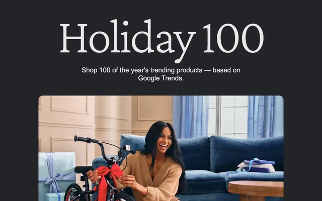
Preview image. Unlock full-res
Midnight product showcase
Color palette
Outlined action borders, interactive link color, and decorative accents, providing a consistent visual cue for interactivity
Violet text accent for links, tags, and emphasized short phrases. Do not promote it to the primary CTA color
Red outline accent for tags, dividers, and focused UI edges. Use as a supporting accent, not as a status color
Blue outline accent for tags, dividers, and focused UI edges. Use as a supporting accent, not as a status color
Green outline accent for tags, dividers, and focused UI edges. Use as a supporting accent, not as a status color
Yellow outline accent for tags, dividers, and focused UI edges. Use as a supporting accent, not as a status color
Hairline borders, dividers, input outlines, and card edges on light surfaces. Use as a supporting accent, not as a status color
Green outline accent for tags, dividers, and focused UI edges. Use as a supporting accent, not as a status color
Primary background for pages and most content cards, providing a deep, consistent canvas
Primary text color for headlines and body content, offering high contrast against dark backgrounds
Lightest neutral highlight for product cards or supporting textual information
Muted secondary text and icon color for captions or less prominent information
Elevated card background, creating a subtle layer distinction from the main page background
Typography
- Weights
- 200, 400
- Sizes
- 48px, 80px, 220px
- Line height
- 0.91, 1
- Letter spacing
- -0.0400em at 220px, -0.0200em at 48px
- Fallback
- serif
Primary display and hero headlines. The very light weight (200) for large sizes creates an elegant, almost whispered presence, demanding attention through its unexpected delicacy rather than bold assertion.
- Weights
- 200, 400, 500
- Sizes
- 14px, 16px, 24px, 30px
- Line height
- 1, 1.14, 1.2, 1.25, 1.43, 1.5, 1.71
- Letter spacing
- -0.0200em
- Fallback
- system-ui
Headings, subheadings, and UI elements. Its clean, slightly humanist form provides clarity and a modern, friendly feel, while consistent tight letter-spacing in larger sizes keeps text compact and impactful.
- Weights
- 400, 700
- Sizes
- 14px
- Line height
- 1.2, 1.43
- Letter spacing
- normal
- Fallback
- system-ui
Body text and less prominent information like button labels and captions. Its ubiquity ensures high legibility and a neutral, functional bedrock for content.
Spacing & shape
Components
White background (`#ffffff`), dark text (`#1f1f1f`), with a generous `20px` border-radius to create a soft, pill-like shape. Uses `14px` vertical padding and `20px` horizontal padding.
Transparent background, light text (`#e8e8e8`), with `0px` border-radius. Often found in navigation or minimal calls-to-action where an understated presence is desired.
Dark background (`#202124`), with a `20px` border-radius and `0px` padding. Designed to frame product imagery and minimal text content, blending into the page background and letting the product stand out.
Vibrant background for specific categories (e.g., `#980b0b`, `#113979`, `#d2e3fc`, `#073618`, `#a8dab5`, `#ffedb8`, `#e8f0fe`). Features `20px` border-radius and `24px` padding, visually distinguishing it from standard product cards to draw attention to curated collections.
Guidelines
- Use Midnight Ink (`#202124`) as the default background for sections and cards to maintain a consistent dark theme.
- Employ Ash Gray (`#e8e8e8`) for all primary text elements, ensuring strong readability against dark surfaces.
- Apply a `20px` border-radius to all cards and primary buttons to maintain a soft, approachable aesthetic.
- Utilize Sky Link (`#99c3ff`) for interactive elements like links and outlined button borders, providing a clear and consistent interactive cue.
- Maintain a comfortable rhythm with `36px` spacing between major sections and `6px` element gaps for tighter UI components.
- Pair Crimson Pro (weight 200) for hero headlines at large sizes with Google Sans (weight 400-500) for section headings to balance elegance with modern clarity.
- Use specific accent card backgrounds (e.g., Crimson Alert `#980b0b` or Cerulean Insight `#113979`) only for curated product groups or messages requiring visual emphasis, reserving them for distinct categories.
- Do not introduce light backgrounds for entire sections or pages; the theme is predominantly dark.
- Avoid blocky or sharp corners; all significant UI elements should leverage the `20px` border-radius.
- Do not use highly saturated colors for large surface areas unless it's one of the pre-defined accent card backgrounds and serves a clear thematic purpose.
- Avoid heavy drop shadows or glows; the design relies on subtle background color shifts for surface distinction.
- Do not use generic system fonts when Google Sans or Crimson Pro are available for headings and subheadings; Arial is reserved for body text.
- Do not use letter-spacing outside the specified values for Google Sans and Crimson Pro; maintain the precise tracking for these fonts.
- Avoid dense UI elements with minimal padding; prioritize comfortable spacing, using `24px` for card padding and `14px` for button vertical padding.
About this system
ShowHide
Holiday 100 features a dark, spacious aesthetic with a focus on product showcase. Generous negative space and subtle card treatments ensure content breathes, while selective use of vibrant accent colors for key messages and interactive elements adds visual interest without overpowering the rich product imagery. Typography combines a classic serif for headlines with a clean sans-serif for body text, creating a modern yet approachable feel. The system prioritizes clarity and directness over heavy adornment.
The page structure is a full-bleed layout with content sections that maintain a comfortable horizontal max-width, typically centered. The hero section often features a large image or video with centered text overlays. Section rhythm is organized by full-width dark backgrounds, with alternating content blocks that can range from full-width cards to multi-column grids. Content is generally arranged in visually balanced blocks, often with a clear visual hierarchy. Navigation is a sticky top bar with minimal elements.
This system primarily uses high-quality product photography and occasional lifestyle imagery. Products are often tightly cropped and presented against neutral or brand-colored backgrounds, with an emphasis on showcasing the item itself. Illustrations are minimal, seen mostly in small, outlined icon styles for categories. Imagery serves to directly showcase products or create anaspirational mood rather than purely decorative purposes. The density is moderate, balancing large hero images with smaller product grids, always allowing ample breathing room around visuals.
Reminiscent of Apple, Google Store, Samsung, Wirecutter / New York Times Reviews.
# Holiday 100 — Style Reference
> Midnight product showcase

**Theme:** dark

**Site:** https://shopping.google.com/m/bestthings

Holiday 100 features a dark, spacious aesthetic with a focus on product showcase. Generous negative space and subtle card treatments ensure content breathes, while selective use of vibrant accent colors for key messages and interactive elements adds visual interest without overpowering the rich product imagery. Typography combines a classic serif for headlines with a clean sans-serif for body text, creating a modern yet approachable feel. The system prioritizes clarity and directness over heavy adornment.

## Tokens — Colors

| Name | Value | Token | Role |
|------|------|------|------|
| Sky Link | `#99c3ff` | `--color-sky-link` | Outlined action borders, interactive link color, and decorative accents, providing a consistent visual cue for interactivity |
| Grape Glow | `#c58af9` | `--color-grape-glow` | Violet text accent for links, tags, and emphasized short phrases. Do not promote it to the primary CTA color |
| Crimson Alert | `#980b0b` | `--color-crimson-alert` | Red outline accent for tags, dividers, and focused UI edges. Use as a supporting accent, not as a status color |
| Cerulean Insight | `#113979` | `--color-cerulean-insight` | Blue outline accent for tags, dividers, and focused UI edges. Use as a supporting accent, not as a status color |
| Mint Whisper | `#a8dab5` | `--color-mint-whisper` | Green outline accent for tags, dividers, and focused UI edges. Use as a supporting accent, not as a status color |
| Goldenrod Hue | `#ffedb8` | `--color-goldenrod-hue` | Yellow outline accent for tags, dividers, and focused UI edges. Use as a supporting accent, not as a status color |
| Arctic Mist | `#d2e3fc` | `--color-arctic-mist` | Hairline borders, dividers, input outlines, and card edges on light surfaces. Use as a supporting accent, not as a status color |
| Forest Dew | `#073618` | `--color-forest-dew` | Green outline accent for tags, dividers, and focused UI edges. Use as a supporting accent, not as a status color |
| Midnight Ink | `#202124` | `--color-midnight-ink` | Primary background for pages and most content cards, providing a deep, consistent canvas |
| Ash Gray | `#e8e8e8` | `--color-ash-gray` | Primary text color for headlines and body content, offering high contrast against dark backgrounds |
| Pale Gray | `#e8f0fe` | `--color-pale-gray` | Lightest neutral highlight for product cards or supporting textual information |
| Steel Gray | `#9e9e9e` | `--color-steel-gray` | Muted secondary text and icon color for captions or less prominent information |
| Charcoal Surface | `#333438` | `--color-charcoal-surface` | Elevated card background, creating a subtle layer distinction from the main page background |

## Tokens — Typography

### Crimson Pro
- **Substitute:** serif
- **Weights:** 200, 400
- **Sizes:** 48px, 80px, 220px
- **Line height:** 0.91, 1
- **Letter spacing:** -0.0400em at 220px, -0.0200em at 48px
- **Role:** Primary display and hero headlines. The very light weight (200) for large sizes creates an elegant, almost whispered presence, demanding attention through its unexpected delicacy rather than bold assertion.

### Google Sans
- **Substitute:** system-ui
- **Weights:** 200, 400, 500
- **Sizes:** 14px, 16px, 24px, 30px
- **Line height:** 1, 1.14, 1.2, 1.25, 1.43, 1.5, 1.71
- **Letter spacing:** -0.0200em
- **Role:** Headings, subheadings, and UI elements. Its clean, slightly humanist form provides clarity and a modern, friendly feel, while consistent tight letter-spacing in larger sizes keeps text compact and impactful.

### Arial
- **Substitute:** system-ui
- **Weights:** 400, 700
- **Sizes:** 14px
- **Line height:** 1.2, 1.43
- **Letter spacing:** normal
- **Role:** Body text and less prominent information like button labels and captions. Its ubiquity ensures high legibility and a neutral, functional bedrock for content.

## Tokens — Type Scale

Augmented Fourth (1.414) from 16px base.

| Role | Size | Line height | Letter spacing |
|------|------|------|------|
| caption | 14px | 1.43 | — |
| body | 16px | 1.5 | -0.32px |
| subheading | 24px | 1.2 | -0.48px |
| heading | 30px | 1.14 | -0.6px |
| heading-lg | 48px | 1 | -0.96px |
| display | 80px | 0.91 | -3.2px |

## Tokens — Spacing

- **Section gap:** 36px
- **Card padding:** 24px
- **Element gap:** 6px

## Tokens — Radius

- **Default:** 20px
- **Buttons:** 20px
- **Cards:** 20px
- **links:** 2px
- **pill:** 9999px

## Layout

The page structure is a full-bleed layout with content sections that maintain a comfortable horizontal max-width, typically centered. The hero section often features a large image or video with centered text overlays. Section rhythm is organized by full-width dark backgrounds, with alternating content blocks that can range from full-width cards to multi-column grids. Content is generally arranged in visually balanced blocks, often with a clear visual hierarchy. Navigation is a sticky top bar with minimal elements.

## Imagery

This system primarily uses high-quality product photography and occasional lifestyle imagery. Products are often tightly cropped and presented against neutral or brand-colored backgrounds, with an emphasis on showcasing the item itself. Illustrations are minimal, seen mostly in small, outlined icon styles for categories. Imagery serves to directly showcase products or create anaspirational mood rather than purely decorative purposes. The density is moderate, balancing large hero images with smaller product grids, always allowing ample breathing room around visuals.

## Components

### Pill Button
*Primary Call to Action*

White background (`#ffffff`), dark text (`#1f1f1f`), with a generous `20px` border-radius to create a soft, pill-like shape. Uses `14px` vertical padding and `20px` horizontal padding.

### Ghost Link
*Secondary Action / Navigation*

Transparent background, light text (`#e8e8e8`), with `0px` border-radius. Often found in navigation or minimal calls-to-action where an understated presence is desired.

### Product Card
*Information Display / Product Listing*

Dark background (`#202124`), with a `20px` border-radius and `0px` padding. Designed to frame product imagery and minimal text content, blending into the page background and letting the product stand out.

### Accent Product Card
*Highlight / Themed Product Listing*

Vibrant background for specific categories (e.g., `#980b0b`, `#113979`, `#d2e3fc`, `#073618`, `#a8dab5`, `#ffedb8`, `#e8f0fe`). Features `20px` border-radius and `24px` padding, visually distinguishing it from standard product cards to draw attention to curated collections.

## Guidelines

### Do

- Use Midnight Ink (`#202124`) as the default background for sections and cards to maintain a consistent dark theme.
- Employ Ash Gray (`#e8e8e8`) for all primary text elements, ensuring strong readability against dark surfaces.
- Apply a `20px` border-radius to all cards and primary buttons to maintain a soft, approachable aesthetic.
- Utilize Sky Link (`#99c3ff`) for interactive elements like links and outlined button borders, providing a clear and consistent interactive cue.
- Maintain a comfortable rhythm with `36px` spacing between major sections and `6px` element gaps for tighter UI components.
- Pair Crimson Pro (weight 200) for hero headlines at large sizes with Google Sans (weight 400-500) for section headings to balance elegance with modern clarity.
- Use specific accent card backgrounds (e.g., Crimson Alert `#980b0b` or Cerulean Insight `#113979`) only for curated product groups or messages requiring visual emphasis, reserving them for distinct categories.

### Don't

- Do not introduce light backgrounds for entire sections or pages; the theme is predominantly dark.
- Avoid blocky or sharp corners; all significant UI elements should leverage the `20px` border-radius.
- Do not use highly saturated colors for large surface areas unless it's one of the pre-defined accent card backgrounds and serves a clear thematic purpose.
- Avoid heavy drop shadows or glows; the design relies on subtle background color shifts for surface distinction.
- Do not use generic system fonts when Google Sans or Crimson Pro are available for headings and subheadings; Arial is reserved for body text.
- Do not use letter-spacing outside the specified values for Google Sans and Crimson Pro; maintain the precise tracking for these fonts.
- Avoid dense UI elements with minimal padding; prioritize comfortable spacing, using `24px` for card padding and `14px` for button vertical padding.

## Agent Prompt Guide

Quick Color Reference:
- text: #e8e8e8
- background: #202124
- border: no distinct chromatic border
- accent: #99c3ff
- primary action: #99c3ff (outlined action border)

Example Component Prompts:
- Create a hero section: Midnight Ink background. Headline 'Holiday 100' at 80px Crimson Pro weight 200, Ash Gray. Subheading 'Shop 100 of the year's trending products — based on Google Trends.' at 24px Google Sans weight 400, Ash Gray.
- Create an outlined link: Sky Link border (1px solid), Sky Link text (`#99c3ff`) at 14px Arial, 2px border-radius, `8px` horizontal padding.
- Create a product card: Charcoal Surface background. Image fill. Body text 14px Arial, Ash Gray. Pill Button with White background, 20px radius, 14px vertical padding and 20px horizontal padding, 14px Arial text in #1f1f1f.
- Create an accent card (Crimson Alert): Crimson Alert background (`#980b0b`). Google Sans weight 500 headline at 24px, Ash Gray. Body text at 14px Arial, Ash Gray. Use `24px` padding and `20px` border-radius.
More like this








Keep what you find
A free account saves references to boards and can send you a weekly email of picks based on what you save.
To see every result, go Pro.