Preview image. Unlock full-res
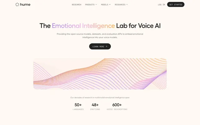
Warm pastel research lab. Soft, rounded elements meet crisp technical details within a muted, inviting color scheme.
Color palette
Primary brand accent, used for prominent headings and interactive elements (links, active states, progress bars) – a vivid violet that adds a touch of digital sophistication without overpowering the softer neutrals.
Decorative background for hero graphics or prominent visual elements, symbolizing organic data flow.
Secondary accent for icon backgrounds and subtle highlights – a warm, vivid orange.
Tertiary accent for icon backgrounds and content categorization – a moderate pink.
Tertiary accent for icon backgrounds and content categorization – a moderate blue.
Tertiary accent for icon backgrounds and content categorization – a moderate teal.
Tertiary accent for icon backgrounds and content categorization – a vivid orange.
Page backgrounds, subtle card surfaces – creates a warm, inviting foundation.
Primary text, main button backgrounds, iconic elements – serves as the dominant dark anchor against the light background.
Content container backgrounds, elements needing crisp contrast against Pale Ivory.
Background for secondary content blocks.
Background for secondary content blocks.
Background for secondary content blocks.
Background for secondary content blocks.
Background for secondary content blocks.
Background for secondary content blocks.
Typography
- Weights
- 400, 520
- Sizes
- 12px, 14px, 16px, 18px, 20px, 24px, 30px, 36px, 48px
- Line height
- 1, 1.11, 1.2, 1.25, 1.33, 1.43, 1.5, 1.56, 1.63
- Letter spacing
- -0.6
- Fallback
- system-ui, sans-serif
Primary typeface for all headings, body text, and UI elements. Its slightly humanist touch makes technical content accessible. Letter spacing of -0.025em (approx -0.6px at 24px) contributes to a tighter, more deliberate aesthetic for headings.
- Weights
- 400
- Sizes
- 10px, 12px, 14px
- Line height
- 1.33, 1.43, 1.5
- Letter spacing
- 0.3
- Fallback
- monospace
Secondary typeface for code snippets, data labels, and certain UI elements requiring a precise, technical feel. Its monospaced nature and slight positive letter-spacing (0.025em, approx 0.3px at 12px) clearly distinguishes factual, quantitative content.
Spacing & shape
Components
Transparent background, text Graphite (rgba(0, 0, 0, 0.8)) on hover for current, or rgba(34, 34, 34, 0.6) for inactive. No border. Padding 8px vertical, 12px horizontal. Uses Fellix typeface, 14px size, weight 400.
Transparent background, text Graphite (rgba(34, 34, 34, 0.6)). Fully rounded corners (1.67772e+07px). Padding 8px vertical, 16px horizontal. Used for filters or options.
Transparent background, text Bright White (#ffffff). Fully rounded corners (1.67772e+07px). Padding 8px vertical, 16px horizontal. Used for actions within dark hero sections.
Background Bright White with 10% opacity (oklab(0.999994 0.0000455678 0.0000200868 / 0.1)), text Bright White (#ffffff), border Bright White (#ffffff). Fully rounded corners (1.67772e+07px). Padding 12px vertical, 20px left, 48px right. Uses Fellix typeface.
Backgrounds vary between Light Mauve, Soft Lilac, Mint Cream, Sky Mist, Muted Apricot, Dusty Peach. Corner radius 8px or 12px. Internal padding generally 24px.
Background Deep Plum (#c094e4). Used for bar charts, indicating performance or quantity. Rounded corners likely 8px or 12px.
Guidelines
- Use Pale Ivory (#fff9f3) as the default page background to establish a warm, inviting tone.
- Apply Graphite (#222222) for all primary body text, headlines, and main interactive element backgrounds to ensure strong contrast and readability.
- Employ the fully rounded 1.67772e+07px radius for all buttons and text input fields to maintain a soft, approachable aesthetic.
- Reserve Deep Plum (#c094e4) for key interactive elements, headlines that need emphasis, and prominent data visualizations.
- Utilize Fellix for all general UI text and headings, adjusting letter-spacing to -0.6px where larger font sizes are used.
- Alternate section backgrounds between Pale Ivory (#fff9f3) and muted chromatic tints like Light Mauve (#fce0ee) or Soft Lilac (#e6d1ed) to create visual separation.
- Maintain a clear element gap of 12px and card padding of 24px within components for consistent internal spacing.
- Avoid using harsh, saturated colors for backgrounds; stick to the muted pastel range provided for secondary content areas.
- Do not introduce sharp corners on interactive elements or cards; the aesthetic relies on a consistent soft radius (8px to 1.67772e+07px).
- Refrain from using bold or heavy font weights for headlines; the Fellix typeface in weights 400 and 520 provides sufficient hierarchy without being assertive.
- Do not deviate from the established letter-spacing values; the tight -0.025em for Fellix and expanded 0.025em for PP Fraktion Mono are integral to the typographic identity.
- Avoid excessive use of drop shadows; depth is primarily achieved through background color shifts and subtle elevation.
- Do not use PP Fraktion Mono for general body text; its monospaced nature is intended for data and technical contexts only.
- Never use generic blue for links; active links should employ Deep Plum (#c094e4) to align with brand accents.
About this system
ShowHide
This design system evokes a sense of gentle authority and advanced scientific inquiry, presenting complex AI research with an approachable, almost pastel-like palette. The primary typefaces, Fellix and PP Fraktion Mono, contrast a bespoke humanist sans-serif with a technical monospaced font, establishing a duality of user-friendliness and precision. Subtle, muted chromatic backgrounds create distinct section breaks and highlight content, preventing visual fatigue, while the prominent use of rounded forms offers visual softness in a technology-focused context.
The page maintains a centered, max-width content container (likely around 1200-1400px, though not explicitly defined) against full-bleed backgrounds. The hero section often features a large, centered headline over a Pale Ivory background, sometimes accompanied by a prominent abstract visual. Sections alternate their background colors (Pale Ivory and various muted pastels) creating a distinct visual rhythm. Content arrangement is primarily centered text blocks, often followed by a 2-column or 3-column grid for features or data points, ensuring a balanced and spacious presentation. Navigation is a clear top bar with discrete 'Log In' and 'Get Started' buttons. Vertical spacing between main sections is generous, typically 64px or more, contributing to an airy feel.
Imagery is predominantly abstract, featuring organic wave-like gradients that symbolize intelligence and data flow, rendered with a soft, pastel color scheme (e.g., Wavy Gradient). When product-related, visuals lean towards data visualizations within soft, muted containers. Icons are minimalist, outline-based, and adopt the brand's accent colors, often contained within fully rounded shapes. The overall impression is one of sophisticated, abstract representation rather than literal photography or complex illustrations, keeping the focus on the data and technology.
Reminiscent of Linear, Anthropic, Figma, Perplexity AI, Superhuman.
# Hume AI — Style Reference
> Warm pastel research lab. Soft, rounded elements meet crisp technical details within a muted, inviting color scheme.

**Theme:** light

**Site:** https://hume.ai

This design system evokes a sense of gentle authority and advanced scientific inquiry, presenting complex AI research with an approachable, almost pastel-like palette. The primary typefaces, Fellix and PP Fraktion Mono, contrast a bespoke humanist sans-serif with a technical monospaced font, establishing a duality of user-friendliness and precision. Subtle, muted chromatic backgrounds create distinct section breaks and highlight content, preventing visual fatigue, while the prominent use of rounded forms offers visual softness in a technology-focused context.

## Tokens — Colors

| Name | Value | Token | Role |
|------|------|------|------|
| Deep Plum | `#c094e4` | `--color-deep-plum` | Primary brand accent, used for prominent headings and interactive elements (links, active states, progress bars) – a vivid violet that adds a touch of digital sophistication without overpowering the softer neutrals. |
| Wavy Gradient | `#c094e4` | `--color-wavy-gradient` | Decorative background for hero graphics or prominent visual elements, symbolizing organic data flow. |
| Golden Glow | `#ffb760` | `--color-golden-glow` | Secondary accent for icon backgrounds and subtle highlights – a warm, vivid orange. |
| Blush Pink | `#f7bbe6` | `--color-blush-pink` | Tertiary accent for icon backgrounds and content categorization – a moderate pink. |
| Ocean Dream | `#7fb8ef` | `--color-ocean-dream` | Tertiary accent for icon backgrounds and content categorization – a moderate blue. |
| Jade Mist | `#85e4c5` | `--color-jade-mist` | Tertiary accent for icon backgrounds and content categorization – a moderate teal. |
| Sunset Coral | `#f89d6b` | `--color-sunset-coral` | Tertiary accent for icon backgrounds and content categorization – a vivid orange. |
| Pale Ivory | `#fff9f3` | `--color-pale-ivory` | Page backgrounds, subtle card surfaces – creates a warm, inviting foundation. |
| Graphite | `#222222` | `--color-graphite` | Primary text, main button backgrounds, iconic elements – serves as the dominant dark anchor against the light background. |
| Bright White | `#ffffff` | `--color-bright-white` | Content container backgrounds, elements needing crisp contrast against Pale Ivory. |
| Light Mauve | `#fce0ee` | `--color-light-mauve` | Background for secondary content blocks. |
| Soft Lilac | `#e6d1ed` | `--color-soft-lilac` | Background for secondary content blocks. |
| Mint Cream | `#cef1e1` | `--color-mint-cream` | Background for secondary content blocks. |
| Sky Mist | `#ccdff1` | `--color-sky-mist` | Background for secondary content blocks. |
| Muted Apricot | `#ffdfb8` | `--color-muted-apricot` | Background for secondary content blocks. |
| Dusty Peach | `#fcd4bd` | `--color-dusty-peach` | Background for secondary content blocks. |

## Tokens — Typography

### Fellix
- **Substitute:** system-ui, sans-serif
- **Weights:** 400, 520
- **Sizes:** 12px, 14px, 16px, 18px, 20px, 24px, 30px, 36px, 48px
- **Line height:** 1, 1.11, 1.2, 1.25, 1.33, 1.43, 1.5, 1.56, 1.63
- **Letter spacing:** -0.6
- **Role:** Primary typeface for all headings, body text, and UI elements. Its slightly humanist touch makes technical content accessible. Letter spacing of -0.025em (approx -0.6px at 24px) contributes to a tighter, more deliberate aesthetic for headings.

### PP Fraktion Mono
- **Substitute:** monospace
- **Weights:** 400
- **Sizes:** 10px, 12px, 14px
- **Line height:** 1.33, 1.43, 1.5
- **Letter spacing:** 0.3
- **Role:** Secondary typeface for code snippets, data labels, and certain UI elements requiring a precise, technical feel. Its monospaced nature and slight positive letter-spacing (0.025em, approx 0.3px at 12px) clearly distinguishes factual, quantitative content.

## Tokens — Type Scale

| Role | Size | Line height | Letter spacing |
|------|------|------|------|
| caption | 10px | 1.5 | 0.3px |
| body | 14px | 1.56 | -0.35px |
| subheading | 18px | 1.43 | -0.45px |
| heading | 24px | 1.25 | -0.6px |
| heading-lg | 36px | 1.11 | -0.9px |
| display | 48px | 1 | -1.2px |

## Tokens — Spacing

- **Section gap:** 64px
- **Element gap:** 12px

## Tokens — Radius

- **Default:** 8px
- **Buttons:** 1.67772e+07px
- **Cards:** 8px
- **input:** 1.67772e+07px

## Layout

The page maintains a centered, max-width content container (likely around 1200-1400px, though not explicitly defined) against full-bleed backgrounds. The hero section often features a large, centered headline over a Pale Ivory background, sometimes accompanied by a prominent abstract visual. Sections alternate their background colors (Pale Ivory and various muted pastels) creating a distinct visual rhythm. Content arrangement is primarily centered text blocks, often followed by a 2-column or 3-column grid for features or data points, ensuring a balanced and spacious presentation. Navigation is a clear top bar with discrete 'Log In' and 'Get Started' buttons. Vertical spacing between main sections is generous, typically 64px or more, contributing to an airy feel.

## Imagery

Imagery is predominantly abstract, featuring organic wave-like gradients that symbolize intelligence and data flow, rendered with a soft, pastel color scheme (e.g., Wavy Gradient). When product-related, visuals lean towards data visualizations within soft, muted containers. Icons are minimalist, outline-based, and adopt the brand's accent colors, often contained within fully rounded shapes. The overall impression is one of sophisticated, abstract representation rather than literal photography or complex illustrations, keeping the focus on the data and technology.

## Components

### Stat Block — Research Metrics

### Tab Bar + Data Bar Chart

### Dataset Composition Card + Feature Cards

### Navigation Link
*Navigation element*

Transparent background, text Graphite (rgba(0, 0, 0, 0.8)) on hover for current, or rgba(34, 34, 34, 0.6) for inactive. No border. Padding 8px vertical, 12px horizontal. Uses Fellix typeface, 14px size, weight 400.

### Pill Button
*Segmented control or tag*

Transparent background, text Graphite (rgba(34, 34, 34, 0.6)). Fully rounded corners (1.67772e+07px). Padding 8px vertical, 16px horizontal. Used for filters or options.

### Ghost Button (White Text)
*Secondary action on dark backgrounds*

Transparent background, text Bright White (#ffffff). Fully rounded corners (1.67772e+07px). Padding 8px vertical, 16px horizontal. Used for actions within dark hero sections.

### Text Input
*User data entry*

Background Bright White with 10% opacity (oklab(0.999994 0.0000455678 0.0000200868 / 0.1)), text Bright White (#ffffff), border Bright White (#ffffff). Fully rounded corners (1.67772e+07px). Padding 12px vertical, 20px left, 48px right. Uses Fellix typeface.

### Feature Card with Muted Background
*Showcasing features or data points*

Backgrounds vary between Light Mauve, Soft Lilac, Mint Cream, Sky Mist, Muted Apricot, Dusty Peach. Corner radius 8px or 12px. Internal padding generally 24px.

### Data Bar Chart Segment (Vivid Violet)
*Visualizing quantitative data*

Background Deep Plum (#c094e4). Used for bar charts, indicating performance or quantity. Rounded corners likely 8px or 12px.

## Guidelines

### Do

- Use Pale Ivory (#fff9f3) as the default page background to establish a warm, inviting tone.
- Apply Graphite (#222222) for all primary body text, headlines, and main interactive element backgrounds to ensure strong contrast and readability.
- Employ the fully rounded 1.67772e+07px radius for all buttons and text input fields to maintain a soft, approachable aesthetic.
- Reserve Deep Plum (#c094e4) for key interactive elements, headlines that need emphasis, and prominent data visualizations.
- Utilize Fellix for all general UI text and headings, adjusting letter-spacing to -0.6px where larger font sizes are used.
- Alternate section backgrounds between Pale Ivory (#fff9f3) and muted chromatic tints like Light Mauve (#fce0ee) or Soft Lilac (#e6d1ed) to create visual separation.
- Maintain a clear element gap of 12px and card padding of 24px within components for consistent internal spacing.

### Don't

- Avoid using harsh, saturated colors for backgrounds; stick to the muted pastel range provided for secondary content areas.
- Do not introduce sharp corners on interactive elements or cards; the aesthetic relies on a consistent soft radius (8px to 1.67772e+07px).
- Refrain from using bold or heavy font weights for headlines; the Fellix typeface in weights 400 and 520 provides sufficient hierarchy without being assertive.
- Do not deviate from the established letter-spacing values; the tight -0.025em for Fellix and expanded 0.025em for PP Fraktion Mono are integral to the typographic identity.
- Avoid excessive use of drop shadows; depth is primarily achieved through background color shifts and subtle elevation.
- Do not use PP Fraktion Mono for general body text; its monospaced nature is intended for data and technical contexts only.
- Never use generic blue for links; active links should employ Deep Plum (#c094e4) to align with brand accents.

## Agent Prompt Guide

### Quick Color Reference
Text: #222222
Background: #fff9f3
CTA: #222222
Border (interactive): #fff9f3
Accent (brand): #c094e4

### 3-5 Example Component Prompts
1. Create a Hero Section: Background #fff9f3. Headline 'The Emotional Intelligence Lab for Voice AI' in Fellix, size 48px, weight 520, color #222222, letter-spacing -1.2px. Subtext 'Providing the open source models, datasets...' in Fellix, size 18px, weight 400, color #222222. Primary button 'Learn More' (Background #222222, text #fff9f3, border #fff9f3, radius 1.67772e+07px, padding 12px 24px).
2. Create a Feature Card: Background Light Mauve (#fce0ee), corner radius 8px, padding 24px. Title 'Emotional Intelligence' in Fellix, size 24px, weight 520, color #222222. Body text 'Fine-grained emotional responses...' in Fellix, size 14px, weight 400, color #222222.
3. Create a Navigation Bar: Background #fff9f3. Logo 'hume' on the left in Fellix, size 18px, weight 520, color #222222. Right-aligned links 'Research', 'Products', 'Models', 'Resources' (Fellix, size 14px, weight 400, color rgba(34, 34, 34, 0.6)). Button 'Get Started' (Background #222222, text #fff9f3, border #fff9f3, radius 1.67772e+07px, padding 12px 24px).
More like this








Keep what you find
A free account saves references to boards and can send you a weekly email of picks based on what you save.
To see every result, go Pro.