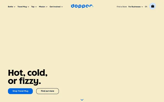
Preview image. Unlock full-res
Playful Marine Minimalism — like sunshine bouncing off clear blue water.
Color palette
Accent background on specific product cards; adds a cool, sophisticated touch.
Accent background on specific product cards; a lighter, softer blue that complements `Sky Blue`.
Accent background on specific product cards, drawing attention with its vivid warmth.
Primary call-to-action buttons, interactive elements, and illustrations; conveys trust and freshness.
Gradient for prominent elements, transitioning from bold blue to a slightly softer shade, suggesting depth and movement.
Major background areas, accent panels on cards, giving a warm and inviting base.
Headings, body text, and icons; provides maximum contrast and legibility against light backgrounds.
Secondary text and subtle interactive states, providing hierarchy without stark contrast.
Subtle background tint for informational sections.
Subtle alternative background for nested UI elements or very light sections, offering a slight visual break from Pale Sand.
Typography
- Weights
- 400, 600, 700
- Sizes
- 18px, 20px, 24px, 27px, 43px, 48px
- Line height
- 1.1, 1.2, 1.3
- Fallback
- system-ui (e.g., Arial, Helvetica)
Headlines, subheadings, and prominent body text. Gilroy's geometric structure provides a clean, modern feel, essential for conveying brand messaging clearly.
- Weights
- 400
- Sizes
- 58px, 72px
- Line height
- 1
- Fallback
- Poppins, Montserrat
Display headings for hero sections, lending a unique, custom brand voice at large sizes. Its distinct character prevents the larger text from feeling generic.
- Weights
- 400
- Sizes
- 16px
- Line height
- 1
- Fallback
- system-ui
Standard body text and navigation links, ensuring high readability and system-level performance.
Spacing & shape
Components
Filled button with `Sky Blue` (#0067e5) background, `True Black` (#000000) text. Border radius `20px`. The solid, saturated color ensures high visibility.
Transparent background, `True Black` (#000000) text color, `True Black` (#000000) border, and `20px` border radius. Provides an alternative, less prominent action.
Transparent background, `True Black` (#000000) text. No explicit border radius or padding, relying on surrounding spacing for definition. Uses system font `-apple-system` at `16px` weight `400`.
Background `Sky Blue` (#0067e5), `20px` border radius, no shadow. Content padding `0px` based on variants but visually appears to have internal padding. Text is typically `True Black` or `Off White` for contrast.
Background `Sea Mist` (#8ab1e6), `20px` border radius, no shadow. Offers a softer visual alongside more intense brand colors.
Transparent background, `0px` border radius, no shadow. Used for grouping content sections where the background color of the parent section defines its visual presence. Internal padding is `20px`.
Guidelines
- Prioritize `Pale Sand` (#f6ecc8) as the dominant page background to establish a consistent brand canvas.
- Apply `20px` border radius consistently to all interactive buttons, cards, and image containers for a friendly, approachable feel.
- Use `Ocean Deep` (#000f2e) for primary headings and prominent text to create a strong visual presence.
- Reserve `Sky Blue` (#0067e5) and its gradient for primary calls-to-action to highlight key interactions.
- Maintain a clear visual hierarchy by using `Gilroy` weights `700` and `600` for headlines and `400` for body text with `-apple-system` for accessibility details.
- Utilize a 4px grid for all spacing; common values include `8px` for element gaps and `20px` for internal component padding.
- Ensure contrast: `True Black` (#000000) text on `Pale Sand` (#f6ecc8) backgrounds is the default for readability.
- Avoid arbitrary border radii; stick strictly to `20px` for rounded elements and `0px` for sharp edges.
- Do not introduce new saturated colors outside the defined `accent` and `brand` palettes to maintain visual consistency.
- Never use `Ocean Deep` (#000f2e) as a background for primary buttons; it is reserved for text dominance.
- Avoid applying drop shadows; the design relies on bold color blocks and internal content for visual depth, not traditional elevation.
- Do not use system fonts for prominent headlines or branding elements; `Gilroy` and `Dopper` carry the brand's typographic identity.
- Refrain from using monochrome photography; imagery should be vibrant and full-color to match the playful aesthetic of the brand colors.
- Do not create complex layouts that deviate from clear, sectioned content blocks; simplicity and directness are key.
About this system
ShowHide
Dopper's design evokes a sense of playful environmentalism, blending a cheerful primary color palette with crisp typography. The abundant use of `Pale Sand` (#f6ecc8) as a primary background creates a warm, inviting canvas, contrasting sharply with the deep, saturated blues and vivid yellow. Rounded corners at `20px` are applied universally to interactive elements and cards, giving components a friendly, approachable character that softens the otherwise direct, functional aesthetic.
The layout primarily uses a full-bleed page model, with content sections extending edge-to-edge laterally. Content within sections is often centered or arranged in alternating two-column text-left/image-right compositions. The hero section features large, centered headlines over a `Pale Sand` background, setting a bright and open tone. Section rhythm is defined by large vertical spacing, with subsequent sections filling the width but using various background colors (like `Pale Sand`, `Sky Blue`, or custom colors for product cards) to create visual breaks rather than strict horizontal dividers. Card grids, particularly 5-column product feature cards, are a common pattern for showcasing multiple items, demonstrating both variety and consistency. Navigation is a persistent top bar with minimal styling.
The site uses a mix of high-quality product photography and vibrant, bold graphics. Product imagery features tight crops of bottles, often against clean white or brand-colored backgrounds, emphasizing utility and design. Illustrations are typically geometric and flat, using the brand's vibrant color palette to communicate concepts. Photography, when humans are present, is lifestyle-oriented but clean and aspirational, showcasing people actively using the products in positive, outdoor settings. The overall feel is image-heavy, using visuals to tell a story alongside compelling typography, and images are contained within card structures with `20px` rounded corners, maintaining a consistent brand aesthetic.
Reminiscent of Hydro Flask, Owala, Chilly's, Figma, Mailchimp.
# Dopper — Style Reference
> Playful Marine Minimalism — like sunshine bouncing off clear blue water.

**Theme:** light

**Site:** https://dopper.com

Dopper's design evokes a sense of playful environmentalism, blending a cheerful primary color palette with crisp typography. The abundant use of `Pale Sand` (#f6ecc8) as a primary background creates a warm, inviting canvas, contrasting sharply with the deep, saturated blues and vivid yellow. Rounded corners at `20px` are applied universally to interactive elements and cards, giving components a friendly, approachable character that softens the otherwise direct, functional aesthetic.

## Tokens — Colors

| Name | Value | Token | Role |
|------|------|------|------|
| Teal Splash | `#116973` | `--color-teal-splash` | Accent background on specific product cards; adds a cool, sophisticated touch. |
| Sea Mist | `#8ab1e6` | `--color-sea-mist` | Accent background on specific product cards; a lighter, softer blue that complements `Sky Blue`. |
| Sunbeam Yellow | `#fed200` | `--color-sunbeam-yellow` | Accent background on specific product cards, drawing attention with its vivid warmth. |
| Sky Blue | `#0067e5` | `--color-sky-blue` | Primary call-to-action buttons, interactive elements, and illustrations; conveys trust and freshness. |
| Clear Sky Gradient | `#0067e5` | `--color-clear-sky-gradient` | Gradient for prominent elements, transitioning from bold blue to a slightly softer shade, suggesting depth and movement. |
| Pale Sand | `#f6ecc8` | `--color-pale-sand` | Major background areas, accent panels on cards, giving a warm and inviting base. |
| True Black | `#000000` | `--color-true-black` | Headings, body text, and icons; provides maximum contrast and legibility against light backgrounds. |
| Slate Gray | `#515a8a` | `--color-slate-gray` | Secondary text and subtle interactive states, providing hierarchy without stark contrast. |
| Glacier Blue | `#cce2ff` | `--color-glacier-blue` | Subtle background tint for informational sections. |
| Off White | `#fcfaf2` | `--color-off-white` | Subtle alternative background for nested UI elements or very light sections, offering a slight visual break from Pale Sand. |

## Tokens — Typography

### Gilroy
- **Substitute:** system-ui (e.g., Arial, Helvetica)
- **Weights:** 400, 600, 700
- **Sizes:** 18px, 20px, 24px, 27px, 43px, 48px
- **Line height:** 1.1, 1.2, 1.3
- **Role:** Headlines, subheadings, and prominent body text. Gilroy's geometric structure provides a clean, modern feel, essential for conveying brand messaging clearly.

### Dopper
- **Substitute:** Poppins, Montserrat
- **Weights:** 400
- **Sizes:** 58px, 72px
- **Line height:** 1
- **Role:** Display headings for hero sections, lending a unique, custom brand voice at large sizes. Its distinct character prevents the larger text from feeling generic.

### -apple-system
- **Substitute:** system-ui
- **Weights:** 400
- **Sizes:** 16px
- **Line height:** 1
- **Role:** Standard body text and navigation links, ensuring high readability and system-level performance.

## Tokens — Type Scale

Minor Third (1.2) from 16px base.

| Role | Size | Line height | Letter spacing |
|------|------|------|------|
| body | 16px | 1 | — |
| body-lg | 18px | 1.3 | — |
| subheading | 20px | 1.2 | — |
| heading | 24px | 1.2 | — |
| heading-lg | 27px | 1.1 | — |
| display | 43px | 1.1 | — |
| display-lg | 48px | 1.1 | — |
| hero | 58px | 1 | — |
| hero-lg | 72px | 1 | — |

## Tokens — Spacing

- **Card padding:** 20px
- **Element gap:** 8px

## Tokens — Radius

- **Buttons:** 20px
- **Cards:** 20px
- **tags:** 9999px

## Layout

The layout primarily uses a full-bleed page model, with content sections extending edge-to-edge laterally. Content within sections is often centered or arranged in alternating two-column text-left/image-right compositions. The hero section features large, centered headlines over a `Pale Sand` background, setting a bright and open tone. Section rhythm is defined by large vertical spacing, with subsequent sections filling the width but using various background colors (like `Pale Sand`, `Sky Blue`, or custom colors for product cards) to create visual breaks rather than strict horizontal dividers. Card grids, particularly 5-column product feature cards, are a common pattern for showcasing multiple items, demonstrating both variety and consistency. Navigation is a persistent top bar with minimal styling.

## Imagery

The site uses a mix of high-quality product photography and vibrant, bold graphics. Product imagery features tight crops of bottles, often against clean white or brand-colored backgrounds, emphasizing utility and design. Illustrations are typically geometric and flat, using the brand's vibrant color palette to communicate concepts. Photography, when humans are present, is lifestyle-oriented but clean and aspirational, showcasing people actively using the products in positive, outdoor settings. The overall feel is image-heavy, using visuals to tell a story alongside compelling typography, and images are contained within card structures with `20px` rounded corners, maintaining a consistent brand aesthetic.

## Components

### CTA Button Group

### Solutions Feature Cards

### Hero Headline Block

### Primary Call-to-Action Button
*Interactive element*

Filled button with `Sky Blue` (#0067e5) background, `True Black` (#000000) text. Border radius `20px`. The solid, saturated color ensures high visibility.

### Outline Secondary Button
*Interactive element*

Transparent background, `True Black` (#000000) text color, `True Black` (#000000) border, and `20px` border radius. Provides an alternative, less prominent action.

### Navigation Link
*Interactive element*

Transparent background, `True Black` (#000000) text. No explicit border radius or padding, relying on surrounding spacing for definition. Uses system font `-apple-system` at `16px` weight `400`.

### Product Feature Card - Sky Blue
*Informational display*

Background `Sky Blue` (#0067e5), `20px` border radius, no shadow. Content padding `0px` based on variants but visually appears to have internal padding. Text is typically `True Black` or `Off White` for contrast.

### Product Feature Card - Sea Mist
*Informational display*

Background `Sea Mist` (#8ab1e6), `20px` border radius, no shadow. Offers a softer visual alongside more intense brand colors.

### Plain Content Card
*Informational display/Container*

Transparent background, `0px` border radius, no shadow. Used for grouping content sections where the background color of the parent section defines its visual presence. Internal padding is `20px`.

## Guidelines

### Do

- Prioritize `Pale Sand` (#f6ecc8) as the dominant page background to establish a consistent brand canvas.
- Apply `20px` border radius consistently to all interactive buttons, cards, and image containers for a friendly, approachable feel.
- Use `Ocean Deep` (#000f2e) for primary headings and prominent text to create a strong visual presence.
- Reserve `Sky Blue` (#0067e5) and its gradient for primary calls-to-action to highlight key interactions.
- Maintain a clear visual hierarchy by using `Gilroy` weights `700` and `600` for headlines and `400` for body text with `-apple-system` for accessibility details.
- Utilize a 4px grid for all spacing; common values include `8px` for element gaps and `20px` for internal component padding.
- Ensure contrast: `True Black` (#000000) text on `Pale Sand` (#f6ecc8) backgrounds is the default for readability.

### Don't

- Avoid arbitrary border radii; stick strictly to `20px` for rounded elements and `0px` for sharp edges.
- Do not introduce new saturated colors outside the defined `accent` and `brand` palettes to maintain visual consistency.
- Never use `Ocean Deep` (#000f2e) as a background for primary buttons; it is reserved for text dominance.
- Avoid applying drop shadows; the design relies on bold color blocks and internal content for visual depth, not traditional elevation.
- Do not use system fonts for prominent headlines or branding elements; `Gilroy` and `Dopper` carry the brand's typographic identity.
- Refrain from using monochrome photography; imagery should be vibrant and full-color to match the playful aesthetic of the brand colors.
- Do not create complex layouts that deviate from clear, sectioned content blocks; simplicity and directness are key.

## Agent Prompt Guide

### Quick Color Reference
- Text (Primary): #000f2 (Ocean Deep)
- Text (Body): #000000 (True Black)
- Background (Primary): #f6ecc8 (Pale Sand)
- CTA (Primary): #0067e5 (Sky Blue)
- Border (Outline Button): #000000 (True Black)

### 3-5 Example Component Prompts
1. **Create a hero section:** Background `Pale Sand` (#f6ecc8). Centered headline: 'Hot, cold, or fizzy.' using 'Dopper' font `72px` `400` weight, `True Black` (#000000). Subtext 'Whatever your mood, our Travel Mug matches it.' using 'Gilroy' font `18px` `400` weight, `True Black` (#000000). Below the text, add a primary `Sky Blue` (#0067e5) button 'Shop Travel Mug' with `20px` radius, `True Black` (#000000) text. Next create an outline 'Find out more' button, same text style, `True Black` (#000000) border and text, `20px` radius. Both buttons should have `8px` horizontal gap.
2. **Generate a product feature card:** Background `Sky Blue` (#0067e5), `20px` border radius. Content area for product image and text. For call to action, use a simple `True Black` (#000000) text link 'Learn more' at `16px` `-apple-system` font.
3. **Design a secondary content block:** Background `Pale Sand` (#f6ecc8). Heading 'Drink up all life has to offer.' using 'Gilroy' font `43px` `700` weight, `Ocean Deep` (#000f2e). Body text using 'Gilroy' `18px` `400` weight, `True Black` (#000000).
More like this





Keep what you find
A free account saves references to boards and can send you a weekly email of picks based on what you save.
To see every result, go Pro.