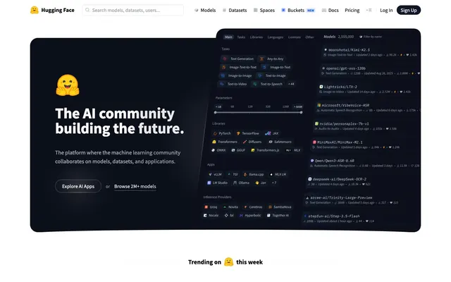
Preview image. Unlock full-res
High-contrast data console. A brightly lit control panel with precise readouts and subtle depth.
Color palette
Interactive text links and key actionable elements, providing a clear visual indicator of engagement.
Badge backgrounds and small accent elements, adding vibrancy in a contained manner.
Badge backgrounds and small accent elements, providing distinct categorization.
Badge backgrounds and small accent elements, adding a warm, bright category indicator.
Badge backgrounds and small accent elements, offering a third vibrant categorization.
Background for specific feature blocks or card elements within darker sections, creating a sense of depth and slight distinction.
Highlight elements or banners that require a vibrant, energetic visual cue.
Page backgrounds, primary surface for content areas like input fields.
Subtle borders, dividers, ghost button backgrounds, and secondary surface accents. It defines boundaries gently without harsh lines.
Slightly darker secondary backgrounds, separating content blocks or showcasing inactive states, providing a touch more visual separation than Canvas White.
Primary text, critical headings, and button text, ensuring maximum contrast and readability against light backgrounds.
Darker backgrounds for immersive sections, navigation elements, and primary buttons in dark mode areas, establishing a base for high-contrast white text.
Secondary text for descriptions, subtle borders, and inactive or less emphasized UI elements. This color provides visual relief from pure black.
Semantic highlight for negative states or alerts, used sparingly to draw attention.
Semantic highlight for informational states or subtle branding touches, offering an alternative to Azure Link.
Semantic highlight for positive states or success indicators.
Typography
- Weights
- 400, 600, 700
- Sizes
- 10px, 12px, 13px, 14px, 15px, 16px, 18px, 20px, 24px, 30px, 48px, 60px, 96px
- Line height
- 1, 1.2, 1.25, 1.33, 1.37, 1.4, 1.43, 1.5, 1.56
- Letter spacing
- normal
- Fallback
- Open Sans, Lato
The primary typeface for all text content including body, headings, links, and buttons. Its clean, sans-serif structure provides legibility across all sizes, anchoring the UI's practical, information-dense aesthetic.
- Weights
- 400
- Sizes
- 15px
- Line height
- 1.6
- Letter spacing
- normal
- Fallback
- Space Mono, Fira Code
Used for code snippets and technical labels, typically within heading elements as seen, adding a distinct developer-centric feel without overwhelming the interface. Its monospaced nature clearly designates technical information.
Spacing & shape
Components
Solid Carbon (#101828) background with Canvas White (#FFFFFF) text. Rounded corners at 8px. Padding 8px vertical, 16px horizontal. Signifies primary actions, often within darker UI sections.
Transparent background with a subtle Fog Gray (#E5E7EB) border and Jet Black (#000000) text. No border radius (0px). Padding 2px vertical, 8px horizontal. Used for less prominent actions, appearing as an understated link with a boundary.
Fog Gray (#e5e7eb) background with Jet Black (#000000) text. Significantly rounded corners at 25.6px. Large padding 24px vertical, 24px horizontal. Used for prominent calls to action in hero sections or key promotional areas, providing a distinct, friendly feel.
Canvas White (#ffffff) background with Jet Black (#000000) text and Fog Gray (#e5e7eb) border. Rounded corners at 8px. Padding 8px vertical, 12px (left) to 32px (left, with icon) horizontal. Indicates interactive input areas for user data.
Transparent background with 8px border radius. Uses a subtle shadow: `rgba(0, 0, 0, 0.05) 0px 1px 2px 0px`. No explicit padding, content determines internal spacing. Used for displaying individual items in lists or grids, providing gentle visual separation without heavy borders.
Transparent background, no border radius, no shadow. This variant is designed for seamless integration into larger content areas where visual separation is handled by background shifts or strong typography, maintaining a flat aesthetic. Often used for header-like content within lists.
Text in Azure Link (#155dfc), indicating the currently selected or active navigation item. No specific background or padding, relies on text color for emphasis. Usually within the main navigation bar.
Varied vibrant backgrounds (Sunset Orange, Grape Violet, Goldenrod, Fuchsia Pink) with white text. Rounded corners (8px). Padding is minimal, e.g., 4px vertical, 14px horizontal. Used for concise, color-coded labeling within content cards or lists.
Guidelines
- Prioritize Source Sans Pro for all text, using Jet Black (#000000) on light backgrounds for maximum legibility.
- Use 8px border-radius as the default for interactive elements like buttons, input fields, and cards.
- Implement subtle shadows `rgba(0, 0, 0, 0.05) 0px 1px 2px 0px` for cards and interactive components to indicate elevation without heavy visual weight.
- Employ Fog Gray (#e5e7eb) for subtle borders and dividers, ensuring visual separation without creating harsh lines.
- Utilize Azure Link (#155dfc) exclusively for interactive text links and primary accents, maintaining its impact through limited use.
- Maintain an element gap of 8px to 16px between elements to ensure a compact yet readable layout.
- Align content to a maximum width of 1280px, with responsive padding, except for full-bleed hero sections.
- Use IBM Plex Mono for all programmatic or technical headings to explicitly differentiate them.
- Avoid using highly saturated, non-brand colors for large background areas or primary UI elements; reserve them for small accents and badges only.
- Do not introduce strong, dark shadows; stick to the light, single-axis shadow that provides subtle depth.
- Avoid excessive variation in border radii; adhere to the 8px default for most elements and 25.6px for specific large CTAs.
- Do not use gradients as primary backgrounds for content sections; use them only for small, contained feature blocks or decorative elements.
- Never use pure black backgrounds with pure white text on every element, use Carbon (#101828) for dark sections to soften the visual contrast slightly.
- Do not use generic system fonts; always specify Source Sans Pro or IBM Plex Mono.
- Avoid random padding values; stick to multiples of 4px and 8px for vertical and horizontal spacing.
About this system
ShowHide
Hugging Face presents a UI that feels like a meticulously organized, high-performance data console under bright, even lighting. The visual identity hinges on a subtle interplay of dark grays and bright whites, using minimal accent colors to highlight interactive elements and status. The crisp typography and sharp corners create an atmosphere of precision and utility, while soft shadows add subtle layers of hierarchy without heavy visual weight, making complex data structures feel approachable.
Reminiscent of GitHub, Vercel, OpenAI, Linear.
# Hugging Face — Style Reference
> High-contrast data console. A brightly lit control panel with precise readouts and subtle depth.

**Theme:** light

**Site:** https://huggingface.co

Hugging Face presents a UI that feels like a meticulously organized, high-performance data console under bright, even lighting. The visual identity hinges on a subtle interplay of dark grays and bright whites, using minimal accent colors to highlight interactive elements and status. The crisp typography and sharp corners create an atmosphere of precision and utility, while soft shadows add subtle layers of hierarchy without heavy visual weight, making complex data structures feel approachable.

## Tokens — Colors

| Name | Value | Token | Role |
|------|------|------|------|
| Azure Link | `#155dfc` | `--color-azure-link` | Interactive text links and key actionable elements, providing a clear visual indicator of engagement. |
| Sunset Orange | `#ff6900` | `--color-sunset-orange` | Badge backgrounds and small accent elements, adding vibrancy in a contained manner. |
| Grape Violet | `#8e51ff` | `--color-grape-violet` | Badge backgrounds and small accent elements, providing distinct categorization. |
| Goldenrod | `#fe9a00` | `--color-goldenrod` | Badge backgrounds and small accent elements, adding a warm, bright category indicator. |
| Fuchsia Pink | `#f6339a` | `--color-fuchsia-pink` | Badge backgrounds and small accent elements, offering a third vibrant categorization. |
| Nebula Blue Gradient | `#30404a` | `--color-nebula-blue-gradient` | Background for specific feature blocks or card elements within darker sections, creating a sense of depth and slight distinction. |
| Warm Sunset Gradient | `#e79321` | `--color-warm-sunset-gradient` | Highlight elements or banners that require a vibrant, energetic visual cue. |
| Canvas White | `#ffffff` | `--color-canvas-white` | Page backgrounds, primary surface for content areas like input fields. |
| Fog Gray | `#e5e7eb` | `--color-fog-gray` | Subtle borders, dividers, ghost button backgrounds, and secondary surface accents. It defines boundaries gently without harsh lines. |
| Ash Gray | `#f3f4f6` | `--color-ash-gray` | Slightly darker secondary backgrounds, separating content blocks or showcasing inactive states, providing a touch more visual separation than Canvas White. |
| Jet Black | `#000000` | `--color-jet-black` | Primary text, critical headings, and button text, ensuring maximum contrast and readability against light backgrounds. |
| Carbon | `#101828` | `--color-carbon` | Darker backgrounds for immersive sections, navigation elements, and primary buttons in dark mode areas, establishing a base for high-contrast white text. |
| Slate Blue | `#4a5565` | `--color-slate-blue` | Secondary text for descriptions, subtle borders, and inactive or less emphasized UI elements. This color provides visual relief from pure black. |
| Crimson Accent | `#ff3939` | `--color-crimson-accent` | Semantic highlight for negative states or alerts, used sparingly to draw attention. |
| Electric Blue | `#2b7fff` | `--color-electric-blue` | Semantic highlight for informational states or subtle branding touches, offering an alternative to Azure Link. |
| Lime Green | `#7ccf00` | `--color-lime-green` | Semantic highlight for positive states or success indicators. |

## Tokens — Typography

### Source Sans Pro
- **Substitute:** Open Sans, Lato
- **Weights:** 400, 600, 700
- **Sizes:** 10px, 12px, 13px, 14px, 15px, 16px, 18px, 20px, 24px, 30px, 48px, 60px, 96px
- **Line height:** 1, 1.2, 1.25, 1.33, 1.37, 1.4, 1.43, 1.5, 1.56
- **Letter spacing:** normal
- **Role:** The primary typeface for all text content including body, headings, links, and buttons. Its clean, sans-serif structure provides legibility across all sizes, anchoring the UI's practical, information-dense aesthetic.

### IBM Plex Mono
- **Substitute:** Space Mono, Fira Code
- **Weights:** 400
- **Sizes:** 15px
- **Line height:** 1.6
- **Letter spacing:** normal
- **Role:** Used for code snippets and technical labels, typically within heading elements as seen, adding a distinct developer-centric feel without overwhelming the interface. Its monospaced nature clearly designates technical information.

## Tokens — Type Scale

| Role | Size | Line height | Letter spacing |
|------|------|------|------|
| caption | 10px | 1.5 | — |
| body | 14px | 1.43 | — |
| heading-sm | 18px | 1.5 | — |
| heading | 24px | 1.33 | — |
| heading-lg | 30px | 1.25 | — |
| display | 48px | 1.2 | — |

## Tokens — Spacing

- **Max width:** 1280px
- **Section gap:** 64px
- **Card padding:** 16px
- **Element gap:** 8px

## Tokens — Radius

- **Default:** 8px
- **Buttons:** 8px, 25.6px
- **Inputs:** 8px
- **Cards:** 8px

## Components

### Trending Models & Spaces Cards

### Spaces Cards — Colorful Gradient Cards

### Search Bar + Filter Tab Bar

### Primary Button - Dark
*Call to action*

Solid Carbon (#101828) background with Canvas White (#FFFFFF) text. Rounded corners at 8px. Padding 8px vertical, 16px horizontal. Signifies primary actions, often within darker UI sections.

### Secondary Button - Ghost
*Secondary action*

Transparent background with a subtle Fog Gray (#E5E7EB) border and Jet Black (#000000) text. No border radius (0px). Padding 2px vertical, 8px horizontal. Used for less prominent actions, appearing as an understated link with a boundary.

### Large Rounded Button
*Hero CTA*

Fog Gray (#e5e7eb) background with Jet Black (#000000) text. Significantly rounded corners at 25.6px. Large padding 24px vertical, 24px horizontal. Used for prominent calls to action in hero sections or key promotional areas, providing a distinct, friendly feel.

### Input Field
*Data entry*

Canvas White (#ffffff) background with Jet Black (#000000) text and Fog Gray (#e5e7eb) border. Rounded corners at 8px. Padding 8px vertical, 12px (left) to 32px (left, with icon) horizontal. Indicates interactive input areas for user data.

### Content Card - Subtle Shadow
*Grouped content, data list item*

Transparent background with 8px border radius. Uses a subtle shadow: `rgba(0, 0, 0, 0.05) 0px 1px 2px 0px`. No explicit padding, content determines internal spacing. Used for displaying individual items in lists or grids, providing gentle visual separation without heavy borders.

### Content Card - No Shadow/Border
*Pure content block*

Transparent background, no border radius, no shadow. This variant is designed for seamless integration into larger content areas where visual separation is handled by background shifts or strong typography, maintaining a flat aesthetic. Often used for header-like content within lists.

### Navigation Link - Active
*Current page indicator*

Text in Azure Link (#155dfc), indicating the currently selected or active navigation item. No specific background or padding, relies on text color for emphasis. Usually within the main navigation bar.

### Pill Badge - Category
*Categorization, meta-data*

Varied vibrant backgrounds (Sunset Orange, Grape Violet, Goldenrod, Fuchsia Pink) with white text. Rounded corners (8px). Padding is minimal, e.g., 4px vertical, 14px horizontal. Used for concise, color-coded labeling within content cards or lists.

## Guidelines

### Do

- Prioritize Source Sans Pro for all text, using Jet Black (#000000) on light backgrounds for maximum legibility.
- Use 8px border-radius as the default for interactive elements like buttons, input fields, and cards.
- Implement subtle shadows `rgba(0, 0, 0, 0.05) 0px 1px 2px 0px` for cards and interactive components to indicate elevation without heavy visual weight.
- Employ Fog Gray (#e5e7eb) for subtle borders and dividers, ensuring visual separation without creating harsh lines.
- Utilize Azure Link (#155dfc) exclusively for interactive text links and primary accents, maintaining its impact through limited use.
- Maintain an element gap of 8px to 16px between elements to ensure a compact yet readable layout.
- Align content to a maximum width of 1280px, with responsive padding, except for full-bleed hero sections.
- Use IBM Plex Mono for all programmatic or technical headings to explicitly differentiate them.

### Don't

- Avoid using highly saturated, non-brand colors for large background areas or primary UI elements; reserve them for small accents and badges only.
- Do not introduce strong, dark shadows; stick to the light, single-axis shadow that provides subtle depth.
- Avoid excessive variation in border radii; adhere to the 8px default for most elements and 25.6px for specific large CTAs.
- Do not use gradients as primary backgrounds for content sections; use them only for small, contained feature blocks or decorative elements.
- Never use pure black backgrounds with pure white text on every element, use Carbon (#101828) for dark sections to soften the visual contrast slightly.
- Do not use generic system fonts; always specify Source Sans Pro or IBM Plex Mono.
- Avoid random padding values; stick to multiples of 4px and 8px for vertical and horizontal spacing.

## Agent Prompt Guide

### Quick Color Reference
- Text: #000000 (Jet Black)
- Background: #ffffff (Canvas White)
- CTA (Primary): #101828 (Carbon)
- Border: #e5e7eb (Fog Gray)
- Accent: #155dfc (Azure Link)

### 3 Example Component Prompts
1. Create a Hero section: full-bleed background linear-gradient(oklch(0.278 0.033 256.848) 0%, oklch(0.21 0.034 264.665) 100%). Centered headline: 'The AI community building the future.' (Source Sans Pro, 96px, 700 weight, #ffffff). Subtext: 'The platform where the machine learning community collaborates...' (Source Sans Pro, 18px, 400 weight, #f3f4f6, lineHeight 1.5). Two buttons: 'Explore AI Apps' (backgroundColor #101828, color #ffffff, borderRadius 8px, padding 8px 16px) and 'Sign Up' (backgroundColor #e5e7eb, color #000000, borderRadius 25.6px, padding 24px 24px).
2. Create a default Input Field: background #ffffff, border 1px solid #e5e7eb, color #000000, borderRadius 8px, paddingTop 8px, paddingRight 12px, paddingBottom 8px, paddingLeft 32px. Placeholder text: 'Search models, datasets, users...' (Source Sans Pro, 16px, 400 weight, #4a5565).
3. Create a Content Card: transparent background, borderRadius 8px, boxShadow rgba(0, 0, 0, 0.05) 0px 1px 2px 0px. Inside, include a heading 'zai-org/GLM-5.1' (Source Sans Pro, 16px, 600 weight, #000000) and a subtext 'Updated about 5 hours ago • 24k • 965' (Source Sans Pro, 14px, 400 weight, #4a5565).
More like this






Keep what you find
A free account saves references to boards and can send you a weekly email of picks based on what you save.
To see every result, go Pro.