Preview image. Unlock full-res
Spiced Amber Glow
Color palette
Primary brand accent for interactive elements like CTA buttons, links, and highlighted text. Also used for badge text and card backgrounds, ensuring high contrast against dark surfaces
Decorative color for some heading borders and text, offering a slightly more nuanced warm tone than the primary orange
Accent color used for specific badge backgrounds, creating a vibrant, spicy contrast
Decorative background accent, used as a subtle radial spotlight effect
Page background, primary dark surface for content sections. Forms the base of the color scheme
Secondary surface color for cards and accents, creating subtle depth against the canvas. Also for neutral button borders and muted text
Background for feature badges, and input element borders, providing a warmer tone than Burnt Sienna
Typography
- Weights
- 400, 500, 700
- Sizes
- 11px, 12px, 13px, 14px, 18px, 29px, 42px, 43px, 65px, 68px, 72px, 101px, 130px, 144px, 195px, 213px
- Line height
- 0.7, 0.8, 0.88, 0.9, 0.93, 0.95, 1, 1.1, 1.2, 1.3, 1.4, 1.43
- Letter spacing
- -0.0200em to 0.0200em, varying significantly with size (e.g. -0.02em at 144px, 0.02em at 11px)
- Fallback
- Bebas Neue (display), Montserrat (body)
Primary display and text font. Its wide range of weights and sizes, combined with condensed tracking, delivers impact for headlines and legibility for body text. The distinctiveness comes from its ability to be both bold and compact.
- Weights
- 500
- Sizes
- 13px
- Line height
- 1, 1.2, 1.3
- Letter spacing
- -0.0200em to 0.0100em
- Fallback
- Inter
Secondary sans-serif font used for some button labels and small body text, providing a clean, functional contrast to the primary display font. Its slightly wider tracking offers better readability for smaller elements.
Spacing & shape
Components
Filled button with Curry Yellow background (#faae33), text in Burnt Sienna (#402011), and a highly rounded border-radius of 1296px. Padding varies: 0px vertical, 17px horizontal for compact sizes (e.g., header nav), or 20px top, 16px bottom, 32px horizontal for larger feature CTAs.
Outlined button with Mahogany Canvas background (#281006), Curry Yellow text (#faae33), and a highly rounded border-radius of 1296px. Padding is larger: 16px top, 12px bottom, 42px horizontal, creating high contrast against dark backgrounds.
Text-only button with no explicit background, Curry Yellow text (#faae33), and a 100% border-radius for click area. Minimal padding of 9px vertical, 15px horizontal.
Card with Burnt Sienna background (#402011) and a soft border-radius of 6px. No explicit padding mentioned directly on the card for content, but implies content fills edge to edge.
Card with Curry Yellow background (#faae33) and a soft border-radius of 6px. Features internal padding of 14px top/sides, 32px bottom, often used for recipe highlights or marketing blocks.
Input field with transparent background, Burnt Sienna text (#402011), and a highly rounded border-radius of 1224px. Placeholder text matches the same style. Padding is 16px top, 12px bottom, 16px right, 20px left, suggesting a subtle left indent for text.
Badge with Spiced Orange background (#823513), Curry Yellow text (#faae33), and a highly rounded border-radius of 1080px. Padding is 12px top, 8px bottom, 12px horizontal, giving it a plump, clear appearance.
Badge with Chili Red background (#d1255c), Curry Yellow text (#faae33), and a highly rounded border-radius of 1224px. Padding is 8px top/sides, 4px bottom, offering a compact, punchy label.
Guidelines
- Prioritize Curry Yellow (#faae33) for all primary interactive elements, including button backgrounds, link text, and hero headlines, contrasting against dark backgrounds.
- Use Salmond font (custom) at large sizes with negative letter-spacing for headlines to create a bold, condensed, and impactful visual statement.
- Employ consistent, highly rounded border-radii for interactive components: 1296px for buttons, 1080px for badges, and 1224px for inputs, for a soft, tactile feel.
- Establish clear visual hierarchy by using Mahogany Canvas (#281006) as the base background, with Burnt Sienna (#402011) and Spiced Orange (#823513) for progressively lighter surface layers.
- Integrate background patterns and subtle radial gradients to add depth and warmth to surfaces, preventing flat, sterile dark mode aesthetics.
- Maintain comfortable element spacing, using 10px as a default `elementGap`, to keep components distinct but visually connected.
- Ensure all text (except primary buttons) uses Curry Yellow (#faae33) for maximum readability against the dark spectrum of backgrounds.
- Avoid using pure black or white; all neutrals are warm-tinted browns and deep oranges, contributing to the rich palette.
- Do not use generic sans-serif fonts for headlines; the custom Salmond font's condensed and bold presence is critical to the brand voice.
- Refrain from sharp corners on interactive or prominent UI elements; the design emphasizes pill-shaped and softly rounded forms.
- Avoid sterile, flat backgrounds; always consider a subtle texture, pattern, or radial glow to enhance the spicy and inviting atmosphere.
- Do not introduce cool-toned colors (blues, greens, purples) beyond very specific brand-approved accents; the palette is overwhelmingly warm.
- Do not allow generous line-heights on display typography; the condensed nature of Salmond is critical to its bold presence using specified tight line-heights (e.g., 0.7-0.9).
- Never use less than 1296px border-radius for primary buttons, as this roundedness is a core identity element.
About this system
ShowHide
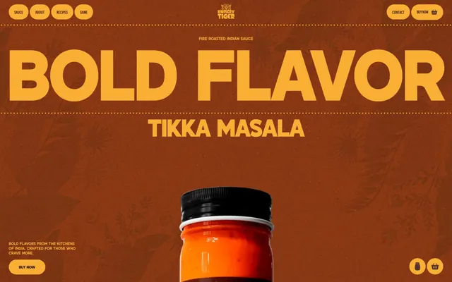
Hungry Tiger's design system evokes the rich, warm experience of Indian spices through a dark-mode palette dominated by deep oranges and ochre yellows. Typography is bold and highly condensed, with generous tracking on large headlines, creating a strong, impactful voice. Components are rounded and tactile, integrating seamlessly with textured backgrounds.
The page layout is primarily full-bleed, with content often centered but spanning the full width of the viewport to create an immersive experience. The hero utilizes a full-bleed dark background with large, centered headline typography. Sections alternate between deep Mahogany Canvas and Burnt Sienna, creating a seamless visual flow rather than distinct bands. Content frequently employs a text-left/text-right or text-over-image pattern within the full-width flow, anchored by strong typography, rather than a strict grid of cards or columns. Navigation is a fixed top bar on larger screens with highly rounded ghost buttons, supplemented by a minimal shopping cart icon. The overall density is comfortable, with generous vertical spacing between content blocks.
This site features product photography with tight crops on bottles against a dark, textured background, emphasizing the product itself. Illustrations are subtle, embossed-like organic patterns integrated into the background surfaces, providing a decorative, atmospheric layer rather than explanatory content. Icons are minimal, filled, and utilize the brand's Curry Yellow, maintaining consistency. The density is image-heavy in the hero sections, transitioning to text-dominant blocks with atmospheric background graphics. Product visuals are the hero, presented directly and evocatively.
# Hungry Tiger — Style Reference
> Spiced Amber Glow

**Theme:** dark

**Site:** https://www.eathungrytiger.com

Hungry Tiger's design system evokes the rich, warm experience of Indian spices through a dark-mode palette dominated by deep oranges and ochre yellows. Typography is bold and highly condensed, with generous tracking on large headlines, creating a strong, impactful voice. Components are rounded and tactile, integrating seamlessly with textured backgrounds.

## Tokens — Colors

| Name | Value | Token | Role |
|------|------|------|------|
| Curry Yellow | `#faae33` | `--color-curry-yellow` | Primary brand accent for interactive elements like CTA buttons, links, and highlighted text. Also used for badge text and card backgrounds, ensuring high contrast against dark surfaces |
| Cinnamon Brown | `#9f531b` | `--color-cinnamon-brown` | Decorative color for some heading borders and text, offering a slightly more nuanced warm tone than the primary orange |
| Chili Red | `#d1255c` | `--color-chili-red` | Accent color used for specific badge backgrounds, creating a vibrant, spicy contrast |
| Subtle Radial Glow | `#f7ac32` | `--color-subtle-radial-glow` | Decorative background accent, used as a subtle radial spotlight effect |
| Mahogany Canvas | `#281006` | `--color-mahogany-canvas` | Page background, primary dark surface for content sections. Forms the base of the color scheme |
| Burnt Sienna | `#402011` | `--color-burnt-sienna` | Secondary surface color for cards and accents, creating subtle depth against the canvas. Also for neutral button borders and muted text |
| Spiced Orange | `#823513` | `--color-spiced-orange` | Background for feature badges, and input element borders, providing a warmer tone than Burnt Sienna |

## Tokens — Typography

### Salmond
- **Substitute:** Bebas Neue (display), Montserrat (body)
- **Weights:** 400, 500, 700
- **Sizes:** 11px, 12px, 13px, 14px, 18px, 29px, 42px, 43px, 65px, 68px, 72px, 101px, 130px, 144px, 195px, 213px
- **Line height:** 0.7, 0.8, 0.88, 0.9, 0.93, 0.95, 1, 1.1, 1.2, 1.3, 1.4, 1.43
- **Letter spacing:** -0.0200em to 0.0200em, varying significantly with size (e.g. -0.02em at 144px, 0.02em at 11px)
- **Role:** Primary display and text font. Its wide range of weights and sizes, combined with condensed tracking, delivers impact for headlines and legibility for body text. The distinctiveness comes from its ability to be both bold and compact.

### Graphikx
- **Substitute:** Inter
- **Weights:** 500
- **Sizes:** 13px
- **Line height:** 1, 1.2, 1.3
- **Letter spacing:** -0.0200em to 0.0100em
- **Role:** Secondary sans-serif font used for some button labels and small body text, providing a clean, functional contrast to the primary display font. Its slightly wider tracking offers better readability for smaller elements.

## Tokens — Type Scale

Augmented Fourth (1.414) from 18px base.

| Role | Size | Line height | Letter spacing |
|------|------|------|------|
| caption | 11px | 1 | — |
| body-sm | 13px | 1 | — |
| body | 18px | 1 | — |
| body-lg | 42px | 1 | — |
| heading-sm | 65px | 1 | — |
| heading | 68px | 1 | — |
| heading-lg | 101px | 1 | — |
| display-sm | 144px | 1 | — |
| display | 213px | 1 | — |

## Tokens — Spacing

- **Section gap:** 173px
- **Card padding:** 12px
- **Element gap:** 10px

## Tokens — Radius

- **Buttons:** 1296px
- **Inputs:** 1224px
- **Cards:** 6px
- **badges:** 1080px
- **secondaryButtons:** 1152px

## Layout

The page layout is primarily full-bleed, with content often centered but spanning the full width of the viewport to create an immersive experience. The hero utilizes a full-bleed dark background with large, centered headline typography. Sections alternate between deep Mahogany Canvas and Burnt Sienna, creating a seamless visual flow rather than distinct bands. Content frequently employs a text-left/text-right or text-over-image pattern within the full-width flow, anchored by strong typography, rather than a strict grid of cards or columns. Navigation is a fixed top bar on larger screens with highly rounded ghost buttons, supplemented by a minimal shopping cart icon. The overall density is comfortable, with generous vertical spacing between content blocks.

## Imagery

This site features product photography with tight crops on bottles against a dark, textured background, emphasizing the product itself. Illustrations are subtle, embossed-like organic patterns integrated into the background surfaces, providing a decorative, atmospheric layer rather than explanatory content. Icons are minimal, filled, and utilize the brand's Curry Yellow, maintaining consistency. The density is image-heavy in the hero sections, transitioning to text-dominant blocks with atmospheric background graphics. Product visuals are the hero, presented directly and evocatively.

## Components

### Primary Call to Action Button
*Main interactive element*

Filled button with Curry Yellow background (#faae33), text in Burnt Sienna (#402011), and a highly rounded border-radius of 1296px. Padding varies: 0px vertical, 17px horizontal for compact sizes (e.g., header nav), or 20px top, 16px bottom, 32px horizontal for larger feature CTAs.

### Ghost Inverse Action Button
*Secondary interactive element*

Outlined button with Mahogany Canvas background (#281006), Curry Yellow text (#faae33), and a highly rounded border-radius of 1296px. Padding is larger: 16px top, 12px bottom, 42px horizontal, creating high contrast against dark backgrounds.

### Navigation Button
*Top navigation links*

Text-only button with no explicit background, Curry Yellow text (#faae33), and a 100% border-radius for click area. Minimal padding of 9px vertical, 15px horizontal.

### Dark Content Card
*Container for content sections*

Card with Burnt Sienna background (#402011) and a soft border-radius of 6px. No explicit padding mentioned directly on the card for content, but implies content fills edge to edge.

### Light Highlight Card
*Highlighted content container*

Card with Curry Yellow background (#faae33) and a soft border-radius of 6px. Features internal padding of 14px top/sides, 32px bottom, often used for recipe highlights or marketing blocks.

### Pill Input Field
*Data entry fields*

Input field with transparent background, Burnt Sienna text (#402011), and a highly rounded border-radius of 1224px. Placeholder text matches the same style. Padding is 16px top, 12px bottom, 16px right, 20px left, suggesting a subtle left indent for text.

### Information Badge
*Categorization or status indicator*

Badge with Spiced Orange background (#823513), Curry Yellow text (#faae33), and a highly rounded border-radius of 1080px. Padding is 12px top, 8px bottom, 12px horizontal, giving it a plump, clear appearance.

### Vibrant Accent Badge
*Emphasized categorization*

Badge with Chili Red background (#d1255c), Curry Yellow text (#faae33), and a highly rounded border-radius of 1224px. Padding is 8px top/sides, 4px bottom, offering a compact, punchy label.

## Guidelines

### Do

- Prioritize Curry Yellow (#faae33) for all primary interactive elements, including button backgrounds, link text, and hero headlines, contrasting against dark backgrounds.
- Use Salmond font (custom) at large sizes with negative letter-spacing for headlines to create a bold, condensed, and impactful visual statement.
- Employ consistent, highly rounded border-radii for interactive components: 1296px for buttons, 1080px for badges, and 1224px for inputs, for a soft, tactile feel.
- Establish clear visual hierarchy by using Mahogany Canvas (#281006) as the base background, with Burnt Sienna (#402011) and Spiced Orange (#823513) for progressively lighter surface layers.
- Integrate background patterns and subtle radial gradients to add depth and warmth to surfaces, preventing flat, sterile dark mode aesthetics.
- Maintain comfortable element spacing, using 10px as a default `elementGap`, to keep components distinct but visually connected.
- Ensure all text (except primary buttons) uses Curry Yellow (#faae33) for maximum readability against the dark spectrum of backgrounds.

### Don't

- Avoid using pure black or white; all neutrals are warm-tinted browns and deep oranges, contributing to the rich palette.
- Do not use generic sans-serif fonts for headlines; the custom Salmond font's condensed and bold presence is critical to the brand voice.
- Refrain from sharp corners on interactive or prominent UI elements; the design emphasizes pill-shaped and softly rounded forms.
- Avoid sterile, flat backgrounds; always consider a subtle texture, pattern, or radial glow to enhance the spicy and inviting atmosphere.
- Do not introduce cool-toned colors (blues, greens, purples) beyond very specific brand-approved accents; the palette is overwhelmingly warm.
- Do not allow generous line-heights on display typography; the condensed nature of Salmond is critical to its bold presence using specified tight line-heights (e.g., 0.7-0.9).
- Never use less than 1296px border-radius for primary buttons, as this roundedness is a core identity element.

## Agent Prompt Guide

primary action: #faae33 (filled action)
Create a Primary Action Button: #faae33 background, high-contrast text, 9999px radius, compact pill padding. Use this filled treatment for the main CTA.
More like this






Keep what you find
A free account saves references to boards and can send you a weekly email of picks based on what you save.
To see every result, go Pro.