Preview image. Unlock full-res
Retro Pixelated Arcade
Color palette
Orange wash for highlight backgrounds, decorative bands, and soft emphasis behind content.
Primary call-to-action buttons, active elements — a direct and clear indicator of interactable elements
Decorative gradient element — provides a deep, moody blue within a larger gradient
Decorative gradient element — a warm, vibrant orange complementing the deep blue in a gradient
Primary screen background, dominant text color, strong borders — controls the overall dark theme contrast
Card backgrounds, secondary surface fills, inner button shadows — creates the aged paper-like texture against the dark background
Primary UI borders, ghost button borders, dividers — a subtle, slightly cool neutral that defines component edges
Background for secondary panels or elements, subtle fills — provides layered depth within the dark mode
Muted text, disabled states, secondary button text — for lower hierarchy information
Typography
- Weights
- 400, 700
- Sizes
- 10px, 14px, 16px, 18px
- Line height
- 1.25, 1.43, 1.5, 1.56
- Letter spacing
- normal
- Fallback
- Press Start 2P, IBM Plex Mono
The sole typeface, 'Arcade', dictates the retro, pixelated aesthetic of the entire interface. Its limited weights and specific sizing evoke a classic video game display.
Spacing & shape
Components
Transparent background, Midnight Screen text, 4px padding, 0px border-radius, with a 1px solid Midnight Screen border. Used for 'Win Store Coupons' and '3D/AR' toggles.
Transparent background, Midnight Screen text, 6px vertical padding, 4px horizontal padding, 0px border-radius, with a 1px solid Off-White Border. Used for actions like 'Try in AR'.
Transparent background, Midnight Screen text, 8px padding, 6px border-radius, with a 1px solid Off-White Border. Used for smaller, less prominent actions.
Midnight Screen background with Paper Canvas text, 4px vertical padding and 8-12px horizontal padding. Features a 9999px border-radius on the left side, squared on the right, and an inset shadow of rgb(243, 229, 223) 0px 1px 0px 0px.
Action Green background with Midnight Screen text, 4px horizontal padding and a small inner shadow of rgb(243, 229, 223) 0px 1px 0px 0px. Used for 'Add to Cart'.
Paper Canvas background, 12px padding, and 12px border-radius. Contains product image, name, price, and actions like 'Add to cart'.
Transparent background, Ghostly Gray text, with a 1px solid Off-White Border. Used to indicate product availability.
Guidelines
- Retain the dominant dark theme foregrounded by Paper Canvas (#f3e5df) elements and Midnight Screen (#000000) text for content.
- Utilize the Arcade font exclusively for all text elements to maintain the pixelated retro aesthetic.
- Frame all interactive and content containers with a 1px solid Off-White Border (#e5e7eb) to define UI boundaries.
- Apply a 12px border-radius to all card-like components and a 6px border-radius to smaller interactive elements like buttons.
- Employ Action Green (#128e44) solely for primary call-to-action buttons like 'Add to Cart'.
- Use Marigold Gold (#faa21f) as a vibrant, distinct accent for top-level promotions or specific highlight features.
- Maintain a compact density for elements, primarily using 4px and 12px for padding and gaps, reserving larger values for section separation.
- Avoid using bright white backgrounds; always use Paper Canvas (#f3e5df) for lighter surfaces to maintain the aged paper aesthetic.
- Do not introduce any additional font families or weights beyond the defined Arcade font to preserve the distinctive typography.
- Refrain from using strong, modern drop shadows; prioritize the subtle inset button shadow rgb(243, 229, 223) 0px 1px 0px 0px or flat designs.
- Do not deviate from the specified border-radius values (12px for cards, 6px for buttons) as they contribute to the system's character.
- Never use Action Green (#128e44) for decorative purposes or secondary text; it is strictly reserved for primary actions.
- Avoid introducing new primary accent colors; limit the palette to the defined Marigold Gold (#faa21f) and Action Green (#128e44).
- Do not add gradients arbitrarily; use them sparingly and only with the defined color combinations and directions where appropriate for decorative elements.
About this system
ShowHide
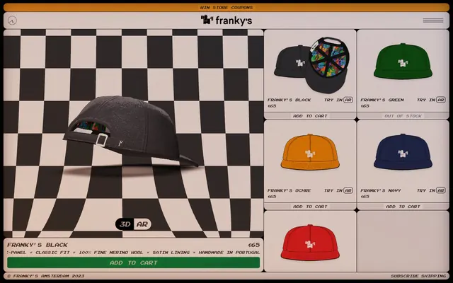
Franky's employs an 8-bit arcade aesthetic, reminiscent of retro computing interfaces and early video games. The UI features a dominant dark mode with soft, paper-like neutral surfaces and vibrant, purposeful chromatic accents. A distinct pixelated font defines all typography, reinforcing a digital-native, nostalgic feel. Elements are framed with thin, sometimes dashed borders, and rounded corners provide a subtle organic counterpoint to the pixel grid.
The page uses a contained, centered layout, appearing within a distinct browser-like frame. The hero section features a full-width interactive product view (3D/AR) alongside a dynamic checkerboard background. Below this, content is arranged in a fluid grid of product cards, breaking into a two-column layout on larger screens. Navigation is a minimalist top bar within the browser-like frame, with subtle text links for secondary actions. The layout maintains consistent vertical spacing between sections, creating a compact but clear presentation.
The site uses product photography paired with stylized graphics. Product images are flat, illustrative representations of hats. The main product display section features a large, dynamic 3D render of a hat against a checkerboard pattern. Icons are minimal, outlined, and monochromatic, matching the pixelated aesthetic. Imagery serves primarily as product showcase and decorative atmosphere, contributing to the retro digital theme.
Reminiscent of Teenage Engineering, Panic, Inc., Playdate, AIGA Design Archives (older versions).
# FRANKY'S — Style Reference
> Retro Pixelated Arcade

**Theme:** dark

**Site:** https://frankys-hats.com

Franky's employs an 8-bit arcade aesthetic, reminiscent of retro computing interfaces and early video games. The UI features a dominant dark mode with soft, paper-like neutral surfaces and vibrant, purposeful chromatic accents. A distinct pixelated font defines all typography, reinforcing a digital-native, nostalgic feel. Elements are framed with thin, sometimes dashed borders, and rounded corners provide a subtle organic counterpoint to the pixel grid.

## Tokens — Colors

| Name | Value | Token | Role |
|------|------|------|------|
| Marigold Gold | `#faa21f` | `--color-marigold-gold` | Orange wash for highlight backgrounds, decorative bands, and soft emphasis behind content. |
| Action Green | `#128e44` | `--color-action-green` | Primary call-to-action buttons, active elements — a direct and clear indicator of interactable elements |
| Midnight Gradient Blue | `#2b4893` | `--color-midnight-gradient-blue` | Decorative gradient element — provides a deep, moody blue within a larger gradient |
| Sunset Gradient Orange | `#cf4308` | `--color-sunset-gradient-orange` | Decorative gradient element — a warm, vibrant orange complementing the deep blue in a gradient |
| Midnight Screen | `#000000` | `--color-midnight-screen` | Primary screen background, dominant text color, strong borders — controls the overall dark theme contrast |
| Paper Canvas | `#f3e5df` | `--color-paper-canvas` | Card backgrounds, secondary surface fills, inner button shadows — creates the aged paper-like texture against the dark background |
| Off-White Border | `#e5e7eb` | `--color-off-white-border` | Primary UI borders, ghost button borders, dividers — a subtle, slightly cool neutral that defines component edges |
| Subtle Charcoal | `#333333` | `--color-subtle-charcoal` | Background for secondary panels or elements, subtle fills — provides layered depth within the dark mode |
| Ghostly Gray | `#737373` | `--color-ghostly-gray` | Muted text, disabled states, secondary button text — for lower hierarchy information |

## Tokens — Typography

### Arcade
- **Substitute:** Press Start 2P, IBM Plex Mono
- **Weights:** 400, 700
- **Sizes:** 10px, 14px, 16px, 18px
- **Line height:** 1.25, 1.43, 1.5, 1.56
- **Letter spacing:** normal
- **Role:** The sole typeface, 'Arcade', dictates the retro, pixelated aesthetic of the entire interface. Its limited weights and specific sizing evoke a classic video game display.

## Tokens — Type Scale

Minor Third (1.2) from 16px base.

| Role | Size | Line height | Letter spacing |
|------|------|------|------|
| caption | 10px | 1.56 | — |
| body-sm | 14px | 1.43 | — |
| body | 16px | 1.5 | — |
| heading | 18px | 1.25 | — |

## Tokens — Spacing

- **Section gap:** 44px
- **Card padding:** 12px
- **Element gap:** 4px

## Tokens — Radius

- **Buttons:** 6px
- **Cards:** 12px
- **pill:** 9999px

## Layout

The page uses a contained, centered layout, appearing within a distinct browser-like frame. The hero section features a full-width interactive product view (3D/AR) alongside a dynamic checkerboard background. Below this, content is arranged in a fluid grid of product cards, breaking into a two-column layout on larger screens. Navigation is a minimalist top bar within the browser-like frame, with subtle text links for secondary actions. The layout maintains consistent vertical spacing between sections, creating a compact but clear presentation.

## Imagery

The site uses product photography paired with stylized graphics. Product images are flat, illustrative representations of hats. The main product display section features a large, dynamic 3D render of a hat against a checkerboard pattern. Icons are minimal, outlined, and monochromatic, matching the pixelated aesthetic. Imagery serves primarily as product showcase and decorative atmosphere, contributing to the retro digital theme.

## Components

### Ghost Button Thin Border
*Secondary action control*

Transparent background, Midnight Screen text, 4px padding, 0px border-radius, with a 1px solid Midnight Screen border. Used for 'Win Store Coupons' and '3D/AR' toggles.

### Ghost Button Subtle Border
*Tertiary action control*

Transparent background, Midnight Screen text, 6px vertical padding, 4px horizontal padding, 0px border-radius, with a 1px solid Off-White Border. Used for actions like 'Try in AR'.

### Ghost Button Rounded Subtle Border
*Tertiary action control with soft corners*

Transparent background, Midnight Screen text, 8px padding, 6px border-radius, with a 1px solid Off-White Border. Used for smaller, less prominent actions.

### Pill Button Left Rounded
*Segmented control left segment*

Midnight Screen background with Paper Canvas text, 4px vertical padding and 8-12px horizontal padding. Features a 9999px border-radius on the left side, squared on the right, and an inset shadow of rgb(243, 229, 223) 0px 1px 0px 0px.

### Primary Action Button
*Main call to action*

Action Green background with Midnight Screen text, 4px horizontal padding and a small inner shadow of rgb(243, 229, 223) 0px 1px 0px 0px. Used for 'Add to Cart'.

### Product Card
*Display individual products and details*

Paper Canvas background, 12px padding, and 12px border-radius. Contains product image, name, price, and actions like 'Add to cart'.

### Status Indicator Button
*Informative button, non-interactive (e.g. 'Out of Stock')*

Transparent background, Ghostly Gray text, with a 1px solid Off-White Border. Used to indicate product availability.

## Guidelines

### Do

- Retain the dominant dark theme foregrounded by Paper Canvas (#f3e5df) elements and Midnight Screen (#000000) text for content.
- Utilize the Arcade font exclusively for all text elements to maintain the pixelated retro aesthetic.
- Frame all interactive and content containers with a 1px solid Off-White Border (#e5e7eb) to define UI boundaries.
- Apply a 12px border-radius to all card-like components and a 6px border-radius to smaller interactive elements like buttons.
- Employ Action Green (#128e44) solely for primary call-to-action buttons like 'Add to Cart'.
- Use Marigold Gold (#faa21f) as a vibrant, distinct accent for top-level promotions or specific highlight features.
- Maintain a compact density for elements, primarily using 4px and 12px for padding and gaps, reserving larger values for section separation.

### Don't

- Avoid using bright white backgrounds; always use Paper Canvas (#f3e5df) for lighter surfaces to maintain the aged paper aesthetic.
- Do not introduce any additional font families or weights beyond the defined Arcade font to preserve the distinctive typography.
- Refrain from using strong, modern drop shadows; prioritize the subtle inset button shadow rgb(243, 229, 223) 0px 1px 0px 0px or flat designs.
- Do not deviate from the specified border-radius values (12px for cards, 6px for buttons) as they contribute to the system's character.
- Never use Action Green (#128e44) for decorative purposes or secondary text; it is strictly reserved for primary actions.
- Avoid introducing new primary accent colors; limit the palette to the defined Marigold Gold (#faa21f) and Action Green (#128e44).
- Do not add gradients arbitrarily; use them sparingly and only with the defined color combinations and directions where appropriate for decorative elements.

## Agent Prompt Guide

**Quick Color Reference**
text: #000000
background: #000000
border: #e5e7eb
accent: #faa21f
primary action: #128e44 (filled action)

**3-5 Example Component Prompts**
1. Create a `Ghost Button Subtle Border` with the text 'TRY IN AR'. Use font 'Arcade', size 14px, weight 400, color #000000. Apply 6px vertical padding, 4px horizontal padding, 0px border-radius, and a 1px solid #e5e7eb border.
2. Create a Primary Action Button: #128e44 background, #f3e5df text, 9999px radius, compact pill padding. Use this filled treatment for the main CTA.
3. Implement a `Status Indicator Button` reading 'OUT OF STOCK'. Use transparent background, `Arcade` font, size 14px, weight 400, Ghostly Gray (#737373) text, with a 1px solid Off-White Border (#e5e7eb).
More like this








Keep what you find
A free account saves references to boards and can send you a weekly email of picks based on what you save.
To see every result, go Pro.