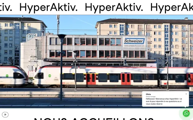
Preview image. Unlock full-res
High-contrast stark blueprint
Color palette
Primary interactive elements like buttons and footer background, providing a vivid accent color against the monochrome palette
Page backgrounds, input fields, interactive element text, base for headings and body text
Dark borders and separators for elevated surfaces and inverted UI. Do not promote it to the primary CTA color
Subtle borders for input fields, indicating inactive states or contained areas without heavy visual weight
Text within form inputs, slightly softer than primary text black
Typography
- Weights
- 400, 700
- Sizes
- 14px, 16px, 20px, 22px, 25px, 28px, 42px, 72px, 80px, 90px
- Line height
- 0.89, 1, 1.2, 1.22, 1.43, 1.5, 2
- Fallback
- Arial Black, Impact
Headings and prominent display text that demand immediate attention. Its heavy weights and condensed appearance contribute to the system's direct, impactful tone.
- Weights
- 400
- Sizes
- 14px, 16px, 20px
- Line height
- 1.25, 1.43
- Fallback
- Inter, Lato
Body copy, input text, and more subtle information. Its legibility balances the bold, aggressive nature of the display font.
Spacing & shape
Components
Background: Action Blue (#0000ff), Text: Canvas White (#ffffff), Border Radius: 0px, Padding: 9px vertical, 15px horizontal. Uses Studiofeixensans font.
Background: Canvas White (#ffffff), Text: Text Black (#000000), Border: 1px solid Text Black (#000000), Border Radius: 0px, Padding: 9px vertical, 15px horizontal. Uses DM Sans font.
Background: Canvas White (#ffffff), Text: Text Black (#000000), Border: 1px solid Text Black (#000000), Border Radius: 20px, Padding: 9px vertical, 15px horizontal. Uses DM Sans font.
Background: Canvas White (#ffffff), Text: Dark Text Gray (#333333), Border: 1px solid Muted Gray (#cccccc), Border Radius: 0px, Padding: 8px vertical, 12px horizontal. Uses DM Sans font.
Background: transparent (no fill). Features no explicit border, shadow, or radius, relying on layout for separation. Content padding is 0px.
Guidelines
- Prioritize Text Black (#000000) for all main headings and body copy to maintain high contrast and directness.
- Use Canvas White (#ffffff) as the default background for sections and components, creating a stark, clean canvas.
- Reserve Action Blue (#0000ff) strictly for primary call-to-action buttons and prominent interactive elements.
- Maintain a rigid sans-serif typography hierarchy, using Studiofeixensans for headlines and DM Sans for body text.
- Apply 0px border-radius to most UI components for a sharp, unyielding aesthetic, except for specific pill-shaped buttons at 20px.
- Ensure input fields use Muted Gray (#cccccc) for borders against Canvas White (#ffffff) backgrounds.
- Utilize white space generously, with a base element gap of 10px and section gaps of 30px to create distinct content blocks.
- Avoid soft gradients or shadows; the visual system is flat and direct, with elevation primarily conveyed through contrast and spatial separation.
- Do not introduce additional chromatic colors; the palette is intentionally limited to black, white, and a single accent blue.
- Refrain from using rounded corners on cards or typical buttons; sharp edges are a core identifier of the system's visual language.
- Do not use subtle variations of grays for text; stick to Text Black (#000000) for prominence and Dark Text Gray (#333333) only for input text.
- Do not apply padding or borders to feature cards; their visual distinction comes from their content and surrounding layout.
- Avoid decorative imagery that deviates from product photos; the system emphasizes functionality and direct information.
- Do not use light font weights for headlines; bold contrast is key to the brand's assertive vocal tone.
About this system
ShowHide
HyperAktiv's design system is minimalist and stark, featuring high-contrast typography and a raw, unadorned aesthetic. Dominant black text on pure white surfaces creates a strong, direct presence, while a lone vibrant blue provides a single, impactful interactive accent. The system avoids elaborate styling, favoring sharp edges and direct expression over soft shadows or rounded forms, giving it an almost industrial, no-nonsense feel.
The page uses a contained layout with no explicit page maximum width, allowing content to stretch. The hero prominently features a full-width background image with bold, centered, high-contrast typography. Sections exhibit a modular rhythm, often alternating between centered text blocks and multi-column arrangements (e.g., text-left/image-right). Vertical spacing is consistent, creating clear separation between content blocks. Navigation is typically a simple top bar, with a persistent floating circular 'feedback' button at the bottom right. Cards are text-only, relying on their stark content and surrounding whitespace for definition.
Imagery primarily consists of high-quality, often architectural or interior product photography, presented without complex treatments like masking or layering. There are no illustrations or abstract graphics. Photography serves to showcase physical spaces and events, typically contained within their content sections. Icons are minimal, outlined, and monochromatic, used sparingly for functional markers. The density is moderate, with images serving as content anchors rather than decorative elements.
Reminiscent of B&O (Bang & Olufsen), Archiweb, AIGA Journal, Dyson, Cargo Collective (some portfolios).
# HyperAktiv — Style Reference
> High-contrast stark blueprint

**Theme:** light

**Site:** https://hyperaktiv.li

HyperAktiv's design system is minimalist and stark, featuring high-contrast typography and a raw, unadorned aesthetic. Dominant black text on pure white surfaces creates a strong, direct presence, while a lone vibrant blue provides a single, impactful interactive accent. The system avoids elaborate styling, favoring sharp edges and direct expression over soft shadows or rounded forms, giving it an almost industrial, no-nonsense feel.

## Tokens — Colors

| Name | Value | Token | Role |
|------|------|------|------|
| Action Blue | `#0000ff` | `--color-action-blue` | Primary interactive elements like buttons and footer background, providing a vivid accent color against the monochrome palette |
| Canvas White | `#ffffff` | `--color-canvas-white` | Page backgrounds, input fields, interactive element text, base for headings and body text |
| Text Black | `#000000` | `--color-text-black` | Dark borders and separators for elevated surfaces and inverted UI. Do not promote it to the primary CTA color |
| Muted Gray | `#cccccc` | `--color-muted-gray` | Subtle borders for input fields, indicating inactive states or contained areas without heavy visual weight |
| Dark Text Gray | `#333333` | `--color-dark-text-gray` | Text within form inputs, slightly softer than primary text black |

## Tokens — Typography

### Studiofeixensans
- **Substitute:** Arial Black, Impact
- **Weights:** 400, 700
- **Sizes:** 14px, 16px, 20px, 22px, 25px, 28px, 42px, 72px, 80px, 90px
- **Line height:** 0.89, 1, 1.2, 1.22, 1.43, 1.5, 2
- **Role:** Headings and prominent display text that demand immediate attention. Its heavy weights and condensed appearance contribute to the system's direct, impactful tone.

### DM Sans
- **Substitute:** Inter, Lato
- **Weights:** 400
- **Sizes:** 14px, 16px, 20px
- **Line height:** 1.25, 1.43
- **Role:** Body copy, input text, and more subtle information. Its legibility balances the bold, aggressive nature of the display font.

## Tokens — Type Scale

| Role | Size | Line height | Letter spacing |
|------|------|------|------|
| caption | 14px | 1.43 | — |
| body | 16px | 1.25 | — |
| subheading | 20px | 1.25 | — |
| heading | 28px | 1.2 | — |
| heading-lg | 42px | 1.2 | — |
| display | 90px | 0.89 | — |

## Tokens — Spacing

- **Section gap:** 30px
- **Card padding:** 15px
- **Element gap:** 10px

## Tokens — Radius

- **Buttons:** 0px
- **Inputs:** 0px
- **round-button:** 20px

## Layout

The page uses a contained layout with no explicit page maximum width, allowing content to stretch. The hero prominently features a full-width background image with bold, centered, high-contrast typography. Sections exhibit a modular rhythm, often alternating between centered text blocks and multi-column arrangements (e.g., text-left/image-right). Vertical spacing is consistent, creating clear separation between content blocks. Navigation is typically a simple top bar, with a persistent floating circular 'feedback' button at the bottom right. Cards are text-only, relying on their stark content and surrounding whitespace for definition.

## Imagery

Imagery primarily consists of high-quality, often architectural or interior product photography, presented without complex treatments like masking or layering. There are no illustrations or abstract graphics. Photography serves to showcase physical spaces and events, typically contained within their content sections. Icons are minimal, outlined, and monochromatic, used sparingly for functional markers. The density is moderate, with images serving as content anchors rather than decorative elements.

## Components

### Primary Filled Button
*Main call-to-action button, direct and prominent.*

Background: Action Blue (#0000ff), Text: Canvas White (#ffffff), Border Radius: 0px, Padding: 9px vertical, 15px horizontal. Uses Studiofeixensans font.

### Outline Button
*Secondary action or informational button.*

Background: Canvas White (#ffffff), Text: Text Black (#000000), Border: 1px solid Text Black (#000000), Border Radius: 0px, Padding: 9px vertical, 15px horizontal. Uses DM Sans font.

### Pill Button
*Small, distinct interactive element for specific actions or navigation.*

Background: Canvas White (#ffffff), Text: Text Black (#000000), Border: 1px solid Text Black (#000000), Border Radius: 20px, Padding: 9px vertical, 15px horizontal. Uses DM Sans font.

### Input Field
*Standard form input for collecting user data.*

Background: Canvas White (#ffffff), Text: Dark Text Gray (#333333), Border: 1px solid Muted Gray (#cccccc), Border Radius: 0px, Padding: 8px vertical, 12px horizontal. Uses DM Sans font.

### Feature Card (Text Only)
*Divisive content section for features or conceptual blocks.*

Background: transparent (no fill). Features no explicit border, shadow, or radius, relying on layout for separation. Content padding is 0px.

## Guidelines

### Do

- Prioritize Text Black (#000000) for all main headings and body copy to maintain high contrast and directness.
- Use Canvas White (#ffffff) as the default background for sections and components, creating a stark, clean canvas.
- Reserve Action Blue (#0000ff) strictly for primary call-to-action buttons and prominent interactive elements.
- Maintain a rigid sans-serif typography hierarchy, using Studiofeixensans for headlines and DM Sans for body text.
- Apply 0px border-radius to most UI components for a sharp, unyielding aesthetic, except for specific pill-shaped buttons at 20px.
- Ensure input fields use Muted Gray (#cccccc) for borders against Canvas White (#ffffff) backgrounds.
- Utilize white space generously, with a base element gap of 10px and section gaps of 30px to create distinct content blocks.

### Don't

- Avoid soft gradients or shadows; the visual system is flat and direct, with elevation primarily conveyed through contrast and spatial separation.
- Do not introduce additional chromatic colors; the palette is intentionally limited to black, white, and a single accent blue.
- Refrain from using rounded corners on cards or typical buttons; sharp edges are a core identifier of the system's visual language.
- Do not use subtle variations of grays for text; stick to Text Black (#000000) for prominence and Dark Text Gray (#333333) only for input text.
- Do not apply padding or borders to feature cards; their visual distinction comes from their content and surrounding layout.
- Avoid decorative imagery that deviates from product photos; the system emphasizes functionality and direct information.
- Do not use light font weights for headlines; bold contrast is key to the brand's assertive vocal tone.

## Agent Prompt Guide

Quick Color Reference:
text: #000000
background: #ffffff
border: #cccccc
accent: #0000ff
primary action: #0000ff (filled action)

Example Component Prompts:
Create a hero section: full-width background image. Headline 'HYPERAKTIV.' at 90px Studiofeixensans weight 700, Text Black (#000000). Subtext at 20px DM Sans weight 400, Text Black (#000000). Ensure generous vertical spacing.
Create a primary action button: Background Action Blue (#0000ff), text Canvas White (#ffffff), 0px radius, 9px vertical 15px horizontal padding. Font Studiofeixensans.
Create an input field: Background Canvas White (#ffffff), text Dark Text Gray (#333333), 1px solid Muted Gray (#cccccc) border, 0px radius, 8px vertical 12px horizontal padding. Font DM Sans.
Create an outlined button: Background Canvas White (#ffffff), text Text Black (#000000), 1px solid Text Black (#000000) border, 0px radius, 9px vertical 15px horizontal padding. Font DM Sans.
More like this








Keep what you find
A free account saves references to boards and can send you a weekly email of picks based on what you save.
To see every result, go Pro.