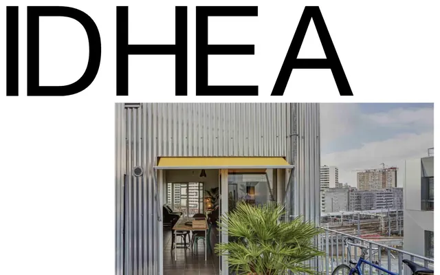
Preview image. Unlock full-res
Monochromatic academic blueprint
Color palette
Link accents, specific heading highlights, outlined action borders
Accent borders on interactive elements, secondary link emphasis
Informational text highlights, subtle content borders
Dark borders and separators for elevated surfaces and inverted UI. Do not promote it to the primary CTA color
Page backgrounds, button fills, card surfaces
Light borders, subtle backgrounds for content blocks, card backgrounds
Shadows for elevation, subtle dividers, button borders
Typography
- Weights
- 400
- Sizes
- 15px, 67px
- Line height
- 1, 1.2
General interface elements, default text where specific brand fonts are not applied. Its broad stroke makes it versatile but used sparingly for distinct brand identity.
- Weights
- 400
- Sizes
- 12px, 18px, 21px, 105px
- Line height
- 0.8, 0.95, 1, 1.17, 1.2
- Fallback
- Arial, Helvetica, sans-serif
Body text, list items, some button text. Provides a clean, modern readability.
- Weights
- 400
- Sizes
- 12px
- Line height
- 1.2
- Fallback
- Arial, Helvetica, sans-serif
Large headings and titles. The medium weight for headline sizes creates a strong visual presence without being overly bold, emphasizing institutional gravitas.
- Fallback
- Georgia, serif
Navigation, some body text, and subheadings. The serif typeface introduces a classic, academic feel, contrasting with the sans-serif for hierarchy.
- Weights
- 400
- Sizes
- 16px
- Line height
- 1.1
- Fallback
- Arial, Helvetica, sans-serif
Subtle captions and secondary information where a lighter touch is desired.
- Weights
- 400
- Sizes
- 16px, 18px, 21px, 23px, 39px, 43px
- Line height
- 0.95, 1, 1.08, 1.1
NewCenturySchlbkLTStd-Roman — detected in extracted data but not described by AI
- Weights
- 400
- Sizes
- 12px, 16px, 20px, 39px
- Line height
- 1, 1.1, 1.2
HelveticaNeueLTPro-Roman — detected in extracted data but not described by AI
Spacing & shape
Elevation
Components
White background, Ink Black text, Subtle Gray 1px border, 50% border radius for a circular shape. 10.5px padding on all sides. Creates a lightweight, tappable ghost element.
White background, Ink Black text, Ink Black 1px border with a 15px border radius. Padding of 6px top/bottom and 7.5px left/right. Provides a slightly more defined boundary than the circular variant.
Transparent background with no border or shadow. 0px border radius, indicating a stark, grid-like composition without visual separation for content blocks. Implicit padding on content.
Ink Black text, no background. Emphasizes text hierarchy with Ink Black text on Canvas White as the primary navigation style, leveraging the default link interaction.
Uses Ink Black text for the main headline, with an accent color (e.g., Brick Red) for a small following element like a 'read more' indicator or date delimiter, usually with an underline or border.
Guidelines
- Prioritize Ink Black text (#000000) on Canvas White (#ffffff) backgrounds for all primary content.
- Use Helvetica Neue LT Pro Medium for large headings to establish a serious and authoritative tone.
- Punctuate long text blocks or lists with the New Century Schoolbook LT Std serif font to introduce an academic aesthetic.
- Utilize Subtle Gray (#e5e5e5) for thin borders and light backgrounds to suggest content grouping without heavy visual division.
- Apply 15px border radius to buttons for a soft, approachable feel, unless explicitly requiring a circular (50% / 9999px) form.
- Employ Brick Red (#bc5346) and Fuchsia Pink (#ff00bc) sparingly as outline borders or text highlights for interactive elements, not as solid backgrounds.
- Maintain compact spacing, typically 10px for element gaps and 30px for section gaps, to create a dense, content-rich layout.
- Avoid using solid chromatic backgrounds for interactive elements; prefer outlined or text-only buttons with Ink Black text.
- Do not introduce gradients; the system relies on flat colors and typography for visual hierarchy.
- Refrain from using heavily rounded corners for cards; they should mostly be 0px radius to maintain a stark, precise structure.
- Do not deviate from the core monochromatic color palette for large sections or backgrounds; color is reserved for functional accents.
- Avoid decorative imagery that competes with text; imagery should be minimal or serve a clear, illustrative purpose.
- Do not use overly expressive or casual typography; maintain a formal and academic tone through the selected sans-serif and serif pairings.
- Do not introduce complex shadow patterns; limit elevation to a subtle rgba(0, 0, 0, 0.2) 4px 2px 4px 0px or rgb(237, 237, 237) 2px -1px 6px 0px for discrete layering.
About this system
ShowHide
IDHEAL presents a clean, academic aesthetic, characterized by a high-contrast black and white foundation. Typography is the primary visual element, conveying a sense of authority and clarity. Color accents are minimal and serve as functional highlights for links and borders, rather than broad decorative elements. The overall feel is one of directness and seriousness, with a compact density and structured content flow.
The page primarily follows a centered, contained layout, though the hero section might be full-bleed. The hero consists of a prominent, potentially large type logo over an image, indicating a strong visual statement at the top. Sections exhibit a consistent vertical rhythm, with content blocks often appearing as clean, unbordered units or subtly bordered cards. Content is likely arranged in single or two-column structures for readability, avoiding complex multi-column grids except for potentially feature displays. Navigation is a sticky top bar, providing persistent access. The overall density is compact, making efficient use of vertical space with clear, but not exaggerated, separation between content blocks.
Imagery is minimal, focusing on large, uncropped photographs that serve as background elements or as distinct visual breaks. The treatment appears raw, without heavy masking or stylized effects, often presenting architectural or urban scenes. Icons, if present, are likely minimal, outlined, and monochromatic, aligning with the clean UI. The overall density suggests a text-dominant layout where images support the content rather than defining it. When images are used, they are typically large and used sparingly. The provided image shows realistic imagery with normal color treatment, not desaturated or highly stylized.
Reminiscent of The New York Times (NYT), Architectural Digest, Monocle, academic journals or university websites.
# IDHEAL — Style Reference
> Monochromatic academic blueprint

**Theme:** light

**Site:** https://idheal.fr

IDHEAL presents a clean, academic aesthetic, characterized by a high-contrast black and white foundation. Typography is the primary visual element, conveying a sense of authority and clarity. Color accents are minimal and serve as functional highlights for links and borders, rather than broad decorative elements. The overall feel is one of directness and seriousness, with a compact density and structured content flow.

## Tokens — Colors

| Name | Value | Token | Role |
|------|------|------|------|
| Brick Red | `#bc5346` | `--color-brick-red` | Link accents, specific heading highlights, outlined action borders |
| Fuchsia Pink | `#ff00bc` | `--color-fuchsia-pink` | Accent borders on interactive elements, secondary link emphasis |
| Moss Green | `#51633c` | `--color-moss-green` | Informational text highlights, subtle content borders |
| Ink Black | `#000000` | `--color-ink-black` | Dark borders and separators for elevated surfaces and inverted UI. Do not promote it to the primary CTA color |
| Canvas White | `#ffffff` | `--color-canvas-white` | Page backgrounds, button fills, card surfaces |
| Subtle Gray | `#e5e5e5` | `--color-subtle-gray` | Light borders, subtle backgrounds for content blocks, card backgrounds |
| Shadow Gray | `#cccccc` | `--color-shadow-gray` | Shadows for elevation, subtle dividers, button borders |

## Tokens — Typography

### sans-serif
- **Weights:** 400
- **Sizes:** 15px, 67px
- **Line height:** 1, 1.2
- **Role:** General interface elements, default text where specific brand fonts are not applied. Its broad stroke makes it versatile but used sparingly for distinct brand identity.

### Helvetica Neue LT Pro
- **Substitute:** Arial, Helvetica, sans-serif
- **Weights:** 400
- **Sizes:** 12px, 18px, 21px, 105px
- **Line height:** 0.8, 0.95, 1, 1.17, 1.2
- **Role:** Body text, list items, some button text. Provides a clean, modern readability.

### Helvetica Neue LT Pro
- **Substitute:** Arial, Helvetica, sans-serif
- **Weights:** 400
- **Sizes:** 12px
- **Line height:** 1.2
- **Role:** Large headings and titles. The medium weight for headline sizes creates a strong visual presence without being overly bold, emphasizing institutional gravitas.

### New Century Schoolbook LT Std
- **Substitute:** Georgia, serif
- **Role:** Navigation, some body text, and subheadings. The serif typeface introduces a classic, academic feel, contrasting with the sans-serif for hierarchy.

### Helvetica Neue LT Pro
- **Substitute:** Arial, Helvetica, sans-serif
- **Weights:** 400
- **Sizes:** 16px
- **Line height:** 1.1
- **Role:** Subtle captions and secondary information where a lighter touch is desired.

### NewCenturySchlbkLTStd-Roman
- **Weights:** 400
- **Sizes:** 16px, 18px, 21px, 23px, 39px, 43px
- **Line height:** 0.95, 1, 1.08, 1.1
- **Role:** NewCenturySchlbkLTStd-Roman — detected in extracted data but not described by AI

### HelveticaNeueLTPro-Roman
- **Weights:** 400
- **Sizes:** 12px, 16px, 20px, 39px
- **Line height:** 1, 1.1, 1.2
- **Role:** HelveticaNeueLTPro-Roman — detected in extracted data but not described by AI

## Tokens — Type Scale

| Role | Size | Line height | Letter spacing |
|------|------|------|------|
| caption | 12px | 1.2 | — |
| body-sm | 15px | 1 | — |
| subheading | 20px | 1 | — |
| heading | 39px | 1.1 | — |
| heading-lg | 43px | 1.1 | — |
| display | 105px | 0.95 | — |

## Tokens — Spacing

- **Section gap:** 30px
- **Card padding:** 0px
- **Element gap:** 10px

## Tokens — Radius

- **Buttons:** 15px
- **Cards:** 0px
- **generalRoundedElements:** 9.999px
- **navigationItems:** 37.5px

## Tokens — Elevation

- **Card:** `rgba(0, 0, 0, 0.2) 4px 2px 4px 0px`
- **Button:** `rgba(0, 0, 0, 0.2) 4px 2px 4px 0px`
- **Navigation:** `rgba(0, 0, 0, 0.2) 4px 2px 4px 0px`

## Layout

The page primarily follows a centered, contained layout, though the hero section might be full-bleed. The hero consists of a prominent, potentially large type logo over an image, indicating a strong visual statement at the top. Sections exhibit a consistent vertical rhythm, with content blocks often appearing as clean, unbordered units or subtly bordered cards. Content is likely arranged in single or two-column structures for readability, avoiding complex multi-column grids except for potentially feature displays. Navigation is a sticky top bar, providing persistent access. The overall density is compact, making efficient use of vertical space with clear, but not exaggerated, separation between content blocks.

## Imagery

Imagery is minimal, focusing on large, uncropped photographs that serve as background elements or as distinct visual breaks. The treatment appears raw, without heavy masking or stylized effects, often presenting architectural or urban scenes. Icons, if present, are likely minimal, outlined, and monochromatic, aligning with the clean UI. The overall density suggests a text-dominant layout where images support the content rather than defining it. When images are used, they are typically large and used sparingly. The provided image shows realistic imagery with normal color treatment, not desaturated or highly stylized.

## Components

### Circular Ghost Button
*Tertiary action button, decorative element with text*

White background, Ink Black text, Subtle Gray 1px border, 50% border radius for a circular shape. 10.5px padding on all sides. Creates a lightweight, tappable ghost element.

### Rounded Corner Ghost Button
*Outlined button for secondary actions or links*

White background, Ink Black text, Ink Black 1px border with a 15px border radius. Padding of 6px top/bottom and 7.5px left/right. Provides a slightly more defined boundary than the circular variant.

### Borderless Content Card
*Container for content, particularly news items or listings*

Transparent background with no border or shadow. 0px border radius, indicating a stark, grid-like composition without visual separation for content blocks. Implicit padding on content.

### Navigation Link
*Primary navigation items*

Ink Black text, no background. Emphasizes text hierarchy with Ink Black text on Canvas White as the primary navigation style, leveraging the default link interaction.

### Headline Link with Accent
*Clickable headlines, leading to detailed content*

Uses Ink Black text for the main headline, with an accent color (e.g., Brick Red) for a small following element like a 'read more' indicator or date delimiter, usually with an underline or border.

## Guidelines

### Do

- Prioritize Ink Black text (#000000) on Canvas White (#ffffff) backgrounds for all primary content.
- Use Helvetica Neue LT Pro Medium for large headings to establish a serious and authoritative tone.
- Punctuate long text blocks or lists with the New Century Schoolbook LT Std serif font to introduce an academic aesthetic.
- Utilize Subtle Gray (#e5e5e5) for thin borders and light backgrounds to suggest content grouping without heavy visual division.
- Apply 15px border radius to buttons for a soft, approachable feel, unless explicitly requiring a circular (50% / 9999px) form.
- Employ Brick Red (#bc5346) and Fuchsia Pink (#ff00bc) sparingly as outline borders or text highlights for interactive elements, not as solid backgrounds.
- Maintain compact spacing, typically 10px for element gaps and 30px for section gaps, to create a dense, content-rich layout.

### Don't

- Avoid using solid chromatic backgrounds for interactive elements; prefer outlined or text-only buttons with Ink Black text.
- Do not introduce gradients; the system relies on flat colors and typography for visual hierarchy.
- Refrain from using heavily rounded corners for cards; they should mostly be 0px radius to maintain a stark, precise structure.
- Do not deviate from the core monochromatic color palette for large sections or backgrounds; color is reserved for functional accents.
- Avoid decorative imagery that competes with text; imagery should be minimal or serve a clear, illustrative purpose.
- Do not use overly expressive or casual typography; maintain a formal and academic tone through the selected sans-serif and serif pairings.
- Do not introduce complex shadow patterns; limit elevation to a subtle rgba(0, 0, 0, 0.2) 4px 2px 4px 0px or rgb(237, 237, 237) 2px -1px 6px 0px for discrete layering.

## Agent Prompt Guide

Quick Color Reference:
text: #000000
background: #ffffff
border: #e5e5e5
accent: #bc5346
primary action: #bc5346 (outlined action border)

Example Component Prompts:
1. Create a primary navigation item: New Century Schoolbook LT Std weight 400, size 21px, lineHeight 1.0, Ink Black text #000000. Underline on hover.
2. Create a content card for a news item: Canvas White background #ffffff, 0px border-radius, no border, Ink Black text #000000 for heading (Helvetica Neue LT Pro-Md weight 400, 39px), and Helvetica Neue LT Pro-Roman weight 400, 16px, Ink Black text #000000 for body. Provide 15px bottom margin after the card.
3. Create a circular ghost button with a label 'Details': Canvas White background #ffffff, Ink Black text #000000, Subtle Gray border #e5e5e5 with 1px width, 50% border radius, 10.5px padding on all sides.
More like this








Keep what you find
A free account saves references to boards and can send you a weekly email of picks based on what you save.
To see every result, go Pro.