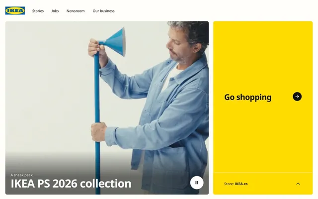
Preview image. Unlock full-res
Scandinavian sunshine on white birch
Color palette
Primary brand accent, interactive elements like CTA buttons, hero backgrounds, and prominent informational cards — its vibrancy instantly draws the eye and signifies action or importance
Decorative link backgrounds, indicating followable content or external navigation. This blue offers a slight variation from the yellow without competing
Highlight elements or decorative backgrounds for specific content blocks, providing a warm, playful accent
Primary text, headline text, dark button backgrounds, and strong borders. Provides high contrast against light backgrounds
Page backgrounds, card surfaces, ghost button backgrounds, and text on dark button backgrounds
Subtle background for UI elements, offering a soft alternative to pure white for visual layering or highlighting. Also used for some button backgrounds and borders
Secondary text, input text, and default icon fills. Used for general text where Core Black might be too intense
Muted text, less prominent icons, and secondary button borders. Provides secondary text hierarchy
Subtle button backgrounds, offering a very soft interaction state or a less emphasized button style
Typography
- Weights
- 400, 700
- Sizes
- 13px, 14px, 16px, 20px, 36px, 51px
- Line height
- 1, 1.08, 1.2, 1.4, 1.57, 1.62
- Letter spacing
- -0.0290em at 51px, -0.0270em at 36px, normal for smaller sizes
- Fallback
- Inter
The primary typeface for all content, from navigation to body text and headlines. Its robust yet friendly character supports the brand's accessible image. The varied weights and sizes are used to establish clear hierarchy, particularly the subtle negative letter-spacing on larger sizes which gives titles a composed feel.
Spacing & shape
Components
Background: Ikea Yellow (#ffdb00). Text: Core Black (#111111). Border radius: 8px. Padding: 16px vertical, 50px horizontal. Typically found at the bottom of hero sections or prominent content blocks.
Background: Core Black (#111111). Text/Icon: Canvas White (#ffffff). Border radius: 50% (circular). No padding, designed for icon-only content.
Background: Canvas White (#ffffff). Text/Icon: Core Black (#111111). Border radius: 50% (circular). No padding, designed for icon-only content.
Background: Off-White (#fffefb). Text: Text Black (#000000). Border: 1px solid Text Black (#000000). Padding: 20px vertical, 20px horizontal. No border radius (sharp rectangular form).
Background: Ikea Yellow (#ffdb00). Border radius: 8px. No padding on the card itself, content handles its own spacing.
Background: Canvas White (#ffffff). Text: Text Black (#000000). Border: 1px solid Text Black (#000000). Border radius: 8px. Padding: 12px vertical, 42px left (for potential icon placement).
Guidelines
- Prioritize Ikea Yellow (#ffdb00) for all primary call-to-actions, ensuring it's the most prominent interactive element.
- Maintain a clear visual hierarchy using Core Black (#111111) for main headlines and Canvas White (#ffffff) for backgrounds.
- Apply an 8px border radius consistently to all cards, buttons, and interactive elements for a cohesive, friendly aesthetic.
- Use letter-spacing of -0.0290em for 'display' type (51px) and -0.0270em for 'heading' type (36px) to give titles a distinct composed feel.
- Ensure generous vertical spacing between sections, defaulting to 80px, to promote a comfortable, scannable layout.
- Reserve Deep Sea Blue (#0159a3) for decorative link backgrounds or highly specific interactive accents, not for primary actions.
- Use Off-White (#fffefb) for subtle background variations, providing visual depth without harsh color changes.
- Do not use Core Black (#111111) for general body text; reserve it for high-contrast headlines or specific dark UI elements.
- Avoid arbitrary color choices outside of the defined palette; color should always serve a specific functional or brand-aligned purpose.
- Do not vary border radius values across components; all interactive elements and contained content should use a consistent 8px radius.
- Do not crowd content; maintain an 'elementGap' of 24px for horizontal and vertical spacing between internal elements.
- Avoid using multiple accent colors in close proximity that compete with Ikea Yellow (#ffdb00) or Deep Sea Blue (#0159a3).
- Do not use generic system fonts; only use Noto IKEA (or Inter as a substitute) to maintain typographic brand identity.
- Do not create an overly dense layout; ensure a maximum page width of 1440px with content centered, leaving ample breathing room.
About this system
ShowHide
IKEA's global digital presence is built on a foundation of optimistic simplicity. The interface features a clean, bright canvas, primarily using high-contrast typography and a distinct, energetic yellow as the primary brand accent. Component surfaces are generally flat and rounded, creating a friendly and approachable feel. This system prioritizes clear communication and intuitive interaction, using color sparingly for functional highlights, while maintaining a spacious, user-friendly layout.
The page adheres to a max-width 1440px centered container for most content. The hero section is often full-bleed with either a product video or a large visual split between content and a prominent Ikea Yellow CTA. Sections maintain a consistent vertical rhythm with 80px gaps. Content is arranged in flexible layouts, often with product cards or content blocks organized into grids. Visuals frequently feature text overlays at the bottom left. The navigation is a persistent top bar, minimalist and functional, with logo and primary links.
Imagery primarily features product shots and lifestyle photography, often with a white or light-colored background that blends seamlessly with the UI. Product shots are typically centered and well-lit, functioning as content showcases. Illustrations, when present, are flat, organic, and often use brand colors or soft pastels for decorative or conceptual purposes. Icons are predominantly outline-style with a medium stroke weight, in monochrome (black) or occasionally brand colors, used functionally for navigation and interaction. Imagery plays a significant role in conveying product context and aspirational living, balancing text-dominant informational blocks with engaging visual content.
# IKEA — Style Reference
> Scandinavian sunshine on white birch

**Theme:** light

**Site:** https://www.ikea.com

IKEA's global digital presence is built on a foundation of optimistic simplicity. The interface features a clean, bright canvas, primarily using high-contrast typography and a distinct, energetic yellow as the primary brand accent. Component surfaces are generally flat and rounded, creating a friendly and approachable feel. This system prioritizes clear communication and intuitive interaction, using color sparingly for functional highlights, while maintaining a spacious, user-friendly layout.

## Tokens — Colors

| Name | Value | Token | Role |
|------|------|------|------|
| Ikea Yellow | `#ffdb00` | `--color-ikea-yellow` | Primary brand accent, interactive elements like CTA buttons, hero backgrounds, and prominent informational cards — its vibrancy instantly draws the eye and signifies action or importance |
| Deep Sea Blue | `#0159a3` | `--color-deep-sea-blue` | Decorative link backgrounds, indicating followable content or external navigation. This blue offers a slight variation from the yellow without competing |
| Soft Peach | `#ffa6da` | `--color-soft-peach` | Highlight elements or decorative backgrounds for specific content blocks, providing a warm, playful accent |
| Core Black | `#111111` | `--color-core-black` | Primary text, headline text, dark button backgrounds, and strong borders. Provides high contrast against light backgrounds |
| Canvas White | `#ffffff` | `--color-canvas-white` | Page backgrounds, card surfaces, ghost button backgrounds, and text on dark button backgrounds |
| Off-White | `#fffefb` | `--color-off-white` | Subtle background for UI elements, offering a soft alternative to pure white for visual layering or highlighting. Also used for some button backgrounds and borders |
| Text Black | `#000000` | `--color-text-black` | Secondary text, input text, and default icon fills. Used for general text where Core Black might be too intense |
| Mid Grey | `#818181` | `--color-mid-grey` | Muted text, less prominent icons, and secondary button borders. Provides secondary text hierarchy |
| Light Grey | `#dadada` | `--color-light-grey` | Subtle button backgrounds, offering a very soft interaction state or a less emphasized button style |

## Tokens — Typography

### Noto IKEA
- **Substitute:** Inter
- **Weights:** 400, 700
- **Sizes:** 13px, 14px, 16px, 20px, 36px, 51px
- **Line height:** 1, 1.08, 1.2, 1.4, 1.57, 1.62
- **Letter spacing:** -0.0290em at 51px, -0.0270em at 36px, normal for smaller sizes
- **Role:** The primary typeface for all content, from navigation to body text and headlines. Its robust yet friendly character supports the brand's accessible image. The varied weights and sizes are used to establish clear hierarchy, particularly the subtle negative letter-spacing on larger sizes which gives titles a composed feel.

## Tokens — Type Scale

Augmented Fourth (1.414) from 16px base.

| Role | Size | Line height | Letter spacing |
|------|------|------|------|
| caption | 13px | 1.57 | — |
| body | 16px | 1.57 | — |
| subheading | 20px | 1.4 | — |
| heading | 36px | 1.2 | -0.97px |
| display | 51px | 1.08 | -1.48px |

## Tokens — Spacing

- **Max width:** 1440px
- **Section gap:** 80px
- **Card padding:** 16px
- **Element gap:** 24px

## Tokens — Radius

- **all:** 8px

## Layout

The page adheres to a max-width 1440px centered container for most content. The hero section is often full-bleed with either a product video or a large visual split between content and a prominent Ikea Yellow CTA. Sections maintain a consistent vertical rhythm with 80px gaps. Content is arranged in flexible layouts, often with product cards or content blocks organized into grids. Visuals frequently feature text overlays at the bottom left. The navigation is a persistent top bar, minimalist and functional, with logo and primary links.

## Imagery

Imagery primarily features product shots and lifestyle photography, often with a white or light-colored background that blends seamlessly with the UI. Product shots are typically centered and well-lit, functioning as content showcases. Illustrations, when present, are flat, organic, and often use brand colors or soft pastels for decorative or conceptual purposes. Icons are predominantly outline-style with a medium stroke weight, in monochrome (black) or occasionally brand colors, used functionally for navigation and interaction. Imagery plays a significant role in conveying product context and aspirational living, balancing text-dominant informational blocks with engaging visual content.

## Components

### Primary Action Button
*Main call-to-action button, drawing immediate attention.*

Background: Ikea Yellow (#ffdb00). Text: Core Black (#111111). Border radius: 8px. Padding: 16px vertical, 50px horizontal. Typically found at the bottom of hero sections or prominent content blocks.

### Dark Icon Button
*Small, functional buttons for video controls or navigation, offering a clear visual cue.*

Background: Core Black (#111111). Text/Icon: Canvas White (#ffffff). Border radius: 50% (circular). No padding, designed for icon-only content.

### Light Icon Button
*Small, functional buttons for controls like video pause, against lighter backgrounds.*

Background: Canvas White (#ffffff). Text/Icon: Core Black (#111111). Border radius: 50% (circular). No padding, designed for icon-only content.

### Ghost Header Button
*Secondary call-to-action or functional button within headers, unobtrusive.*

Background: Off-White (#fffefb). Text: Text Black (#000000). Border: 1px solid Text Black (#000000). Padding: 20px vertical, 20px horizontal. No border radius (sharp rectangular form).

### Content Card - Yellow
*Highlighting key information or promotional content.*

Background: Ikea Yellow (#ffdb00). Border radius: 8px. No padding on the card itself, content handles its own spacing.

### Text Input Field
*User input fields.*

Background: Canvas White (#ffffff). Text: Text Black (#000000). Border: 1px solid Text Black (#000000). Border radius: 8px. Padding: 12px vertical, 42px left (for potential icon placement).

## Guidelines

### Do

- Prioritize Ikea Yellow (#ffdb00) for all primary call-to-actions, ensuring it's the most prominent interactive element.
- Maintain a clear visual hierarchy using Core Black (#111111) for main headlines and Canvas White (#ffffff) for backgrounds.
- Apply an 8px border radius consistently to all cards, buttons, and interactive elements for a cohesive, friendly aesthetic.
- Use letter-spacing of -0.0290em for 'display' type (51px) and -0.0270em for 'heading' type (36px) to give titles a distinct composed feel.
- Ensure generous vertical spacing between sections, defaulting to 80px, to promote a comfortable, scannable layout.
- Reserve Deep Sea Blue (#0159a3) for decorative link backgrounds or highly specific interactive accents, not for primary actions.
- Use Off-White (#fffefb) for subtle background variations, providing visual depth without harsh color changes.

### Don't

- Do not use Core Black (#111111) for general body text; reserve it for high-contrast headlines or specific dark UI elements.
- Avoid arbitrary color choices outside of the defined palette; color should always serve a specific functional or brand-aligned purpose.
- Do not vary border radius values across components; all interactive elements and contained content should use a consistent 8px radius.
- Do not crowd content; maintain an 'elementGap' of 24px for horizontal and vertical spacing between internal elements.
- Avoid using multiple accent colors in close proximity that compete with Ikea Yellow (#ffdb00) or Deep Sea Blue (#0159a3).
- Do not use generic system fonts; only use Noto IKEA (or Inter as a substitute) to maintain typographic brand identity.
- Do not create an overly dense layout; ensure a maximum page width of 1440px with content centered, leaving ample breathing room.

## Agent Prompt Guide

primary action: #ffdb00 (filled action)
Create a Primary Action Button: #ffdb00 background, #000000 text, 9999px radius, compact pill padding. Use this filled treatment for the main CTA.
More like this









Keep what you find
A free account saves references to boards and can send you a weekly email of picks based on what you save.
To see every result, go Pro.