Preview image. Unlock full-res
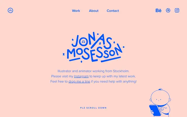
Playful Blueprint on Blush
Color palette
Primary brand accent — used for links, interactive elements, graphic outlines, and the brand's signature identity marks. Provides vibrant contrast against the soft peach background
Page backgrounds, surface accents, subtle borders
Dark borders and separators for elevated surfaces and inverted UI. Do not promote it to the primary CTA color
Overlays, decorative fills for graphic elements
Hairline borders, dividers, input outlines, and card edges on light surfaces. Do not promote it to the primary CTA color
Subtle background variation
Typography
- Weights
- 300, 600
- Sizes
- 16px, 27px, 35px, 48px
- Line height
- 1.25, 1.5
- Letter spacing
- 0.2500em
- Fallback
- Montserrat
Primary typeface for all content, navigation, and headings. Its light 300 weight across larger sizes creates an airy feel, while the 600 weight provides necessary emphasis without heaviness. Consistent, slightly open letter-spacing contributes to an approachable, legible brand voice.
Spacing & shape
Components
Uses 'proxima-nova' weight 300, 16px, 0.25em letter-spacing, and Electric Blue (#0057ff) for text. Hover state subtly changes color or adds an underline using the same Electric Blue.
Custom hand-drawn logotype. Visually represented by Electric Blue (#0057ff) against the Powder Peach background. Typography in the logotype itself is custom but adheres to the Electric Blue accent color.
Set in 'proxima-nova' weight 300, 16px, and Graphite (#666666) text color against a Powder Peach (#ffd7ce) background. Section text typically uses a 30px top margin.
Uses 'proxima-nova' at different sizes (27px, 35px, 48px) with a light weight (300) and Electric Blue (#0057ff) or Graphite (#666666) color. Letter-spacing is 0.25em. Headlines have a 10px bottom margin.
Text 'PLZ SCROLL DOWN' in Graphite (#666666), 'proxima-nova' weight 300, 16px. Positioned centrally at the bottom of the hero section.
Outline in Electric Blue (#0057ff) with a transparent fill. These appear in the header and footer.
Guidelines
- Always use Powder Peach (#ffd7ce) as the primary background color for page sections.
- Utilize Electric Blue (#0057ff) exclusively for interactive elements like links and buttons, and for key brand graphics or outlines.
- Prioritize 'proxima-nova' (Montserrat substitute) weight 300 for all text content to maintain a light and friendly tone.
- Apply 0.25em letter-spacing consistently across all text elements using 'proxima-nova'.
- Maintain a clear vertical rhythm using 30px section gaps and 10px element gaps.
- Use Graphite (#666666) for secondary text and subtle UI borders to ensure legibility against light backgrounds.
- Employ Midnight Ink (#000000) sparingly, primarily for decorative SVG fills where high contrast is desired.
- Avoid introducing additional saturated colors unless they are part of specific content imagery – maintain a strict two-color primary palette (Peach and Blue).
- Do not use heavy font weights (e.g., 700 or 800) for headlines or body text; the heaviest allowed is 600 for emphasis.
- Refrain from using strong shadows or gradients; the design relies on flat surfaces and clean lines.
- Do not deviate from the established 0.25em letter-spacing for 'proxima-nova' as it's a key identifier of the typographic style.
- Avoid tight element spacing; leverage ample white space and the defined 10px element gap and 30px section gap for content separation.
- Do not use rounded corners unless explicitly part of a specific illustrative element; UI elements should generally have sharp edges.
About this system
ShowHide
Jonas Mosesson’s online presence expresses a playful yet understated artistic sensibility. It leverages a soft monochrome canvas highlighted by a single vibrant blue, creating a clear visual focal point. Typography is compact and confident, primarily utilizing thin weights to convey a light and approachable tone. The overall design feels open and clean, with ample white space and minimal decorative elements, allowing the artwork and key information to stand out clearly.
Reminiscent of Frank Chimero, Tobias Hall, Jessica Hische.
# Jonas Mosesson — Style Reference
> Playful Blueprint on Blush

**Theme:** light

**Site:** https://jonasmosesson.se

Jonas Mosesson’s online presence expresses a playful yet understated artistic sensibility. It leverages a soft monochrome canvas highlighted by a single vibrant blue, creating a clear visual focal point. Typography is compact and confident, primarily utilizing thin weights to convey a light and approachable tone. The overall design feels open and clean, with ample white space and minimal decorative elements, allowing the artwork and key information to stand out clearly.

## Tokens — Colors

| Name | Value | Token | Role |
|------|------|------|------|
| Electric Blue | `#0057ff` | `--color-electric-blue` | Primary brand accent — used for links, interactive elements, graphic outlines, and the brand's signature identity marks. Provides vibrant contrast against the soft peach background |
| Powder Peach | `#ffd7ce` | `--color-powder-peach` | Page backgrounds, surface accents, subtle borders |
| Graphite | `#666666` | `--color-graphite` | Dark borders and separators for elevated surfaces and inverted UI. Do not promote it to the primary CTA color |
| Midnight Ink | `#000000` | `--color-midnight-ink` | Overlays, decorative fills for graphic elements |
| Canvas White | `#ffffff` | `--color-canvas-white` | Hairline borders, dividers, input outlines, and card edges on light surfaces. Do not promote it to the primary CTA color |
| Pearl Gray | `#edede2` | `--color-pearl-gray` | Subtle background variation |

## Tokens — Typography

### proxima-nova
- **Substitute:** Montserrat
- **Weights:** 300, 600
- **Sizes:** 16px, 27px, 35px, 48px
- **Line height:** 1.25, 1.5
- **Letter spacing:** 0.2500em
- **Role:** Primary typeface for all content, navigation, and headings. Its light 300 weight across larger sizes creates an airy feel, while the 600 weight provides necessary emphasis without heaviness. Consistent, slightly open letter-spacing contributes to an approachable, legible brand voice.

## Tokens — Type Scale

Augmented Fourth (1.414) from 35px base.

| Role | Size | Line height | Letter spacing |
|------|------|------|------|
| caption | 16px | 1.5 | — |
| body-sm | 27px | 1.3 | — |
| body | 35px | 1.3 | — |
| body-lg | 48px | 1.3 | — |

## Tokens — Spacing

- **Section gap:** 30px
- **Element gap:** 10px

## Tokens — Radius

- **Default:** 0px

## Components

### Navigation Link
*Top navigation and inline content links*

Uses 'proxima-nova' weight 300, 16px, 0.25em letter-spacing, and Electric Blue (#0057ff) for text. Hover state subtly changes color or adds an underline using the same Electric Blue.

### Brand Logo (Text)
*Primary site identifier*

Custom hand-drawn logotype. Visually represented by Electric Blue (#0057ff) against the Powder Peach background. Typography in the logotype itself is custom but adheres to the Electric Blue accent color.

### Body Text Block
*Main informational paragraphs*

Set in 'proxima-nova' weight 300, 16px, and Graphite (#666666) text color against a Powder Peach (#ffd7ce) background. Section text typically uses a 30px top margin.

### Headline Text
*Major section titles and introductory statements*

Uses 'proxima-nova' at different sizes (27px, 35px, 48px) with a light weight (300) and Electric Blue (#0057ff) or Graphite (#666666) color. Letter-spacing is 0.25em. Headlines have a 10px bottom margin.

### Scroll Indicator
*Visual cue for more content*

Text 'PLZ SCROLL DOWN' in Graphite (#666666), 'proxima-nova' weight 300, 16px. Positioned centrally at the bottom of the hero section.

### Social Media Icon (Outlined)
*Links to external social platforms*

Outline in Electric Blue (#0057ff) with a transparent fill. These appear in the header and footer.

## Guidelines

### Do

- Always use Powder Peach (#ffd7ce) as the primary background color for page sections.
- Utilize Electric Blue (#0057ff) exclusively for interactive elements like links and buttons, and for key brand graphics or outlines.
- Prioritize 'proxima-nova' (Montserrat substitute) weight 300 for all text content to maintain a light and friendly tone.
- Apply 0.25em letter-spacing consistently across all text elements using 'proxima-nova'.
- Maintain a clear vertical rhythm using 30px section gaps and 10px element gaps.
- Use Graphite (#666666) for secondary text and subtle UI borders to ensure legibility against light backgrounds.
- Employ Midnight Ink (#000000) sparingly, primarily for decorative SVG fills where high contrast is desired.

### Don't

- Avoid introducing additional saturated colors unless they are part of specific content imagery – maintain a strict two-color primary palette (Peach and Blue).
- Do not use heavy font weights (e.g., 700 or 800) for headlines or body text; the heaviest allowed is 600 for emphasis.
- Refrain from using strong shadows or gradients; the design relies on flat surfaces and clean lines.
- Do not deviate from the established 0.25em letter-spacing for 'proxima-nova' as it's a key identifier of the typographic style.
- Avoid tight element spacing; leverage ample white space and the defined 10px element gap and 30px section gap for content separation.
- Do not use rounded corners unless explicitly part of a specific illustrative element; UI elements should generally have sharp edges.

## Agent Prompt Guide

Quick Color Reference:
- text: #666666
- background: #ffd7ce
- border: #0057ff (for interactive outlines)
- accent: #0057ff
- primary action: #0057ff (outlined action border)

Example Component Prompts:
- Create a footer section: Powder Peach (#ffd7ce) background. Centered text 'This is the end, my friend ☹' in Graphite (#666666), proxima-nova weight 300, 16px, 0.25em letter-spacing. Below it, an outlined social icon of Electric Blue (#0057ff) on transparent background.
- Design a prominent link within a body paragraph: 'Instagram' text in Electric Blue (#0057ff), proxima-nova weight 300, 16px, 0.25em letter-spacing. Ensure it maintains a 10px element gap from surrounding text.
- Generate a primary headline for a subpage: 'Look, it's me →' in Electric Blue (#0057ff), proxima-nova weight 48px, 300, 0.25em letter-spacing. Positioned with a 30px top margin from the previous section.
More like this









Keep what you find
A free account saves references to boards and can send you a weekly email of picks based on what you save.
To see every result, go Pro.