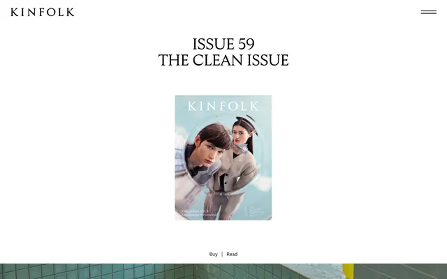
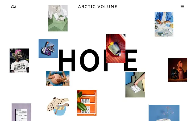
Preview image. Unlock full-res
Literary magazine, minimal frames
Color palette
Page backgrounds, card surfaces, ghost button backgrounds, interactive elements' hover states
Primary text, headings, strong borders, interactive elements' static states, button backgrounds for filled variants
Subtle background for UI elements, secondary surfaces, and very muted text contrast
Typography
- Weights
- 400
- Sizes
- 15px, 20px
- Line height
- 1.25, 1.33, 1.5
- Letter spacing
- normal
- Fallback
- Lora
Body text and subheadings. Its generous line height contributes to readability and the overall spacious layout.
- Weights
- 400
- Sizes
- 25px, 32px, 50px, 60px
- Line height
- 1, 1.04, 1.16, 1.19
- Letter spacing
- -0.0100em, -0.0050em
- Fallback
- Playfair Display
Hero headlines and section titles. The wide letter spacing at larger sizes gives a stately, editorial feel.
- Weights
- 400
- Sizes
- 13px, 15px, 16px, 20px, 25px
- Line height
- 1.16, 1.31, 1.33, 1.5
- Letter spacing
- -0.0050em, 0.0100em, 0.0200em, 0.0300em, 0.0600em
- Fallback
- Inter
Captions, button text, and smaller UI labels. Its neutrality balances the classic elegance of the serif fonts.
- Weights
- 400
- Sizes
- 13px
- Line height
- 1.2
Arial — detected in extracted data but not described by AI
- Weights
- 400
- Sizes
- 20px
- Line height
- 0.85
- Letter spacing
- -0.025
Kinfolk-Serif-Display — detected in extracted data but not described by AI
Spacing & shape
Components
Background: transparent (rgba(0, 0, 0, 0)), Text: Ink Black (#000000), Border: 1px solid Ink Black (#000000), Padding: 1px top/bottom, 6px left/right. Radius: 0px.
Background: Canvas White (#ffffff), Text: Ink Black (#000000), Border: 1px solid Ink Black (#000000), Padding: 9px top, 7px bottom, 30px left/right. Radius: 0px.
Background: Ink Black (#000000), Text: Canvas White (#ffffff), Border: 1px solid Ink Black (#000000), Padding: 9px top, 7px bottom, 30px left/right. Radius: 0px.
Background: transparent (rgba(0,0,0,0)), Border: none, Shadow: none, Padding: 0px. Emphasizes content over container.
Background: Canvas White (#ffffff), Text: Ink Black (#000000), Border: 1px solid Ink Black (#000000), Padding: 0px. Radius: 0px.
Guidelines
- Always use Kinfolk-Serif-Deck for hero and main section headlines to convey editorial gravitas.
- Maintain generous line heights (e.g., 1.5 for body text) throughout the design to enhance readability and spaciousness.
- Frame crucial interactive elements with a distinct 1px solid Ink Black (#000000) border, especially for ghost or outlined buttons.
- Prioritize Canvas White (#ffffff) backgrounds with Ink Black (#000000) text for all primary content areas.
- Apply 0px border radius as a default for all elements to maintain a sharp, classic aesthetic, except for specific interactive links which can use 2px.
- Use a minimum element gap of 20px (from elementGap token) between distinct content blocks to preserve visual breathing room.
- Ensure all black text on white backgrounds achieves AAA contrast ratio (21.0:1) for optimal accessibility and visual clarity.
- Avoid using drop shadows or complex gradients; the design relies on flat surfaces and high contrast borders.
- Do not introduce highly saturated colors; stick to the achromatic palette with occasional photographic color accents.
- Never use rounded corners on cards or primary buttons; maintain a strict 0px radius for these elements.
- Minimize visual clutter; every element should have ample negative space around it.
- Do not deviate from the specified font families; their custom nature is central to the brand's identity.
- Avoid dense packing of information; break content into distinct, well-spaced blocks.
- Refrain from using thin, light gray text on white backgrounds; ensure sufficient contrast for all text elements.
About this system
ShowHide
Kinfolk cultivates an atmosphere of understated elegance and classic publishing. Its design relies on a spacious, monochrome canvas with strong typographic hierarchy, favoring custom serif fonts for headlines and body text to evoke a sense of heritage and literary depth. Interaction is minimal, with ghost-like controls and strong black borders that frame content like traditional print media. The aesthetic emphasizes clean lines and ample negative space, allowing imagery and text to breathe and command attention.
The page primarily uses a max-width contained model with significant white space, although some hero and content sections break to full-bleed. The hero pattern often involves a large, atmospheric image or a combination with a prominent, centered headline in Kinfolk-Serif-Deck. Sections typically flow vertically with consistent, generous vertical spacing, primarily using either a simple centered stack for text and imagery or a grid of cards. There's a strong visual rhythm established by alternating content blocks horizontally, often a 2-column with text on one side and an image on the other. Navigation is a minimal top bar that includes the brand logo and a discreet burger menu icon.
Imagery on Kinfolk is a central element, frequently occupying large sections. It primarily features high-quality, often editorial or lifestyle photography that ranges from bright and airy to moodier, more contemplative scenes, often with a muted or desaturated color palette. Photography is typically full-bleed or contained within sharp, unrounded frames, presented without overlapping elements. The focus is on product/subject-focused shots or candid, natural compositions. Illustrations, when present, are simple, monochromatic, and used minimally. Icons are outlined, simple, and monochrome, often Ink Black, used functionally rather than decoratively to create a clean UI. Imagery serves a dual role: both as explanatory content and to establish the brand's atmospheric mood and aesthetic.
Reminiscent of Apartamento, Cereal Magazine, The New York Times (digital), Monocle.
# Kinfolk — Style Reference
> Literary magazine, minimal frames

**Theme:** light

**Site:** https://www.kinfolk.com

Kinfolk cultivates an atmosphere of understated elegance and classic publishing. Its design relies on a spacious, monochrome canvas with strong typographic hierarchy, favoring custom serif fonts for headlines and body text to evoke a sense of heritage and literary depth. Interaction is minimal, with ghost-like controls and strong black borders that frame content like traditional print media. The aesthetic emphasizes clean lines and ample negative space, allowing imagery and text to breathe and command attention.

## Tokens — Colors

| Name | Value | Token | Role |
|------|------|------|------|
| Canvas White | `#ffffff` | `--color-canvas-white` | Page backgrounds, card surfaces, ghost button backgrounds, interactive elements' hover states |
| Ink Black | `#000000` | `--color-ink-black` | Primary text, headings, strong borders, interactive elements' static states, button backgrounds for filled variants |
| Paper Gray | `#dbded5` | `--color-paper-gray` | Subtle background for UI elements, secondary surfaces, and very muted text contrast |

## Tokens — Typography

### Kinfolk-Serif-Text
- **Substitute:** Lora
- **Weights:** 400
- **Sizes:** 15px, 20px
- **Line height:** 1.25, 1.33, 1.5
- **Letter spacing:** normal
- **Role:** Body text and subheadings. Its generous line height contributes to readability and the overall spacious layout.

### Kinfolk-Serif-Deck
- **Substitute:** Playfair Display
- **Weights:** 400
- **Sizes:** 25px, 32px, 50px, 60px
- **Line height:** 1, 1.04, 1.16, 1.19
- **Letter spacing:** -0.0100em, -0.0050em
- **Role:** Hero headlines and section titles. The wide letter spacing at larger sizes gives a stately, editorial feel.

### Kinfolk-Sans
- **Substitute:** Inter
- **Weights:** 400
- **Sizes:** 13px, 15px, 16px, 20px, 25px
- **Line height:** 1.16, 1.31, 1.33, 1.5
- **Letter spacing:** -0.0050em, 0.0100em, 0.0200em, 0.0300em, 0.0600em
- **Role:** Captions, button text, and smaller UI labels. Its neutrality balances the classic elegance of the serif fonts.

### Arial
- **Weights:** 400
- **Sizes:** 13px
- **Line height:** 1.2
- **Role:** Arial — detected in extracted data but not described by AI

### Kinfolk-Serif-Display
- **Weights:** 400
- **Sizes:** 20px
- **Line height:** 0.85
- **Letter spacing:** -0.025
- **Role:** Kinfolk-Serif-Display — detected in extracted data but not described by AI

## Tokens — Type Scale

Perfect Fourth (1.333) from 16px base.

| Role | Size | Line height | Letter spacing |
|------|------|------|------|
| body-lg | 16px | 1.33 | — |
| subheading | 20px | 1.25 | -0.5px |
| heading | 25px | 1.16 | -0.25px |
| heading-lg | 32px | 1.04 | -0.32px |
| display | 50px | 1 | -0.5px |
| display-lg | 60px | 1.19 | -0.6px |

## Tokens — Spacing

- **Section gap:** 25px
- **Card padding:** 0px
- **Element gap:** 20px

## Tokens — Radius

- **Default:** 0px
- **links:** 2px

## Layout

The page primarily uses a max-width contained model with significant white space, although some hero and content sections break to full-bleed. The hero pattern often involves a large, atmospheric image or a combination with a prominent, centered headline in Kinfolk-Serif-Deck. Sections typically flow vertically with consistent, generous vertical spacing, primarily using either a simple centered stack for text and imagery or a grid of cards. There's a strong visual rhythm established by alternating content blocks horizontally, often a 2-column with text on one side and an image on the other. Navigation is a minimal top bar that includes the brand logo and a discreet burger menu icon.

## Imagery

Imagery on Kinfolk is a central element, frequently occupying large sections. It primarily features high-quality, often editorial or lifestyle photography that ranges from bright and airy to moodier, more contemplative scenes, often with a muted or desaturated color palette. Photography is typically full-bleed or contained within sharp, unrounded frames, presented without overlapping elements. The focus is on product/subject-focused shots or candid, natural compositions. Illustrations, when present, are simple, monochromatic, and used minimally. Icons are outlined, simple, and monochrome, often Ink Black, used functionally rather than decoratively to create a clean UI. Imagery serves a dual role: both as explanatory content and to establish the brand's atmospheric mood and aesthetic.

## Components

### Ghost Button
*Minimal interactive elements with a strong border, common for secondary actions.*

Background: transparent (rgba(0, 0, 0, 0)), Text: Ink Black (#000000), Border: 1px solid Ink Black (#000000), Padding: 1px top/bottom, 6px left/right. Radius: 0px.

### Outlined Button
*General purpose buttons for secondary actions or links, maintaining a light footprint.*

Background: Canvas White (#ffffff), Text: Ink Black (#000000), Border: 1px solid Ink Black (#000000), Padding: 9px top, 7px bottom, 30px left/right. Radius: 0px.

### Filled Button
*Primary calls to action, providing high contrast and visual weight.*

Background: Ink Black (#000000), Text: Canvas White (#ffffff), Border: 1px solid Ink Black (#000000), Padding: 9px top, 7px bottom, 30px left/right. Radius: 0px.

### Content Card
*Displaying articles or features with a focus on imagery and text.*

Background: transparent (rgba(0,0,0,0)), Border: none, Shadow: none, Padding: 0px. Emphasizes content over container.

### Input Field
*Standard text input fields, visually minimal.*

Background: Canvas White (#ffffff), Text: Ink Black (#000000), Border: 1px solid Ink Black (#000000), Padding: 0px. Radius: 0px.

## Guidelines

### Do

- Always use Kinfolk-Serif-Deck for hero and main section headlines to convey editorial gravitas.
- Maintain generous line heights (e.g., 1.5 for body text) throughout the design to enhance readability and spaciousness.
- Frame crucial interactive elements with a distinct 1px solid Ink Black (#000000) border, especially for ghost or outlined buttons.
- Prioritize Canvas White (#ffffff) backgrounds with Ink Black (#000000) text for all primary content areas.
- Apply 0px border radius as a default for all elements to maintain a sharp, classic aesthetic, except for specific interactive links which can use 2px.
- Use a minimum element gap of 20px (from elementGap token) between distinct content blocks to preserve visual breathing room.
- Ensure all black text on white backgrounds achieves AAA contrast ratio (21.0:1) for optimal accessibility and visual clarity.

### Don't

- Avoid using drop shadows or complex gradients; the design relies on flat surfaces and high contrast borders.
- Do not introduce highly saturated colors; stick to the achromatic palette with occasional photographic color accents.
- Never use rounded corners on cards or primary buttons; maintain a strict 0px radius for these elements.
- Minimize visual clutter; every element should have ample negative space around it.
- Do not deviate from the specified font families; their custom nature is central to the brand's identity.
- Avoid dense packing of information; break content into distinct, well-spaced blocks.
- Refrain from using thin, light gray text on white backgrounds; ensure sufficient contrast for all text elements.

## Agent Prompt Guide

Quick Color Reference:
text: #000000
background: #ffffff
border: #000000
accent: no distinct accent color
primary action: no distinct CTA color

Example Component Prompts:
Create a hero section with a full-bleed image (use a placeholder image URL for `src`). Overlay a centered headline 'The Clean Issue' in Kinfolk-Serif-Deck, #000000, 50px, lineHeight 1.0, letterSpacing -0.5px. Below it, a ghost button 'Read More' with Ink Black text (#000000), transparent background, 1px Ink Black border, 1px top/bottom padding, 6px left/right padding, 0px radius.

Generate an outlined button labeled 'Subscribe Now' with a Canvas White background (#ffffff), Ink Black text (#000000), a 1px solid Ink Black border (#000000), 9px top padding, 7px bottom padding, 30px left/right padding, and 0px radius.

Design a multi-column feature section with 3 content cards. Each card should have transparent background, no borders, no padding. Inside each card, include an image placeholder and below it, a Kinfolk-Sans 15px body text 'Article Title' in Ink Black (#000000), followed by a Kinfolk-Serif-Text 13px caption 'Category, Issue' also in Ink Black (#000000). Ensure 5px top margin between the caption and title. The cards should be separated by 20px horizontal elementGap.

Create a footer section with an Ink Black (#000000) background, Canvas White text (#ffffff). Include a navigation link in Kinfolk-Sans, 13px, Canvas White text, with 4px top/bottom padding, 0px left/right padding, and a 2px radius. Place several links horizontally with 8px elementGap.
More like this






Keep what you find
A free account saves references to boards and can send you a weekly email of picks based on what you save.
To see every result, go Pro.