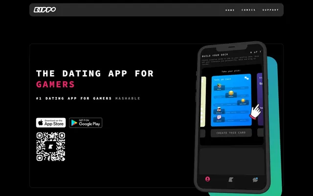
Preview image. Unlock full-res
Fuchsia glow in the dark.
Color palette
Red action color for filled buttons, selected navigation states, and focused conversion moments.
Decorative gradient accent for highlights or special content
Decorative gradient accent, possibly for rewards or positive feedback
Subtle decorative gradient for background textures or UI embellishments
Page backgrounds, section dividers, default text for contrast
Card backgrounds, elevated container surfaces
Primary text, navigation links, button text, subtle borders
Muted text, secondary links
Typography
- Weights
- 400, 600, 700
- Sizes
- 10px, 12px, 16px, 42px
- Line height
- 1.19, 1.67, 1.88, 2
- Letter spacing
- 0.10em at 10px, 0.083em at 12px, 0.417em at 16px
- Fallback
- monospace
Body text, captions, and secondary information, maintaining a legible, compact density.
- Weights
- 400, 600, 700
- Sizes
- 10px, 12px, 16px, 42px
- Line height
- 1.19, 1.67, 1.88, 2
- Letter spacing
- 0.313em at 16px
- Fallback
- monospace
Subheadings and emphasized text, providing a slightly bolder voice while retaining the monospace aesthetic.
- Weights
- 400, 600, 700
- Sizes
- 10px, 12px, 16px, 42px
- Line height
- 1.19, 1.67, 1.88, 2
- Letter spacing
- 0.333em at 42px
- Fallback
- monospace
Primary headlines and impactful statements, using increased weight and generous letter spacing to command attention within the dark theme.
Spacing & shape
Components
Solid Kippo Fuchsia background (#ee1f66) with Snow Ghost text (#ffffff), 10px border-radius, and 10px vertical, 15px horizontal padding. This is the primary call to action, demanding attention with its vibrant color.
Charcoal Surface (#29292a) background with 10px border-radius and 15px padding on all sides. Used for grouping related content in a distinct, elevated block.
Charcoal Surface (#29292a) background with a larger 15px border-radius and generous 35px vertical, 30px horizontal padding. Used for prominent content sections requiring more visual breathing room.
Transparent background with Snow Ghost text (#ffffff) and subtle 1px Snow Ghost border visible on hover or focus within a navigation menu. No border-radius or padding.
Guidelines
- Prioritize Kippo Fuchsia (#ee1f66) exclusively for primary calls to action or key interactive states, ensuring it stands out against the dark canvas.
- Container elements like cards should use Charcoal Surface (#29292a) with radius 10px, providing subtle depth against the Pitch Black (#000000) background.
- Use Source Code Pro at weight 700 and size 42px for main headlines, applying its distinctive 0.333em letter spacing to establish brand identity.
- Employ consistent padding of 15px around content within cards and as element gaps between distinct UI elements.
- Ensure all interactive elements and content containers adhere to either 10px or 15px border-radius for a consistent soft-edged aesthetic.
- For all text content, default to Source Code Pro with Snow Ghost (#ffffff) for readability on dark backgrounds.
- Do not introduce new saturated colors; maintain the brand focus on Kippo Fuchsia (#ee1f66) as the primary accent.
- Avoid using drop shadows for elevation; rely on background color changes from Pitch Black (#000000) to Charcoal Surface (#29292a) and border radii for depth.
- Do not use generic sans-serif fonts; the monospace Source Code Pro is integral to the brand's 'gamer tech' aesthetic.
- Never overcrowd sections; maintain a generous sectionGap of 50px between major content blocks to preserve visual breathing room.
- Avoid sharp corners on interactive components; 10px or 15px border radii are critical for the brand's softer, approachable feel.
About this system
ShowHide
Kippo builds a dark-mode, gaming-centric interface with a compelling use of a single vibrant fuchsia accent color against a deep charcoal background. Typography leans modern and compact, utilizing a monospace font that evokes code or terminal screens. Interactive elements are softened with generous corner radii, creating a friendly contrast to the sharp, dark theme. The overall aesthetic is engaging and dynamic, designed to keep users immersed.
The page model is a max-width contained layout at 1170px, centered on the screen, creating a focused content area while allowing the Pitch Black background to extend full-bleed. The hero pattern features a split layout: a bold, centered headline on the left alongside a product UI screenshot within a dark mobile mock-up on the right. Sections primarily follow an alternating content arrangement, featuring textual information on one side and supporting visuals or client logos on the other. A rhythm of consistent vertical spacing is created by a section gap of 50px between major blocks, sometimes with a sub-section elementGap of 15px. Navigation is a sticky top bar with minimal links.
This site uses product screenshots and abstract vector illustrations. Product screenshots are typically displayed within a mobile device mock-up, showcasing UI functionality. Abstract vector illustrations are used decoratively, sometimes with subtle gradients like Sunshine Aura or Fresh Mint Gradient. Photography is minimal, appearing primarily as small profile images of users, often desaturated or blended into the dark theme. Icons are outlined, mono-color (either Snow Ghost or Kippo Fuchsia), and have a substantial stroke weight, sometimes with a 50px border-radius creating a circular appearance. Imagery serves both as explanatory content (product UI) and decorative atmosphere (abstract graphics), maintaining a balanced density relative to the text.
Reminiscent of Discord, Twitch, Razer, Linear.
# Kippo — Style Reference
> Fuchsia glow in the dark.

**Theme:** dark

**Site:** https://kippo.com

Kippo builds a dark-mode, gaming-centric interface with a compelling use of a single vibrant fuchsia accent color against a deep charcoal background. Typography leans modern and compact, utilizing a monospace font that evokes code or terminal screens. Interactive elements are softened with generous corner radii, creating a friendly contrast to the sharp, dark theme. The overall aesthetic is engaging and dynamic, designed to keep users immersed.

## Tokens — Colors

| Name | Value | Token | Role |
|------|------|------|------|
| Kippo Fuchsia | `#ee1f66` | `--color-kippo-fuchsia` | Red action color for filled buttons, selected navigation states, and focused conversion moments. |
| Sunshine Aura | `#ffc400` | `--color-sunshine-aura` | Decorative gradient accent for highlights or special content |
| Fresh Mint Gradient | `#33beff` | `--color-fresh-mint-gradient` | Decorative gradient accent, possibly for rewards or positive feedback |
| Silver Gloss Gradient | `#cfcfcf` | `--color-silver-gloss-gradient` | Subtle decorative gradient for background textures or UI embellishments |
| Pitch Black | `#000000` | `--color-pitch-black` | Page backgrounds, section dividers, default text for contrast |
| Charcoal Surface | `#29292a` | `--color-charcoal-surface` | Card backgrounds, elevated container surfaces |
| Snow Ghost | `#ffffff` | `--color-snow-ghost` | Primary text, navigation links, button text, subtle borders |
| Smoke Text | `#333333` | `--color-smoke-text` | Muted text, secondary links |

## Tokens — Typography

### Source Code Pro
- **Substitute:** monospace
- **Weights:** 400, 600, 700
- **Sizes:** 10px, 12px, 16px, 42px
- **Line height:** 1.19, 1.67, 1.88, 2
- **Letter spacing:** 0.10em at 10px, 0.083em at 12px, 0.417em at 16px
- **Role:** Body text, captions, and secondary information, maintaining a legible, compact density.

### Source Code Pro
- **Substitute:** monospace
- **Weights:** 400, 600, 700
- **Sizes:** 10px, 12px, 16px, 42px
- **Line height:** 1.19, 1.67, 1.88, 2
- **Letter spacing:** 0.313em at 16px
- **Role:** Subheadings and emphasized text, providing a slightly bolder voice while retaining the monospace aesthetic.

### Source Code Pro
- **Substitute:** monospace
- **Weights:** 400, 600, 700
- **Sizes:** 10px, 12px, 16px, 42px
- **Line height:** 1.19, 1.67, 1.88, 2
- **Letter spacing:** 0.333em at 42px
- **Role:** Primary headlines and impactful statements, using increased weight and generous letter spacing to command attention within the dark theme.

## Tokens — Type Scale

| Role | Size | Line height | Letter spacing |
|------|------|------|------|
| caption | 10px | 1.67 | 1px |
| body | 16px | 1.67 | 6.67px |
| heading | 42px | 1.88 | 14px |

## Tokens — Spacing

- **Max width:** 1170px
- **Section gap:** 50px
- **Card padding:** 15px
- **Element gap:** 15px

## Tokens — Radius

- **Buttons:** 10px
- **Cards:** 10px
- **Images:** 15px
- **icons:** 50px
- **other:** 15px

## Layout

The page model is a max-width contained layout at 1170px, centered on the screen, creating a focused content area while allowing the Pitch Black background to extend full-bleed. The hero pattern features a split layout: a bold, centered headline on the left alongside a product UI screenshot within a dark mobile mock-up on the right. Sections primarily follow an alternating content arrangement, featuring textual information on one side and supporting visuals or client logos on the other. A rhythm of consistent vertical spacing is created by a section gap of 50px between major blocks, sometimes with a sub-section elementGap of 15px. Navigation is a sticky top bar with minimal links.

## Imagery

This site uses product screenshots and abstract vector illustrations. Product screenshots are typically displayed within a mobile device mock-up, showcasing UI functionality. Abstract vector illustrations are used decoratively, sometimes with subtle gradients like Sunshine Aura or Fresh Mint Gradient. Photography is minimal, appearing primarily as small profile images of users, often desaturated or blended into the dark theme. Icons are outlined, mono-color (either Snow Ghost or Kippo Fuchsia), and have a substantial stroke weight, sometimes with a 50px border-radius creating a circular appearance. Imagery serves both as explanatory content (product UI) and decorative atmosphere (abstract graphics), maintaining a balanced density relative to the text.

## Components

### Primary Action Button
*Interactive element*

Solid Kippo Fuchsia background (#ee1f66) with Snow Ghost text (#ffffff), 10px border-radius, and 10px vertical, 15px horizontal padding. This is the primary call to action, demanding attention with its vibrant color.

### Standard Card
*Content container*

Charcoal Surface (#29292a) background with 10px border-radius and 15px padding on all sides. Used for grouping related content in a distinct, elevated block.

### Promo Callout Card
*Featured content container*

Charcoal Surface (#29292a) background with a larger 15px border-radius and generous 35px vertical, 30px horizontal padding. Used for prominent content sections requiring more visual breathing room.

### Ghost Navigation Link
*Navigation element*

Transparent background with Snow Ghost text (#ffffff) and subtle 1px Snow Ghost border visible on hover or focus within a navigation menu. No border-radius or padding.

## Guidelines

### Do

- Prioritize Kippo Fuchsia (#ee1f66) exclusively for primary calls to action or key interactive states, ensuring it stands out against the dark canvas.
- Container elements like cards should use Charcoal Surface (#29292a) with radius 10px, providing subtle depth against the Pitch Black (#000000) background.
- Use Source Code Pro at weight 700 and size 42px for main headlines, applying its distinctive 0.333em letter spacing to establish brand identity.
- Employ consistent padding of 15px around content within cards and as element gaps between distinct UI elements.
- Ensure all interactive elements and content containers adhere to either 10px or 15px border-radius for a consistent soft-edged aesthetic.
- For all text content, default to Source Code Pro with Snow Ghost (#ffffff) for readability on dark backgrounds.

### Don't

- Do not introduce new saturated colors; maintain the brand focus on Kippo Fuchsia (#ee1f66) as the primary accent.
- Avoid using drop shadows for elevation; rely on background color changes from Pitch Black (#000000) to Charcoal Surface (#29292a) and border radii for depth.
- Do not use generic sans-serif fonts; the monospace Source Code Pro is integral to the brand's 'gamer tech' aesthetic.
- Never overcrowd sections; maintain a generous sectionGap of 50px between major content blocks to preserve visual breathing room.
- Avoid sharp corners on interactive components; 10px or 15px border radii are critical for the brand's softer, approachable feel.

## Agent Prompt Guide

Quick Color Reference:
text: #ffffff
background: #000000
border: #ffffff
accent: #ee1f66
primary action: #ee1f66 (filled action)

Example Component Prompts:
1. Create a Primary Action Button: #ee1f66 background, #ffffff text, 9999px radius, compact pill padding. Use this filled treatment for the main CTA.
2. Create a feature card: Charcoal Surface (#29292a) background, 10px radius, 15px padding. Title 'Match based on what you both love' in Snow Ghost (#ffffff) using Source Code Pro weight 600 at 16px, letter-spacing 5px. Body text in Snow Ghost (#ffffff) using Source Code Pro weight 400 at 12px, letter-spacing 1px.
3. Create a navigation bar: Pitch Black (#000000) background. Left aligned logo. Right aligned navigation links 'Home', 'Comics', 'Support' as Ghost Navigation Links in Snow Ghost (#ffffff).
4. Create a download button for an app store: Primary Action Button with Kippo Fuchsia (#ee1f66) background, Snow Ghost (#ffffff) text, 10px radius, 10px vertical/15px horizontal padding. The button should display an app store icon to its left, which is outlined and white.
5. Create a callout section for partners: Pitch Black (#000000) background. Heading 'AS SEEN ON' in Snow Ghost (#ffffff) using Source Code Pro weight 400 at 16px, letter-spacing 6.67px. Display logos, e.g., 'Mashable', as interactive elements with Snow Ghost (#ffffff) text which changes to Kippo Fuchsia (#ee1f66) on hover.
More like this








Keep what you find
A free account saves references to boards and can send you a weekly email of picks based on what you save.
To see every result, go Pro.