Preview image. Unlock full-res
Clinical clarity on white canvas
Color palette
Primary brand color, navigation backgrounds, button fills, and a dominant footer background gradient — signifies trust and authority; A subtle left-to-right gradient, used for prominent background elements like the footer, deepening the primary brand color
Accent for links, interactive borders, and icon strokes — provides a cool, clinical highlight against neutrals, indicating interactive states or important information
Primary text color for all content, headings, and neutral link/button borders — ensures high contrast and legibility
Main page background, default button text, and neutral borders — provides a clean, expansive foundation for content
Secondary background for subtle content separation or cards — offers a warmer, slightly off-white surface
Tertiary background color for distinct content blocks or subtle cards — offers another subtle variation in surface tone
Typography
- Weights
- 100, 200, 400, 500, 600
- Sizes
- 12px, 13px, 14px, 18px
- Line height
- 1.05, 1.3, 1.4, 1.5, 1.6
- Letter spacing
- -0.3px at 12px, -0.4px at 13px, -0.45px at 14px, -0.9px at 18px
- Fallback
- Inter
Functional text for navigation, body copy, and secondary information — its compact line height and subtle tracking create a concise, efficient visual rhythm.
- Weights
- 500
- Sizes
- 48px, 64px
- Line height
- 1.1, 1.2
- Letter spacing
- -1.44px at 48px, -1.28px at 64px
- Fallback
- Tiempos Headline
Display headings and prominent titles — the moderate weight and tight letter-spacing give it a formal, confident presence without being overly bold. Characterized by specific 'case' and 'liga' features that refine its appearance.
Spacing & shape
Components
Filled with Midnight Indigo (#2e3fd2), Canvas White (#ffffff) text, 4px border-radius, with 14px vertical and 20px horizontal padding. Font: Surt, 14px, weight 400.
Transparent background, Canvas White (#ffffff) text, with an implicit 9999px border-radius for pill shape. Padding is handled by the text content's natural spacing.
Transparent background, Ebony Text (#302625) text, no explicit border-radius. Used for discreet actions or text-based links that function as buttons.
Ebony Text (#302625) color, transparent background, with 10px vertical and 20px horizontal padding. No explicit border-radius but often appears with interactive states that round to 9999px.
Transparent background, no box shadow, 0px border-radius. Features 72px top padding, and 0px horizontal padding, with a large 128px bottom padding to separate sections.
Background color #efe0d9 (Parchment Tan), Ebony Text (#302625) for text. Minimal padding to make it compact: 14px vertical, with a subtle border for separation.
Guidelines
- Prioritize Canvas White (#ffffff) as the dominant background for body content to maintain a clean appearance.
- Use Midnight Indigo (#2e3fd2) for primary calls-to-action and significant branding elements like the footer.
- Apply Super font for all main headings (H1, H2) with weight 500 and tight letter-spacing (-1.28px at 64px, -1.44px at 48px).
- Use Surt font for body text, navigation, and detailed information, opting for lighter weights (400) for readability.
- Employ Arctic Teal (#5ed7de) as the primary accent color for active states, links, and illustrative details.
- Maintain comfortable element spacing using a base of 8px, with multiples like 16px, 24px and 40px for consistency.
- Ensure buttons use a 4px border-radius, while smaller interactive elements like tags or active navigation tabs can use a 9999px (pill) radius.
- Avoid using heavy box shadows; elevation is minimal and surfaces are predominantly flat.
- Do not introduce new saturated colors outside of Midnight Indigo or Arctic Teal; maintain a controlled palette.
- Refrain from using overly decorative elements or gradients unless they are the brand's primary Midnight Indigo Gradient.
- Do not use letter-spacing on body text or standard paragraph elements, reserve custom tracking for headlines and navigation.
- Avoid large, expansive padding on components unless specifically for section breaks, promoting a denser, information-focused layout.
- Do not deviate from the established font families Surt and Super; avoid using system fonts or other typefaces.
- Avoid dark-themed sections on pages prominently displaying a light theme, except for the clearly defined footer area.
About this system
ShowHide
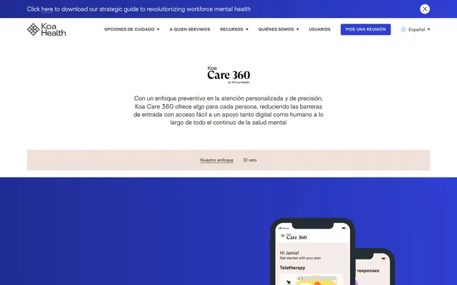
Koa Health presents a calm, structured brand identity, marrying a clinical white canvas with deep, authoritative blues. Its visual system is built on compact, precise typography that prioritizes scannability, offset by a single vivid teal as an accent color for interactive elements and subtle highlights. Component treatment is minimal, emphasizing content clarity through soft surfaces and clear borders rather than heavy-handed elevation or decorative elements. The overall aesthetic is one of understated professionalism and focused user experience.
The page primarily uses a max-width 1440px centered layout. The hero section is full-width with a significant top margin, featuring a centered headline and description. Content sections maintain consistent vertical spacing, often with text-heavy blocks, sometimes paired with illustrations or product UI shots. The footer is a full-bleed block of Midnight Indigo gradient. Navigation is a sticky top bar, accommodating an internal menu and a 'Request a meeting' button.
The imagery leans towards product screenshots of mobile interfaces, treated as contained, rectangular blocks without overlapping or complex masking. There's an absence of lifestyle photography, focusing instead on UI elements and information. Icons are primarily outlined, thin-stroked, and monochrome, often in Arctic Teal, serving as functional accents rather than decorative elements. The visual density of imagery is low, with text dominating most sections.
Reminiscent of Calm (app), Headspace, Modern Health, Omada Health.
# Koa Health — Style Reference
> Clinical clarity on white canvas

**Theme:** light

**Site:** https://foundations.koahealth.com

Koa Health presents a calm, structured brand identity, marrying a clinical white canvas with deep, authoritative blues. Its visual system is built on compact, precise typography that prioritizes scannability, offset by a single vivid teal as an accent color for interactive elements and subtle highlights. Component treatment is minimal, emphasizing content clarity through soft surfaces and clear borders rather than heavy-handed elevation or decorative elements. The overall aesthetic is one of understated professionalism and focused user experience.

## Tokens — Colors

| Name | Value | Token | Role |
|------|------|------|------|
| Midnight Indigo | `#2e3fd2` | `--color-midnight-indigo` | Primary brand color, navigation backgrounds, button fills, and a dominant footer background gradient — signifies trust and authority; A subtle left-to-right gradient, used for prominent background elements like the footer, deepening the primary brand color |
| Arctic Teal | `#5ed7de` | `--color-arctic-teal` | Accent for links, interactive borders, and icon strokes — provides a cool, clinical highlight against neutrals, indicating interactive states or important information |
| Ebony Text | `#302625` | `--color-ebony-text` | Primary text color for all content, headings, and neutral link/button borders — ensures high contrast and legibility |
| Canvas White | `#ffffff` | `--color-canvas-white` | Main page background, default button text, and neutral borders — provides a clean, expansive foundation for content |
| Soft Vanilla | `#fef8f4` | `--color-soft-vanilla` | Secondary background for subtle content separation or cards — offers a warmer, slightly off-white surface |
| Parchment Tan | `#efe0d9` | `--color-parchment-tan` | Tertiary background color for distinct content blocks or subtle cards — offers another subtle variation in surface tone |

## Tokens — Typography

### Surt
- **Substitute:** Inter
- **Weights:** 100, 200, 400, 500, 600
- **Sizes:** 12px, 13px, 14px, 18px
- **Line height:** 1.05, 1.3, 1.4, 1.5, 1.6
- **Letter spacing:** -0.3px at 12px, -0.4px at 13px, -0.45px at 14px, -0.9px at 18px
- **Role:** Functional text for navigation, body copy, and secondary information — its compact line height and subtle tracking create a concise, efficient visual rhythm.

### Super
- **Substitute:** Tiempos Headline
- **Weights:** 500
- **Sizes:** 48px, 64px
- **Line height:** 1.1, 1.2
- **Letter spacing:** -1.44px at 48px, -1.28px at 64px
- **Role:** Display headings and prominent titles — the moderate weight and tight letter-spacing give it a formal, confident presence without being overly bold. Characterized by specific 'case' and 'liga' features that refine its appearance.

## Tokens — Type Scale

Perfect Fifth (1.5) from 14px base.

| Role | Size | Line height | Letter spacing |
|------|------|------|------|
| caption | 12px | 1.5 | 0.36px |
| body | 14px | 1.3 | 0.42px |
| subheading | 18px | 1.6 | 0.18px |
| heading | 48px | 1.2 | -1.44px |
| display | 64px | 1.1 | -1.28px |

## Tokens — Spacing

- **Max width:** 1440px
- **Section gap:** 80px
- **Card padding:** 40px
- **Element gap:** 8px

## Tokens — Radius

- **Buttons:** 4px
- **navItems:** 9999px
- **tags:** 9999px

## Layout

The page primarily uses a max-width 1440px centered layout. The hero section is full-width with a significant top margin, featuring a centered headline and description. Content sections maintain consistent vertical spacing, often with text-heavy blocks, sometimes paired with illustrations or product UI shots. The footer is a full-bleed block of Midnight Indigo gradient. Navigation is a sticky top bar, accommodating an internal menu and a 'Request a meeting' button.

## Imagery

The imagery leans towards product screenshots of mobile interfaces, treated as contained, rectangular blocks without overlapping or complex masking. There's an absence of lifestyle photography, focusing instead on UI elements and information. Icons are primarily outlined, thin-stroked, and monochrome, often in Arctic Teal, serving as functional accents rather than decorative elements. The visual density of imagery is low, with text dominating most sections.

## Components

### Primary Filled Button
*Key calls to action*

Filled with Midnight Indigo (#2e3fd2), Canvas White (#ffffff) text, 4px border-radius, with 14px vertical and 20px horizontal padding. Font: Surt, 14px, weight 400.

### Ghost Navigation Button
*Secondary actions within navigation*

Transparent background, Canvas White (#ffffff) text, with an implicit 9999px border-radius for pill shape. Padding is handled by the text content's natural spacing.

### Ghost Text Button
*Outline/text links*

Transparent background, Ebony Text (#302625) text, no explicit border-radius. Used for discreet actions or text-based links that function as buttons.

### Navigation Link
*Primary navigation items*

Ebony Text (#302625) color, transparent background, with 10px vertical and 20px horizontal padding. No explicit border-radius but often appears with interactive states that round to 9999px.

### Feature Card (Ghost)
*Informational content blocks*

Transparent background, no box shadow, 0px border-radius. Features 72px top padding, and 0px horizontal padding, with a large 128px bottom padding to separate sections.

### Message Bar (Top)
*Global announcements or alerts*

Background color #efe0d9 (Parchment Tan), Ebony Text (#302625) for text. Minimal padding to make it compact: 14px vertical, with a subtle border for separation.

## Guidelines

### Do

- Prioritize Canvas White (#ffffff) as the dominant background for body content to maintain a clean appearance.
- Use Midnight Indigo (#2e3fd2) for primary calls-to-action and significant branding elements like the footer.
- Apply Super font for all main headings (H1, H2) with weight 500 and tight letter-spacing (-1.28px at 64px, -1.44px at 48px).
- Use Surt font for body text, navigation, and detailed information, opting for lighter weights (400) for readability.
- Employ Arctic Teal (#5ed7de) as the primary accent color for active states, links, and illustrative details.
- Maintain comfortable element spacing using a base of 8px, with multiples like 16px, 24px and 40px for consistency.
- Ensure buttons use a 4px border-radius, while smaller interactive elements like tags or active navigation tabs can use a 9999px (pill) radius.

### Don't

- Avoid using heavy box shadows; elevation is minimal and surfaces are predominantly flat.
- Do not introduce new saturated colors outside of Midnight Indigo or Arctic Teal; maintain a controlled palette.
- Refrain from using overly decorative elements or gradients unless they are the brand's primary Midnight Indigo Gradient.
- Do not use letter-spacing on body text or standard paragraph elements, reserve custom tracking for headlines and navigation.
- Avoid large, expansive padding on components unless specifically for section breaks, promoting a denser, information-focused layout.
- Do not deviate from the established font families Surt and Super; avoid using system fonts or other typefaces.
- Avoid dark-themed sections on pages prominently displaying a light theme, except for the clearly defined footer area.

## Agent Prompt Guide

Quick Color Reference:
text: #302625
background: #ffffff
border: #302625
accent: #5ed7de
primary action: #2e3fd2 (filled action)

Example Component Prompts:
1. Create a primary call-to-action button: 'Pide una reunión' text in Canvas White (#ffffff), filled with Midnight Indigo (#2e3fd2), 4px border-radius. Font: Surt, 14px, weight 400. Padding 14px vertical, 20px horizontal.
2. Create a ghost navigation item: 'Opciones de cuidado' text in Ebony Text (#302625). Font: Surt, 14px, weight 400. Transparent background.
3. Create a footer link: 'info@koahealth.com' text in Arctic Teal (#5ed7de). Font: Surt, 12px, weight 400. No underline by default.
4. Create a main page heading: 'Koa Care 360' text in Ebony Text (#302625). Font: Super, 64px, weight 500, letter-spacing -1.28px, line-height 1.1.
More like this








Keep what you find
A free account saves references to boards and can send you a weekly email of picks based on what you save.
To see every result, go Pro.