Preview image. Unlock full-res
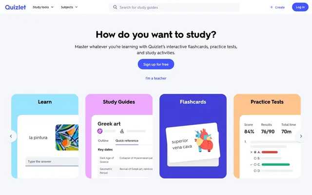
Academic Playground on Soft Gray. Like a well-organized desk scattered with colorful learning tools.
Color palette
Primary interactive elements, main CTA buttons, active links, important icons, defining Quizlet's brand identity.
Decorative background for 'Learn' card, adding a moderate, fresh accent.
Decorative background for 'Study Guides' card, adding a playful, vivid accent.
Decorative background for 'Flashcards' card, a darker, more intense variant of the brand violet.
Decorative background for 'Practice Tests' card, a moderate, warm accent.
Secondary text, less prominent icons, button outlines, subtle informational text.
Subtle borders, inactive states, lighter text elements for hierarchical distinction.
Detailed body text, specific informational blocks, providing a muted contrast.
Dominant background color for the entire application, serving as a bright, clean foundation.
Card backgrounds, section separators, text on dark buttons, establishing a crisp, elevated surface.
Dividers, subtle input borders, defining content boundaries without harshness.
Typography
- Weights
- 400, 600, 700
- Sizes
- 12px, 14px, 16px, 20px, 21px, 24px, 32px, 44px
- Line height
- 1.25, 1.27, 1.33, 1.4, 1.43, 1.5, 1.63
- Letter spacing
- normal
- Fallback
- system-ui, sans-serif
Primary typeface for all textual content from headlines to body text, buttons, and navigation. Its consistent application across all sizes and weights establishes a direct, legible tone.
Spacing & shape
Elevation
Components
Transparent background (`rgba(0, 0, 0, 0)`), text 'Quizlet Violet' (`#4255ff`), `hurme_no2-webfont` weight 400 at 16px, padding `0px`, `4px` border-radius.
Transparent background (`rgba(0, 0, 0, 0)`), text 'Ash Border' (`#d9dde8`) (likely for inactive state), `50%` border-radius resulting in a circle, `0px` padding.
Transparent background (`rgba(0, 0, 0, 0)`), text 'Stormcloud Ink' (`#282e3e`), `0px` border-radius, `0px` padding, typically for internal navigation.
Background 'Pure White' (`#ffffff`), `8px` border-radius, `Stormcloud Ink` (`rgba(40, 46, 62, 0.1) 0px 4px 16px 0px`) shadow, `Sky Study` (`#98e3ff`) background accent for content block.
Background 'Pure White' (`#ffffff`), `8px` border-radius, `Stormcloud Ink` (`rgba(40, 46, 62, 0.1) 0px 4px 16px 0px`) shadow, `Night Violet` (`#423ed8`) background accent for content block.
Background 'Pure White' (`#ffffff`), `8px` border-radius, `Stormcloud Ink` (`rgba(40, 46, 62, 0.1) 0px 4px 16px 0px`) shadow, `Practice Orange` (`#ffc38c`) background accent for content block.
Guidelines
- Use 'Page Background' (`#f6f7fb`) as the foundational canvas for all pages.
- Apply 'Quizlet Violet' (`#4255ff`) exclusively for primary call-to-action buttons and key interactive elements to maintain focus.
- Utilize `hurme_no2-webfont` weight 700 for headlines and primary CTA button text to ensure clear hierarchy and impact.
- Maintain `8px` border-radius for all content cards and larger container elements, and `4px` for input fields and smaller interactive items.
- Employ the `Stormcloud Ink` shadow (`rgba(40, 46, 62, 0.1) 0px 4px 16px 0px`) for elevated components like cards and navigation to create subtle depth.
- Employ `16px` padding for internal spacing within content blocks and `48px` for vertical separation between major sections.
- Use `Stormcloud Ink` (`#282e3e`) for main body text and prominent informational text, and `Slate Text` (`#586380`) for secondary text details.
- Do not introduce new highly saturated colors outside of the defined accent palette, as they will clash with the established brand hues.
- Avoid using `200px` border-radius on any element other than primary buttons to preserve their distinctive pill shape.
- Do not use generic system fonts; only `hurme_no2-webfont` should be used for all text content.
- Refrain from heavy, dark shadows; the subtle `Stormcloud Ink` shadow is sufficient for elevation.
- Do not use `0px` border-radius on any visible component unless it's a specific, text-only navigation link, to preserve a soft, approachable aesthetic.
- Do not cluster too much vibrant imagery; allow the core UI colors and clean layout to guide user attention.
- Avoid using `Pure White` (#ffffff) for any primary text color; it's reserved for backgrounds and text on dark buttons.
About this system
ShowHide
This design system feels like a friendly, structured learning environment, prioritizing clarity and interactive engagement. The dominant near-gray background (#F6F7FB) provides a clean canvas, while a palette of vivid and moderate hues—primarily a bold violet (#4255FF) and accent colors like light blue (#98E3FF) and vibrant pink (#EEAAFF)—define interactive elements and illustrate content categories. The consistent use of `hurme_no2-webfont` with varying weights creates a cohesive textual experience, balancing readability with a distinctive, approachable character.
The page primarily uses a max-width contained layout, approximately 1200px wide, centered within the browser. The hero section features a centered headline and subtext over a `Page Background` (`#f6f7fb`), followed by a row of distinct, accent-colored category cards. Sections generally follow a consistent `48px` vertical spacing. Content is often arranged in alternate text-left/image-right compositions for features, and a flexible grid for content cards (visible as a 3-column grid in some sections). The navigation is a fixed top bar (`64px` height) with a clear search input and primary CTA button. The footer is dense with links, organized into column lists.
Imagery features a mix of product screenshots demonstrating the app's interface (contained in stylized device mockups), flat, geometric illustrations that are brand-colored and serve as decorative accents on cards, and abstract graphics. Photography is largely absent. The icons are minimalistic, usually filled, with a medium stroke weight where outlines are present, consistent with the brand colors. Imagery plays a role in both explanatory content (product screenshots) and decorative atmosphere (card illustrations), balancing visual interest with clean UI. Density shows imagery playing a significant role in breaking up text and making sections more engaging, especially in the hero area and feature descriptions.
Reminiscent of Canva, Duolingo, Notion, Headspace.
# Quizlet — Style Reference
> Academic Playground on Soft Gray. Like a well-organized desk scattered with colorful learning tools.

**Theme:** light

**Site:** https://quizlet.com

This design system feels like a friendly, structured learning environment, prioritizing clarity and interactive engagement. The dominant near-gray background (#F6F7FB) provides a clean canvas, while a palette of vivid and moderate hues—primarily a bold violet (#4255FF) and accent colors like light blue (#98E3FF) and vibrant pink (#EEAAFF)—define interactive elements and illustrate content categories. The consistent use of `hurme_no2-webfont` with varying weights creates a cohesive textual experience, balancing readability with a distinctive, approachable character.

## Tokens — Colors

| Name | Value | Token | Role |
|------|------|------|------|
| Quizlet Violet | `#4255ff` | `--color-quizlet-violet` | Primary interactive elements, main CTA buttons, active links, important icons, defining Quizlet's brand identity. |
| Sky Study | `#98e3ff` | `--color-sky-study` | Decorative background for 'Learn' card, adding a moderate, fresh accent. |
| Flashcard Pink | `#eeaaff` | `--color-flashcard-pink` | Decorative background for 'Study Guides' card, adding a playful, vivid accent. |
| Night Violet | `#423ed8` | `--color-night-violet` | Decorative background for 'Flashcards' card, a darker, more intense variant of the brand violet. |
| Practice Orange | `#ffc38c` | `--color-practice-orange` | Decorative background for 'Practice Tests' card, a moderate, warm accent. |
| Slate Text | `#586380` | `--color-slate-text` | Secondary text, less prominent icons, button outlines, subtle informational text. |
| Light Slate | `#939bb4` | `--color-light-slate` | Subtle borders, inactive states, lighter text elements for hierarchical distinction. |
| Deep Slate | `#2e3856` | `--color-deep-slate` | Detailed body text, specific informational blocks, providing a muted contrast. |
| Page Background | `#f6f7fb` | `--color-page-background` | Dominant background color for the entire application, serving as a bright, clean foundation. |
| Pure White | `#ffffff` | `--color-pure-white` | Card backgrounds, section separators, text on dark buttons, establishing a crisp, elevated surface. |
| Ash Border | `#d9dde8` | `--color-ash-border` | Dividers, subtle input borders, defining content boundaries without harshness. |

## Tokens — Typography

### hurme_no2-webfont
- **Substitute:** system-ui, sans-serif
- **Weights:** 400, 600, 700
- **Sizes:** 12px, 14px, 16px, 20px, 21px, 24px, 32px, 44px
- **Line height:** 1.25, 1.27, 1.33, 1.4, 1.43, 1.5, 1.63
- **Letter spacing:** normal
- **Role:** Primary typeface for all textual content from headlines to body text, buttons, and navigation. Its consistent application across all sizes and weights establishes a direct, legible tone.

## Tokens — Type Scale

Major Third (1.25) from 16px base.

| Role | Size | Line height | Letter spacing |
|------|------|------|------|
| caption | 12px | 1.5 | — |
| body-sm | 14px | 1.43 | — |
| body | 16px | 1.5 | — |
| subheading | 20px | 1.25 | — |
| heading | 24px | 1.33 | — |
| heading-lg | 32px | 1.27 | — |
| display | 44px | 1.25 | — |

## Tokens — Spacing

- **Section gap:** 48px
- **Element gap:** 8px

## Tokens — Radius

- **General:** 4px
- **Buttons:** 200px
- **Inputs:** 4px
- **Cards:** 8px

## Tokens — Elevation

- **Card / Elevated Panel:** `rgba(40, 46, 62, 0.1) 0px 4px 16px 0px`
- **Button Focus:** `rgba(40, 46, 62, 0.1) 0px 2px 4px 0px`
- **Icon Outline / Inner Shadow:** `rgba(0, 0, 0, 0.3) 0px 0px 1px 0px inset`

## Layout

The page primarily uses a max-width contained layout, approximately 1200px wide, centered within the browser. The hero section features a centered headline and subtext over a `Page Background` (`#f6f7fb`), followed by a row of distinct, accent-colored category cards. Sections generally follow a consistent `48px` vertical spacing. Content is often arranged in alternate text-left/image-right compositions for features, and a flexible grid for content cards (visible as a 3-column grid in some sections). The navigation is a fixed top bar (`64px` height) with a clear search input and primary CTA button. The footer is dense with links, organized into column lists.

## Imagery

Imagery features a mix of product screenshots demonstrating the app's interface (contained in stylized device mockups), flat, geometric illustrations that are brand-colored and serve as decorative accents on cards, and abstract graphics. Photography is largely absent. The icons are minimalistic, usually filled, with a medium stroke weight where outlines are present, consistent with the brand colors. Imagery plays a role in both explanatory content (product screenshots) and decorative atmosphere (card illustrations), balancing visual interest with clean UI. Density shows imagery playing a significant role in breaking up text and making sections more engaging, especially in the hero area and feature descriptions.

## Components

### Study Mode Cards

### Flashcard Set Cards Grid

### CTA Button Group with Search Bar

### Secondary Button (Ghost)
*Action*

Transparent background (`rgba(0, 0, 0, 0)`), text 'Quizlet Violet' (`#4255ff`), `hurme_no2-webfont` weight 400 at 16px, padding `0px`, `4px` border-radius.

### Icon Button (Circular)
*Navigation/Action*

Transparent background (`rgba(0, 0, 0, 0)`), text 'Ash Border' (`#d9dde8`) (likely for inactive state), `50%` border-radius resulting in a circle, `0px` padding.

### Navigation Link Button
*Navigation*

Transparent background (`rgba(0, 0, 0, 0)`), text 'Stormcloud Ink' (`#282e3e`), `0px` border-radius, `0px` padding, typically for internal navigation.

### Category Card (Learn)
*Content Display*

Background 'Pure White' (`#ffffff`), `8px` border-radius, `Stormcloud Ink` (`rgba(40, 46, 62, 0.1) 0px 4px 16px 0px`) shadow, `Sky Study` (`#98e3ff`) background accent for content block.

### Category Card (Flashcards)
*Content Display*

Background 'Pure White' (`#ffffff`), `8px` border-radius, `Stormcloud Ink` (`rgba(40, 46, 62, 0.1) 0px 4px 16px 0px`) shadow, `Night Violet` (`#423ed8`) background accent for content block.

### Category Card (Practice Tests)
*Content Display*

Background 'Pure White' (`#ffffff`), `8px` border-radius, `Stormcloud Ink` (`rgba(40, 46, 62, 0.1) 0px 4px 16px 0px`) shadow, `Practice Orange` (`#ffc38c`) background accent for content block.

## Guidelines

### Do

- Use 'Page Background' (`#f6f7fb`) as the foundational canvas for all pages.
- Apply 'Quizlet Violet' (`#4255ff`) exclusively for primary call-to-action buttons and key interactive elements to maintain focus.
- Utilize `hurme_no2-webfont` weight 700 for headlines and primary CTA button text to ensure clear hierarchy and impact.
- Maintain `8px` border-radius for all content cards and larger container elements, and `4px` for input fields and smaller interactive items.
- Employ the `Stormcloud Ink` shadow (`rgba(40, 46, 62, 0.1) 0px 4px 16px 0px`) for elevated components like cards and navigation to create subtle depth.
- Employ `16px` padding for internal spacing within content blocks and `48px` for vertical separation between major sections.
- Use `Stormcloud Ink` (`#282e3e`) for main body text and prominent informational text, and `Slate Text` (`#586380`) for secondary text details.

### Don't

- Do not introduce new highly saturated colors outside of the defined accent palette, as they will clash with the established brand hues.
- Avoid using `200px` border-radius on any element other than primary buttons to preserve their distinctive pill shape.
- Do not use generic system fonts; only `hurme_no2-webfont` should be used for all text content.
- Refrain from heavy, dark shadows; the subtle `Stormcloud Ink` shadow is sufficient for elevation.
- Do not use `0px` border-radius on any visible component unless it's a specific, text-only navigation link, to preserve a soft, approachable aesthetic.
- Do not cluster too much vibrant imagery; allow the core UI colors and clean layout to guide user attention.
- Avoid using `Pure White` (#ffffff) for any primary text color; it's reserved for backgrounds and text on dark buttons.

## Agent Prompt Guide

### Quick Color Reference
- Text: `#282e3e` (Stormcloud Ink)
- Page Background: `#f6f7fb` (Page Background)
- CTA Button: `#4255ff` (Quizlet Violet)
- Border/Divider: `#d9dde8` (Ash Border)
- Accent (Learn Card): `#98e3ff` (Sky Study)

### 3-5 Example Component Prompts
1. **Create a hero section:** Background `Page Background` (`#f6f7fb`). Headline 'How do you want to study?' `hurme_no2-webfont` weight 700 at 44px, color `Stormcloud Ink` (`#282e3e`). Subtext 'Master whatever you're learning with Quizlet’s interactive flashcards, practice tests, and study activities.' `hurme_no2-webfont` weight 400 at 20px, color `Stormcloud Ink` (`#282e3e`). Primary CTA button 'Sign up for free' with background `Quizlet Violet` (`#4255ff`), text `Pure White` (`#ffffff`), `hurme_no2-webfont` weight 700 at 16px, `10px 16px` padding, and `200px` border-radius.
2. **Create a card for 'Flashcards':** Background `Pure White` (`#ffffff`), `8px` border-radius, `rgba(40, 46, 62, 0.1) 0px 4px 16px 0px` shadow. Inside the card, display an accent content block with background `Night Violet` (`#423ed8`) and a headline 'Flashcards' `hurme_no2-webfont` weight 700 at 24px, color `Pure White` (`#ffffff`).
3. **Create a secondary ghost button:** Text 'I’m a teacher' `hurme_no2-webfont` weight 400 at 16px, color `Quizlet Violet` (`#4255ff`), transparent background (`rgba(0, 0, 0, 0)`), and `0px` padding with `4px` border-radius.
4. **Generate a search input field:** Color `Stormcloud Ink` (`#282e3e`), transparent background (`rgba(0, 0, 0, 0)`), placeholder text `Stormcloud Ink` (`#282e3e`) (e.g., 'Search for study guides'), `4px` border-radius, with an implied `Ash Border` (`#d9dde8`) border on focus.
More like this





Keep what you find
A free account saves references to boards and can send you a weekly email of picks based on what you save.
To see every result, go Pro.