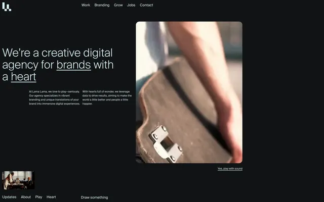
Preview image. Unlock full-res
Midnight theater with luminous text
Color palette
Primary text, ghost button borders and text, interactive element accents, subtle decorative strokes
Page backgrounds, card surfaces, primary text for some inverted sections
Deepest canvas background, secondary card surfaces providing subtle layering
Typography
- Weights
- 300, 400, 500, 700
- Sizes
- 10px, 12px, 14px, 16px, 30px, 40px, 50px, 134px
- Line height
- 0.86, 1, 1.06, 1.17, 1.22, 1.25, 1.38, 1.5, 1.56
- Letter spacing
- normal
- Fallback
- Inter
Primary typeface for all headings, body text, navigation, and interactive elements. Its range from light (300) to bold (700) supports a nuanced hierarchy within a compact line height for a dense, editorial feel.
Spacing & shape
Components
Text in Polar Mist (#d7f3f5), no background fill, bordered with a 1.5px solid Polar Mist (#d7f3f5) stroke. Features an 8px border-radius, maintaining a subtle pill-like shape only on active button.
Void Black (#020203) background, text in Polar Mist (#d7f3f5). Features a 15px border-radius without explicit borders or shadows, relying on background contrast for separation.
Text in Polar Mist (#d7f3f5) with no background. Underlined on hover or active state with Polar Mist (#d7f3f5).
Utilizes SuisseIntl at large sizes (40px, 50px, 134px) with weight 300, text in Polar Mist (#d7f3f5). Line height is compacted to create a dense, impactful block of text.
Polar Mist (#d7f3f5) text on a transparent background, with a 1.5px solid Polar Mist (#d7f3f5) border. 8px border-radius for a slightly rounded rectangular form. Inner padding is minimal to keep it compact.
Guidelines
- Prioritize Deep Charcoal (#111314) and Void Black (#020203) for backgrounds, establishing a dark, immersive canvas.
- Use Polar Mist (#d7f3f5) for all primary text, ghost button borders, and interactive accents to ensure high contrast.
- Apply SuisseIntl font consistently across all text elements, leveraging its varying weights for typographic hierarchy.
- Maintain a spacious layout with section gaps of 60-80px to prevent visual clutter and allow content to breathe.
- When creating cards or interactive elements, use a 15px border-radius for a consistent soft-edged appearance.
- For all primary action buttons, employ the ghost style using Polar Mist (#d7f3f5) for text and border, with an 8px border-radius.
- Avoid using bright or vivid colors for large background areas; reserve chromatic accents for subtle interactive states or small functional elements.
- Do not introduce heavy drop shadows or busy decorative elements that would disrupt the understated, contained aesthetic.
- Refrain from using bold typefaces for body text or subheadings; reserve heavier weights for high-impact headlines only.
- Do not deviate from the defined border radii; maintain 15px for card-like elements and 8px for buttons.
- Avoid tight spacing for content blocks or sections; maintain generous padding to uphold the design's comfortable density.
- Do not use black for text on a deep charcoal background; ensure sufficient contrast by using Polar Mist (#d7f3f5).
About this system
ShowHide
Lama Lama employs a dark mode aesthetic with a rich, immersive character, balancing deep charcoal backgrounds with luminous, near-white typography for high contrast. The visual system is defined by its understated UI elements, which often surface through subtle borders rather than solid fills, allowing content such as photography and video to dominate. Typography is compact and precise, maintaining clarity within the spacious, uncrowded layouts. Components are minimal, relying on rounded corners and ghost-like interactions to suggest functionality without visual clutter.
The page uses a full-bleed layout on a dark canvas, primarily centered content sections within an implied max-width. The hero section features a centered headline over a video or prominent visual, with supporting text below. Subsequent sections often use split-pane layouts, presenting visuals on one side and text on the other, or a dynamic grid for featured projects. Vertical rhythm is established by consistent large section gaps (60-80px), creating a sense of spaciousness. Navigation is a minimalist top bar, with a persistent footer at the bottom containing utility links.
Imagery primarily features product/project videos and still photography presented within rounded containers. The treatment suggests a focus on the subject, often with a slight vignette or deep, rich tones that blend with the dark background. Photography is mostly product-focused or environmental, avoiding overt lifestyle shots. Small illustrative icons are outlined and monochrome, matching the Polar Mist (#d7f3f5) accent color. Imagery generally serves to showcase work and provide atmospheric context, while maintaining a balanced density with text.
Reminiscent of Huge Inc., Locomotive, Basic Theory.
# Lama Lama — Style Reference
> Midnight theater with luminous text

**Theme:** dark

**Site:** https://lamalama.nl

Lama Lama employs a dark mode aesthetic with a rich, immersive character, balancing deep charcoal backgrounds with luminous, near-white typography for high contrast. The visual system is defined by its understated UI elements, which often surface through subtle borders rather than solid fills, allowing content such as photography and video to dominate. Typography is compact and precise, maintaining clarity within the spacious, uncrowded layouts. Components are minimal, relying on rounded corners and ghost-like interactions to suggest functionality without visual clutter.

## Tokens — Colors

| Name | Value | Token | Role |
|------|------|------|------|
| Polar Mist | `#d7f3f5` | `--color-polar-mist` | Primary text, ghost button borders and text, interactive element accents, subtle decorative strokes |
| Deep Charcoal | `#111314` | `--color-deep-charcoal` | Page backgrounds, card surfaces, primary text for some inverted sections |
| Void Black | `#020203` | `--color-void-black` | Deepest canvas background, secondary card surfaces providing subtle layering |

## Tokens — Typography

### SuisseIntl
- **Substitute:** Inter
- **Weights:** 300, 400, 500, 700
- **Sizes:** 10px, 12px, 14px, 16px, 30px, 40px, 50px, 134px
- **Line height:** 0.86, 1, 1.06, 1.17, 1.22, 1.25, 1.38, 1.5, 1.56
- **Letter spacing:** normal
- **Role:** Primary typeface for all headings, body text, navigation, and interactive elements. Its range from light (300) to bold (700) supports a nuanced hierarchy within a compact line height for a dense, editorial feel.

## Tokens — Type Scale

| Role | Size | Line height | Letter spacing |
|------|------|------|------|
| caption | 10px | 1.5 | — |
| body | 14px | 1.22 | — |
| heading-sm | 30px | 1.06 | — |
| heading | 40px | 1 | — |
| heading-lg | 50px | 0.86 | — |
| display | 134px | 0.86 | — |

## Tokens — Spacing

- **Section gap:** 60-80px
- **Card padding:** 40px
- **Element gap:** 8-10px

## Tokens — Radius

- **Buttons:** 8px
- **Cards:** 15px
- **interactiveElements:** 15px

## Layout

The page uses a full-bleed layout on a dark canvas, primarily centered content sections within an implied max-width. The hero section features a centered headline over a video or prominent visual, with supporting text below. Subsequent sections often use split-pane layouts, presenting visuals on one side and text on the other, or a dynamic grid for featured projects. Vertical rhythm is established by consistent large section gaps (60-80px), creating a sense of spaciousness. Navigation is a minimalist top bar, with a persistent footer at the bottom containing utility links.

## Imagery

Imagery primarily features product/project videos and still photography presented within rounded containers. The treatment suggests a focus on the subject, often with a slight vignette or deep, rich tones that blend with the dark background. Photography is mostly product-focused or environmental, avoiding overt lifestyle shots. Small illustrative icons are outlined and monochrome, matching the Polar Mist (#d7f3f5) accent color. Imagery generally serves to showcase work and provide atmospheric context, while maintaining a balanced density with text.

## Components

### Ghost Action Button
*Primary interactive control for calls to action or navigation.*

Text in Polar Mist (#d7f3f5), no background fill, bordered with a 1.5px solid Polar Mist (#d7f3f5) stroke. Features an 8px border-radius, maintaining a subtle pill-like shape only on active button.

### Feature Card
*Container for project highlights or content blocks.*

Void Black (#020203) background, text in Polar Mist (#d7f3f5). Features a 15px border-radius without explicit borders or shadows, relying on background contrast for separation.

### Navigation Link
*Interactive text link within headers and footers.*

Text in Polar Mist (#d7f3f5) with no background. Underlined on hover or active state with Polar Mist (#d7f3f5).

### Hero Headline
*Prominent headline for introductory sections.*

Utilizes SuisseIntl at large sizes (40px, 50px, 134px) with weight 300, text in Polar Mist (#d7f3f5). Line height is compacted to create a dense, impactful block of text.

### Play Showreel Button
*Specific action button for media playback.*

Polar Mist (#d7f3f5) text on a transparent background, with a 1.5px solid Polar Mist (#d7f3f5) border. 8px border-radius for a slightly rounded rectangular form. Inner padding is minimal to keep it compact.

## Guidelines

### Do

- Prioritize Deep Charcoal (#111314) and Void Black (#020203) for backgrounds, establishing a dark, immersive canvas.
- Use Polar Mist (#d7f3f5) for all primary text, ghost button borders, and interactive accents to ensure high contrast.
- Apply SuisseIntl font consistently across all text elements, leveraging its varying weights for typographic hierarchy.
- Maintain a spacious layout with section gaps of 60-80px to prevent visual clutter and allow content to breathe.
- When creating cards or interactive elements, use a 15px border-radius for a consistent soft-edged appearance.
- For all primary action buttons, employ the ghost style using Polar Mist (#d7f3f5) for text and border, with an 8px border-radius.

### Don't

- Avoid using bright or vivid colors for large background areas; reserve chromatic accents for subtle interactive states or small functional elements.
- Do not introduce heavy drop shadows or busy decorative elements that would disrupt the understated, contained aesthetic.
- Refrain from using bold typefaces for body text or subheadings; reserve heavier weights for high-impact headlines only.
- Do not deviate from the defined border radii; maintain 15px for card-like elements and 8px for buttons.
- Avoid tight spacing for content blocks or sections; maintain generous padding to uphold the design's comfortable density.
- Do not use black for text on a deep charcoal background; ensure sufficient contrast by using Polar Mist (#d7f3f5).

## Agent Prompt Guide

### Quick Color Reference
text: #d7f3f5
background: #111314
border: #d7f3f5
accent: #d7f3f5
primary action: no distinct CTA color

### 3-5 Example Component Prompts
1. Create a Hero Section: Void Black (#020203) background. Centered SuisseIntl heading-lg 'Creative Digital Agency' in Polar Mist (#d7f3f5), weight 300, lineHeight 0.86. Below it, a ghost action button 'Play showreel' using Polar Mist (#d7f3f5) text and a 1.5px Polar Mist border, 8px border-radius.
2. Design a Feature Card: Deep Charcoal (#111314) background, with a 15px border-radius. Use SuisseIntl body-sm for descriptive text and SuisseIntl subheading for titles, both in Polar Mist (#d7f3f5). Inner padding 40px.
3. Implement a Header Navigation: Deep Charcoal (#111314) background with SuisseIntl subheading 'Work' and 'Contact' links in Polar Mist (#d7f3f5), weight 400. Horizontal elementGap 20px, vertical padding 10px.
More like this








Keep what you find
A free account saves references to boards and can send you a weekly email of picks based on what you save.
To see every result, go Pro.