Preview image. Unlock full-res
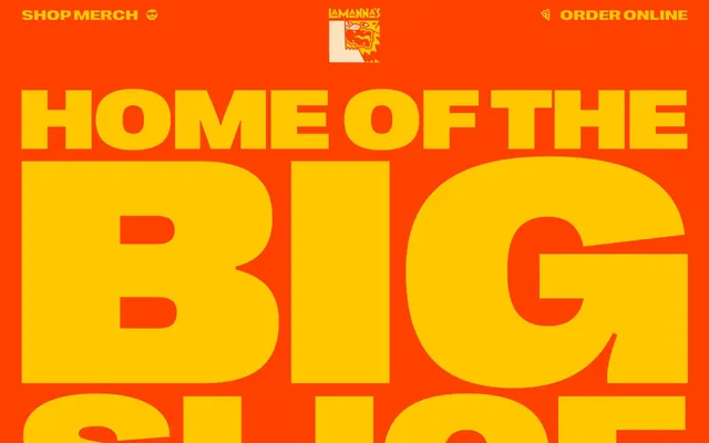
Electric Circus Diner: Bold, high-energy, and a little chaotic, like a retro diner bathed in neon.
Color palette
Dominant background, headline accents, active outlines — this orange establishes the brand's energetic and playful tone; Orange accent for outlined action borders, linked labels, and lightweight interactive emphasis. Use as a supporting accent, not as a status color
Secondary accent, background for prominent elements, text color for high-contrast headlines against dark backgrounds; Warning messages, highlights — leveraging the brand yellow for immediate attention
Section backgrounds, decorative elements — a softer, warmer background for content blocks
Interactive elements, navigation links, outlined component borders — providing a clear contrast for actionable items
Primary body text, bold headings, various borders — a deep, near-black for maximum legibility on light and colored backgrounds
Subtle borders, text on light backgrounds, decorative fills — used sparingly for sharp definition
Typography
- Weights
- 400
- Sizes
- 18px, 22px
- Line height
- 1, 1.67
Open Sans — detected in extracted data but not described by AI
- Weights
- 400
- Sizes
- 18px, 24px, 30px, 36px, 54px
- Line height
- 0.89, 0.93, 1
- Letter spacing
- -0.36, -0.33, -0.53, -0.72, -1.08
- Fallback
- Bebas Neue
Display headlines and navigation — its condensed, heavy form and tight tracking establish a dynamic, almost aggressive brand voice.
- Weights
- 400
- Sizes
- 23px
- Line height
- 1.13
- Letter spacing
- -0.47
- Fallback
- Source Sans Pro Extra Condensed Bold
Sub-headings and emphasized body text — providing a strong, extended sans-serif voice for key content.
- Weights
- 400
- Sizes
- 21px, 36px
- Line height
- 0.89, 1.48
- Letter spacing
- 0, 0
- Fallback
- Source Sans Pro Extra Condensed Regular
Body text and supporting content where an extended but less imposing presence is needed.
- Letter spacing
- 0, 0
- Fallback
- Open Sans
General UI text, captions, and occasional decorative elements — a highly legible, neutral sans-serif.
- Weights
- 400
- Sizes
- 32px
- Line height
- 1.16
- Letter spacing
- 0
- Fallback
- Oswald Semi Bold
Decorative text for links and specialized elements.
Spacing & shape
Components
Round border, transparent background, #000000 text. Uses 1px padding-top/bottom and 6px padding-left/right for minimal size, with a 50% border radius for a circular shape.
Uses Golden Crust Yellow (#ffc700) as a background and Ink Text (#292a2c) for text, with 0px border radius and generous vertical padding (120px).
Guidelines
- Prioritize Big Slice Orange (#ff4100) or Golden Crust Yellow (#ffc700) as primary background colors for sections to maintain high energy.
- Use 'rightgrotesk-spatialblack-webfont' (or Bebas Neue) with tight letter spacing for all major headlines to maintain brand impact.
- Apply 50% border-radius to all buttons for a distinctive circular or pill shape.
- Utilize Navigation Blue (#1573dd) for outlined interactive elements to signal action without heavy fills.
- Ensure large headlines utilize a font-size of 36px or higher for maximum visual impact.
- Implement Ink Text (#292a2c) for body copy to ensure strong contrast and readability on colored backgrounds.
- Avoid using pastel or desaturated colors for main sections; the system thrives on vivid and high-contrast combinations.
- Do not use subtle or thin typefaces for headlines; the brand demands bold, condensed, or extended typography.
- Do not introduce complex shadows or depth effects; rely on color blocking and outlines for visual hierarchy.
- Avoid large blocks of pure white or light grey backgrounds; always integrate brand colors in sections.
- Do not use generic square buttons; adhere to the distinct circular/pill shape.
- Do not use open, airy letter-spacing for display text; tight tracking is a signature element.
About this system
ShowHide
Lamanna's design system is a bold, high-contrast experience, marrying a vibrant, energetic color palette with a dynamic, almost rebellious typography approach. The site operates with maximal impact, using large, tightly tracked headlines that often break visual bounds. Surfaces shift abruptly between saturated backgrounds, creating distinct visual blocks rather than a fluid flow. Call-to-actions are subtly outlined, maintaining visual punch through color rather than heavy fills, complementing the overall lightweight, border-centric component aesthetic.
The page uses a maximum width containment of 1230px, but the hero section often spills out as full-bleed. The hero pattern features large, overlaying typography on a solid Big Slice Orange background, sometimes with a large product image (like a pizza slice) cutting through the text. Section rhythm is highly dynamic, characterized by abrupt shifts in background color between Playful Pink, Big Slice Orange, and Golden Crust Yellow. Content arrangement often features central stacks of text and product images, or simple grid structures, like the 3-column product display below the 'Hall of Fame' section. The layout is compact in its information delivery within these colorful blocks. Navigation is a minimalist top bar with small, uppercase text links and subtle circular outline buttons.
The imagery is product-focused and high-energy. It primarily features isolated food items (pizza slices, donuts, gelato) with clear, high-contrast presentation. Some images creatively integrate human elements (like hands holding food) to add personality without detracting from the product. The style is raw, vibrant, and direct, often using angular or dynamic compositions. Icons are simple, outlined, and monochromatic, used for navigation or small decorative flourishes like pointing hands, matching the bold but minimalist component aesthetic. Photography is clearly product showcase and decorative atmosphere, not explanatory or social proof. The density is image-heavy in hero sections, with imagery often overlapping with or being cut by text.
Reminiscent of Sweetgreen, Shake Shack, Dosist, McDonald's (newer branding), Chipotle.
# Lamanna — Style Reference
> Electric Circus Diner: Bold, high-energy, and a little chaotic, like a retro diner bathed in neon.

**Theme:** light

**Site:** https://lamannabakery.com

Lamanna's design system is a bold, high-contrast experience, marrying a vibrant, energetic color palette with a dynamic, almost rebellious typography approach. The site operates with maximal impact, using large, tightly tracked headlines that often break visual bounds. Surfaces shift abruptly between saturated backgrounds, creating distinct visual blocks rather than a fluid flow. Call-to-actions are subtly outlined, maintaining visual punch through color rather than heavy fills, complementing the overall lightweight, border-centric component aesthetic.

## Tokens — Colors

| Name | Value | Token | Role |
|------|------|------|------|
| Big Slice Orange | `#ff4100` | `--color-big-slice-orange` | Dominant background, headline accents, active outlines — this orange establishes the brand's energetic and playful tone; Orange accent for outlined action borders, linked labels, and lightweight interactive emphasis. Use as a supporting accent, not as a status color |
| Golden Crust Yellow | `#ffc700` | `--color-golden-crust-yellow` | Secondary accent, background for prominent elements, text color for high-contrast headlines against dark backgrounds; Warning messages, highlights — leveraging the brand yellow for immediate attention |
| Playful Pink | `#fdbeba` | `--color-playful-pink` | Section backgrounds, decorative elements — a softer, warmer background for content blocks |
| Navigation Blue | `#1573dd` | `--color-navigation-blue` | Interactive elements, navigation links, outlined component borders — providing a clear contrast for actionable items |
| Ink Text | `#292a2c` | `--color-ink-text` | Primary body text, bold headings, various borders — a deep, near-black for maximum legibility on light and colored backgrounds |
| Pure Black | `#000000` | `--color-pure-black` | Subtle borders, text on light backgrounds, decorative fills — used sparingly for sharp definition |

## Tokens — Typography

### Open Sans
- **Weights:** 400
- **Sizes:** 18px, 22px
- **Line height:** 1, 1.67
- **Role:** Open Sans — detected in extracted data but not described by AI

### rightgrotesk-spatialblack-webfont
- **Substitute:** Bebas Neue
- **Weights:** 400
- **Sizes:** 18px, 24px, 30px, 36px, 54px
- **Line height:** 0.89, 0.93, 1
- **Letter spacing:** -0.36, -0.33, -0.53, -0.72, -1.08
- **Role:** Display headlines and navigation — its condensed, heavy form and tight tracking establish a dynamic, almost aggressive brand voice.

### nimbus-sans-extended-bold
- **Substitute:** Source Sans Pro Extra Condensed Bold
- **Weights:** 400
- **Sizes:** 23px
- **Line height:** 1.13
- **Letter spacing:** -0.47
- **Role:** Sub-headings and emphasized body text — providing a strong, extended sans-serif voice for key content.

### nimbus-sans-extended-regular
- **Substitute:** Source Sans Pro Extra Condensed Regular
- **Weights:** 400
- **Sizes:** 21px, 36px
- **Line height:** 0.89, 1.48
- **Letter spacing:** 0, 0
- **Role:** Body text and supporting content where an extended but less imposing presence is needed.

### Inter
- **Substitute:** Open Sans
- **Letter spacing:** 0, 0
- **Role:** General UI text, captions, and occasional decorative elements — a highly legible, neutral sans-serif.

### obviously-condensed-semibold
- **Substitute:** Oswald Semi Bold
- **Weights:** 400
- **Sizes:** 32px
- **Line height:** 1.16
- **Letter spacing:** 0
- **Role:** Decorative text for links and specialized elements.

## Tokens — Type Scale

Minor Third (1.2) from 18px base.

| Role | Size | Line height | Letter spacing |
|------|------|------|------|
| body | 18px | 1 | — |
| subheading | 22px | 1.67 | — |
| heading | 24px | 1 | -0.53px |
| heading-lg | 30px | 0.93 | -0.33px |
| display-sm | 32px | 1.16 | — |
| display | 36px | 0.89 | -0.72px |
| display-lg | 54px | 0.89 | -1.08px |

## Tokens — Spacing

- **Max width:** 1230px
- **Section gap:** 105px
- **Card padding:** 15px
- **Element gap:** 10px

## Tokens — Radius

- **Buttons:** 50%
- **badges:** 0px

## Layout

The page uses a maximum width containment of 1230px, but the hero section often spills out as full-bleed. The hero pattern features large, overlaying typography on a solid Big Slice Orange background, sometimes with a large product image (like a pizza slice) cutting through the text. Section rhythm is highly dynamic, characterized by abrupt shifts in background color between Playful Pink, Big Slice Orange, and Golden Crust Yellow. Content arrangement often features central stacks of text and product images, or simple grid structures, like the 3-column product display below the 'Hall of Fame' section. The layout is compact in its information delivery within these colorful blocks. Navigation is a minimalist top bar with small, uppercase text links and subtle circular outline buttons.

## Imagery

The imagery is product-focused and high-energy. It primarily features isolated food items (pizza slices, donuts, gelato) with clear, high-contrast presentation. Some images creatively integrate human elements (like hands holding food) to add personality without detracting from the product. The style is raw, vibrant, and direct, often using angular or dynamic compositions. Icons are simple, outlined, and monochromatic, used for navigation or small decorative flourishes like pointing hands, matching the bold but minimalist component aesthetic. Photography is clearly product showcase and decorative atmosphere, not explanatory or social proof. The density is image-heavy in hero sections, with imagery often overlapping with or being cut by text.

## Components

### Circular Outline Button
*Secondary action button for navigation or minor actions.*

Round border, transparent background, #000000 text. Uses 1px padding-top/bottom and 6px padding-left/right for minimal size, with a 50% border radius for a circular shape.

### Product Display Badge
*Highlighting key product items with a strong visual presence.*

Uses Golden Crust Yellow (#ffc700) as a background and Ink Text (#292a2c) for text, with 0px border radius and generous vertical padding (120px).

## Guidelines

### Do

- Prioritize Big Slice Orange (#ff4100) or Golden Crust Yellow (#ffc700) as primary background colors for sections to maintain high energy.
- Use 'rightgrotesk-spatialblack-webfont' (or Bebas Neue) with tight letter spacing for all major headlines to maintain brand impact.
- Apply 50% border-radius to all buttons for a distinctive circular or pill shape.
- Utilize Navigation Blue (#1573dd) for outlined interactive elements to signal action without heavy fills.
- Ensure large headlines utilize a font-size of 36px or higher for maximum visual impact.
- Implement Ink Text (#292a2c) for body copy to ensure strong contrast and readability on colored backgrounds.

### Don't

- Avoid using pastel or desaturated colors for main sections; the system thrives on vivid and high-contrast combinations.
- Do not use subtle or thin typefaces for headlines; the brand demands bold, condensed, or extended typography.
- Do not introduce complex shadows or depth effects; rely on color blocking and outlines for visual hierarchy.
- Avoid large blocks of pure white or light grey backgrounds; always integrate brand colors in sections.
- Do not use generic square buttons; adhere to the distinct circular/pill shape.
- Do not use open, airy letter-spacing for display text; tight tracking is a signature element.

## Agent Prompt Guide

Quick Color Reference:
text: #292a2c
background: #ff4100
border: #292a2c
accent: #1573dd
primary action: #1573dd (outlined action border)

Example Component Prompts:
Create a hero section with a Big Slice Orange (#ff4100) background. Headline at 54px rightgrotesk-spatialblack-webfont weight 400, #292a2c, letter-spacing -1.08px. Above it, a navigation link 'SHOP MERCH' with text #292a2c, font 'rightgrotesk-spatialblack-webfont' size 18px letter-spacing -0.36px.

Create a product display card: Golden Crust Yellow (#ffc700) background, 'Nutella® Gelato' as a body-lg label in Ink Text (#292a2c), font 'nimbus-sans-extended-regular' size 21px. Include a product image and ensure the card respects cardPadding of 15px.

Create an outlined navigation button: transparent background with #000000 text and 1px border of #000000, 50% border-radius. Padding 1px top/bottom, 6px left/right. Font 'rightgrotesk-spatialblack-webfont' size 18px, letter-spacing -0.36px.
More like this







Keep what you find
A free account saves references to boards and can send you a weekly email of picks based on what you save.
To see every result, go Pro.