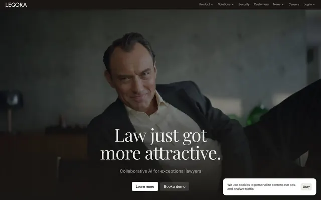
Preview image. Unlock full-res
Warm monochrome legal canvas
Color palette
Subtle background accent for specific sections, adding a warm, academic feel
Background for certain interactive link states or prominent data blocks
Background for specific link states, a cool accent
Primary text, borders, dark background for hero section and certain UI elements
Page background, primary light surface for cards and content sections
Content text, secondary dark borders, slightly softer than Inkwell Black for body copy
Subtle background for UI elements, input fields, and alternating section backgrounds
Muted helper text, secondary body copy
Tertiary text, even subtler than Shadowstone Gray, for very de-emphasized elements
Typography
- Weights
- 400
- Sizes
- 12px
- Line height
- 1.2
- Fallback
- Arial, Helvetica
System fallback for small UI elements and utility text.
- Weights
- 450
- Sizes
- 11px, 13px, 14px, 16px
- Line height
- 0.8, 1.25, 1.3
- Letter spacing
- -0.01em at 16px, 0.01em at 11px
- Fallback
- Inter
Primary body text, labels, and paragraph content. The 'Book' weight at 450 provides a substantial yet refined feel. Its specific font features ('blwf', 'cv03', 'cv04', 'cv09', 'cv11') are critical for the brand's typographic identity.
- Weights
- 400
- Sizes
- 15px, 20px
- Line height
- 1.3
- Fallback
- Inter
Subheadings and supporting headlines in product descriptions. The regular weight keeps it grounded.
- Weights
- 300
- Sizes
- 24px, 32px, 88px
- Line height
- 0.95, 1.1
- Letter spacing
- -0.02em at 88px, -0.01em at 24px
- Fallback
- Lora
Emphasis headlines. The highly distinctive 'Light' weight (300) for large display sizes creates an unusually refined and open feel, conveying authority through restraint rather than boldness.
- Weights
- 400
- Sizes
- 80px
- Line height
- 1
- Letter spacing
- -0.02em
- Fallback
- Playfair Display
Prominent display headlines, particularly the main hero title. Its serif elegance adds a touch of classic sophistication.
- Weights
- 400
- Sizes
- 12px
- Line height
- 1.2
- Fallback
- Inter
Secondary utility text and metadata, providing a clear sans-serif contrast.
- Weights
- 500
- Sizes
- 13px
- Line height
- 1
- Fallback
- Inter
Input labels and placeholder text, providing clear readability.
Spacing & shape
Components
Text in Inkwell Black. No background, no border. Used for top navigation menu items. Font: Suisse Intl Book at 16px, weight 450.
Background: rgba(255, 255, 255, 0.12) - a translucent white over dark backgrounds. Text color: rgba(0, 0, 238) (browser default link blue, implying it's not a brand-specific button color). Border-radius: 4px. Padding: 10px vertical, 16px horizontal. Used for primary interactive buttons.
Background: Canvas White (#fefefc). Text color: rgb(0, 0, 238) (browser default link blue). Border-radius: 4px. Padding: 10px vertical, 16px horizontal.
Background: Pale Ash (#ebf5ed). Text color: Text Gray (#0a0a0a). Border-radius: 8px. Padding: 10px all sides. Uses Suisse Intl Medium at 13px, weight 500.
Background: Canvas White (#fefefc). Text: Whisper Gray (#444444). Rounded corners at 4px. Contains a filled and an outlined button.
Guidelines
- Prioritize high visual contrast between text (#000000, #0a0a0a) and background (#fefefc, #ebf5ed), maintaining AAA accessibility standards.
- Use Rhymes Display Light (weight 300) for large headlines (32px and up) with a tight line height and negative letter-spacing for a refined, spacious feel.
- Apply Suisse Intl Book (weight 450) consistently for all body text, maintaining its specific font feature settings for brand consistency.
- Utilize Pale Ash (#ebf5ed) as a subtle alternating background color for content sections, providing visual rhythm without strong division.
- Employ a radius of 8px for cards, images, and input fields to convey a soft, modern touch.
- Ensure interactive elements like buttons and links maintain a clear visual distinction, even if the primary action color is derived from a browser default.
- Use Inkwell Black (#000000) for hero section text and prominent borders to create a strong initial impression against dark backgrounds.
- Avoid using highly saturated colors for large UI elements; accents should be subtle and functional.
- Do not introduce strong drop shadows; rely on background color changes or minimal borders for surface differentiation.
- Do not deviate from the specified font families and weights, especially for Rhymes Display Light, as its unique weight defines the brand's headline style.
- Avoid over-clustering content; embrace white space and the specified elementGap (10px) to maintain a compact yet uncrowded appearance.
- Do not use generic system borders for inputs; always apply Pale Ash (#ebf5ed) background and 8px border-radius.
- Do not use multiple button styles for primary actions; stick to the translucent white filled button on dark backgrounds and the outlined white button on light backgrounds.
- Avoid full-bleed imagery that competes with text; imagery should be contained or used as a subtle background element as seen in the hero.
About this system
ShowHide
Legora employs a classic minimalist aesthetic with high contrast typography and subdued, often desaturated, color accents. The design emphasizes clear information hierarchy through sparse layouts and strong textual elements. Subtle background shifts and minimal interactive elements create an atmosphere of quiet professionalism, allowing content to take center stage.
The page primarily employs a contained layout with a maximum content width, centered on a light canvas. The hero section is a full-bleed application of the Inkwell Black background with a foreground image, displaying a centered, large-format serif headline and supportive text. Subsequent sections alternate between the Canvas White and Pale Ash backgrounds, providing clear visual breaks. Content within these sections often uses a two-column layout, featuring text on one side and a product screenshot or abstract visual on the other, occasionally reversing the arrangement for rhythm (z-pattern). Vertical spacing is consistent with a section gap of 80px, contributing to a spacious feel. Navigation is handled by a sticky top bar with minimal ghost links and a single primary action button (Book a demo).
The site uses a mix of high-quality, professional photography and subtle, abstract visual elements, with a distinct absence of illustrative graphics. Photography is often dark and moody, featuring professional individuals in a corporate or office setting, sometimes blurred or used as a background layer, such as in the hero section. Product screenshots are clean, functional, and presented flat within UI frames, sometimes with a slight backdrop filter blur. Icons are minimal, outlined, and monochromatic, typically in Inkwell Black. The imagery serves both decorative atmospheric purposes (hero) and explanatory content (product screenshots), maintaining a refined and serious tone. Image density is moderate, used strategically to break up text-heavy sections or to establish a mood, rather than overwhelming the page.
Reminiscent of Axiom, Clerk AI, LexisNexis, Palantir.
# Legora — Style Reference
> Warm monochrome legal canvas

**Theme:** light

**Site:** https://legora.com

Legora employs a classic minimalist aesthetic with high contrast typography and subdued, often desaturated, color accents. The design emphasizes clear information hierarchy through sparse layouts and strong textual elements. Subtle background shifts and minimal interactive elements create an atmosphere of quiet professionalism, allowing content to take center stage.

## Tokens — Colors

| Name | Value | Token | Role |
|------|------|------|------|
| Parchment Tan | `#e1d5b6` | `--color-parchment-tan` | Subtle background accent for specific sections, adding a warm, academic feel |
| Sky Tint | `#bdd4f0` | `--color-sky-tint` | Background for certain interactive link states or prominent data blocks |
| Steel Blue | `#98a7aa` | `--color-steel-blue` | Background for specific link states, a cool accent |
| Inkwell Black | `#000000` | `--color-inkwell-black` | Primary text, borders, dark background for hero section and certain UI elements |
| Canvas White | `#fefefc` | `--color-canvas-white` | Page background, primary light surface for cards and content sections |
| Text Gray | `#0a0a0a` | `--color-text-gray` | Content text, secondary dark borders, slightly softer than Inkwell Black for body copy |
| Pale Ash | `#ebf5ed` | `--color-pale-ash` | Subtle background for UI elements, input fields, and alternating section backgrounds |
| Shadowstone Gray | `#6b6b6b` | `--color-shadowstone-gray` | Muted helper text, secondary body copy |
| Whisper Gray | `#444444` | `--color-whisper-gray` | Tertiary text, even subtler than Shadowstone Gray, for very de-emphasized elements |

## Tokens — Typography

### sans-serif
- **Substitute:** Arial, Helvetica
- **Weights:** 400
- **Sizes:** 12px
- **Line height:** 1.2
- **Role:** System fallback for small UI elements and utility text.

### Suisse Intl Book
- **Substitute:** Inter
- **Weights:** 450
- **Sizes:** 11px, 13px, 14px, 16px
- **Line height:** 0.8, 1.25, 1.3
- **Letter spacing:** -0.01em at 16px, 0.01em at 11px
- **Role:** Primary body text, labels, and paragraph content. The 'Book' weight at 450 provides a substantial yet refined feel. Its specific font features ('blwf', 'cv03', 'cv04', 'cv09', 'cv11') are critical for the brand's typographic identity.

### Aktiv Grotesk VF Variable Regular
- **Substitute:** Inter
- **Weights:** 400
- **Sizes:** 15px, 20px
- **Line height:** 1.3
- **Role:** Subheadings and supporting headlines in product descriptions. The regular weight keeps it grounded.

### Rhymes Display Light
- **Substitute:** Lora
- **Weights:** 300
- **Sizes:** 24px, 32px, 88px
- **Line height:** 0.95, 1.1
- **Letter spacing:** -0.02em at 88px, -0.01em at 24px
- **Role:** Emphasis headlines. The highly distinctive 'Light' weight (300) for large display sizes creates an unusually refined and open feel, conveying authority through restraint rather than boldness.

### Playfair Display
- **Substitute:** Playfair Display
- **Weights:** 400
- **Sizes:** 80px
- **Line height:** 1
- **Letter spacing:** -0.02em
- **Role:** Prominent display headlines, particularly the main hero title. Its serif elegance adds a touch of classic sophistication.

### Inter
- **Substitute:** Inter
- **Weights:** 400
- **Sizes:** 12px
- **Line height:** 1.2
- **Role:** Secondary utility text and metadata, providing a clear sans-serif contrast.

### Suisse Intl Medium
- **Substitute:** Inter
- **Weights:** 500
- **Sizes:** 13px
- **Line height:** 1
- **Role:** Input labels and placeholder text, providing clear readability.

## Tokens — Type Scale

Perfect Fifth (1.5) from 14px base.

| Role | Size | Line height | Letter spacing |
|------|------|------|------|
| caption | 11px | 0.8 | — |
| body | 14px | 1.25 | — |
| heading-sm | 20px | 1.3 | — |
| heading | 24px | 1.1 | -0.24px |
| heading-lg | 32px | 0.95 | -0.32px |
| display | 88px | 0.95 | -1.76px |

## Tokens — Spacing

- **Section gap:** 80px
- **Card padding:** 16px
- **Element gap:** 10px

## Tokens — Radius

- **Buttons:** 2px
- **Inputs:** 8px
- **Cards:** 8px
- **Images:** 8px
- **cookieConsent:** 4px

## Layout

The page primarily employs a contained layout with a maximum content width, centered on a light canvas. The hero section is a full-bleed application of the Inkwell Black background with a foreground image, displaying a centered, large-format serif headline and supportive text. Subsequent sections alternate between the Canvas White and Pale Ash backgrounds, providing clear visual breaks. Content within these sections often uses a two-column layout, featuring text on one side and a product screenshot or abstract visual on the other, occasionally reversing the arrangement for rhythm (z-pattern). Vertical spacing is consistent with a section gap of 80px, contributing to a spacious feel. Navigation is handled by a sticky top bar with minimal ghost links and a single primary action button (Book a demo).

## Imagery

The site uses a mix of high-quality, professional photography and subtle, abstract visual elements, with a distinct absence of illustrative graphics. Photography is often dark and moody, featuring professional individuals in a corporate or office setting, sometimes blurred or used as a background layer, such as in the hero section. Product screenshots are clean, functional, and presented flat within UI frames, sometimes with a slight backdrop filter blur. Icons are minimal, outlined, and monochromatic, typically in Inkwell Black. The imagery serves both decorative atmospheric purposes (hero) and explanatory content (product screenshots), maintaining a refined and serious tone. Image density is moderate, used strategically to break up text-heavy sections or to establish a mood, rather than overwhelming the page.

## Components

### Ghost Navigation Link
*Primary navigation item*

Text in Inkwell Black. No background, no border. Used for top navigation menu items. Font: Suisse Intl Book at 16px, weight 450.

### Filled Action Button
*Call to action button*

Background: rgba(255, 255, 255, 0.12) - a translucent white over dark backgrounds. Text color: rgba(0, 0, 238) (browser default link blue, implying it's not a brand-specific button color). Border-radius: 4px. Padding: 10px vertical, 16px horizontal. Used for primary interactive buttons.

### Outlined Cookie Consent Button
*Secondary action in cookie consent*

Background: Canvas White (#fefefc). Text color: rgb(0, 0, 238) (browser default link blue). Border-radius: 4px. Padding: 10px vertical, 16px horizontal.

### Text Input Field
*User input control*

Background: Pale Ash (#ebf5ed). Text color: Text Gray (#0a0a0a). Border-radius: 8px. Padding: 10px all sides. Uses Suisse Intl Medium at 13px, weight 500.

### Cookie Consent Banner
*Legal disclosure pop-up*

Background: Canvas White (#fefefc). Text: Whisper Gray (#444444). Rounded corners at 4px. Contains a filled and an outlined button.

## Guidelines

### Do

- Prioritize high visual contrast between text (#000000, #0a0a0a) and background (#fefefc, #ebf5ed), maintaining AAA accessibility standards.
- Use Rhymes Display Light (weight 300) for large headlines (32px and up) with a tight line height and negative letter-spacing for a refined, spacious feel.
- Apply Suisse Intl Book (weight 450) consistently for all body text, maintaining its specific font feature settings for brand consistency.
- Utilize Pale Ash (#ebf5ed) as a subtle alternating background color for content sections, providing visual rhythm without strong division.
- Employ a radius of 8px for cards, images, and input fields to convey a soft, modern touch.
- Ensure interactive elements like buttons and links maintain a clear visual distinction, even if the primary action color is derived from a browser default.
- Use Inkwell Black (#000000) for hero section text and prominent borders to create a strong initial impression against dark backgrounds.

### Don't

- Avoid using highly saturated colors for large UI elements; accents should be subtle and functional.
- Do not introduce strong drop shadows; rely on background color changes or minimal borders for surface differentiation.
- Do not deviate from the specified font families and weights, especially for Rhymes Display Light, as its unique weight defines the brand's headline style.
- Avoid over-clustering content; embrace white space and the specified elementGap (10px) to maintain a compact yet uncrowded appearance.
- Do not use generic system borders for inputs; always apply Pale Ash (#ebf5ed) background and 8px border-radius.
- Do not use multiple button styles for primary actions; stick to the translucent white filled button on dark backgrounds and the outlined white button on light backgrounds.
- Avoid full-bleed imagery that competes with text; imagery should be contained or used as a subtle background element as seen in the hero.

## Agent Prompt Guide

Quick Color Reference:
text: #000000
background: #fefefc
border: #000000
accent: #e1d5b6
primary action: no distinct CTA color

Example Component Prompts:
No distinct primary action color was observed; use the extracted neutral button treatments instead of inventing a filled CTA color.
2. Create an Input Field: background Pale Ash (#ebf5ed), text Text Gray (#0a0a0a), border-radius 8px, padding 10px. Placeholder text in Suisse Intl Medium 13px weight 500, #6b6b6b.
3. Create a Feature Block: background Canvas White (#fefefc), heading 'Review faster' using Aktiv Grotesk VF Variable Regular 20px weight 400, #0a0a0a. Body text using Suisse Intl Book 14px weight 450, #0a0a0a. Card padding 16px, element gap 10px.
More like this









Keep what you find
A free account saves references to boards and can send you a weekly email of picks based on what you save.
To see every result, go Pro.