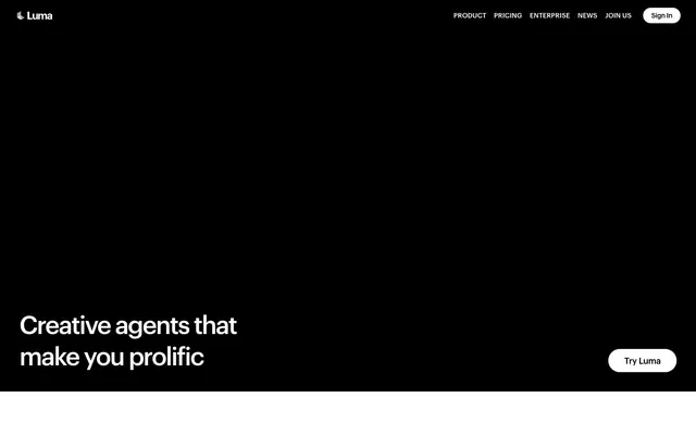
Preview image. Unlock full-res
Monochrome canvas, sharp typography.
Color palette
Page backgrounds, card surfaces, UI elements in dark sections
Primary text, darkest backgrounds, active navigation text, selected button fills
Subtle borders, dividers, subtle background distinction between elements
Secondary text, muted helper text, soft borders for body content
Tertiary text, subtle body text emphasis
Typography
- Weights
- 400, 500, 600, 700
- Sizes
- 14px, 16px, 18px, 20px, 22px, 32px, 48px, 52px
- Line height
- 1, 1.2, 1.25, 1.4, 1.43, 1.5, 1.56, 1.71
- Letter spacing
- -0.0500em at 52px, -0.0400em at 48px, -0.0300em at 32px, -0.0290em at 22px, -0.0250em at 20px, -0.0220em at 18px, -0.0200em at 16px
- Fallback
- system-ui, sans-serif
Primary font for all headings, body text, navigation, and interactive elements. Its consistent use and precise letter-spacing ensure a cohesive, professional voice across the interface.
Spacing & shape
Components
Black background (#000000) with white text (#ffffff) and full pill shape (1.67772e+07px radius). Padding: 0px top/bottom, 24px left/right. Used for 'Try Luma' or 'Learn more' calls to action.
White background (#ffffff) with black text (#000000) and full pill shape (1.67772e+07px radius). Padding: 0px top/bottom, 32px left/right. Used where a lighter button is needed on a dark background, e.g., 'Sign In'.
Graphik font, 400 weight, 16px size. Uses Midnight Ink (#000000) for text on light backgrounds and Canvas White (#ffffff) on dark backgrounds. Does not have a distinct interactive color change, relying on context instead.
Transparent background with 24px border-radius. No visual shadow. Content inside maintains uniform spacing from edges defined by cardPadding: 20px.
Presumably features an 8px border-radius, potentially with a 1px solid border in Ash Gray (#e5e5e5) for definition against the background.
Guidelines
- Use Midnight Ink (#000000) for all primary text content and main headings.
- Apply Canvas White (#ffffff) as the dominant background for body sections and content cards.
- Maintain a clear visual hierarchy with Graphik font, adjusting letter-spacing as per type steps (e.g., -0.0400em at 48px, -0.0200em at 16px).
- Utilize Ash Gray (#e5e5e5) for all subtle borders and dividing lines between content sections.
- Ensure buttons adhere to a full pill shape by using a 1.67772e+07px border-radius.
- Employ 24px border-radius for all card-like content containers.
- Structure page sections with a consistent 73px vertical gap.
- Avoid using highly saturated or chromatic colors; the palette is strictly achromatic with very subtle gray variations.
- Do not add shadows to cards or surface elements; the design relies on flat, borderless segmentation or soft borders.
- Do not introduce additional font families; Graphik is the sole typeface for all content.
- Avoid decorative gradients or background images; surfaces should remain solid black or white.
- Do not deviate from the established letter-spacing values per font size; these are critical for brand typography.
- Do not use generic default button styles; always apply the pill shape and specific black/white color combinations.
- Do not make interactive elements visually distinct through bold color changes; interaction is suggested through text only or subtle background shifts where appropriate.
About this system
ShowHide
Luma embraces a minimalist, high-contrast aesthetic, primarily using black and white with subtle gray accents. Typography is sharp and impactful, relying on a custom sans-serif for all content, with careful letter-spacing changes defining hierarchy. Surfaces are predominantly uncluttered, featuring soft cards for content grouping against stark backgrounds. The visual system emphasizes clarity and directness, with interactive elements subtly integrated rather than boldly highlighted.
The page primarily uses a full-bleed layout for background elements, but content is often constrained within a centered max-width container, though a specific max-width value is not explicitly defined in the data. The hero section features a full-bleed dark background with a large, centered headline and a single call-to-action button. Subsequent sections alternate between stark black and white backgrounds, creating a clear vertical rhythm. Content is generally arranged in centered stacks or alternating text-left/image-right patterns, with 2-column or 3-column grids for feature displays. The overall density is comfortable, with generous breathing room between sections. Navigation is via a minimal top bar, featuring right-aligned links and a 'Sign In' button.
Imagery primarily consists of tight product screenshots or highly stylized, abstract visuals, always contained within designated areas. These visuals serve an explanatory and showcase role through product-focused content. When illustrations appear, they are likely minimalistic, flat, and monochromatic, integrated cleanly into the UI or as background elements. Icons are filled, simple, and monochrome, maintaining the overall clean aesthetic. The density is moderate, allowing text to dominate while imagery provides visual breaks or specific product context.
Reminiscent of Anthropic, OpenAI, Arc Browser.
# Luma — Style Reference
> Monochrome canvas, sharp typography.

**Theme:** light

**Site:** https://lumalabs.ai

Luma embraces a minimalist, high-contrast aesthetic, primarily using black and white with subtle gray accents. Typography is sharp and impactful, relying on a custom sans-serif for all content, with careful letter-spacing changes defining hierarchy. Surfaces are predominantly uncluttered, featuring soft cards for content grouping against stark backgrounds. The visual system emphasizes clarity and directness, with interactive elements subtly integrated rather than boldly highlighted.

## Tokens — Colors

| Name | Value | Token | Role |
|------|------|------|------|
| Canvas White | `#ffffff` | `--color-canvas-white` | Page backgrounds, card surfaces, UI elements in dark sections |
| Midnight Ink | `#000000` | `--color-midnight-ink` | Primary text, darkest backgrounds, active navigation text, selected button fills |
| Ash Gray | `#e5e5e5` | `--color-ash-gray` | Subtle borders, dividers, subtle background distinction between elements |
| Muted Graphite | `#737373` | `--color-muted-graphite` | Secondary text, muted helper text, soft borders for body content |
| Light Graphite | `#8c8c8c` | `--color-light-graphite` | Tertiary text, subtle body text emphasis |

## Tokens — Typography

### Graphik
- **Substitute:** system-ui, sans-serif
- **Weights:** 400, 500, 600, 700
- **Sizes:** 14px, 16px, 18px, 20px, 22px, 32px, 48px, 52px
- **Line height:** 1, 1.2, 1.25, 1.4, 1.43, 1.5, 1.56, 1.71
- **Letter spacing:** -0.0500em at 52px, -0.0400em at 48px, -0.0300em at 32px, -0.0290em at 22px, -0.0250em at 20px, -0.0220em at 18px, -0.0200em at 16px
- **Role:** Primary font for all headings, body text, navigation, and interactive elements. Its consistent use and precise letter-spacing ensure a cohesive, professional voice across the interface.

## Tokens — Type Scale

Minor Third (1.2) from 16px base.

| Role | Size | Line height | Letter spacing |
|------|------|------|------|
| caption | 14px | 1.71 | -0.28px |
| body | 16px | 1.5 | -0.32px |
| body-lg | 18px | 1.5 | -0.396px |
| subheading | 20px | 1.4 | -0.5px |
| heading-sm | 22px | 1.43 | -0.638px |
| heading | 32px | 1.25 | -0.96px |
| heading-lg | 48px | 1.2 | -1.92px |
| display | 52px | 1 | -2.6px |

## Tokens — Spacing

- **Section gap:** 73px
- **Card padding:** 20px
- **Element gap:** 12px

## Tokens — Radius

- **Buttons:** 1.67772e+07px
- **Inputs:** 8px
- **Cards:** 24px

## Layout

The page primarily uses a full-bleed layout for background elements, but content is often constrained within a centered max-width container, though a specific max-width value is not explicitly defined in the data. The hero section features a full-bleed dark background with a large, centered headline and a single call-to-action button. Subsequent sections alternate between stark black and white backgrounds, creating a clear vertical rhythm. Content is generally arranged in centered stacks or alternating text-left/image-right patterns, with 2-column or 3-column grids for feature displays. The overall density is comfortable, with generous breathing room between sections. Navigation is via a minimal top bar, featuring right-aligned links and a 'Sign In' button.

## Imagery

Imagery primarily consists of tight product screenshots or highly stylized, abstract visuals, always contained within designated areas. These visuals serve an explanatory and showcase role through product-focused content. When illustrations appear, they are likely minimalistic, flat, and monochromatic, integrated cleanly into the UI or as background elements. Icons are filled, simple, and monochrome, maintaining the overall clean aesthetic. The density is moderate, allowing text to dominate while imagery provides visual breaks or specific product context.

## Components

### Solid Black Button
*Primary action button*

Black background (#000000) with white text (#ffffff) and full pill shape (1.67772e+07px radius). Padding: 0px top/bottom, 24px left/right. Used for 'Try Luma' or 'Learn more' calls to action.

### Solid White Button
*Secondary action button for dark backgrounds*

White background (#ffffff) with black text (#000000) and full pill shape (1.67772e+07px radius). Padding: 0px top/bottom, 32px left/right. Used where a lighter button is needed on a dark background, e.g., 'Sign In'.

### Navigation Link
*Top navigation and footer links*

Graphik font, 400 weight, 16px size. Uses Midnight Ink (#000000) for text on light backgrounds and Canvas White (#ffffff) on dark backgrounds. Does not have a distinct interactive color change, relying on context instead.

### Soft Card
*Content grouping and feature display*

Transparent background with 24px border-radius. No visual shadow. Content inside maintains uniform spacing from edges defined by cardPadding: 20px.

### Text Input / Form Field
*Interactive data entry field*

Presumably features an 8px border-radius, potentially with a 1px solid border in Ash Gray (#e5e5e5) for definition against the background.

## Guidelines

### Do

- Use Midnight Ink (#000000) for all primary text content and main headings.
- Apply Canvas White (#ffffff) as the dominant background for body sections and content cards.
- Maintain a clear visual hierarchy with Graphik font, adjusting letter-spacing as per type steps (e.g., -0.0400em at 48px, -0.0200em at 16px).
- Utilize Ash Gray (#e5e5e5) for all subtle borders and dividing lines between content sections.
- Ensure buttons adhere to a full pill shape by using a 1.67772e+07px border-radius.
- Employ 24px border-radius for all card-like content containers.
- Structure page sections with a consistent 73px vertical gap.

### Don't

- Avoid using highly saturated or chromatic colors; the palette is strictly achromatic with very subtle gray variations.
- Do not add shadows to cards or surface elements; the design relies on flat, borderless segmentation or soft borders.
- Do not introduce additional font families; Graphik is the sole typeface for all content.
- Avoid decorative gradients or background images; surfaces should remain solid black or white.
- Do not deviate from the established letter-spacing values per font size; these are critical for brand typography.
- Do not use generic default button styles; always apply the pill shape and specific black/white color combinations.
- Do not make interactive elements visually distinct through bold color changes; interaction is suggested through text only or subtle background shifts where appropriate.

## Agent Prompt Guide

### Quick Color Reference
- text: #000000
- background: #ffffff
- border: #e5e5e5
- accent: no distinct accent color
- primary action: #000000 (filled action)

### 3-5 Example Component Prompts
- Create a hero section: full-bleed black background. Headline 'Creative agents that make you prolific' in Midnight Ink (#000000) against white background for first word, then white text (#ffffff) against black background for the rest, Graphik 52px, line-height 1, letter-spacing -2.6px. Add a 'Try Luma' button: #000000 background, #ffffff text, 1.67772e+07px radius, padding 0px 24px.
- Design a secondary content card: 24px border-radius, transparent background. Inside, place a Graphik 22px heading with Midnight Ink text (#000000), letter-spacing -0.638px, above a smaller body text in Muted Graphite (#737373) using Graphik 16px, letter-spacing -0.32px.
- Build a navigation bar: Canvas White (#ffffff) background. Left-aligned 'Luma' logo (Graphik 18px #000000). Right-aligned links: 'Product', 'Pricing', 'Enterprise', 'News', 'Join us' (Graphik 400, 16px, #000000). Include a 'Sign In' button: #ffffff background, #000000 text, 1.67772e+07px radius, padding 0px 32px.
- Create a client logo grid section: Canvas White (#ffffff) background. Centered introductory text 'Force multiplying teams at' in Muted Graphite (#737373), Graphik 16px, letter-spacing -0.32px. Below, evenly space a grid of monochrome client logos, with 8px column and row gaps.
More like this








Keep what you find
A free account saves references to boards and can send you a weekly email of picks based on what you save.
To see every result, go Pro.