Preview image. Unlock full-res
Codebase blueprint on frosted glass
Color palette
Primary action buttons, interactive highlights, and brand accents to draw attention
Subtle button backgrounds, decorative accents, and soft focus states
Decorative background fills, hinting at digital patterns and data visualizations
Primary text for headings and interactive elements, button backgrounds for ghost/outlined variants
Hero section text, secondary button backgrounds, and subtle borders
Input backgrounds, primary body text, and some borders
Secondary body text and muted informational details
Tertiary text, decorative elements, and subtle icon strokes
Light helper text, link borders, and subtle descriptive text
Subtle background for UI elements, light cards
Page backgrounds, primary card surfaces, high-contrast text
Subtle background for alternating sections or distinct UI areas
Background for subtle surface differentiation, such as active states or hovering elements
Typography
- Weights
- 400
- Sizes
- 12px
- Line height
- 1.2
sans-serif — detected in extracted data but not described by AI
- Weights
- 400, 600
- Sizes
- 18px, 48px, 56px, 57px, 76px
- Line height
- 0.9, 0.95, 1, 1.56
- Letter spacing
- -0.025em, -0.020em
- Fallback
- Montserrat
Primary headlines and impactful display text. The tight letter-spacing at larger sizes gives a sense of modern precision and weight without being bold, authoritative through restraint.
- Weights
- 400, 500
- Sizes
- 14px, 16px, 18px, 20px, 24px, 32px
- Line height
- 1.11, 1.14, 1.2, 1.25, 1.3, 1.8, 2
- Letter spacing
- -0.020em, -0.010em, 0.010em
- Fallback
- Montserrat
Subheadings, section titles, and prominent UI labels. A slightly more relaxed tracking than display text, maintaining legibility at various intermediate sizes.
- Weights
- 400
- Sizes
- 48px
- Line height
- 1, 1.2
- Letter spacing
- -0.020em
- Fallback
- Montserrat
Specific display text, often used for numerical data or secondary large-scale headings, offering a slightly lighter visual presence than semibold.
- Weights
- 400, 500, 600
- Sizes
- 9px, 12px, 13px, 14px, 15px, 16px, 17px, 18px, 24px
- Line height
- 1, 1.19, 1.2, 1.33, 1.38, 1.43, 1.5, 1.54, 1.63, 1.78
- Letter spacing
- -0.020em, -0.015em, -0.010em
- Fallback
- Inter
Body text, navigation, input fields, and most UI elements. Its variable weights provide flexibility for hierarchy without introducing additional type families.
- Weights
- 400, 500
- Sizes
- 12px, 13px, 14px, 16px, 18px
- Line height
- 1.25, 1.43, 1.54, 1.67, 1.7
- Letter spacing
- -0.010em
- Fallback
- Inter
Specific body text instances, often for slightly larger or more prominent paragraph content, leveraging the variable font features for fine-tuned density.
- Weights
- 400
- Sizes
- 12px
- Line height
- 1.5
- Letter spacing
- -0.020em
- Fallback
- IBM Plex Mono
Monospaced text for code snippets, data displays, or precise technical information. Maintains a consistent visual rhythm.
- Weights
- 400
- Sizes
- 31px
- Line height
- 1.2
- Letter spacing
- normal
- Fallback
- Micro 5 (Google Fonts)
Highly stylized, decorative headlines or special numeric displays, used sparingly for specific visual impact that evokes digital code or retro computing.
Spacing & shape
Elevation
Components
Filled button with Electric Violet (#5e4cff) background, white text, 8px border-radius, and 12px vertical, 20px horizontal padding. Uses Inter font weight 500.
Ghost button with a transparent background, Midnight Ink (#1a1b25) border, a minimum 1px border stroke, 8px border-radius, and 12px vertical, 20px horizontal padding. Text color is Midnight Ink (#1a1b25). Uses Inter font weight 500.
Filled button with Lava Mist (#dfdbff) background, Midnight Ink (#1a1b25) text, 8px border-radius, and 12px vertical, 20px horizontal padding.
Card-like button with a light background (rgba(5, 5, 19, 0.04)), 26px border-radius for a pill shape, and 12px padding all around. No shadow.
Card with Canvas White (#ffffff) background, 20px border-radius, and a prominent shadow stack (rgba(39, 40, 53, 0.05) 0px 0px 0px 1px, rgba(39, 40, 53, 0.01) 0px 50px 20px 0px, etc.). Padding of 24px top, 32px horizontal, 20px bottom.
Card with Canvas White (#ffffff) background, 12px border-radius, and a subtle 1px border shadow (rgba(39, 40, 53, 0.1) 0px 0px 0px 1px). Padding of 28px top/bottom, 22px horizontal.
Segmented control item with a background of rgba(5, 5, 19, 0.06), 26px border-radius, and 16px top, 8px horizontal, 8px bottom padding. No shadow.
Input field with a Deep Indigo (#36394a) background, white text, and a white border (rgb(255, 255, 255)). Standard 10px vertical and 20-24px horizontal padding. No border-radius, implying sharp corners or system default.
Guidelines
- Use Electric Violet (#5e4cff) exclusively for primary calls-to-action and critical interactive highlights.
- Apply Britti Sans Trial Semibold for all primary headings, using the specified letter-spacing for each size.
- Maintain a clear visual hierarchy by limiting saturated colors to Electric Violet and its softer accent tints.
- Utilize Canvas White (#ffffff) as the dominant page background and primary card surfaces for visual breathability.
- Implement 8px border-radius for all buttons and 12px for cards to maintain consistent soft-edged elements.
- Differentiate UI surfaces using Charcoal Slate (#272835) for darker elements and Lava Cloud (#eceff3) for subtle background variations.
- Employ IBM Plex Mono for all code blocks or technical data displays to ensure typographic distinction and readability.
- Do not introduce new saturated hues outside of the established Electric Violet and its related accent shades.
- Avoid using drop shadows on functional UI elements unless it's a card from the 'Elevated Feature Card' component.
- Do not vary letter-spacing for Britti Sans headlines from the specified -0.025em for large sizes and -0.020em for smaller sizes.
- Never use generic system fonts for branding or primary content where Britti Sans or Inter are specified.
- Do not use Electric Violet (#5e4cff) for body text or large blocks of content; it is reserved for action and accent.
- Avoid excessive use of very dark backgrounds; the system leans heavily on light mode with dark neutral accents.
- Do not apply large, rounded corners (e.g., 20px) to anything other than the specific Elevated Feature Card and pill-shaped elements.
About this system
ShowHide
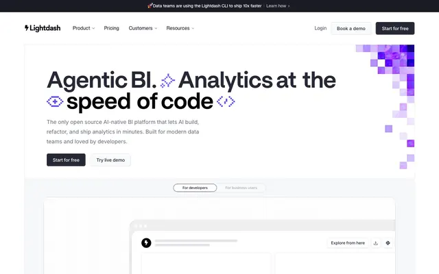
Lightdash employs a precise, tech-forward aesthetic using a monochromatic palette punctuated by a single vibrant accent. Typography is a key identifier, balancing strong, impactful sans-serif headlines with clean, readable body text. Components favor soft curves and subtle elevation, appearing lightweight yet defined, maintaining a sense of digital clarity and focused productivity. The overall design feels robust and intelligent, reflecting its AI/BI platform nature.
The page adheres to a max-width contained layout with content centered, though specific sections may break this for full-bleed effects. The hero section features a prominent headline centered over a nuanced background of dark neutrals and pixelated violet accents. Section rhythm is primarily defined by consistent vertical spacing, creating breathing room, and alternating background colors (Canvas White vs. Lava Cloud) to delineate content blocks. Content arrangement often utilizes two-column layouts with text-left/image-right or centered stacks. Navigation is a sticky top bar, providing persistent access to key links.
Imagery treatment is primarily focused on abstract, pixelated backgrounds and product UI screenshots. The pixelated patterns, often in shades of violet or dark grays (Pixel Purple #c8ccf3), provide a technical, data-driven atmosphere. Product screenshots feature clean, contained UI elements on dark backgrounds, often with simple, illustrative icons. Icons are predominantly outlined, thin stroke weight, maintaining the minimalist and precise aesthetic. The visual density is balanced, allowing prominent text to lead, with imagery serving as supportive illustration or product showcase rather than decorative flourish for its own sake.
Reminiscent of Vercel, Linear, Supabase, Figma.
# Lightdash — Style Reference
> Codebase blueprint on frosted glass

**Theme:** light

**Site:** https://www.lightdash.com

Lightdash employs a precise, tech-forward aesthetic using a monochromatic palette punctuated by a single vibrant accent. Typography is a key identifier, balancing strong, impactful sans-serif headlines with clean, readable body text. Components favor soft curves and subtle elevation, appearing lightweight yet defined, maintaining a sense of digital clarity and focused productivity. The overall design feels robust and intelligent, reflecting its AI/BI platform nature.

## Tokens — Colors

| Name | Value | Token | Role |
|------|------|------|------|
| Electric Violet | `#5e4cff` | `--color-electric-violet` | Primary action buttons, interactive highlights, and brand accents to draw attention |
| Lavender Mist | `#dfdbff` | `--color-lavender-mist` | Subtle button backgrounds, decorative accents, and soft focus states |
| Pixel Purple | `#c8ccf3` | `--color-pixel-purple` | Decorative background fills, hinting at digital patterns and data visualizations |
| Midnight Ink | `#1a1b25` | `--color-midnight-ink` | Primary text for headings and interactive elements, button backgrounds for ghost/outlined variants |
| Charcoal Slate | `#272835` | `--color-charcoal-slate` | Hero section text, secondary button backgrounds, and subtle borders |
| Deep Indigo | `#36394a` | `--color-deep-indigo` | Input backgrounds, primary body text, and some borders |
| Steel Gray | `#666d80` | `--color-steel-gray` | Secondary body text and muted informational details |
| Cloud Gray | `#818898` | `--color-cloud-gray` | Tertiary text, decorative elements, and subtle icon strokes |
| Stone Wash | `#a4abb8` | `--color-stone-wash` | Light helper text, link borders, and subtle descriptive text |
| Off-White | `#f8fafb` | `--color-off-white` | Subtle background for UI elements, light cards |
| Canvas White | `#ffffff` | `--color-canvas-white` | Page backgrounds, primary card surfaces, high-contrast text |
| Lava Cloud | `#eceff3` | `--color-lava-cloud` | Subtle background for alternating sections or distinct UI areas |
| Ghost Fill | `#f6f8fa` | `--color-ghost-fill` | Background for subtle surface differentiation, such as active states or hovering elements |

## Tokens — Typography

### sans-serif
- **Weights:** 400
- **Sizes:** 12px
- **Line height:** 1.2
- **Role:** sans-serif — detected in extracted data but not described by AI

### Britti Sans Trial Semibold
- **Substitute:** Montserrat
- **Weights:** 400, 600
- **Sizes:** 18px, 48px, 56px, 57px, 76px
- **Line height:** 0.9, 0.95, 1, 1.56
- **Letter spacing:** -0.025em, -0.020em
- **Role:** Primary headlines and impactful display text. The tight letter-spacing at larger sizes gives a sense of modern precision and weight without being bold, authoritative through restraint.

### Britti Sans Medium
- **Substitute:** Montserrat
- **Weights:** 400, 500
- **Sizes:** 14px, 16px, 18px, 20px, 24px, 32px
- **Line height:** 1.11, 1.14, 1.2, 1.25, 1.3, 1.8, 2
- **Letter spacing:** -0.020em, -0.010em, 0.010em
- **Role:** Subheadings, section titles, and prominent UI labels. A slightly more relaxed tracking than display text, maintaining legibility at various intermediate sizes.

### Britti Sans Trial Regular
- **Substitute:** Montserrat
- **Weights:** 400
- **Sizes:** 48px
- **Line height:** 1, 1.2
- **Letter spacing:** -0.020em
- **Role:** Specific display text, often used for numerical data or secondary large-scale headings, offering a slightly lighter visual presence than semibold.

### Inter
- **Substitute:** Inter
- **Weights:** 400, 500, 600
- **Sizes:** 9px, 12px, 13px, 14px, 15px, 16px, 17px, 18px, 24px
- **Line height:** 1, 1.19, 1.2, 1.33, 1.38, 1.43, 1.5, 1.54, 1.63, 1.78
- **Letter spacing:** -0.020em, -0.015em, -0.010em
- **Role:** Body text, navigation, input fields, and most UI elements. Its variable weights provide flexibility for hierarchy without introducing additional type families.

### Inter Variable
- **Substitute:** Inter
- **Weights:** 400, 500
- **Sizes:** 12px, 13px, 14px, 16px, 18px
- **Line height:** 1.25, 1.43, 1.54, 1.67, 1.7
- **Letter spacing:** -0.010em
- **Role:** Specific body text instances, often for slightly larger or more prominent paragraph content, leveraging the variable font features for fine-tuned density.

### IBM Plex Mono
- **Substitute:** IBM Plex Mono
- **Weights:** 400
- **Sizes:** 12px
- **Line height:** 1.5
- **Letter spacing:** -0.020em
- **Role:** Monospaced text for code snippets, data displays, or precise technical information. Maintains a consistent visual rhythm.

### Micro 5
- **Substitute:** Micro 5 (Google Fonts)
- **Weights:** 400
- **Sizes:** 31px
- **Line height:** 1.2
- **Letter spacing:** normal
- **Role:** Highly stylized, decorative headlines or special numeric displays, used sparingly for specific visual impact that evokes digital code or retro computing.

## Tokens — Type Scale

Augmented Fourth (1.414) from 14px base.

| Role | Size | Line height | Letter spacing |
|------|------|------|------|
| body | 14px | 1.43 | -0.01em |
| subheading | 18px | 1.3 | -0.01em |
| heading-sm | 24px | 1.25 | -0.01em |
| heading | 32px | 1.14 | — |
| heading-lg | 48px | 1 | -0.025em |
| display | 76px | 0.9 | -0.025em |

## Tokens — Spacing

- **Section gap:** 40-64px
- **Card padding:** 24-32px
- **Element gap:** 8px

## Tokens — Radius

- **Buttons:** 8px
- **Inputs:** 0px
- **Cards:** 12px
- **tags:** 999px

## Tokens — Elevation

- **cards:** `rgba(39, 40, 53, 0.1) 0px 0px 0px 1px`
- **elevated cards:** `rgba(39, 40, 53, 0.05) 0px 0px 0px 1px, rgba(39, 40, 53, 0.01) 0px 50px 20px 0px, rgba(39, 40, 53, 0.02) 0px 30px 18px 0px, rgba(39, 40, 53, 0.04) 0px 13px 13px 0px, rgba(39, 40, 53, 0.05) 0px 3px 7px 0px`
- **layered UI elements:** `rgba(0, 0, 0, 0.05) 0px 2px 5px 0px, rgba(0, 0, 0, 0.04) 0px 9px 9px 0px, rgba(0, 0, 0, 0.02) 0px 20px 12px 0px, rgba(0, 0, 0, 0.01) 0px 35px 14px 0px, rgba(0, 0, 0, 0.01) 0px 0px 0px 1px`

## Layout

The page adheres to a max-width contained layout with content centered, though specific sections may break this for full-bleed effects. The hero section features a prominent headline centered over a nuanced background of dark neutrals and pixelated violet accents. Section rhythm is primarily defined by consistent vertical spacing, creating breathing room, and alternating background colors (Canvas White vs. Lava Cloud) to delineate content blocks. Content arrangement often utilizes two-column layouts with text-left/image-right or centered stacks. Navigation is a sticky top bar, providing persistent access to key links.

## Imagery

Imagery treatment is primarily focused on abstract, pixelated backgrounds and product UI screenshots. The pixelated patterns, often in shades of violet or dark grays (Pixel Purple #c8ccf3), provide a technical, data-driven atmosphere. Product screenshots feature clean, contained UI elements on dark backgrounds, often with simple, illustrative icons. Icons are predominantly outlined, thin stroke weight, maintaining the minimalist and precise aesthetic. The visual density is balanced, allowing prominent text to lead, with imagery serving as supportive illustration or product showcase rather than decorative flourish for its own sake.

## Components

### Primary Action Button
*Call to action.*

Filled button with Electric Violet (#5e4cff) background, white text, 8px border-radius, and 12px vertical, 20px horizontal padding. Uses Inter font weight 500.

### Secondary Ghost Button
*Secondary action or subtle interaction.*

Ghost button with a transparent background, Midnight Ink (#1a1b25) border, a minimum 1px border stroke, 8px border-radius, and 12px vertical, 20px horizontal padding. Text color is Midnight Ink (#1a1b25). Uses Inter font weight 500.

### Tertiary Filled Button
*Informational actions or less prominent calls to action.*

Filled button with Lava Mist (#dfdbff) background, Midnight Ink (#1a1b25) text, 8px border-radius, and 12px vertical, 20px horizontal padding.

### Interactive Chip Button
*Filter chips or toggleable options.*

Card-like button with a light background (rgba(5, 5, 19, 0.04)), 26px border-radius for a pill shape, and 12px padding all around. No shadow.

### Elevated Feature Card
*Showcasing product features or key information.*

Card with Canvas White (#ffffff) background, 20px border-radius, and a prominent shadow stack (rgba(39, 40, 53, 0.05) 0px 0px 0px 1px, rgba(39, 40, 53, 0.01) 0px 50px 20px 0px, etc.). Padding of 24px top, 32px horizontal, 20px bottom.

### Simple Information Card
*Containing lists, text, or less emphasized content.*

Card with Canvas White (#ffffff) background, 12px border-radius, and a subtle 1px border shadow (rgba(39, 40, 53, 0.1) 0px 0px 0px 1px). Padding of 28px top/bottom, 22px horizontal.

### Segmented Control Item
*Selectable options within a group.*

Segmented control item with a background of rgba(5, 5, 19, 0.06), 26px border-radius, and 16px top, 8px horizontal, 8px bottom padding. No shadow.

### Dark Input Field
*User input for forms in a dark context.*

Input field with a Deep Indigo (#36394a) background, white text, and a white border (rgb(255, 255, 255)). Standard 10px vertical and 20-24px horizontal padding. No border-radius, implying sharp corners or system default.

## Guidelines

### Do

- Use Electric Violet (#5e4cff) exclusively for primary calls-to-action and critical interactive highlights.
- Apply Britti Sans Trial Semibold for all primary headings, using the specified letter-spacing for each size.
- Maintain a clear visual hierarchy by limiting saturated colors to Electric Violet and its softer accent tints.
- Utilize Canvas White (#ffffff) as the dominant page background and primary card surfaces for visual breathability.
- Implement 8px border-radius for all buttons and 12px for cards to maintain consistent soft-edged elements.
- Differentiate UI surfaces using Charcoal Slate (#272835) for darker elements and Lava Cloud (#eceff3) for subtle background variations.
- Employ IBM Plex Mono for all code blocks or technical data displays to ensure typographic distinction and readability.

### Don't

- Do not introduce new saturated hues outside of the established Electric Violet and its related accent shades.
- Avoid using drop shadows on functional UI elements unless it's a card from the 'Elevated Feature Card' component.
- Do not vary letter-spacing for Britti Sans headlines from the specified -0.025em for large sizes and -0.020em for smaller sizes.
- Never use generic system fonts for branding or primary content where Britti Sans or Inter are specified.
- Do not use Electric Violet (#5e4cff) for body text or large blocks of content; it is reserved for action and accent.
- Avoid excessive use of very dark backgrounds; the system leans heavily on light mode with dark neutral accents.
- Do not apply large, rounded corners (e.g., 20px) to anything other than the specific Elevated Feature Card and pill-shaped elements.

## Agent Prompt Guide

Quick Color Reference:
text: #272835
background: #ffffff
border: #b4acff
accent: #c8ccf3
primary action: #5e4cff (filled action)

Example Component Prompts:
Create a hero section: Canvas White (#ffffff) background. Headline 'Agentic BI. Analytics at the speed of code' using Britti Sans Trial Semibold 76px, Charcoal Slate (#272835), letter-spacing -0.025em. Subtext 'The only open source AI-native BI platform...' using Inter 18px, Steel Gray (#666d80). Primary call-to-action button 'Start for free' with Electric Violet (#5e4cff) background, white text, 8px radius, 12px vertical, 20px horizontal padding.

Create a Simple Information Card: Canvas White (#ffffff) background, 12px border-radius, subtle 1px border shadow (rgba(39, 40, 53, 0.1) 0px 0px 0px 1px). Padding 28px top/bottom, 22px horizontal. Headline 'Documentation' using Britti Sans Medium 24px, Midnight Ink (#1a1b25). Body text 'Explore our API guides...' using Inter 16px, Deep Indigo (#36394a).

Create a Dark Input Field: Deep Indigo (#36394a) background, with a 1px solid white border, no border-radius. Placeholder text 'Enter your email' should be Cloud Gray (#818898) using Inter 16px. Text input should be Canvas White (#ffffff).
More like this









Keep what you find
A free account saves references to boards and can send you a weekly email of picks based on what you save.
To see every result, go Pro.