Preview image. Unlock full-res
Digital Blueprint on Vellum
Color palette
Main background for content areas and primary navigation surfaces, suggesting a digital canvas for content overlays
Neutral form states, badge text, and quiet UI feedback where color should stay understated. Do not promote it to the primary CTA color
Hairline borders, dividers, input outlines, and card edges on light surfaces. Do not promote it to the primary CTA color
Typography
- Weights
- 300
- Sizes
- 10px, 17px
- Line height
- 1.3
- Letter spacing
- -0.004, -0.002
-apple-system — detected in extracted data but not described by AI
- Letter spacing
- -0.0040em at 10px, -0.0020em at 17px
- Fallback
- -apple-system
Single typographical style used across the entire site for all text, conveying a consistent, pragmatic tone. The lighter weight at smaller sizes paired with specific letter-spacing creates a deliberate 'anti-design' feel, prioritizing clarity and directness.
Spacing & shape
Components
Text in Ink Jot (#000000) at 17px system-ui weight 300, line-height 1.3. Each item has a 15px padding on all sides before an interactive state changes its background.
Text in Ink Jot (#000000) at 17px system-ui weight 300, line-height 1.3. Often grouped with social links.
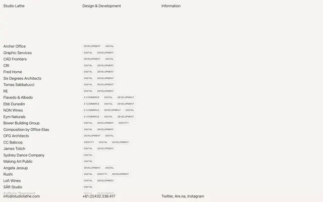
Ghost-style badge with text in Ink Jot (#000000), using 10px system-ui weight 300, line-height 1.3. Background is transparent with a subtle Badge Fog (#DADADA) 1px border. Features 3px vertical padding and 6px horizontal padding, with a 5px border-radius, and 8px right margin for horizontal stacking.
Text in Ink Jot (#000000) at 17px system-ui weight 300. When active, the background fills with Canvas Parchment (#FFFF00), indicating the current section without using color on the text itself.
Guidelines
- Use Canvas Parchment (#FFFF00) as the primary background for sections that act as a visual content canvas or are currently interactive.
- Apply Ink Jot (#000000) for all text elements to maintain high contrast and a stark aesthetic.
- Utilize the system-ui font at weight 300 for all typography, adjusting letter-spacing as per the type scale for 10px and 17px sizes.
- Employ Badge Fog (#DADADA) for subtle 1px borders on ghost-style badge components.
- Adhere to an 8px element gap for horizontal spacing between elements like tags and 180px for section separators.
- Ensure all interactive badge elements use a 5px border-radius with 3px vertical and 6px horizontal padding.
- Do not introduce additional saturated colors; the palette is strictly monochrome with a single vivid yellow for interaction.
- Avoid heavy shadows or gradients; the design relies on flat surfaces and high contrast for definition.
- Do not vary font families or weights beyond the single defined system-ui 300; consistency is paramount for this typographic identity.
- Do not use generic button styles; prefer ghost buttons or text links with distinct background changes for interactive states.
- Do not create complex layouts that deviate from the compact, maximum-width constrained structure; simplicity and directness are key.
About this system
ShowHide
The Studio Lathe design system evokes a raw, digital blueprint aesthetic. It features stark contrasts and a minimal color palette predominantly using black text on a pale, almost invisible background. Interactive elements are subtly highlighted with a vivid yellow that appears to switch content sections or navigational context rather than acting as a traditional brand accent. Typography is a key identifier, utilizing system fonts with precise letter-spacing to achieve a crisp, understated texture against the dominant white space. Visual density is low, emphasizing content rather than decorative flourishes.
The page adheres to a centered maximum width of 353px, creating a compact, focused viewing experience reminiscent of a detailed document or a console interface. The hero section, if implicitly defined, presents critical navigation in a high-contrast format. Sections are clearly demarcated by substantial vertical spacing (specifically 180px `sectionGap`), fostering a minimalist rhythm. Content is primarily arranged in single-column stacks for lists and multi-column grids for badges, with an implicit left-alignment for main content. Navigation is a simple top-bar and footer links, designed for quick access rather than exploration.
This site uses no imagery, illustrations, or graphics. The visual language is entirely expressed through typography, spacing, and stark color contrasts, creating an object-oriented, content-first experience. Icons, if present, are purely functional and monochromatic, likely a simple outlined style matching the text weight.
Reminiscent of Are.na, Working Not Working, Linear (early versions), Superlist.
# Liquid Ideas — Style Reference
> Digital Blueprint on Vellum

**Theme:** light

**Site:** https://studiolathe.com

The Studio Lathe design system evokes a raw, digital blueprint aesthetic. It features stark contrasts and a minimal color palette predominantly using black text on a pale, almost invisible background. Interactive elements are subtly highlighted with a vivid yellow that appears to switch content sections or navigational context rather than acting as a traditional brand accent. Typography is a key identifier, utilizing system fonts with precise letter-spacing to achieve a crisp, understated texture against the dominant white space. Visual density is low, emphasizing content rather than decorative flourishes.

## Tokens — Colors

| Name | Value | Token | Role |
|------|------|------|------|
| Canvas Parchment | `#FFFF00` | `--color-canvas-parchment` | Main background for content areas and primary navigation surfaces, suggesting a digital canvas for content overlays |
| Ink Jot | `#000000` | `--color-ink-jot` | Neutral form states, badge text, and quiet UI feedback where color should stay understated. Do not promote it to the primary CTA color |
| Badge Fog | `#DADADA` | `--color-badge-fog` | Hairline borders, dividers, input outlines, and card edges on light surfaces. Do not promote it to the primary CTA color |

## Tokens — Typography

### -apple-system
- **Weights:** 300
- **Sizes:** 10px, 17px
- **Line height:** 1.3
- **Letter spacing:** -0.004, -0.002
- **Role:** -apple-system — detected in extracted data but not described by AI

### system-ui
- **Substitute:** -apple-system
- **Letter spacing:** -0.0040em at 10px, -0.0020em at 17px
- **Role:** Single typographical style used across the entire site for all text, conveying a consistent, pragmatic tone. The lighter weight at smaller sizes paired with specific letter-spacing creates a deliberate 'anti-design' feel, prioritizing clarity and directness.

## Tokens — Type Scale

| Role | Size | Line height | Letter spacing |
|------|------|------|------|
| caption | 10px | 1.3 | -0.04em |
| body | 17px | 1.3 | -0.034em |

## Tokens — Spacing

- **Max width:** 353px
- **Section gap:** 180px
- **Card padding:** 15px
- **Element gap:** 8px

## Tokens — Radius

- **badges:** 5px

## Layout

The page adheres to a centered maximum width of 353px, creating a compact, focused viewing experience reminiscent of a detailed document or a console interface. The hero section, if implicitly defined, presents critical navigation in a high-contrast format. Sections are clearly demarcated by substantial vertical spacing (specifically 180px `sectionGap`), fostering a minimalist rhythm. Content is primarily arranged in single-column stacks for lists and multi-column grids for badges, with an implicit left-alignment for main content. Navigation is a simple top-bar and footer links, designed for quick access rather than exploration.

## Imagery

This site uses no imagery, illustrations, or graphics. The visual language is entirely expressed through typography, spacing, and stark color contrasts, creating an object-oriented, content-first experience. Icons, if present, are purely functional and monochromatic, likely a simple outlined style matching the text weight.

## Components

### Standard List Item
*Navigational link or content entry in vertical lists*

Text in Ink Jot (#000000) at 17px system-ui weight 300, line-height 1.3. Each item has a 15px padding on all sides before an interactive state changes its background.

### Footer Contact Link
*Minimal contact information links*

Text in Ink Jot (#000000) at 17px system-ui weight 300, line-height 1.3. Often grouped with social links.

### Tag Badge
*Categorization tag for project types*

Ghost-style badge with text in Ink Jot (#000000), using 10px system-ui weight 300, line-height 1.3. Background is transparent with a subtle Badge Fog (#DADADA) 1px border. Features 3px vertical padding and 6px horizontal padding, with a 5px border-radius, and 8px right margin for horizontal stacking.

### Top Navigation Link
*Primary site navigation links.*

Text in Ink Jot (#000000) at 17px system-ui weight 300. When active, the background fills with Canvas Parchment (#FFFF00), indicating the current section without using color on the text itself.

## Guidelines

### Do

- Use Canvas Parchment (#FFFF00) as the primary background for sections that act as a visual content canvas or are currently interactive.
- Apply Ink Jot (#000000) for all text elements to maintain high contrast and a stark aesthetic.
- Utilize the system-ui font at weight 300 for all typography, adjusting letter-spacing as per the type scale for 10px and 17px sizes.
- Employ Badge Fog (#DADADA) for subtle 1px borders on ghost-style badge components.
- Adhere to an 8px element gap for horizontal spacing between elements like tags and 180px for section separators.
- Ensure all interactive badge elements use a 5px border-radius with 3px vertical and 6px horizontal padding.

### Don't

- Do not introduce additional saturated colors; the palette is strictly monochrome with a single vivid yellow for interaction.
- Avoid heavy shadows or gradients; the design relies on flat surfaces and high contrast for definition.
- Do not vary font families or weights beyond the single defined system-ui 300; consistency is paramount for this typographic identity.
- Do not use generic button styles; prefer ghost buttons or text links with distinct background changes for interactive states.
- Do not create complex layouts that deviate from the compact, maximum-width constrained structure; simplicity and directness are key.

## Agent Prompt Guide

Quick Color Reference: text: #000000, background: #FFFF00, border: #DADADA, accent: #FFFF00, primary action: no distinct CTA color

Example Component Prompts:
Create a list item for 'Archer Office': text color Ink Jot (#000000), font system-ui weight 300 size 17px, line height 1.3. It should have 15px padding on all sides.
Create a Tag Badge: text Ink Jot (#000000), font system-ui weight 300 size 10px, line height 1.3. Background transparent, 1px border in Badge Fog (#DADADA), 5px border-radius, 3px vertical padding, 6px horizontal padding, and 8px right margin.
Create a footer contact link for '+61.(2)432.338.417': text color Ink Jot (#000000), font system-ui weight 300 size 17px, line height 1.3.
Create a top navigation item for 'Design & Development': text color Ink Jot (#000000), font system-ui weight 300 size 17px, line height 1.3. If active, its background should be Canvas Parchment (#FFFF00).
More like this









Keep what you find
A free account saves references to boards and can send you a weekly email of picks based on what you save.
To see every result, go Pro.