Preview image. Unlock full-res
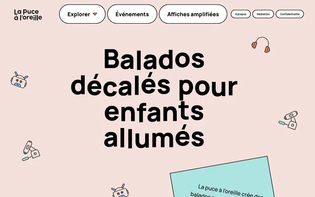
Blush Playground: A soft, inviting canvas for bold, playful content.
Color palette
Orange wash for highlight backgrounds, decorative bands, and soft emphasis behind content. Do not promote it to the primary CTA color
Decorative splashes, card accents, playful iconography
Card backgrounds, decorative accents, secondary navigation hover states
Decorative iconography, small accent fills
Background for subtle accents and illustrations, card backgrounds
Illustrative details, card backgrounds, soft visual punctuation
Card backgrounds, illustrative elements, subtle background fills
Used sparingly for precise illustrative accents
Primary page background, light surface
Card backgrounds, secondary surface
Primary text, borders, active navigation outlines
Typography
- Weights
- 400
- Sizes
- 16px, 35px, 46px
- Line height
- 1.09, 1.2
- Letter spacing
- normal
- Fallback
- Bebas Neue
Display headlines and prominent text areas where a heavy, impactful presence is desired. Its singular weight ensures consistent visual density.
- Weights
- 400, 500, 700, 800
- Sizes
- 12px, 25px, 34px, 50px, 120px
- Line height
- 1, 1.12, 1.16, 1.24, 1.5, 1.6
- Letter spacing
- normal
- Fallback
- Inter
Body text, navigation, and detailed information. The range of weights provides flexibility, with heavier weights used for subheadings and emphasis, complementing the display font's boldness.
Spacing & shape
Components
Buttons with a rounded-pill shape (47px radius), outlined with Charcoal Text (#000000, 2px stroke). Background is white (#ffffff) or Pumpkin Accent (#ef724f) when active, creating clear visual feedback. Text is Manrope, Charcoal Text (#000000), 20px, medium weight.
White (#ffffff) background card with a subtle 10px border-radius, often appearing without a visible stroke. Padding varies, with common values of 16px bottom padding to create comfortable spacing for content.
Cards feature bold, moderate to vivid accent colors like Sky Blue (#84bfff) or Bubblegum Pink (#981082) with a distinctive 40px border-radius. Inner padding is generous at 15px top/bottom and 25px left/right, providing ample breathing room for contents like text.
Uses Alfa Slab One, 46-120px, weight 400, Charcoal Text (#000000), normal letter spacing. Delivered on the Canvas Pink (#f6e0db) background, it establishes a bold and direct tone.
Guidelines
- Prioritize Canvas Pink (#f6e0db) as the default background for new pages to maintain brand warmth.
- Use Alfa Slab One for all main headlines and prominent display text to leverage its bold, heavy character.
- Apply a 47px border-radius to all interactive buttons and navigation elements for a consistently soft, approachable feel.
- Introduce accent colors like Pumpkin Accent (#ef724f) or Bubblegum Pink (#981082) primarily as background fills for interactive elements or distinct card sections, not just decorative flourishes.
- Ensure all primary text uses Charcoal Text (#000000) for high contrast and legibility against light backgrounds.
- Maintain a comfortable density with element gaps of 10px between inline elements and 15px vertical padding within cards.
- Avoid using saturated accent colors for large text blocks; reserve them for backgrounds and smaller, functional elements.
- Do not introduce sharp corners or small radii; the design language consistently applies generous rounding (10px, 40px, or 47px).
- Refrain from using shadows for elevation; surfaces are defined by background color changes and border outlines, not depth.
- Do not deviate from the Manrope and Alfa Slab One font pairing; these are the only sanctioned typefaces.
- Avoid monochromatic designs; the system relies on a playful, varied accent palette to provide visual interest and categorize content.
- Do not implement gradients; the styling relies on solid color blocks and outlines.
About this system
ShowHide
Lpalo exudes a playful, yet bold aesthetic, centered around a light, blush pink canvas that evokes warmth and imagination. Prominent, heavy typography anchors content, while a cast of vibrant, sometimes unexpected, accent colors punctuates the interface without overwhelming. Elements are rounded and friendly, suggesting an approachable, creative space for children's content. The visual system balances strong typographic presence with whimsical, illustrative details.
The page uses a full-bleed layout, filling the entire viewport with the Canvas Pink background. The hero section features a centered, oversized headline using Alfa Slab One, acting as a strong visual anchor. Content sections appear to follow a consistent vertical rhythm, though specific section gaps are moderate. Navigation is a horizontal bar at the top, employing the pill-shaped buttons. Content arrangement likely uses a combination of stacked elements and potential two or three-column card grids further down the page to showcase different podcast categories. Density is comfortable, with ample breathing room around elements.
The site favors outline illustrations with a soft, playful, and slightly quirky style. These illustrations often feature robots, headphones, and abstract objects rendered with thin black strokes and minimal, bright fills pulled from the accent color palette (Sky Blue, Pumpkin Accent, Spring Green). Imagery is integrated as decorative elements scattered across the canvas, avoiding full-bleed or contained hero imagery. There are no photographs or realistic product renders, maintaining a whimsical, illustrative identity.
Reminiscent of Headspace, Calm, Duolingo.
# Lpalo — Style Reference
> Blush Playground: A soft, inviting canvas for bold, playful content.

**Theme:** light

**Site:** https://lpalo.com

Lpalo exudes a playful, yet bold aesthetic, centered around a light, blush pink canvas that evokes warmth and imagination. Prominent, heavy typography anchors content, while a cast of vibrant, sometimes unexpected, accent colors punctuates the interface without overwhelming. Elements are rounded and friendly, suggesting an approachable, creative space for children's content. The visual system balances strong typographic presence with whimsical, illustrative details.

## Tokens — Colors

| Name | Value | Token | Role |
|------|------|------|------|
| Pumpkin Accent | `#ef724f` | `--color-pumpkin-accent` | Orange wash for highlight backgrounds, decorative bands, and soft emphasis behind content. Do not promote it to the primary CTA color |
| Lemon Highlight | `#e7db4c` | `--color-lemon-highlight` | Decorative splashes, card accents, playful iconography |
| Bubblegum Pink | `#981082` | `--color-bubblegum-pink` | Card backgrounds, decorative accents, secondary navigation hover states |
| Spring Green | `#6ed311` | `--color-spring-green` | Decorative iconography, small accent fills |
| Seafoam Accent | `#ace2df` | `--color-seafoam-accent` | Background for subtle accents and illustrations, card backgrounds |
| Lavender Glow | `#e69dff` | `--color-lavender-glow` | Illustrative details, card backgrounds, soft visual punctuation |
| Sky Blue | `#84bfff` | `--color-sky-blue` | Card backgrounds, illustrative elements, subtle background fills |
| Deep Blue | `#5196ff` | `--color-deep-blue` | Used sparingly for precise illustrative accents |
| Canvas Pink | `#f6e0db` | `--color-canvas-pink` | Primary page background, light surface |
| Surface White | `#ffffff` | `--color-surface-white` | Card backgrounds, secondary surface |
| Charcoal Text | `#000000` | `--color-charcoal-text` | Primary text, borders, active navigation outlines |

## Tokens — Typography

### Alfa Slab One
- **Substitute:** Bebas Neue
- **Weights:** 400
- **Sizes:** 16px, 35px, 46px
- **Line height:** 1.09, 1.2
- **Letter spacing:** normal
- **Role:** Display headlines and prominent text areas where a heavy, impactful presence is desired. Its singular weight ensures consistent visual density.

### Manrope
- **Substitute:** Inter
- **Weights:** 400, 500, 700, 800
- **Sizes:** 12px, 25px, 34px, 50px, 120px
- **Line height:** 1, 1.12, 1.16, 1.24, 1.5, 1.6
- **Letter spacing:** normal
- **Role:** Body text, navigation, and detailed information. The range of weights provides flexibility, with heavier weights used for subheadings and emphasis, complementing the display font's boldness.

## Tokens — Type Scale

Golden Ratio (1.618) from 25px base.

| Role | Size | Line height | Letter spacing |
|------|------|------|------|
| caption | 12px | 1.5 | — |
| body-sm | 16px | 1.2 | — |
| body | 25px | 1.24 | — |
| subheading | 34px | 1.16 | — |
| heading-lg | 46px | 1.09 | — |
| display | 120px | 1 | — |

## Tokens — Spacing

- **Section gap:** 46px
- **Card padding:** 15px
- **Element gap:** 10px

## Tokens — Radius

- **Default:** 47px
- **Cards:** 10px
- **largeCards:** 40px
- **navigation:** 47px

## Layout

The page uses a full-bleed layout, filling the entire viewport with the Canvas Pink background. The hero section features a centered, oversized headline using Alfa Slab One, acting as a strong visual anchor. Content sections appear to follow a consistent vertical rhythm, though specific section gaps are moderate. Navigation is a horizontal bar at the top, employing the pill-shaped buttons. Content arrangement likely uses a combination of stacked elements and potential two or three-column card grids further down the page to showcase different podcast categories. Density is comfortable, with ample breathing room around elements.

## Imagery

The site favors outline illustrations with a soft, playful, and slightly quirky style. These illustrations often feature robots, headphones, and abstract objects rendered with thin black strokes and minimal, bright fills pulled from the accent color palette (Sky Blue, Pumpkin Accent, Spring Green). Imagery is integrated as decorative elements scattered across the canvas, avoiding full-bleed or contained hero imagery. There are no photographs or realistic product renders, maintaining a whimsical, illustrative identity.

## Components

### Navigation Button
*Primary navigation links and interactive controls.*

Buttons with a rounded-pill shape (47px radius), outlined with Charcoal Text (#000000, 2px stroke). Background is white (#ffffff) or Pumpkin Accent (#ef724f) when active, creating clear visual feedback. Text is Manrope, Charcoal Text (#000000), 20px, medium weight.

### Default Card
*Content containers for information display.*

White (#ffffff) background card with a subtle 10px border-radius, often appearing without a visible stroke. Padding varies, with common values of 16px bottom padding to create comfortable spacing for content.

### Accent Card - Rounded
*Highlighting specific content or categories with a playful aesthetic.*

Cards feature bold, moderate to vivid accent colors like Sky Blue (#84bfff) or Bubblegum Pink (#981082) with a distinctive 40px border-radius. Inner padding is generous at 15px top/bottom and 25px left/right, providing ample breathing room for contents like text.

### Hero Headline
*Main page title or section headline.*

Uses Alfa Slab One, 46-120px, weight 400, Charcoal Text (#000000), normal letter spacing. Delivered on the Canvas Pink (#f6e0db) background, it establishes a bold and direct tone.

## Guidelines

### Do

- Prioritize Canvas Pink (#f6e0db) as the default background for new pages to maintain brand warmth.
- Use Alfa Slab One for all main headlines and prominent display text to leverage its bold, heavy character.
- Apply a 47px border-radius to all interactive buttons and navigation elements for a consistently soft, approachable feel.
- Introduce accent colors like Pumpkin Accent (#ef724f) or Bubblegum Pink (#981082) primarily as background fills for interactive elements or distinct card sections, not just decorative flourishes.
- Ensure all primary text uses Charcoal Text (#000000) for high contrast and legibility against light backgrounds.
- Maintain a comfortable density with element gaps of 10px between inline elements and 15px vertical padding within cards.

### Don't

- Avoid using saturated accent colors for large text blocks; reserve them for backgrounds and smaller, functional elements.
- Do not introduce sharp corners or small radii; the design language consistently applies generous rounding (10px, 40px, or 47px).
- Refrain from using shadows for elevation; surfaces are defined by background color changes and border outlines, not depth.
- Do not deviate from the Manrope and Alfa Slab One font pairing; these are the only sanctioned typefaces.
- Avoid monochromatic designs; the system relies on a playful, varied accent palette to provide visual interest and categorize content.
- Do not implement gradients; the styling relies on solid color blocks and outlines.

## Agent Prompt Guide

Quick Color Reference:
text: #000000
background: #f6e0db
border: #000000
accent: #ef724f
primary action: no distinct CTA color

Example Component Prompts:
No distinct primary action color was observed; use the extracted neutral button treatments instead of inventing a filled CTA color.
2. Design a feature card for 'Emotions & Intimacy': Sky Blue (#84bfff) background, 40px border-radius, 15px top/bottom padding, 25px left/right padding, text Manrope 25px, Charcoal Text (#000000).
3. Generate a main hero headline: Alfa Slab One, 120px, weight 400, Charcoal Text (#000000), normal letter spacing, placed on a Canvas Pink (#f6e0db) background.
More like this







Keep what you find
A free account saves references to boards and can send you a weekly email of picks based on what you save.
To see every result, go Pro.