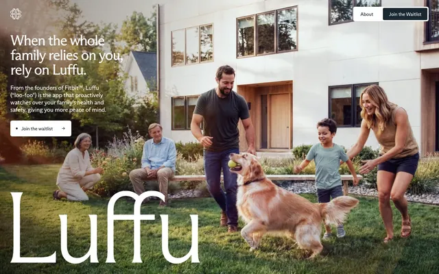
Preview image. Unlock full-res
Family almanac printed on cream linen — editorial restraint meets intimate warmth, executed in two weights of a single serif-adjacent type system on a near-parchment ground.
Color palette
Primary CTA button fill, nav border, interactive controls — this single dark-teal anchor is the only departure from the black/cream palette, creating a subtle aquatic undertone that reads health-adjacent without being clinical
Page background, section fills — the slight warm-green cast separates this from pure white and prevents sterility
Subtle section dividers, secondary surface tinting
Tertiary surface, card backgrounds in feature sections
Body text, headings, primary readable content
Secondary body text, captions, supporting copy
Tertiary text, footer links, subdued labels
Button text on dark fills, icon fills, overlay text on photography
Maximum contrast text, SVG fills
Typography
- Weights
- 400
- Sizes
- 14px, 16px, 20px
- Line height
- 1
- Letter spacing
- -0.35px at 14px, -0.32px at 16px, -0.32px at 20px
- Fallback
- Freight Sans Pro or Cormorant SC
Navigation links, body copy, buttons, captions, footer text. Single weight used across all UI text — no bold weight anywhere forces hierarchy through size alone. The tight letter-spacing (-0.016em at 20px, -0.020em at 16px, -0.025em at 14px) gives a condensed editorial feel at every size.
- Weights
- 400
- Sizes
- 40px, 48px, 64px
- Line height
- 1
- Letter spacing
- -3.2px at 64px, -2.02px at 48px, -1.24px at 40px
- Fallback
- Playfair Display or Cormorant Garamond
Display headings and the oversized brand wordmark. The flare-serif construction (hairline terminal spurs) at very tight -0.05em spacing at 64px collapses letterforms together like editorial magazine typography — the 'Luffu' logotype treatment at display scale is the signature visual moment of this system.
Spacing & shape
Components
Background #192830, white text (#ffffff), 4px border-radius, 0px vertical padding with 20px horizontal padding. ABC Arizona Sans 16px weight 400, letter-spacing -0.32px. The minimal vertical padding makes this feel like an inline chip rather than a traditional button — compact and editorial.
Background white (#ffffff), text #192830, border 1px solid #192830, 6px border-radius, 4px top/bottom padding, 18px left/right padding. ABC Arizona Sans 16px. Sits next to ghost text links — the light border marks it as actionable without using color.
White background, #192830 text, border 1px solid #192830, 6px radius, 4px/18px padding. Small arrow glyph appended after text ('Join the waitlist →'). Uses the same construction as the nav button but with arrow affordance for in-context placement.
Full-width lifestyle photography spanning 100vw, headline text in ABC Arizona Flare 48px weight 400, white (#ffffff), letterSpacing -2.02px, positioned top-left over the image. Oversized brand wordmark 'Luffu' at ~120px+ Arizona Flare overlaid at bottom-left, white, bleeding into the image. Dark gradient overlay implied left-side for text legibility. Navigation floats over image with white text links and outlined ghost button.
Rounded card at 6px radius, image fills the card top, 32px internal padding on text area. Three cards in a row with 20px column gap. Each card has a subdued-tone background (desaturated blue or warm cream) rather than white. Category label in ABC Arizona Sans 14px uppercase tracked, body copy in Sans 16px #535557.
Circular photo crops at 9999px border-radius, approximately 80-100px diameter, on the #f5f5ee parchment background. Small question text labels in Arizona Sans 14px #535557 float adjacent. No card container — avatars scatter with negative-space arrangement around a centered heading block.
Arizona Flare 48px #2f3136 letterSpacing -2.02px centered, followed by Arizona Sans 20px #535557 letterSpacing -0.32px body paragraph, also centered. Max-width approximately 600px on the paragraph to preserve narrow measure. No decorative elements — pure typographic hierarchy.
Transparent/overlay over hero photography, left-anchored brand logomark (floral icon + 'luffu' wordmark in white Arizona Flare). Right side: 'About' text link in white Arizona Sans 16px, and outlined ghost button 'Join the Waitlist'. No background color — floats over hero image. Height approximately 70px.
Background near #393e28 (dark olive-near-black), white text links in Arizona Sans 14px. Social platform links (Instagram, LinkedIn, X, Facebook) and Privacy Notice. Compact height approximately 50px, full-width. The warm dark-olive footer background echoes the #192830 button tone — the only two dark surfaces on the page.
Guidelines
- Use ABC Arizona Flare weight 400 at -0.05em letter-spacing for all display headings above 40px — this tight tracking is non-negotiable for the editorial look.
- Keep the background #f5f5ee (Parchment) as the default section fill; only use #e4e7da (Linen) or #d7d7cb (Pressed Cotton) for subtle section alternation.
- Use circular (9999px radius) crops for all person/avatar photography — it humanizes data and links visual language to the family-member representation pattern.
- Restrict the palette to Parchment + Graphite + White for all new sections; #192830 appears ONLY on the primary button and footer — not as a text color or decorative element.
- Apply letterSpacing -0.016em to -0.05em across all type sizes; zero-tracking Arizona type looks wrong at every size.
- Use full-bleed lifestyle photography for hero sections with text overlaid left-aligned in white, not in a card or box — the image IS the content.
- Maintain single-weight (400) discipline across both typefaces — all hierarchy comes from size and opacity, never weight changes.
- Never introduce a chromatic accent color (no brand blue, green, or orange) — the entire system is intentionally achromatic except for the near-teal #192830.
- Never use bold or semibold weights of Arizona Sans or Arizona Flare; the single-weight system breaks immediately when bold appears.
- Don't use drop shadows or card elevation shadows on content sections — the design is entirely flat with background color differentiation only.
- Don't increase button border-radius above 6px; this is a rectilinear system — pill buttons would clash with the editorial register.
- Never place heading text on a white background without the warm Parchment tint (#f5f5ee) — pure white reads too clinical against this family-warmth palette.
- Don't use icon-only buttons or icon-first navigation; all interactive elements are text-labeled in this system.
- Don't stack multiple sections with the same background color (#f5f5ee) without visual break — alternate with Linen (#e4e7da) or photography.
About this system
ShowHide
Luffu feels like late afternoon sun through a kitchen window — warm, unhurried, intimate. The cream-tan background (#f5f5ee) and near-black text (#2f3136) create a paper-and-ink warmth far from the cold blues of health tech. Two custom ABC Arizona typefaces do the heavy lifting: Flare at massive display sizes with -0.05em letter-spacing renders the brand name as a piece of editorial typography, while Sans handles navigation and body with similar optical tightening. The hero is full-bleed lifestyle photography — a real family, natural light, golden retriever — with oversized logotype overlaid at near-opacity, bleeding into the image. Color restriction is extreme: no accent color anywhere, just dark ink, warm cream, and white, with a single dark-teal (#192830) reserved for the primary CTA button.
Max-width approximately 1200px centered on wide screens, with the hero section breaking fully to 100vw. Hero is full-viewport-height lifestyle photography with floating navigation overlay and left-aligned text block at upper-left. Second section (caregiver) is Parchment background with scattered circular avatars around a centered heading — the layout is deliberately open, low-density, white-space-dominant. Third section (feature cards) is a 3-column grid on Parchment-to-Linen gradient background with equal-width cards. Section gap is generous at 120-218px vertical margin between content blocks. No alternating dark/light band pattern — the site remains warm cream throughout with photography providing contrast. Navigation is a single floating top bar, no sticky behavior implied, no mega-menu.
Full-bleed lifestyle photography of real multi-generational families (grandparents, parents, children, pets) in natural outdoor settings — golden hour, residential gardens, candid movement. Photography is warm-keyed, not treated or duotone, with rich natural color that contrasts with the restrained type system. Circular portrait crops are used for individual family member representations in feature sections. Product feature cards use contained photography (food close-ups, health tracking interfaces) with subdued color-tinted card backgrounds. The brand wordmark 'Luffu' overlaid at massive scale on the hero image is the primary graphic design move — type as imagery. Icons are minimal outlined glyphs at 16-20px, monochrome. Image-to-text ratio is very high in the hero, dropping to roughly 50/50 in feature sections, then text-dominant in the footer.
Reminiscent of Calm, Gentler Streak, Whoop, Care.com, Bellabeat.
# Luffu — Style Reference
> Family almanac printed on cream linen — editorial restraint meets intimate warmth, executed in two weights of a single serif-adjacent type system on a near-parchment ground.

**Theme:** light

**Site:** https://luffu.com

Luffu feels like late afternoon sun through a kitchen window — warm, unhurried, intimate. The cream-tan background (#f5f5ee) and near-black text (#2f3136) create a paper-and-ink warmth far from the cold blues of health tech. Two custom ABC Arizona typefaces do the heavy lifting: Flare at massive display sizes with -0.05em letter-spacing renders the brand name as a piece of editorial typography, while Sans handles navigation and body with similar optical tightening. The hero is full-bleed lifestyle photography — a real family, natural light, golden retriever — with oversized logotype overlaid at near-opacity, bleeding into the image. Color restriction is extreme: no accent color anywhere, just dark ink, warm cream, and white, with a single dark-teal (#192830) reserved for the primary CTA button.

## Tokens — Colors

| Name | Value | Token | Role |
|------|------|------|------|
| Deep Ink | `#192830` | `--color-deep-ink` | Primary CTA button fill, nav border, interactive controls — this single dark-teal anchor is the only departure from the black/cream palette, creating a subtle aquatic undertone that reads health-adjacent without being clinical |
| Parchment | `#f5f5ee` | `--color-parchment` | Page background, section fills — the slight warm-green cast separates this from pure white and prevents sterility |
| Linen | `#e4e7da` | `--color-linen` | Subtle section dividers, secondary surface tinting |
| Pressed Cotton | `#d7d7cb` | `--color-pressed-cotton` | Tertiary surface, card backgrounds in feature sections |
| Graphite | `#2f3136` | `--color-graphite` | Body text, headings, primary readable content |
| Slate | `#535557` | `--color-slate` | Secondary body text, captions, supporting copy |
| Dusk | `#424e52` | `--color-dusk` | Tertiary text, footer links, subdued labels |
| White | `#ffffff` | `--color-white` | Button text on dark fills, icon fills, overlay text on photography |
| Ink | `#000000` | `--color-ink` | Maximum contrast text, SVG fills |

## Tokens — Typography

### ABC Arizona Sans
- **Substitute:** Freight Sans Pro or Cormorant SC
- **Weights:** 400
- **Sizes:** 14px, 16px, 20px
- **Line height:** 1
- **Letter spacing:** -0.35px at 14px, -0.32px at 16px, -0.32px at 20px
- **Role:** Navigation links, body copy, buttons, captions, footer text. Single weight used across all UI text — no bold weight anywhere forces hierarchy through size alone. The tight letter-spacing (-0.016em at 20px, -0.020em at 16px, -0.025em at 14px) gives a condensed editorial feel at every size.

### ABC Arizona Flare
- **Substitute:** Playfair Display or Cormorant Garamond
- **Weights:** 400
- **Sizes:** 40px, 48px, 64px
- **Line height:** 1
- **Letter spacing:** -3.2px at 64px, -2.02px at 48px, -1.24px at 40px
- **Role:** Display headings and the oversized brand wordmark. The flare-serif construction (hairline terminal spurs) at very tight -0.05em spacing at 64px collapses letterforms together like editorial magazine typography — the 'Luffu' logotype treatment at display scale is the signature visual moment of this system.

## Tokens — Type Scale

Perfect Fourth (1.333) from 16px base.

| Role | Size | Line height | Letter spacing |
|------|------|------|------|
| caption | 14px | 1 | -0.35px |
| body | 16px | 1.2 | -0.32px |
| body-lg | 20px | 1.2 | -0.32px |
| heading-sm | 40px | 1 | -1.24px |
| heading | 48px | 1 | -2.02px |
| display | 64px | 1 | -3.2px |

## Tokens — Spacing

- **Max width:** 1200px
- **Card padding:** 32-34px
- **Element gap:** 16-24px

## Tokens — Radius

- **Buttons:** 4-6px
- **Cards:** 6px
- **avatarCircles:** 9999px

## Layout

Max-width approximately 1200px centered on wide screens, with the hero section breaking fully to 100vw. Hero is full-viewport-height lifestyle photography with floating navigation overlay and left-aligned text block at upper-left. Second section (caregiver) is Parchment background with scattered circular avatars around a centered heading — the layout is deliberately open, low-density, white-space-dominant. Third section (feature cards) is a 3-column grid on Parchment-to-Linen gradient background with equal-width cards. Section gap is generous at 120-218px vertical margin between content blocks. No alternating dark/light band pattern — the site remains warm cream throughout with photography providing contrast. Navigation is a single floating top bar, no sticky behavior implied, no mega-menu.

## Imagery

Full-bleed lifestyle photography of real multi-generational families (grandparents, parents, children, pets) in natural outdoor settings — golden hour, residential gardens, candid movement. Photography is warm-keyed, not treated or duotone, with rich natural color that contrasts with the restrained type system. Circular portrait crops are used for individual family member representations in feature sections. Product feature cards use contained photography (food close-ups, health tracking interfaces) with subdued color-tinted card backgrounds. The brand wordmark 'Luffu' overlaid at massive scale on the hero image is the primary graphic design move — type as imagery. Icons are minimal outlined glyphs at 16-20px, monochrome. Image-to-text ratio is very high in the hero, dropping to roughly 50/50 in feature sections, then text-dominant in the footer.

## Components

### Button Group (Primary CTA + Ghost + Inline Waitlist)

### Section Heading Block with Caregiver Questions

### Feature Cards — Health Logging 3-Up Grid

### Primary CTA Button (Dark Fill)
*Main conversion action — waitlist signup*

Background #192830, white text (#ffffff), 4px border-radius, 0px vertical padding with 20px horizontal padding. ABC Arizona Sans 16px weight 400, letter-spacing -0.32px. The minimal vertical padding makes this feel like an inline chip rather than a traditional button — compact and editorial.

### Ghost Navigation Button (Outlined)
*Secondary actions in the navigation bar*

Background white (#ffffff), text #192830, border 1px solid #192830, 6px border-radius, 4px top/bottom padding, 18px left/right padding. ABC Arizona Sans 16px. Sits next to ghost text links — the light border marks it as actionable without using color.

### Inline Waitlist Link-Button
*In-text or body-section CTA*

White background, #192830 text, border 1px solid #192830, 6px radius, 4px/18px padding. Small arrow glyph appended after text ('Join the waitlist →'). Uses the same construction as the nav button but with arrow affordance for in-context placement.

### Hero Full-Bleed Section
*Above-the-fold full-viewport visual anchor*

Full-width lifestyle photography spanning 100vw, headline text in ABC Arizona Flare 48px weight 400, white (#ffffff), letterSpacing -2.02px, positioned top-left over the image. Oversized brand wordmark 'Luffu' at ~120px+ Arizona Flare overlaid at bottom-left, white, bleeding into the image. Dark gradient overlay implied left-side for text legibility. Navigation floats over image with white text links and outlined ghost button.

### Feature Card — App Screen Preview
*Product feature illustration in 3-up grid*

Rounded card at 6px radius, image fills the card top, 32px internal padding on text area. Three cards in a row with 20px column gap. Each card has a subdued-tone background (desaturated blue or warm cream) rather than white. Category label in ABC Arizona Sans 14px uppercase tracked, body copy in Sans 16px #535557.

### Floating Family Member Avatar
*Caregiver network visualization in mid-page section*

Circular photo crops at 9999px border-radius, approximately 80-100px diameter, on the #f5f5ee parchment background. Small question text labels in Arizona Sans 14px #535557 float adjacent. No card container — avatars scatter with negative-space arrangement around a centered heading block.

### Section Heading Block (Centered)
*Mid-page section introductions*

Arizona Flare 48px #2f3136 letterSpacing -2.02px centered, followed by Arizona Sans 20px #535557 letterSpacing -0.32px body paragraph, also centered. Max-width approximately 600px on the paragraph to preserve narrow measure. No decorative elements — pure typographic hierarchy.

### Navigation Bar
*Global persistent header*

Transparent/overlay over hero photography, left-anchored brand logomark (floral icon + 'luffu' wordmark in white Arizona Flare). Right side: 'About' text link in white Arizona Sans 16px, and outlined ghost button 'Join the Waitlist'. No background color — floats over hero image. Height approximately 70px.

### Footer Strip
*Site footer with legal and social links*

Background near #393e28 (dark olive-near-black), white text links in Arizona Sans 14px. Social platform links (Instagram, LinkedIn, X, Facebook) and Privacy Notice. Compact height approximately 50px, full-width. The warm dark-olive footer background echoes the #192830 button tone — the only two dark surfaces on the page.

## Guidelines

### Do

- Use ABC Arizona Flare weight 400 at -0.05em letter-spacing for all display headings above 40px — this tight tracking is non-negotiable for the editorial look.
- Keep the background #f5f5ee (Parchment) as the default section fill; only use #e4e7da (Linen) or #d7d7cb (Pressed Cotton) for subtle section alternation.
- Use circular (9999px radius) crops for all person/avatar photography — it humanizes data and links visual language to the family-member representation pattern.
- Restrict the palette to Parchment + Graphite + White for all new sections; #192830 appears ONLY on the primary button and footer — not as a text color or decorative element.
- Apply letterSpacing -0.016em to -0.05em across all type sizes; zero-tracking Arizona type looks wrong at every size.
- Use full-bleed lifestyle photography for hero sections with text overlaid left-aligned in white, not in a card or box — the image IS the content.
- Maintain single-weight (400) discipline across both typefaces — all hierarchy comes from size and opacity, never weight changes.

### Don't

- Never introduce a chromatic accent color (no brand blue, green, or orange) — the entire system is intentionally achromatic except for the near-teal #192830.
- Never use bold or semibold weights of Arizona Sans or Arizona Flare; the single-weight system breaks immediately when bold appears.
- Don't use drop shadows or card elevation shadows on content sections — the design is entirely flat with background color differentiation only.
- Don't increase button border-radius above 6px; this is a rectilinear system — pill buttons would clash with the editorial register.
- Never place heading text on a white background without the warm Parchment tint (#f5f5ee) — pure white reads too clinical against this family-warmth palette.
- Don't use icon-only buttons or icon-first navigation; all interactive elements are text-labeled in this system.
- Don't stack multiple sections with the same background color (#f5f5ee) without visual break — alternate with Linen (#e4e7da) or photography.

## Agent Prompt Guide

**Quick Color Reference**
- Page background: #f5f5ee (Parchment)
- Primary text: #2f3136 (Graphite)
- Secondary text: #535557 (Slate)
- CTA button fill: #192830 (Deep Ink)
- Button/border text on dark: #ffffff (White)
- Section surface 2: #e4e7da (Linen)

**Example Component Prompts**

1. **Hero Section**: Full-bleed lifestyle photography (100vw). Float nav bar over image with white ABC Arizona Sans 16px 'About' text link and ghost button ('Join the Waitlist', border 1px #192830, bg #ffffff, text #192830, 6px radius, 4px/18px padding). Overlay left-aligned headline in ABC Arizona Flare 48px #ffffff letterSpacing -2.02px weight 400. Below headline: body copy ABC Arizona Sans 16px #ffffff lineHeight 1.2. Primary button: bg #192830, text #ffffff, 4px radius, 0px/20px padding, Flare arrow suffix. Oversized 'Luffu' wordmark in Flare at 96px+ #ffffff bottom-left, overlapping image edge.

2. **Caregiver Section**: Background #f5f5ee. Centered heading in ABC Arizona Flare 48px #2f3136 letterSpacing -2.02px. Centered body paragraph in Arizona Sans 20px #535557 letterSpacing -0.32px, max-width 560px. Circular avatar photos (9999px radius, ~88px diameter) scattered spatially around the heading block with 14px Arizona Sans #535557 question-text labels floating adjacent to each. 218px vertical section margin.

3. **3-Column Feature Card Grid**: Background #f5f5ee. Three equal-width cards, 20px column gap, 6px border-radius. Each card: top-half is an image or tinted screenshot (use desaturated blue ~#b3c4cd or warm cream #d7d7cb as card background tint). Bottom: 32px padding, category label in Arizona Sans 14px #535557 uppercase, card heading in Arizona Sans 20px #2f3136 letterSpacing -0.32px, body in Arizona Sans 16px #535557.

4. **Section Text Block (Centered)**: Background #f5f5ee. Centered 'eyebrow' label in Arizona Sans 14px #535557 uppercase letterSpacing -0.35px. Main heading in Arizona Flare 48px #2f3136 letterSpacing -2.02px, max-width 640px centered. Supporting paragraph in Arizona Sans 20px #535557 letterSpacing -0.32px, max-width 560px centered, lineHeight 1.2.

5. **Footer Strip**: Background #393e28 (dark olive). White (#ffffff) Arizona Sans 14px links in a single horizontal row: social platform names (Instagram, LinkedIn, X, Facebook) + Privacy Notice. No hover state color change implied — text-only links. Full width, ~50px height, 34px horizontal padding.

## Brand Typography Signature

The most distinctive typographic move: ABC Arizona Flare at 64px with -3.2px letter-spacing (≈ -0.05em) used for the brand wordmark 'Luffu' as a display graphic overlaid on photography. The flare-serif terminals — slight calligraphic spurs on an otherwise geometric form — read as warm and human at massive scale. No other typeface, no other weight, no color variation: the brand identity lives entirely in this one typographic gesture. When reproducing this system, the letterSpacing on Flare is mandatory — unspaced Flare reads generic; the collapsed spacing is the brand.
More like this









Keep what you find
A free account saves references to boards and can send you a weekly email of picks based on what you save.
To see every result, go Pro.