Preview image. Unlock full-res
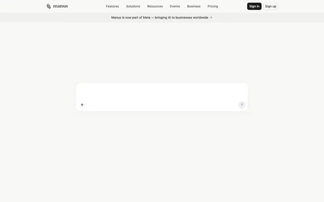
Monochromatic command center: Efficient, responsive, and quietly powerful.
Color palette
Primary call-to-action button backgrounds and prominent button fills. Indicates primary interactive elements
Primary page and large section backgrounds. Establishes the bright, airy base
Card backgrounds, elevated UI elements, and input fields. Provides a clean, contrasting surface
Subtle borders for cards, ghost buttons, and dividers. Creates separation without harsh lines
Secondary body text, navigation labels, and subdued headings. Do not promote it to the primary CTA color
Muted text, helper messages, and inactive navigation links. Provides reduced emphasis
Typography
- Weights
- 400, 500, 510
- Sizes
- 12px, 14px, 16px
- Line height
- 1.29, 1.33, 1.43, 1.5
- Fallback
- system-ui
The primary typeface for all UI elements. Its clean, neutral characteristics support clear information display across buttons, links, body text, and headings.
- Weights
- 400
- Sizes
- 36px
- Line height
- 1.22
- Fallback
- serif
Used sparingly for prominent headings, its serif character provides a touch of classic authority against the otherwise modern system font, without distracting.
Spacing & shape
Elevation
Components
Background #1a1a19, text white (#ffffff), 8px border-radius, 8px horizontal padding. Font is -apple-system.
Transparent background, text #5e5e5b, 9999px border-radius, no discernible padding in data. Font is -apple-system.
Transparent background, text #34322d, 1px #e5e7eb border, 8px border-radius, 8px horizontal padding. Font is -apple-system.
rgba(55, 53, 47, 0.08) background, text #ffffff, 9999px border-radius, no discernible padding in data. Font is -apple-system.
Background #ffffff, 22px border-radius, 12px vertical padding. Casts a soft shadow: rgba(0, 0, 0, 0.02) 0px 12px 32px 0px.
Text #5e5e5b, using -apple-system font at 14px.
Background implies #f8f8f7, text #34322d. Minimal styling suggests it's primarily text content with implied padding.
Background #ffffff, 22px border-radius (same as cards). Suggests a subtle inner shadow or border for definition, similar to Card shadow/border logic.
Guidelines
- Prioritize Canvas Ice (#f8f8f7) for primary page backgrounds to maintain a bright, expansive feel.
- Use Action Ink (#1a1a19) exclusively for primary call-to-action button backgrounds to preserve its impact.
- Apply 22px border-radius to large content cards for a soft, approachable aesthetic.
- Use 8px border-radius for interactive elements like buttons and input fields for consistent component styling.
- Maintain -apple-system as the default font for all UI text, leveraging its multiple weights for hierarchy.
- Employ Text Primary (#34322d) for all main content and heading text to ensure readability.
- Utilize Ghost Border (#e5e7eb) for subtle dividers and outlining ghost buttons to provide visual structure without heaviness.
- Avoid using saturated colors in backgrounds or for large decorative elements; color should be functional punctuation.
- Do not deviate from the established type scale and font families; introducing new fonts or arbitrary sizes will break hierarchy.
- Do not introduce strong, dark shadows; the system relies on a very subtle rgba(0, 0, 0, 0.02) 0px 12px 32px 0px for elevation.
- Avoid excessive use of borders; use Ghost Border (#e5e7eb) sparingly for emphasis, not for every container.
- Do not use multiple font weights within a single text block; use weights to establish hierarchy between elements.
- Do not create complex layouts; default to centered or clearly defined grid structures with ample Canvas Ice (#f8f8f7) as whitespace.
About this system
ShowHide
Manus employs a stark, functional interface with a restrained achromatic palette, punctuated by deep charcoal accents. The design prioritizes clear information hierarchy and interaction over elaborate aesthetics, featuring rounded corners for components and subtle shadow for depth. Typography is crisp and minimal, supporting a quick, efficient user experience.
The page uses a contained layout with a maximum visible width, ensuring content is centered. The hero section appears full-width with a dark background for contrast, housing textual content and navigation. Subsequent sections utilize alternating light/dark bands, but in the screenshot, the dominant layout is a light canvas (#f8f8f7). Content arrangement primarily consists of centered stacks for interactive elements. There are no obvious multi-column card grids visible in the provided view, but implied horizontal menus suggest a linear, organized flow.
This site predominantly uses clean, minimal UI elements with an icon-only visual language. Icons are outlined, monochrome, and functional, providing visual cues without adding decorative weight. Product screenshots or abstract illustrations are absent, emphasizing a pure UI experience. Imagery is not used for atmosphere or content, but strictly for basic UI interaction cues. The density of imagery is extremely low, making it a text-dominant interface.
Reminiscent of Notion, Linear, Supabase, Figma.
# Manus — Style Reference
> Monochromatic command center: Efficient, responsive, and quietly powerful.

**Theme:** light

**Site:** https://manus.im

Manus employs a stark, functional interface with a restrained achromatic palette, punctuated by deep charcoal accents. The design prioritizes clear information hierarchy and interaction over elaborate aesthetics, featuring rounded corners for components and subtle shadow for depth. Typography is crisp and minimal, supporting a quick, efficient user experience.

## Tokens — Colors

| Name | Value | Token | Role |
|------|------|------|------|
| Action Ink | `#1a1a19` | `--color-action-ink` | Primary call-to-action button backgrounds and prominent button fills. Indicates primary interactive elements |
| Canvas Ice | `#f8f8f7` | `--color-canvas-ice` | Primary page and large section backgrounds. Establishes the bright, airy base |
| Surface Snow | `#ffffff` | `--color-surface-snow` | Card backgrounds, elevated UI elements, and input fields. Provides a clean, contrasting surface |
| Ghost Border | `#e5e7eb` | `--color-ghost-border` | Subtle borders for cards, ghost buttons, and dividers. Creates separation without harsh lines |
| Text Primary | `#34322d` | `--color-text-primary` | Secondary body text, navigation labels, and subdued headings. Do not promote it to the primary CTA color |
| Text Secondary | `#5e5e5b` | `--color-text-secondary` | Muted text, helper messages, and inactive navigation links. Provides reduced emphasis |

## Tokens — Typography

### -apple-system
- **Substitute:** system-ui
- **Weights:** 400, 500, 510
- **Sizes:** 12px, 14px, 16px
- **Line height:** 1.29, 1.33, 1.43, 1.5
- **Role:** The primary typeface for all UI elements. Its clean, neutral characteristics support clear information display across buttons, links, body text, and headings.

### Libre Baskerville
- **Substitute:** serif
- **Weights:** 400
- **Sizes:** 36px
- **Line height:** 1.22
- **Role:** Used sparingly for prominent headings, its serif character provides a touch of classic authority against the otherwise modern system font, without distracting.

## Tokens — Type Scale

Augmented Fourth (1.414) from 14px base.

| Role | Size | Line height | Letter spacing |
|------|------|------|------|
| caption | 12px | 1.5 | — |
| body | 14px | 1.43 | — |
| body-lg | 16px | 1.29 | — |
| heading | 36px | 1.22 | — |

## Tokens — Spacing

- **Section gap:** 100px
- **Card padding:** 12px
- **Element gap:** 8px

## Tokens — Radius

- **Buttons:** 8px
- **Cards:** 22px
- **pill:** 9999px

## Tokens — Elevation

- **Elevated Card:** `rgba(0, 0, 0, 0.02) 0px 12px 32px 0px`

## Layout

The page uses a contained layout with a maximum visible width, ensuring content is centered. The hero section appears full-width with a dark background for contrast, housing textual content and navigation. Subsequent sections utilize alternating light/dark bands, but in the screenshot, the dominant layout is a light canvas (#f8f8f7). Content arrangement primarily consists of centered stacks for interactive elements. There are no obvious multi-column card grids visible in the provided view, but implied horizontal menus suggest a linear, organized flow.

## Imagery

This site predominantly uses clean, minimal UI elements with an icon-only visual language. Icons are outlined, monochrome, and functional, providing visual cues without adding decorative weight. Product screenshots or abstract illustrations are absent, emphasizing a pure UI experience. Imagery is not used for atmosphere or content, but strictly for basic UI interaction cues. The density of imagery is extremely low, making it a text-dominant interface.

## Components

### Primary Filled Button
*Main call-to-action button.*

Background #1a1a19, text white (#ffffff), 8px border-radius, 8px horizontal padding. Font is -apple-system.

### Ghost Button
*Secondary action button.*

Transparent background, text #5e5e5b, 9999px border-radius, no discernible padding in data. Font is -apple-system.

### Outlined Button
*Tertiary action or navigational button.*

Transparent background, text #34322d, 1px #e5e7eb border, 8px border-radius, 8px horizontal padding. Font is -apple-system.

### Pill Ghost Button
*Filter or tag button.*

rgba(55, 53, 47, 0.08) background, text #ffffff, 9999px border-radius, no discernible padding in data. Font is -apple-system.

### Elevated Card
*Content container with subtle depth.*

Background #ffffff, 22px border-radius, 12px vertical padding. Casts a soft shadow: rgba(0, 0, 0, 0.02) 0px 12px 32px 0px.

### Header Navigation Link
*Top-level navigation items.*

Text #5e5e5b, using -apple-system font at 14px.

### Banner Alert
*Informational banner.*

Background implies #f8f8f7, text #34322d. Minimal styling suggests it's primarily text content with implied padding.

### Input Field
*User input area.*

Background #ffffff, 22px border-radius (same as cards). Suggests a subtle inner shadow or border for definition, similar to Card shadow/border logic.

## Guidelines

### Do

- Prioritize Canvas Ice (#f8f8f7) for primary page backgrounds to maintain a bright, expansive feel.
- Use Action Ink (#1a1a19) exclusively for primary call-to-action button backgrounds to preserve its impact.
- Apply 22px border-radius to large content cards for a soft, approachable aesthetic.
- Use 8px border-radius for interactive elements like buttons and input fields for consistent component styling.
- Maintain -apple-system as the default font for all UI text, leveraging its multiple weights for hierarchy.
- Employ Text Primary (#34322d) for all main content and heading text to ensure readability.
- Utilize Ghost Border (#e5e7eb) for subtle dividers and outlining ghost buttons to provide visual structure without heaviness.

### Don't

- Avoid using saturated colors in backgrounds or for large decorative elements; color should be functional punctuation.
- Do not deviate from the established type scale and font families; introducing new fonts or arbitrary sizes will break hierarchy.
- Do not introduce strong, dark shadows; the system relies on a very subtle rgba(0, 0, 0, 0.02) 0px 12px 32px 0px for elevation.
- Avoid excessive use of borders; use Ghost Border (#e5e7eb) sparingly for emphasis, not for every container.
- Do not use multiple font weights within a single text block; use weights to establish hierarchy between elements.
- Do not create complex layouts; default to centered or clearly defined grid structures with ample Canvas Ice (#f8f8f7) as whitespace.

## Agent Prompt Guide

Quick Color Reference:
text: #34322d
background: #f8f8f7
border: #e5e7eb
accent: no distinct accent color
primary action: no distinct CTA color

Example Component Prompts:
No distinct primary action color was observed; use the extracted neutral button treatments instead of inventing a filled CTA color.
Create a ghost navigation link: Text Secondary (#5e5e5b) color, -apple-system font, 14px, no background or border.
Create an elevated card: Surface Snow (#ffffff) background, 22px radius, 12px vertical padding, rgba(0, 0, 0, 0.02) 0px 12px 32px 0px shadow.
Create an input field with an 'add' icon: Surface Snow (#ffffff) background, 22px radius, with Text Primary (#34322d) for controls. The 'add' icon should be #34322d.
More like this









Keep what you find
A free account saves references to boards and can send you a weekly email of picks based on what you save.
To see every result, go Pro.