Preview image. Unlock full-res
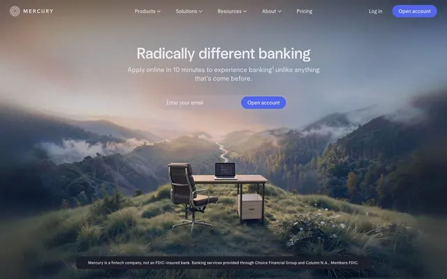
Mountain Top Command Center
Color palette
Primary CTA buttons — the single, vivid accent in a muted palette, focusing user action.
Secondary button backgrounds, hover states — a desaturated, ethereal blue suggesting interaction.
Outermost page background layer, providing depth.
Primary page and section backgrounds.
Subtle button backgrounds and interactive surfaces.
Borders, dividers, subtle UI accents.
Primary text color for headlines, body, and navigation.
Secondary text, footer copy, disabled states.
Text on primary CTA buttons (#5266eb).
Typography
- Weights
- 360, 480, 530
- Sizes
- 21px, 24px, 28px, 32px, 42px, 49px, 65px
- Line height
- 1.1
- Letter spacing
- Subtle positive tracking (0.01-0.02em) for an open feel.
- Fallback
- Inter, Manrope
All major headlines. Use of the light 360 weight at large sizes is a signature choice creating authority through restraint, not volume.
- Weights
- 360, 400, 420, 480
- Sizes
- 12px, 14px, 16px, 18px, 21px
- Line height
- 1.2
- Letter spacing
- Subtle positive tracking (0.005-0.02em) for readability.
- Fallback
- Inter, Manrope
Body copy, UI labels, navigation, legal text, and smaller headings. The workhorse font for all content and interface text.
Spacing & shape
Components
Solid 'Mercury Blue' (#5266eb) background with 'Pure White' (#ffffff) text. Fully rounded with a 32px radius. Padding is around 16px vertically and 24px horizontally. Uses 'arcadia' font.
Translucent 'Ghost Blue' (#cdddff at ~20%) background with 'Starlight' (#ededf3) text. Fully rounded with a 40px radius. Padding is 8px 20px. Uses 'arcadia' font.
Transparent background with 'Starlight' (#ededf3) text. No visible border. Generous hit area implied by padding, visually appears as text-only. Uses 'arcadia' font.
Transparent background with 'Starlight' (#ededf3) text and placeholder. Left side is fully rounded (32px radius), right side is sharp (0px radius) to join with the button. A thin 'Lead' (#70707d) border is implied for definition.
Transparent background with 'Starlight' (#ededf3) text. A 1px 'Lead' (#70707d) border on the bottom separates items. No radius. Uses 'arcadiaDisplay' for the title text.
Transparent background with 'Silver' (#c3c3cc) text. Lighter text color indicates lower priority. Uses 'arcadia' font.
Guidelines
- Use 'arcadiaDisplay' at a light weight (360) for all major headlines to maintain an airy, sophisticated tone.
- Reserve the 'Mercury Blue' (#5266eb) accent exclusively for primary, action-oriented CTAs.
- Employ the deep neutral palette (#171721, #1e1e2a) for all backgrounds to create a focused, immersive environment.
- Utilize extreme corner radii (32px, 40px) for all primary and secondary buttons, creating a signature 'pill' shape.
- Maintain high contrast with 'Starlight' (#ededf3) text on dark backgrounds for all primary content.
- Use generous vertical spacing (80px+) between content sections.
- Differentiate interactive list items with a simple 1px bottom border in 'Lead' (#70707d).
- Don't use 'Mercury Blue' (#5266eb) for text, backgrounds, or decorative elements.
- Don't use heavy font weights (>530) for any typography.
- Don't apply shadows for elevation. Use color and opacity shifts instead.
- Don't introduce new saturated colors. The palette is monochrome plus one blue accent.
- Don't use small corner radii on buttons. They should always be pills.
- Don't use 'Pure White' (#ffffff) for body text; reserve it for text on the primary blue CTA.
- Don't create dense, cluttered layouts. Prioritize breathing room.
About this system
ShowHide
The design feels like a command center at twilight, expansive and focused. A deep, near-black neutral palette (#1e1e2a, #171721) creates an immersive, cinematic canvas where glowing off-white text (#ededf3) provides crisp clarity. All energy is channeled into a single, vibrant violet-blue accent (#5266eb) reserved strictly for primary calls-to-action, like indicator lights on a high-tech console. The typography is a defining feature, with custom fonts used at light weights for headlines, creating an authoritative yet approachable voice. The contrast between spacious, atmospheric hero imagery and the stark, text-driven UI below creates a journey from aspiration to action.
The layout uses a full-bleed hero that occupies the entire viewport, featuring a centered headline and CTA over a background image. Below the hero, the page transitions to a max-width (approx. 1200px) centered layout on a dark background. Content is organized in simple, single-column stacks with generous vertical spacing, creating a calm, linear reading flow. Navigation is a minimal, semi-transparent top bar that likely becomes sticky. The overall structure is spacious and uncluttered.
The visual language is bifurcated. It opens with a full-bleed, atmospheric photograph of a solitary desk in a vast natural landscape, establishing a mood of boundless ambition and serene focus. This imagery is purely atmospheric, not product-focused. Beyond the hero, the site is starkly text-dominant, with no additional photography or illustration. This contrast positions the brand's 'vibe' first, then transitions to a purely functional, information-driven experience.
Reminiscent of Linear, Stripe, Ramp, Vercel.
# Mercury — Style Reference
> Mountain Top Command Center

**Theme:** dark

**Site:** https://mercury.com

The design feels like a command center at twilight, expansive and focused. A deep, near-black neutral palette (#1e1e2a, #171721) creates an immersive, cinematic canvas where glowing off-white text (#ededf3) provides crisp clarity. All energy is channeled into a single, vibrant violet-blue accent (#5266eb) reserved strictly for primary calls-to-action, like indicator lights on a high-tech console. The typography is a defining feature, with custom fonts used at light weights for headlines, creating an authoritative yet approachable voice. The contrast between spacious, atmospheric hero imagery and the stark, text-driven UI below creates a journey from aspiration to action.

## Tokens — Colors

| Name | Value | Token | Role |
|------|------|------|------|
| Mercury Blue | `#5266eb` | `--color-mercury-blue` | Primary CTA buttons — the single, vivid accent in a muted palette, focusing user action. |
| Ghost Blue | `#cdddff` | `--color-ghost-blue` | Secondary button backgrounds, hover states — a desaturated, ethereal blue suggesting interaction. |
| Deep Space | `#171721` | `--color-deep-space` | Outermost page background layer, providing depth. |
| Midnight Slate | `#1e1e2a` | `--color-midnight-slate` | Primary page and section backgrounds. |
| Graphite | `#272735` | `--color-graphite` | Subtle button backgrounds and interactive surfaces. |
| Lead | `#70707d` | `--color-lead` | Borders, dividers, subtle UI accents. |
| Starlight | `#ededf3` | `--color-starlight` | Primary text color for headlines, body, and navigation. |
| Silver | `#c3c3cc` | `--color-silver` | Secondary text, footer copy, disabled states. |
| Pure White | `#ffffff` | `--color-pure-white` | Text on primary CTA buttons (#5266eb). |

## Tokens — Typography

### arcadiaDisplay
- **Substitute:** Inter, Manrope
- **Weights:** 360, 480, 530
- **Sizes:** 21px, 24px, 28px, 32px, 42px, 49px, 65px
- **Line height:** 1.1
- **Letter spacing:** Subtle positive tracking (0.01-0.02em) for an open feel.
- **Role:** All major headlines. Use of the light 360 weight at large sizes is a signature choice creating authority through restraint, not volume.

### arcadia
- **Substitute:** Inter, Manrope
- **Weights:** 360, 400, 420, 480
- **Sizes:** 12px, 14px, 16px, 18px, 21px
- **Line height:** 1.2
- **Letter spacing:** Subtle positive tracking (0.005-0.02em) for readability.
- **Role:** Body copy, UI labels, navigation, legal text, and smaller headings. The workhorse font for all content and interface text.

## Tokens — Type Scale

Major Third (1.25) from 16px base.

| Role | Size | Line height | Letter spacing |
|------|------|------|------|
| caption | 12px | 1.5 | 0.24px |
| body-sm | 14px | 1.5 | 0.28px |
| body | 16px | 1.5 | 0.16px |
| subheading | 18px | 1.4 | — |
| heading-sm | 21px | 1.35 | — |
| heading | 32px | 1.2 | — |
| heading-lg | 49px | 1.15 | — |
| display | 65px | 1.1 | 0.65px |

## Tokens — Spacing

- **Max width:** 1200px
- **Section gap:** 80-120px
- **Element gap:** 12-32px

## Tokens — Radius

- **Buttons:** 32px, 40px
- **Inputs:** 32px
- **Cards:** 0px
- **containers:** 4px

## Layout

The layout uses a full-bleed hero that occupies the entire viewport, featuring a centered headline and CTA over a background image. Below the hero, the page transitions to a max-width (approx. 1200px) centered layout on a dark background. Content is organized in simple, single-column stacks with generous vertical spacing, creating a calm, linear reading flow. Navigation is a minimal, semi-transparent top bar that likely becomes sticky. The overall structure is spacious and uncluttered.

## Imagery

The visual language is bifurcated. It opens with a full-bleed, atmospheric photograph of a solitary desk in a vast natural landscape, establishing a mood of boundless ambition and serene focus. This imagery is purely atmospheric, not product-focused. Beyond the hero, the site is starkly text-dominant, with no additional photography or illustration. This contrast positions the brand's 'vibe' first, then transitions to a purely functional, information-driven experience.

## Components

### Hero Email CTA

### Feature List — Everything in one place

### Button Group — Primary + Secondary + Ghost

### Primary Pill Button
*The main call-to-action on the page.*

Solid 'Mercury Blue' (#5266eb) background with 'Pure White' (#ffffff) text. Fully rounded with a 32px radius. Padding is around 16px vertically and 24px horizontally. Uses 'arcadia' font.

### Header Pill Button
*The secondary call-to-action in the navigation bar.*

Translucent 'Ghost Blue' (#cdddff at ~20%) background with 'Starlight' (#ededf3) text. Fully rounded with a 40px radius. Padding is 8px 20px. Uses 'arcadia' font.

### Ghost Nav Link
*Navigation items and non-primary links in the header.*

Transparent background with 'Starlight' (#ededf3) text. No visible border. Generous hit area implied by padding, visually appears as text-only. Uses 'arcadia' font.

### Hero Email Input
*The email capture field in the hero section.*

Transparent background with 'Starlight' (#ededf3) text and placeholder. Left side is fully rounded (32px radius), right side is sharp (0px radius) to join with the button. A thin 'Lead' (#70707d) border is implied for definition.

### Interactive Feature Link
*Selectable items in a feature list.*

Transparent background with 'Starlight' (#ededf3) text. A 1px 'Lead' (#70707d) border on the bottom separates items. No radius. Uses 'arcadiaDisplay' for the title text.

### Footer Link
*Tertiary links in the page footer.*

Transparent background with 'Silver' (#c3c3cc) text. Lighter text color indicates lower priority. Uses 'arcadia' font.

## Guidelines

### Do

- Use 'arcadiaDisplay' at a light weight (360) for all major headlines to maintain an airy, sophisticated tone.
- Reserve the 'Mercury Blue' (#5266eb) accent exclusively for primary, action-oriented CTAs.
- Employ the deep neutral palette (#171721, #1e1e2a) for all backgrounds to create a focused, immersive environment.
- Utilize extreme corner radii (32px, 40px) for all primary and secondary buttons, creating a signature 'pill' shape.
- Maintain high contrast with 'Starlight' (#ededf3) text on dark backgrounds for all primary content.
- Use generous vertical spacing (80px+) between content sections.
- Differentiate interactive list items with a simple 1px bottom border in 'Lead' (#70707d).

### Don't

- Don't use 'Mercury Blue' (#5266eb) for text, backgrounds, or decorative elements.
- Don't use heavy font weights (>530) for any typography.
- Don't apply shadows for elevation. Use color and opacity shifts instead.
- Don't introduce new saturated colors. The palette is monochrome plus one blue accent.
- Don't use small corner radii on buttons. They should always be pills.
- Don't use 'Pure White' (#ffffff) for body text; reserve it for text on the primary blue CTA.
- Don't create dense, cluttered layouts. Prioritize breathing room.

## Agent Prompt Guide

### Quick Color Reference
- **Page Background:** Midnight Slate (#1e1e2a)
- **Primary Text:** Starlight (#ededf3)
- **Secondary Text:** Silver (#c3c3cc)
- **Primary CTA:** Mercury Blue (#5266eb)
- **Border/Divider:** Lead (#70707d)

### Example Component Prompts
1. `Create a hero section with a full-bleed atmospheric mountain photo background. Center a display headline: 65px arcadiaDisplay weight 360, color Starlight (#ededf3). Below it, add a sub-headline: 21px arcadia weight 400, color Starlight. Finally, add a CTA button group: an email input with a 32px left radius joined to a primary pill button with a 32px radius.`

2. `Build a primary action button with the text 'Open account'. The button should have a 'Mercury Blue' (#5266eb) background, 'Pure White' (#ffffff) text, a 32px corner radius, and 16px 24px padding. Font is 16px arcadia weight 480.`

3. `Design a feature list section on a 'Midnight Slate' (#1e1e2a) background. Each item is a link with heading text at 28px arcadiaDisplay weight 480 in 'Starlight' (#ededf3), with a 1px solid bottom border in 'Lead' (#70707d) with 24px of bottom padding.`
More like this








Keep what you find
A free account saves references to boards and can send you a weekly email of picks based on what you save.
To see every result, go Pro.