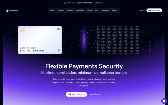
Preview image. Unlock full-res
Digital vault in a cosmic void. Deep indigo and rich purples glow against stark black, outlining crisp content.
Color palette
Primary brand color for calls-to-action, prominent links, active states, and focus indicators. Its vibrancy provides clear interaction cues against the dark theme.
Accent text color, interactive icons, and subtle highlights. A lighter, more luminous shade of purple.
Background for hero sections and prominent visual elements, providing a deep, energetic glow.
Complex background gradient used in abstract graphics; creates a sense of depth and shimmer.
Primary background for the entire application, dark card surfaces, button backgrounds in dark mode.
Navigation backgrounds, subtle background differentiation for sections.
Primary text color for headings and body content, interactive elements, significant icons, and the internal color of dark-mode ghost buttons.
Secondary text color for body paragraphs, less prominent links, faded badge text, and subtle card borders.
Button text color on white buttons, darker text shades, and some card borders.
Minor text, icons, and less prominent UI elements.
Used sparingly for code snippets, indicating specific syntax or an 'error' type state within the developer context.
Typography
- Weights
- 400, 500, 600
- Sizes
- 12px, 13px, 14px, 16px, 18px, 24px, 32px, 48px, 52px, 56px
- Line height
- 1, 1.13, 1.25, 1.3
- Letter spacing
- -0.0250em, -0.0200em, -0.0150em, -0.0100em
- Fallback
- system-ui
Primary display font for all headings and prominent UI elements. Its slightly condensed, geometric forms provide a modern, technical feel, especially with the tighter letter-spacing at larger sizes.
- Weights
- 400, 500, 580
- Sizes
- 11px, 12px, 13px, 14px, 15px, 16px
- Line height
- 1, 1.55, 1.75, 1.76, 1.94, 2
- Letter spacing
- normal
- Fallback
- system-ui
Primary text font for body content, navigation, and most interactive elements. Its high legibility at small sizes and range of weights ensure clarity across the UI.
- Weights
- 400, 500, 600
- Sizes
- 10px, 12px, 15px, 18px, 20px
- Line height
- 1, 1.21, 1.4, 1.5
- Letter spacing
- -0.0500em, 0.4000em
- Fallback
- monospace
Monospaced font specifically for code blocks, input fields where code is expected, and technical annotations. The varied letter-spacing allows for distinct display types, from compact code to decorative labels.
Spacing & shape
Elevation
Components
Transparent background (rgba(0, 0, 0, 0)), Stardust White text (#ffffff), 0px border radius, 0px horizontal padding, 12px vertical padding. Used for prominent but non-primary actions, like navigation links in the header.
Background Stardust White (#ffffff), text Dark Matter Gray (#2a2b3a), 24px border radius, 12.8px horizontal padding, 0px vertical padding. Used for main action buttons.
Background rgba(255, 255, 255, 0.95), text Dark Matter Gray (#2a2b3a), 25px border radius, 16px horizontal padding, 0px vertical padding. A more compact version of the solid button.
Transparent background (rgba(0, 0, 0, 0)), Stardust White text (#ffffff), top-left corner radius 9.6px, 12.8px horizontal padding, 3.2px vertical padding. Creates a distinct tab-like appearance for navigation items.
Stardust White background (#ffffff), 16px border radius, with a complex shadow: rgba(255, 255, 255, 0.2) 0px 1px 0px 0px inset, rgba(0, 0, 0, 0.12) 0px -1px 24px 0px inset, rgba(0, 0, 0, 0.08) 0px 0px 16px 0px inset, rgba(0, 0, 0, 0.2) 0px 0px 0px 1px, rgba(0, 0, 0, 0.2) 0px 1px 2px 0px, rgba(0, 0, 0, 0.2) 0px 2px 4px 0px. Used for cards that need to stand out with a lighter visual weight.
Dark Matter Gray background (#2a2b3a), 16px border radius, with the same complex shadow as the light elevated card. Provides an alternative surface for content within the dark theme.
Transparent background (rgba(0, 0, 0, 0)), 16px border radius, same complex shadow as other elevated cards. Used when content needs subtle framing without a solid background.
Transparent background (rgba(0, 0, 0, 0)), 12px border radius, prominent purple inset shadow: rgba(0, 0, 0, 0.25) 0px 8px 16px -4px, rgba(0, 0, 0, 0.25) 0px 4px 8px -2px, rgba(0, 0, 0, 0.2) 0px 1px 2px 0px, rgba(190, 167, 255, 0.24) 0px 0px 0px 1.5px inset. Used for highlighting important information or interactive components, giving them a subtle glow.
Transparent background (rgba(0, 0, 0, 0)), Stardust White text (#ffffff), 8px border-radius. Subtle classification for small labels.
Transparent background (rgba(0, 0, 0, 0)), Nebula Gray text (#dfe1f4), 16px border-radius. Used for less prominent tags or groupings.
Guidelines
- Use Midnight Abyss (#010314) as the default background for all main page content and primary surface elements.
- Prioritize Stardust White (#ffffff) for primary text elements to ensure high contrast and readability against dark backgrounds.
- Apply Astral Purple (#6633ee) only for primary call-to-action buttons, key interactive elements, and critical highlights to maintain its impact.
- Employ Roobert for all headings and prominent UI text to leverage its modern, technical aesthetic, especially with tight letter-spacing (-0.0100em to -0.0250em) at larger sizes.
- Maintain a default border-radius of 8px for most small elements and 16px for content cards, with 24px reserved for high-prominence buttons to create a consistent soft-edged feel.
- Use the complex card shadow for elevated elements, which includes both subtle inner and outer dark shadows combined with a light inner border highlight, to create depth on dark surfaces.
- Avoid using highly saturated, non-purple colors for interactive elements; Astral Purple and Galactic Violet are reserved for primary brand interaction.
- Do not use Roboto Mono for body text or headlines; reserve it strictly for code snippets or technical annotations.
- Do not introduce sharp corners (0px border-radius) except for specific, decorative ghost buttons or when explicitly part of custom vector graphics.
- Avoid using multiple distinct shadow styles on a single page; stick to the defined elevated card shadow to maintain visual consistency for depth cues.
- Do not use light theme components on pages primarily styled with the dark theme; ensure all components use the appropriate dark backgrounds and text colors.
About this system
ShowHide
This design system evokes a sense of secure, high-tech elegance, like a digital vault operating in a cosmic void. Its visual identity relies on a deep, almost black background punctuated by subtly glowing purple gradients and crisp white text. The calculated tension between sharp edges and soft, almost nebulous gradients gives it a sophisticated yet approachable feel for a data security platform. The visual style avoids typical corporate starkness, opting instead for a more atmospheric, controlled digital aesthetic.
The page primarily utilizes a max-width contained model (around 1200px equivalent, with 12px-16px internal padding used for content blocks), centered on a full-bleed dark background. The hero section is full-bleed, featuring a prominent centered headline against a deep, glowing purple gradient background. Section rhythm alternates between full-width dark sections with atmospheric backgrounds and contained content blocks with consistent vertical spacing (sectionGap 64px). Content arrangement frequently uses a centered stack approach for headings and subtext, often followed by two-column layouts featuring text on one side and a product visual or abstract graphic on the other. Card grids (e.g., 3-column) are used for feature listings. The navigation is a sticky top bar, initially transparent over the hero, then solidifying to Astral Black. There's a subtle top banner for announcements.
Imagery on Evervault is a mix of abstract 3D renders, product photography, and subtle technical illustrations. Product photography (e.g., credit card) features tight, clean crops on a dark, unadorned background, emphasizing the object itself. Abstract 3D renders lean towards glowing, nebulous forms in shades of purple and blue, creating a high-tech, futuristic atmosphere. Technical illustrations are geometric and isometric, often using the brand's purple and white palette to explain complex concepts visually. Icons are generally outlined or filled, monocolor (Stardust White or Nebula Gray) with a consistent, relatively thin stroke weight, playing a functional role in explaining features. Visual density is moderate; imagery serves to break up text-heavy sections or reinforce thematic elements rather than as primary content. Overlapping elements and soft-edged gradients are common, providing a sense of depth without harsh boundaries.
Reminiscent of Stripe, Vercel, Auth0, Linear.
# Evervault — Style Reference
> Digital vault in a cosmic void. Deep indigo and rich purples glow against stark black, outlining crisp content.

**Theme:** dark

**Site:** https://evervault.com

This design system evokes a sense of secure, high-tech elegance, like a digital vault operating in a cosmic void. Its visual identity relies on a deep, almost black background punctuated by subtly glowing purple gradients and crisp white text. The calculated tension between sharp edges and soft, almost nebulous gradients gives it a sophisticated yet approachable feel for a data security platform. The visual style avoids typical corporate starkness, opting instead for a more atmospheric, controlled digital aesthetic.

## Tokens — Colors

| Name | Value | Token | Role |
|------|------|------|------|
| Astral Purple | `#6633ee` | `--color-astral-purple` | Primary brand color for calls-to-action, prominent links, active states, and focus indicators. Its vibrancy provides clear interaction cues against the dark theme. |
| Galactic Violet | `#b88cff` | `--color-galactic-violet` | Accent text color, interactive icons, and subtle highlights. A lighter, more luminous shade of purple. |
| Cosmic Gradient A | `#6633ee` | `--color-cosmic-gradient-a` | Background for hero sections and prominent visual elements, providing a deep, energetic glow. |
| Refractive Glow | `#ececfb` | `--color-refractive-glow` | Complex background gradient used in abstract graphics; creates a sense of depth and shimmer. |
| Midnight Abyss | `#010314` | `--color-midnight-abyss` | Primary background for the entire application, dark card surfaces, button backgrounds in dark mode. |
| Astral Black | `#171825` | `--color-astral-black` | Navigation backgrounds, subtle background differentiation for sections. |
| Stardust White | `#ffffff` | `--color-stardust-white` | Primary text color for headings and body content, interactive elements, significant icons, and the internal color of dark-mode ghost buttons. |
| Nebula Gray | `#dfe1f4` | `--color-nebula-gray` | Secondary text color for body paragraphs, less prominent links, faded badge text, and subtle card borders. |
| Dark Matter Gray | `#2a2b3a` | `--color-dark-matter-gray` | Button text color on white buttons, darker text shades, and some card borders. |
| Whisper Gray | `#5e6077` | `--color-whisper-gray` | Minor text, icons, and less prominent UI elements. |
| Infra Red | `#f92672` | `--color-infra-red` | Used sparingly for code snippets, indicating specific syntax or an 'error' type state within the developer context. |

## Tokens — Typography

### Roobert
- **Substitute:** system-ui
- **Weights:** 400, 500, 600
- **Sizes:** 12px, 13px, 14px, 16px, 18px, 24px, 32px, 48px, 52px, 56px
- **Line height:** 1, 1.13, 1.25, 1.3
- **Letter spacing:** -0.0250em, -0.0200em, -0.0150em, -0.0100em
- **Role:** Primary display font for all headings and prominent UI elements. Its slightly condensed, geometric forms provide a modern, technical feel, especially with the tighter letter-spacing at larger sizes.

### Inter
- **Substitute:** system-ui
- **Weights:** 400, 500, 580
- **Sizes:** 11px, 12px, 13px, 14px, 15px, 16px
- **Line height:** 1, 1.55, 1.75, 1.76, 1.94, 2
- **Letter spacing:** normal
- **Role:** Primary text font for body content, navigation, and most interactive elements. Its high legibility at small sizes and range of weights ensure clarity across the UI.

### Roboto Mono
- **Substitute:** monospace
- **Weights:** 400, 500, 600
- **Sizes:** 10px, 12px, 15px, 18px, 20px
- **Line height:** 1, 1.21, 1.4, 1.5
- **Letter spacing:** -0.0500em, 0.4000em
- **Role:** Monospaced font specifically for code blocks, input fields where code is expected, and technical annotations. The varied letter-spacing allows for distinct display types, from compact code to decorative labels.

## Tokens — Type Scale

| Role | Size | Line height | Letter spacing |
|------|------|------|------|
| caption | 10px | 1 | -0.5px |
| heading | 24px | 1.25 | -0.48px |
| heading-lg | 32px | 1.3 | -0.64px |
| display | 56px | 1.13 | -1.4px |

## Tokens — Spacing

- **Section gap:** 64px
- **Card padding:** 16px
- **Element gap:** 12px

## Tokens — Radius

- **Default:** 8px
- **Buttons:** 24px
- **Cards:** 16px
- **badges:** 8px

## Tokens — Elevation

- **Card:** `rgba(255, 255, 255, 0.2) 0px 1px 0px 0px inset, rgba(0, 0, 0, 0.12) 0px -1px 24px 0px inset, rgba(0, 0, 0, 0.08) 0px 0px 16px 0px inset, rgba(0, 0, 0, 0.2) 0px 0px 0px 1px, rgba(0, 0, 0, 0.2) 0px 1px 2px 0px, rgba(0, 0, 0, 0.2) 0px 2px 4px 0px`
- **Accent Border Card / Elevated Body Element:** `rgba(0, 0, 0, 0.25) 0px 8px 16px -4px, rgba(0, 0, 0, 0.25) 0px 4px 8px -2px, rgba(0, 0, 0, 0.2) 0px 1px 2px 0px, rgba(190, 167, 255, 0.24) 0px 0px 0px 1.5px inset`

## Layout

The page primarily utilizes a max-width contained model (around 1200px equivalent, with 12px-16px internal padding used for content blocks), centered on a full-bleed dark background. The hero section is full-bleed, featuring a prominent centered headline against a deep, glowing purple gradient background. Section rhythm alternates between full-width dark sections with atmospheric backgrounds and contained content blocks with consistent vertical spacing (sectionGap 64px). Content arrangement frequently uses a centered stack approach for headings and subtext, often followed by two-column layouts featuring text on one side and a product visual or abstract graphic on the other. Card grids (e.g., 3-column) are used for feature listings. The navigation is a sticky top bar, initially transparent over the hero, then solidifying to Astral Black. There's a subtle top banner for announcements.

## Imagery

Imagery on Evervault is a mix of abstract 3D renders, product photography, and subtle technical illustrations. Product photography (e.g., credit card) features tight, clean crops on a dark, unadorned background, emphasizing the object itself. Abstract 3D renders lean towards glowing, nebulous forms in shades of purple and blue, creating a high-tech, futuristic atmosphere. Technical illustrations are geometric and isometric, often using the brand's purple and white palette to explain complex concepts visually. Icons are generally outlined or filled, monocolor (Stardust White or Nebula Gray) with a consistent, relatively thin stroke weight, playing a functional role in explaining features. Visual density is moderate; imagery serves to break up text-heavy sections or reinforce thematic elements rather than as primary content. Overlapping elements and soft-edged gradients are common, providing a sense of depth without harsh boundaries.

## Components

### CTA Button Group

### Feature Product Cards

### Developer Code Card

### Primary Ghost Button
*Call to Action*

Transparent background (rgba(0, 0, 0, 0)), Stardust White text (#ffffff), 0px border radius, 0px horizontal padding, 12px vertical padding. Used for prominent but non-primary actions, like navigation links in the header.

### Solid Button Primary
*Call to Action*

Background Stardust White (#ffffff), text Dark Matter Gray (#2a2b3a), 24px border radius, 12.8px horizontal padding, 0px vertical padding. Used for main action buttons.

### Small Solid Button
*Interactive*

Background rgba(255, 255, 255, 0.95), text Dark Matter Gray (#2a2b3a), 25px border radius, 16px horizontal padding, 0px vertical padding. A more compact version of the solid button.

### Navigation Link Button
*Navigation*

Transparent background (rgba(0, 0, 0, 0)), Stardust White text (#ffffff), top-left corner radius 9.6px, 12.8px horizontal padding, 3.2px vertical padding. Creates a distinct tab-like appearance for navigation items.

### Elevated Card (Light)
*Content container*

Stardust White background (#ffffff), 16px border radius, with a complex shadow: rgba(255, 255, 255, 0.2) 0px 1px 0px 0px inset, rgba(0, 0, 0, 0.12) 0px -1px 24px 0px inset, rgba(0, 0, 0, 0.08) 0px 0px 16px 0px inset, rgba(0, 0, 0, 0.2) 0px 0px 0px 1px, rgba(0, 0, 0, 0.2) 0px 1px 2px 0px, rgba(0, 0, 0, 0.2) 0px 2px 4px 0px. Used for cards that need to stand out with a lighter visual weight.

### Elevated Card (Dark)
*Content container*

Dark Matter Gray background (#2a2b3a), 16px border radius, with the same complex shadow as the light elevated card. Provides an alternative surface for content within the dark theme.

### Transparent Elevated Card
*Content container*

Transparent background (rgba(0, 0, 0, 0)), 16px border radius, same complex shadow as other elevated cards. Used when content needs subtle framing without a solid background.

### Accent Border Card
*Content container*

Transparent background (rgba(0, 0, 0, 0)), 12px border radius, prominent purple inset shadow: rgba(0, 0, 0, 0.25) 0px 8px 16px -4px, rgba(0, 0, 0, 0.25) 0px 4px 8px -2px, rgba(0, 0, 0, 0.2) 0px 1px 2px 0px, rgba(190, 167, 255, 0.24) 0px 0px 0px 1.5px inset. Used for highlighting important information or interactive components, giving them a subtle glow.

### Badge (Transparent)
*Metadata / Tag*

Transparent background (rgba(0, 0, 0, 0)), Stardust White text (#ffffff), 8px border-radius. Subtle classification for small labels.

### Badge (Faded)
*Metadata / Tag*

Transparent background (rgba(0, 0, 0, 0)), Nebula Gray text (#dfe1f4), 16px border-radius. Used for less prominent tags or groupings.

## Guidelines

### Do

- Use Midnight Abyss (#010314) as the default background for all main page content and primary surface elements.
- Prioritize Stardust White (#ffffff) for primary text elements to ensure high contrast and readability against dark backgrounds.
- Apply Astral Purple (#6633ee) only for primary call-to-action buttons, key interactive elements, and critical highlights to maintain its impact.
- Employ Roobert for all headings and prominent UI text to leverage its modern, technical aesthetic, especially with tight letter-spacing (-0.0100em to -0.0250em) at larger sizes.
- Maintain a default border-radius of 8px for most small elements and 16px for content cards, with 24px reserved for high-prominence buttons to create a consistent soft-edged feel.
- Use the complex card shadow for elevated elements, which includes both subtle inner and outer dark shadows combined with a light inner border highlight, to create depth on dark surfaces.

### Don't

- Avoid using highly saturated, non-purple colors for interactive elements; Astral Purple and Galactic Violet are reserved for primary brand interaction.
- Do not use Roboto Mono for body text or headlines; reserve it strictly for code snippets or technical annotations.
- Do not introduce sharp corners (0px border-radius) except for specific, decorative ghost buttons or when explicitly part of custom vector graphics.
- Avoid using multiple distinct shadow styles on a single page; stick to the defined elevated card shadow to maintain visual consistency for depth cues.
- Do not use light theme components on pages primarily styled with the dark theme; ensure all components use the appropriate dark backgrounds and text colors.

## Agent Prompt Guide

### Quick Color Reference
- Text: #ffffff (Stardust White)
- Background: #010314 (Midnight Abyss)
- CTA: #6633ee (Astral Purple)
- Border/Accent: #dfe1f4 (Nebula Gray)
- Code Highlight: #f92672 (Infra Red)

### 3-5 Example Component Prompts
1. Create a hero section with `Midnight Abyss` background, overlaying `Cosmic Gradient A`. Center a `display` heading 'Flexible Payments Security' in `Stardust White` (`Roobert 56px`, `lineHeight 1.13`, `letterSpacing -1.4px`). Below it, a `body` subtext 'Maximum protection, minimum compliance burden' in `Nebula Gray` (`Inter 15px`, `lineHeight 1.76`). Include a `Solid Button Primary` 'Talk to an Expert' to the left and a ghost 'Get Started' button (text `Stardust White`, no background, 24px radius, `Inter 15px`) to its right.
2. Generate a feature section: Background `Astral Black`. Heading `heading-lg` 'Accelerate your business with a first-class payments stack' in `Stardust White` (`Roobert 32px`, `lineHeight 1.3`, `letterSpacing -0.64px`). Below it, a 3-column grid of `Elevated Card (Dark)` components, each containing an icon (e.g. `PCI` badge) and a `subheading` text in `Stardust White` (`Inter 16px`, `lineHeight 1.75`).
3. Design a code snippet card: Use an `Accent Border Card` with a transparent background. Inside, display a `Roboto Mono 12px` code block with `Infra Red` for keywords (`#f92672`), `Stardust White` for basic syntax, and `Nebula Gray` for comments. The caption for the card should be 'checkout.jsx' using an `Inter 11px` text in `Nebula Gray`.
4. Create a call to action block: `Midnight Abyss` background, `Roobert 48px` (`letterSpacing -0.96px`) heading 'Ready for a new era of secure payments?' in `Stardust White`. Followed by an `Inter 15px` paragraph 'Explore how Evervault can transform your payments infrastructure.' in `Nebula Gray`. Position a `Solid Button Primary` 'Contact Sales' centered below the text.
More like this





Keep what you find
A free account saves references to boards and can send you a weekly email of picks based on what you save.
To see every result, go Pro.