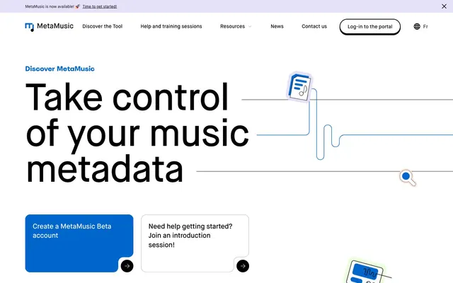
Preview image. Unlock full-res
White Canvas, Blue Current
Color palette
Deep blue backgrounds for feature sections and prominent information blocks
Primary call-to-action buttons, prominent links, and interactive elements. Its vividness drives user engagement
Backgrounds for circular feature icons at a specific scale
Stroke color for illustrative elements and decorative accents
Dominant page background for light sections, creating an open and airy feel
Card backgrounds, section separators, and content areas requiring highest contrast
Primary text color for headlines and body copy on light backgrounds, ensuring maximum readability
Dark footer background and occasional section fills
Muted secondary text, helper text, and subtle borders
Light background washes for specific UI elements and subtle input borders
Subtle background accents, almost off-white, adding a touch of warmth
Division lines and decorative borders, providing subtle structure
Very faint blue background for elevated cards or sections, indicating a slight lift
Subtle, unprominent background/surface color for specific sections
Typography
- Weights
- 400, 500, 600
- Sizes
- 12px, 14px, 16px, 19px, 22px, 26px, 32px, 40px, 56px, 80px, 120px
- Line height
- 0.95, 1.05, 1.1, 1.2, 1.35, 1.4, 1.5
- Letter spacing
- -0.0300em, -0.0200em, -0.0100em
- Fallback
- Inter
Primary typeface for all UI text, headings, and body copy. Its clean, geometric sans-serif nature provides clarity and a modern feel across all sizes and weights. The distinct letter-spacing for larger sizes enhances visual impact.
- Weights
- 500
- Sizes
- 22px
- Line height
- 0.9
- Letter spacing
- -0.0200em
- Fallback
- Bebas Neue
A distinct, semi-bold display typeface used sparingly for decorative headings and specific card titles where a slightly more condensed and impactful presence is desired. Its tight letter-spacing gives it a unique visual texture.
Spacing & shape
Components
Background: Snowdrift (#ffffff), Text: Jet Black (#000000), Border: 1px solid Jet Black (#000000), Border-radius: 9999px, Padding: 2px 24px.
Background: Action Blue (#0066cc), Border-radius: 24px (but data also shows 0px and has 0 padding so check context), Padding not explicitly defined, but visually generous. This serves as a background for clickable elements.
Background: Midnight Ink (#0e2575), Border-radius: 24px, No shadow. These cards present content directly on a dark primary background.
Background: Deep Plum (#213680), Border-radius: 50% (circular), No shadow, No padding. Used as a container for illustrative icons.
Background: Snowdrift (#ffffff), Border-radius: 24px, No shadow, Padding: 40px, or 24px on certain variations. Provides a clean, elevated surface for text and visuals.
Background: transparent (rgba(0,0,0,0)), Text: Jet Black (#000000), Border: 1px solid Lavender Mist (#e6e0f8), Border-radius: 8px, Padding: 0px 16px. Focus state likely uses a darker bordering blue.
Background: Wheat Dust (#f9f7f3), Text: Jet Black (#000000), Border-radius: 9999px, Padding: 8px 16px. Used for compact labels.
Guidelines
- Always use Maison Neue for body text and headlines, varying weights for hierarchy.
- Use Action Blue (#0066cc) for all primary interactive elements, ensuring its vibrant color signifies action.
- Apply a 24px border-radius to all cards and major content blocks to maintain a consistent soft corner aesthetic.
- Employ the 9999px border-radius for all buttons and badges for a distinct pill-shaped appearance.
- Maintain generous vertical spacing between sections, primarily 96px, to create comfortable information blocks.
- Utilize Off-White Canvas (#f4f1ea) as the default background for light sections, creating an open and airy base.
- Ensure input fields use Lavender Mist (#e6e0f8) for their border, signaling a subtle interactive element.
- Avoid using multiple chromatic colors for primary calls to action; Action Blue (#0066cc) is the sole accent for this role.
- Do not introduce sharp corners on cards or buttons; aim for the established 24px or 9999px radius.
- Refrain from heavy drop shadows; elevation is primarily achieved through background color shifts and subtle borders, not complex shadow layers.
- Do not deviate from the Maison Neue and Spoof typefaces; avoid using system fonts or other custom fonts.
- Avoid dense, packed layouts; embrace comfortable spacing of 8px for elements and 96px for sections.
- Do not use dark backgrounds for general body text areas; Snowdrift (#ffffff) and Off-White Canvas (#f4f1ea) are for readability.
- Avoid making text links indistinguishable from body text; ensure they use Action Blue (#0066cc) for clarity.
About this system
ShowHide
MetaMusic's design system uses a bright, open canvas with confident, spacious typography and an energetic blue as its primary accent. It balances structured information with distinctive organic curves and illustrative flourishes. Surfaces are mostly crisp white or subtle off-whites, providing a clean backdrop for bold headlines and call-to-action elements. The overall feel is one of clarity and approachable modernity, leveraging a limited color palette to emphasize important interactive elements and brand messaging.
The page uses a maximum-width 1200px centered layout for most content, with occasional full-bleed sections. The hero features a large, centered headline (Maison Neue display-lg) over a clear Off-White Canvas background, with an abstract illustration providing visual interest. Sections alternate between Off-White Canvas and Midnight Ink (#0e2575) backgrounds, creating a clear vertical rhythm. Content is generally arranged in two-column layouts with text on one side and a visual element or card on the other, or in multi-column card grids for feature showcases. The navigation is a sticky top bar with a logo, text links, and a pill-shaped portal button.
The site uses a mix of flat, vector-based illustrations and simple, clean iconography. Illustrations feature abstract representations of music-related concepts and metadata flows with organic, flowing lines, primarily using the Accent Blue (#0b5aaa) for strokes and a limited secondary palette. Icons are predominantly outlined, matching the stroke weight of illustrations, often presented within circular color backgrounds. Imagery serves an explanatory and decorative role, enhancing understanding without being photo-realistic. Density is medium, with illustrations often anchoring sections or filling background spaces without overwhelming text content.
Reminiscent of Figma, Linear, Relume, Webflow.
# MetaMusic — Style Reference
> White Canvas, Blue Current

**Theme:** light

**Site:** https://metamusic.ca

MetaMusic's design system uses a bright, open canvas with confident, spacious typography and an energetic blue as its primary accent. It balances structured information with distinctive organic curves and illustrative flourishes. Surfaces are mostly crisp white or subtle off-whites, providing a clean backdrop for bold headlines and call-to-action elements. The overall feel is one of clarity and approachable modernity, leveraging a limited color palette to emphasize important interactive elements and brand messaging.

## Tokens — Colors

| Name | Value | Token | Role |
|------|------|------|------|
| Midnight Ink | `#0e2575` | `--color-midnight-ink` | Deep blue backgrounds for feature sections and prominent information blocks |
| Action Blue | `#0066cc` | `--color-action-blue` | Primary call-to-action buttons, prominent links, and interactive elements. Its vividness drives user engagement |
| Deep Plum | `#213680` | `--color-deep-plum` | Backgrounds for circular feature icons at a specific scale |
| Accent Blue | `#0b5aaa` | `--color-accent-blue` | Stroke color for illustrative elements and decorative accents |
| Off-White Canvas | `#f4f1ea` | `--color-off-white-canvas` | Dominant page background for light sections, creating an open and airy feel |
| Snowdrift | `#ffffff` | `--color-snowdrift` | Card backgrounds, section separators, and content areas requiring highest contrast |
| Jet Black | `#000000` | `--color-jet-black` | Primary text color for headlines and body copy on light backgrounds, ensuring maximum readability |
| Graphite | `#101820` | `--color-graphite` | Dark footer background and occasional section fills |
| Slate Blue | `#828aa8` | `--color-slate-blue` | Muted secondary text, helper text, and subtle borders |
| Lavender Mist | `#e6e0f8` | `--color-lavender-mist` | Light background washes for specific UI elements and subtle input borders |
| Warm Beige | `#f7e1d5` | `--color-warm-beige` | Subtle background accents, almost off-white, adding a touch of warmth |
| Silver Thread | `#d6d6d6` | `--color-silver-thread` | Division lines and decorative borders, providing subtle structure |
| Sky Tint | `#e9f4ff` | `--color-sky-tint` | Very faint blue background for elevated cards or sections, indicating a slight lift |
| Wheat Dust | `#f9f7f3` | `--color-wheat-dust` | Subtle, unprominent background/surface color for specific sections |

## Tokens — Typography

### Maison Neue
- **Substitute:** Inter
- **Weights:** 400, 500, 600
- **Sizes:** 12px, 14px, 16px, 19px, 22px, 26px, 32px, 40px, 56px, 80px, 120px
- **Line height:** 0.95, 1.05, 1.1, 1.2, 1.35, 1.4, 1.5
- **Letter spacing:** -0.0300em, -0.0200em, -0.0100em
- **Role:** Primary typeface for all UI text, headings, and body copy. Its clean, geometric sans-serif nature provides clarity and a modern feel across all sizes and weights. The distinct letter-spacing for larger sizes enhances visual impact.

### Spoof
- **Substitute:** Bebas Neue
- **Weights:** 500
- **Sizes:** 22px
- **Line height:** 0.9
- **Letter spacing:** -0.0200em
- **Role:** A distinct, semi-bold display typeface used sparingly for decorative headings and specific card titles where a slightly more condensed and impactful presence is desired. Its tight letter-spacing gives it a unique visual texture.

## Tokens — Type Scale

Major Third (1.25) from 16px base.

| Role | Size | Line height | Letter spacing |
|------|------|------|------|
| body-sm | 14px | 1.4 | — |
| body | 16px | 1.4 | — |
| body-lg | 19px | 1.35 | — |
| subheading | 22px | 1.35 | -0.02em |
| heading-sm | 26px | 1.2 | -0.015em |
| heading | 32px | 1.2 | -0.01em |
| heading-lg | 40px | 1.1 | -0.01em |
| display-sm | 56px | 1.05 | -0.03em |
| display-lg | 80px | 0.95 | -0.03em |

## Tokens — Spacing

- **Max width:** 1200px
- **Section gap:** 96px
- **Card padding:** 40px
- **Element gap:** 8px

## Tokens — Radius

- **Default:** 24px
- **Buttons:** 9999px
- **Inputs:** 8px
- **badges:** 9999px
- **body:** 36px
- **links:** 16px

## Layout

The page uses a maximum-width 1200px centered layout for most content, with occasional full-bleed sections. The hero features a large, centered headline (Maison Neue display-lg) over a clear Off-White Canvas background, with an abstract illustration providing visual interest. Sections alternate between Off-White Canvas and Midnight Ink (#0e2575) backgrounds, creating a clear vertical rhythm. Content is generally arranged in two-column layouts with text on one side and a visual element or card on the other, or in multi-column card grids for feature showcases. The navigation is a sticky top bar with a logo, text links, and a pill-shaped portal button.

## Imagery

The site uses a mix of flat, vector-based illustrations and simple, clean iconography. Illustrations feature abstract representations of music-related concepts and metadata flows with organic, flowing lines, primarily using the Accent Blue (#0b5aaa) for strokes and a limited secondary palette. Icons are predominantly outlined, matching the stroke weight of illustrations, often presented within circular color backgrounds. Imagery serves an explanatory and decorative role, enhancing understanding without being photo-realistic. Density is medium, with illustrations often anchoring sections or filling background spaces without overwhelming text content.

## Components

### Pill Button
*Standard interactive button, typically for secondary actions.*

Background: Snowdrift (#ffffff), Text: Jet Black (#000000), Border: 1px solid Jet Black (#000000), Border-radius: 9999px, Padding: 2px 24px.

### Primary Action Block
*Prominent interactive block for primary calls to action.*

Background: Action Blue (#0066cc), Border-radius: 24px (but data also shows 0px and has 0 padding so check context), Padding not explicitly defined, but visually generous. This serves as a background for clickable elements.

### Tertiary Card
*Informational cards or feature blocks with a substantial background color.*

Background: Midnight Ink (#0e2575), Border-radius: 24px, No shadow. These cards present content directly on a dark primary background.

### Feature Icon Circle
*Decorative circular background for icons within feature sections.*

Background: Deep Plum (#213680), Border-radius: 50% (circular), No shadow, No padding. Used as a container for illustrative icons.

### Standard Content Card
*General purpose content card for displaying information.*

Background: Snowdrift (#ffffff), Border-radius: 24px, No shadow, Padding: 40px, or 24px on certain variations. Provides a clean, elevated surface for text and visuals.

### Ghost Input Field
*Text input field with minimal styling.*

Background: transparent (rgba(0,0,0,0)), Text: Jet Black (#000000), Border: 1px solid Lavender Mist (#e6e0f8), Border-radius: 8px, Padding: 0px 16px. Focus state likely uses a darker bordering blue.

### Pill Badge
*Informational tags for categorization or status.*

Background: Wheat Dust (#f9f7f3), Text: Jet Black (#000000), Border-radius: 9999px, Padding: 8px 16px. Used for compact labels.

## Guidelines

### Do

- Always use Maison Neue for body text and headlines, varying weights for hierarchy.
- Use Action Blue (#0066cc) for all primary interactive elements, ensuring its vibrant color signifies action.
- Apply a 24px border-radius to all cards and major content blocks to maintain a consistent soft corner aesthetic.
- Employ the 9999px border-radius for all buttons and badges for a distinct pill-shaped appearance.
- Maintain generous vertical spacing between sections, primarily 96px, to create comfortable information blocks.
- Utilize Off-White Canvas (#f4f1ea) as the default background for light sections, creating an open and airy base.
- Ensure input fields use Lavender Mist (#e6e0f8) for their border, signaling a subtle interactive element.

### Don't

- Avoid using multiple chromatic colors for primary calls to action; Action Blue (#0066cc) is the sole accent for this role.
- Do not introduce sharp corners on cards or buttons; aim for the established 24px or 9999px radius.
- Refrain from heavy drop shadows; elevation is primarily achieved through background color shifts and subtle borders, not complex shadow layers.
- Do not deviate from the Maison Neue and Spoof typefaces; avoid using system fonts or other custom fonts.
- Avoid dense, packed layouts; embrace comfortable spacing of 8px for elements and 96px for sections.
- Do not use dark backgrounds for general body text areas; Snowdrift (#ffffff) and Off-White Canvas (#f4f1ea) are for readability.
- Avoid making text links indistinguishable from body text; ensure they use Action Blue (#0066cc) for clarity.

## Agent Prompt Guide

Quick Color Reference:
text: #000000
background: #f4f1ea
border: #e6e0f8
accent: #0b5aaa
primary action: #0066cc (outlined action border)

Example Component Prompts:
1. Create an Outlined Primary Action: Transparent background, #0066cc border and text, 9999px radius, compact pill padding. Use it for the main CTA instead of a filled button.
2. Design a standard informational card: title 'Metadata Management', font Spoof weight 500, size 22px, text color Jet Black (#000000). Body text Maison Neue weight 400, size 16px, text color Jet Black (#000000). Card background Snowdrift (#ffffff), border-radius 24px, padding 40px.
3. Implement a Hero headline: text 'Take control of your music metadata', font Maison Neue weight 600, size 80px, letter-spacing -0.03em, text color Jet Black (#000000) on Off-White Canvas (#f4f1ea) background.
4. Generate a feature section block: background Midnight Ink (#0e2575), containing a circular icon with a Deep Plum (#213680) background and a label text Maison Neue weight 500, size 19px, color Snowdrift (#ffffff).
More like this







Keep what you find
A free account saves references to boards and can send you a weekly email of picks based on what you save.
To see every result, go Pro.