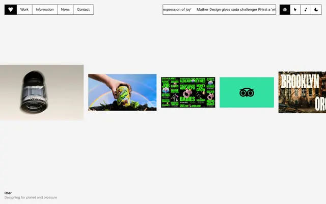
Preview image. Unlock full-res
Architectural blueprint on white marble
Color palette
Page backgrounds, navigation backgrounds, default button backgrounds
Neutral form states, badge text, and quiet UI feedback where color should stay understated. Do not promote it to the primary CTA color
Subtle background for specific sections, establishing a secondary layered surface
Medium-contrast borders, control outlines, and structural separators. Do not promote it to the primary CTA color
Subtle dividers and borders within content areas. (Based on --hr-color: rgba(0,0,0,.15))
Typography
- Weights
- 400, 600
- Sizes
- 10px, 14px, 16px, 48px, 60px, 110px, 226px
- Line height
- 1, 1.1, 1.2, 1.5
- Letter spacing
- -0.01, -0.01, -0.01, -0.02, -0.04, -0.04, -0.04
- Fallback
- Inter
Primary brand typeface for all headings, body text, nav items, and buttons. Its wide range of weights and negative letter-spacing for larger sizes creates a distinctive, assertive presence.
- Weights
- 400
- Sizes
- 14px
- Line height
- 1.2
- Letter spacing
- 0.06
- Fallback
- Space Mono
Monospaced font for specific technical details, code snippets, or subtle secondary information where a fixed-width aesthetic is desired.
- Weights
- 400
- Sizes
- 14px
- Line height
- 1.2
- Letter spacing
- 0.06
- Fallback
- Georgia
Used sparingly for decorative elements or specific content where a traditional serif contrast is intended. Appears to be a default fallback on the site, not a primary voice.
Spacing & shape
Components
Text in Basis, #000000, 16px. Underline on hover. No background or padding. Interactivity is conveyed through text styling rather than distinct button visuals.
Background #ffffff, text #000000. Used for secondary actions in contexts that already have a strong visual container. Text 16px Basis, weight 400, tightly tracked. No borders, no intrinsic padding beyond text content; container provides visual separation.
Background transparent, text #000000, 1px #000000 border. No explicit border-radius. Padding 0px. Text 16px Basis, weight 400. This is the most common interactive element style.
Background transparent, text #808080, 1px #808080 border. Text 16px Basis, weight 400. No border-radius or padding.
Transparent background, text #000000, 1px #000000 border. No border-radius or padding. Uses Basis font.
Implied border of 1px Ink Black. No explicit background color, relying on Canvas White. Uses 0px border-radius. Padding of 16px on larger blocks, 0 on image-heavy media cards. Primarily defined by its visual container lines.
Guidelines
- Prioritize Ink Black text (#000000) on Canvas White (#ffffff) backgrounds for maximum contrast and essential information.
- Use Basis font for all textual content, adjusting weights and letter-spacing for hierarchy as defined in the typography section.
- Define interactive areas primarily through 1px Ink Black (#000000) borders and text-based links, rather than strong background fills.
- Maintain a default border-radius of 0px across all components to reinforce the sharp, precise aesthetic.
- Employ Smoke Grey (#f4f4f4) sparingly for subtle section breaks or secondary surface differentiation, always contrasting with Ink Black text.
- Use Muted Stone (#808080) for helper text, disabled states, or less prominent links.
- Implement the 20px elementGap consistently for horizontal and vertical spacing between most elements.
- Avoid using gradients or shadows; the design relies on flat, high-contrast surfaces and sharp edges.
- Do not use background colors on primary buttons; rely on borders and text color for interaction cues.
- Refrain from introducing decorative imagery that deviates from the grid-like, monochromatic aesthetic.
- Do not use rounded corners on any elements; all corners should be sharp 0px radius.
- Avoid excessive use of color; the system is built on a neutral palette with minimal accentuation.
- Do not vary line-height significantly from the defined values in the typography section; maintain tight leading.
- Avoid large internal padding on interactive elements; content should often sit close to implied borders.
About this system
ShowHide
Mother Design operates with a high-contrast, starkly typographic visual system, channeling the precision of an architectural drawing onto a white canvas. Its deliberate use of un-styled text as clickable elements, minimal decorative elements, and strong grid lines defines a no-frills, functional aesthetic. Typography carries the primary visual weight, with large, confident headlines and tightly tracked text emphasizing clarity and directness. The overall feeling is one of structural rigor and intentional simplicity, where content and interaction are prioritized over visual embellishment.
The page adheres to a full-bleed layout, where content stretches to the viewport edges, creating a continuous canvas. The hero section is characterized by large, impactful typography that extends across the full width. Section rhythm is driven by sharp, 1px Ink Black (#000000) horizontal and vertical dividing lines, creating a visual grid system often with large whitespace blocks. Content is arranged in alternating patterns, frequently split into two main columns, with text-heavy blocks contrasting with image or embedded video blocks. The layout emphasizes strong vertical alignment and horizontal flow, with extensive use of 1px borders to define content areas. Navigation is a minimalist top-bar, fixed and sticky, composed of text links and ghost buttons. Density varies, with large headlines and ample whitespace on some sections, while others present information in more compact, grid-based arrangements.
The site uses a mix of high-quality product photography and occasionally vibrant, conceptual illustrations within its portfolio pieces, but these are largely contained within defined content blocks. UI-wise, imagery is minimal and serves a functional or demonstrative purpose. Photography is typically clean, with subjects clearly delineated; illustrations lean towards bold, often abstract forms within a specific brand's palette. Icons are outlined, Ink Black (#000000) on Canvas White (#ffffff), maintaining the high-contrast aesthetic with a very fine stroke weight. Imagery is contained, often within implicit 0px radius cards, and does not overlap elements. The density is relatively high, with images and text often occupying equal visual space in a balanced, grid-like manner.
Reminiscent of Huge, Pentagram, Work & Co, Manual (Design Studio).
# Mother Design — Style Reference
> Architectural blueprint on white marble

**Theme:** light

**Site:** https://www.motherdesign.com

Mother Design operates with a high-contrast, starkly typographic visual system, channeling the precision of an architectural drawing onto a white canvas. Its deliberate use of un-styled text as clickable elements, minimal decorative elements, and strong grid lines defines a no-frills, functional aesthetic. Typography carries the primary visual weight, with large, confident headlines and tightly tracked text emphasizing clarity and directness. The overall feeling is one of structural rigor and intentional simplicity, where content and interaction are prioritized over visual embellishment.

## Tokens — Colors

| Name | Value | Token | Role |
|------|------|------|------|
| Canvas White | `#ffffff` | `--color-canvas-white` | Page backgrounds, navigation backgrounds, default button backgrounds |
| Ink Black | `#000000` | `--color-ink-black` | Neutral form states, badge text, and quiet UI feedback where color should stay understated. Do not promote it to the primary CTA color |
| Smoke Grey | `#f4f4f4` | `--color-smoke-grey` | Subtle background for specific sections, establishing a secondary layered surface |
| Muted Stone | `#808080` | `--color-muted-stone` | Medium-contrast borders, control outlines, and structural separators. Do not promote it to the primary CTA color |
| Divider Line | `#262626` | `--color-divider-line` | Subtle dividers and borders within content areas. (Based on --hr-color: rgba(0,0,0,.15)) |

## Tokens — Typography

### Basis
- **Substitute:** Inter
- **Weights:** 400, 600
- **Sizes:** 10px, 14px, 16px, 48px, 60px, 110px, 226px
- **Line height:** 1, 1.1, 1.2, 1.5
- **Letter spacing:** -0.01, -0.01, -0.01, -0.02, -0.04, -0.04, -0.04
- **Role:** Primary brand typeface for all headings, body text, nav items, and buttons. Its wide range of weights and negative letter-spacing for larger sizes creates a distinctive, assertive presence.

### Basis Mono
- **Substitute:** Space Mono
- **Weights:** 400
- **Sizes:** 14px
- **Line height:** 1.2
- **Letter spacing:** 0.06
- **Role:** Monospaced font for specific technical details, code snippets, or subtle secondary information where a fixed-width aesthetic is desired.

### Times
- **Substitute:** Georgia
- **Weights:** 400
- **Sizes:** 14px
- **Line height:** 1.2
- **Letter spacing:** 0.06
- **Role:** Used sparingly for decorative elements or specific content where a traditional serif contrast is intended. Appears to be a default fallback on the site, not a primary voice.

## Tokens — Type Scale

| Role | Size | Line height | Letter spacing |
|------|------|------|------|
| caption | 10px | 1.5 | -0.01em |
| body-sm | 14px | 1.2 | -0.01em |
| body | 16px | 1.5 | -0.01em |
| subheading | 48px | 1 | -0.02em |
| heading | 60px | 1 | -0.04em |
| heading-lg | 110px | 1 | -0.04em |
| display | 226px | 1 | -0.04em |

## Tokens — Spacing

- **Section gap:** 200px
- **Card padding:** 16px
- **Element gap:** 20px

## Tokens — Radius

- **Default:** 0px

## Layout

The page adheres to a full-bleed layout, where content stretches to the viewport edges, creating a continuous canvas. The hero section is characterized by large, impactful typography that extends across the full width. Section rhythm is driven by sharp, 1px Ink Black (#000000) horizontal and vertical dividing lines, creating a visual grid system often with large whitespace blocks. Content is arranged in alternating patterns, frequently split into two main columns, with text-heavy blocks contrasting with image or embedded video blocks. The layout emphasizes strong vertical alignment and horizontal flow, with extensive use of 1px borders to define content areas. Navigation is a minimalist top-bar, fixed and sticky, composed of text links and ghost buttons. Density varies, with large headlines and ample whitespace on some sections, while others present information in more compact, grid-based arrangements.

## Imagery

The site uses a mix of high-quality product photography and occasionally vibrant, conceptual illustrations within its portfolio pieces, but these are largely contained within defined content blocks. UI-wise, imagery is minimal and serves a functional or demonstrative purpose. Photography is typically clean, with subjects clearly delineated; illustrations lean towards bold, often abstract forms within a specific brand's palette. Icons are outlined, Ink Black (#000000) on Canvas White (#ffffff), maintaining the high-contrast aesthetic with a very fine stroke weight. Imagery is contained, often within implicit 0px radius cards, and does not overlap elements. The density is relatively high, with images and text often occupying equal visual space in a balanced, grid-like manner.

## Components

### Navigation Link
*Text-based navigation item in header*

Text in Basis, #000000, 16px. Underline on hover. No background or padding. Interactivity is conveyed through text styling rather than distinct button visuals.

### Subtle Accent Button
*Button with background but no visible border or padding beyond text.*

Background #ffffff, text #000000. Used for secondary actions in contexts that already have a strong visual container. Text 16px Basis, weight 400, tightly tracked. No borders, no intrinsic padding beyond text content; container provides visual separation.

### Ghost Bordered Button
*Transparent button with 1px black border. Used for generic interactive elements.*

Background transparent, text #000000, 1px #000000 border. No explicit border-radius. Padding 0px. Text 16px Basis, weight 400. This is the most common interactive element style.

### Muted Ghost Button
*Transparent button with grey text and border, indicating a less prominent action or disabled state.*

Background transparent, text #808080, 1px #808080 border. Text 16px Basis, weight 400. No border-radius or padding.

### Input Field
*Standard text input field*

Transparent background, text #000000, 1px #000000 border. No border-radius or padding. Uses Basis font.

### Project Card
*Container for portfolio items or content blocks*

Implied border of 1px Ink Black. No explicit background color, relying on Canvas White. Uses 0px border-radius. Padding of 16px on larger blocks, 0 on image-heavy media cards. Primarily defined by its visual container lines.

## Guidelines

### Do

- Prioritize Ink Black text (#000000) on Canvas White (#ffffff) backgrounds for maximum contrast and essential information.
- Use Basis font for all textual content, adjusting weights and letter-spacing for hierarchy as defined in the typography section.
- Define interactive areas primarily through 1px Ink Black (#000000) borders and text-based links, rather than strong background fills.
- Maintain a default border-radius of 0px across all components to reinforce the sharp, precise aesthetic.
- Employ Smoke Grey (#f4f4f4) sparingly for subtle section breaks or secondary surface differentiation, always contrasting with Ink Black text.
- Use Muted Stone (#808080) for helper text, disabled states, or less prominent links.
- Implement the 20px elementGap consistently for horizontal and vertical spacing between most elements.

### Don't

- Avoid using gradients or shadows; the design relies on flat, high-contrast surfaces and sharp edges.
- Do not use background colors on primary buttons; rely on borders and text color for interaction cues.
- Refrain from introducing decorative imagery that deviates from the grid-like, monochromatic aesthetic.
- Do not use rounded corners on any elements; all corners should be sharp 0px radius.
- Avoid excessive use of color; the system is built on a neutral palette with minimal accentuation.
- Do not vary line-height significantly from the defined values in the typography section; maintain tight leading.
- Avoid large internal padding on interactive elements; content should often sit close to implied borders.

## Agent Prompt Guide

Quick Color Reference:
- text: #000000
- background: #ffffff
- border: #000000
- accent: no distinct accent color
- primary action: no distinct CTA color

Example Component Prompts:
- Create a section divider: 1px solid border, color #000000, full-width.
No distinct primary action color was observed; use the extracted neutral button treatments instead of inventing a filled CTA color.
- Create a main headline: 'Bold Statement' in Basis 110px (weight 600), color #000000, letter-spacing -0.04em, line-height 1.0.
- Create an input field: Background transparent, 1px solid #000000 border, 0px border-radius. Placeholder text 'Enter text here' in Canvas White, text input color #000000, Basis 16px font.
More like this
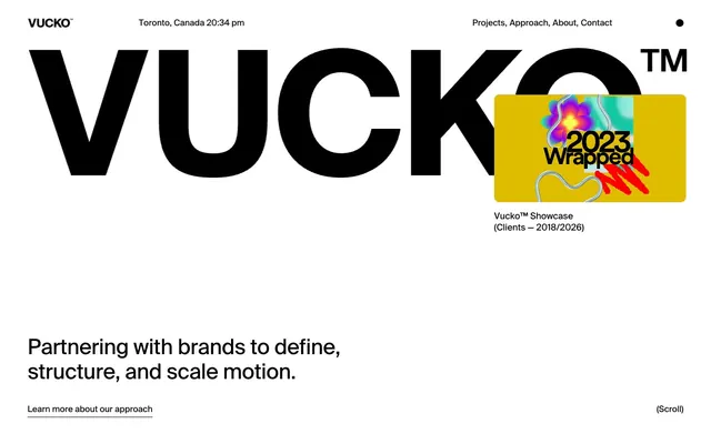









Keep what you find
A free account saves references to boards and can send you a weekly email of picks based on what you save.
To see every result, go Pro.