Preview image. Unlock full-res
earthy minimalist canvas
Color palette
Primary action button background — a deep, muted teal used sparingly to draw attention to key interactive elements
Accent color for specific buttons and highlighted text sections — a vivid violet used for secondary call-to-action buttons
Accent color for specific buttons and highlighted text sections — a rich, dark berry hue that provides a strong, sophisticated accent
Highlighted input fields, accent for specific headings and body text — a soft, muted blue for contextual emphasis
Accent color for specific buttons, and contextual data highlights
Orange action color for filled buttons, selected navigation states, and focused conversion moments
Accent for specific buttons or highlighting elements; used as a button background
Primary text, interactive element borders, muted headings, secondary button text — a deep, warm gray providing strong contrast on light backgrounds
Main page background, neutral card surfaces — a soft, warm off-white that defines the overall light theme
Subtle borders, inactive button borders, link underlines, image borders — providing a soft visual division without stark contrast
Secondary background surfaces, header background, primary button background — a crisp white offering contrast against the Oat Canvas
Subtle dividers and horizontal rule lines
Input field borders, secondary muted text
Typography
- Weights
- 400, 600, 700
- Sizes
- 12px, 13px, 14px, 16px, 22px, 24px, 30px, 43px, 68px
- Line height
- 0.75, 0.81, 1, 1.05, 1.09, 1.1, 1.13, 1.17, 1.2, 1.3, 1.41, 1.43, 1.5
- Letter spacing
- 0.008em at 68px, 0.009em at 43px, 0.013em at 30px, 0.015em at 24px, 0.017em at 22px, normal at 12-16px
- Fallback
- Inter
Used for all primary headings, body text, links, and most UI elements. Its broad range of weights and sizes provides a precise, modern feel, supporting a hierarchy that prioritizes clarity and directness.
- Weights
- 400, 500
- Sizes
- 10px, 11px, 12px
- Line height
- 1, 1.5, 1.8
- Letter spacing
- 0.018em
- Fallback
- Inter
Primarily for smaller, supportive text such as navigation items and detailed body text, ensuring legibility at smaller scales with tighter tracking.
- Weights
- 400
- Sizes
- 18px
- Line height
- 1
Font Awesome 5 Brands — detected in extracted data but not described by AI
Spacing & shape
Components
Transparent background with a 0.3 opacity Peat Ink border at 2px radius. Text in Peat Ink (#3f322a), 12px padding on sides, 8px on top/bottom. Font is neue-haas-grotesk-display.
Filled with Forest Teal (#004e4e), text in Peat Ink (#3f322a). No border radius (0px). Generous padding of 20px on all sides. Font is neue-haas-grotesk-text.
Filled with Amethyst Glow (#a56eff), text in Peat Ink (#3f322a). No border radius (0px). Generous padding of 20px on all sides. Font is neue-haas-grotesk-text.
Filled with Winter Marble (#ffffff), text in Peat Ink (#3f322a). No border radius (0px). Padding of 15px on sides, 10px on top/bottom. Font is neue-haas-grotesk-display.
Transparent background, black text. Subtle border of #000000. No border radius (0px). 0px padding. Font is neue-haas-grotesk-display.
Background in Sky Glaze (#bfebfe), text in Peat Ink (#3f322a). Border and background color are typically the same: #bfebfe. No border radius (0px). Padding of 20px on sides, 15px on top/bottom. Font is neue-haas-grotesk-display.
Background rgba(63, 50, 42, 0.1), text in Peat Ink (#3f322a). Black border. No border radius (0px). Padding of 0px on sides, 8px on top/bottom. Font is neue-haas-grotesk-display.
Background in Oat Canvas (#fff9ee), text in Peat Ink (#3f322a). Border #ab B0 b2 at 3px radius. Padding of 12px on sides, 6px on top/bottom. Font is neue-haas-grotesk-display.
Background rgba(63, 50, 42, 0.1) (a transparent Peat Ink), text in Peat Ink (#3f322a). 2px border radius. Padding of 8px on sides, 6px on top/bottom. Font is neue-haas-grotesk-display.
Guidelines
- Use Peat Ink (#3f322a) for all primary body text and headings.
- Maintain Oat Canvas (#fff9ee) as the dominant background color for content sections.
- Apply 2px border radius for all buttons and badges, reserving 0px for interactive list items.
- Utilize Forest Teal (#004e4e) exclusively for the primary call-to-action button background.
- Implement thin borders (1px) in Silver Clay (#c5bdb3) for subtle content division.
- Ensure generous vertical spacing between sections, using sectionGap of 40px as a minimum.
- Employ the neue-haas-grotesk-display font for headings and most UI elements, using its specific letter spacing values for each size.
- Avoid using multiple vivid accent colors within a single visual area; use them sparingly to highlight specific actions.
- Do not introduce strong shadows or elevation; maintain a flat, clean aesthetic.
- Refrain from using any additional colors beyond the defined palette to preserve the muted brand identity.
- Do not use highly decorative gradients; stick to solid color fills for backgrounds and components.
- Avoid large, impactful imagery beyond the hero section; keep images contained and functional.
- Do not deviate from the defined border radii; maintain 2px for small interactives and 0px for cards/lists unless specifically noted.
- Do not use overly complex or busy layout grids; opt for clean, aligned blocks of content.
About this system
ShowHide
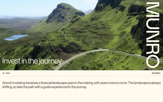
Munro Partners employs a restrained, earthy aesthetic with a foundation of muted neutrals and precise typography. The design emphasizes content clarity over decorative elements, using subtle borders and a limited palette of vivid accent colors to highlight key information and calls to action. Visual weight is maintained through considered spacing and thin lines, creating a sense of understated authority. The overall tone is grounded and professional, reflecting a financial institution's identity.
The page structure is full-bleed for the initial hero section, with a dominant max-width 1200px contained layout for subsequent content. The hero features a large background image with a centered headline in white. Content sections below often alternate between text-dominant blocks and split sections with text and visual elements (like video cards) arranged in a balanced two-column format. The vertical rhythm is comfortable, with consistent section gaps creating clear separation. Navigation is handled by a minimal top bar with a 'MENU' hamburger icon, and the brand name 'MUNRO' consistently positioned on the right.
The site primarily uses high-quality, atmospheric landscape photography, often in full-bleed hero sections, to convey a sense of journey and growth. Product-specific imagery features contained videos or subtle abstract graphics. Icons are minimal, outlined, and monochromatic, used functionally rather than decoratively. The imagery serves to create an inviting atmosphere and contextualize concepts rather than being purely illustrative or product-focused. Image density is low in content areas, with text dominating.
Reminiscent of Vanguard Investor, BlackRock, Fidelity Investments, Macquarie Group.
# Munro Partners — Style Reference
> earthy minimalist canvas

**Theme:** light

**Site:** https://www.munropartners.com.au

Munro Partners employs a restrained, earthy aesthetic with a foundation of muted neutrals and precise typography. The design emphasizes content clarity over decorative elements, using subtle borders and a limited palette of vivid accent colors to highlight key information and calls to action. Visual weight is maintained through considered spacing and thin lines, creating a sense of understated authority. The overall tone is grounded and professional, reflecting a financial institution's identity.

## Tokens — Colors

| Name | Value | Token | Role |
|------|------|------|------|
| Forest Teal | `#004e4e` | `--color-forest-teal` | Primary action button background — a deep, muted teal used sparingly to draw attention to key interactive elements |
| Amethyst Glow | `#a56eff` | `--color-amethyst-glow` | Accent color for specific buttons and highlighted text sections — a vivid violet used for secondary call-to-action buttons |
| Berry Shadow | `#560e4b` | `--color-berry-shadow` | Accent color for specific buttons and highlighted text sections — a rich, dark berry hue that provides a strong, sophisticated accent |
| Sky Glaze | `#bfebfe` | `--color-sky-glaze` | Highlighted input fields, accent for specific headings and body text — a soft, muted blue for contextual emphasis |
| Ocean Blue | `#3074f9` | `--color-ocean-blue` | Accent color for specific buttons, and contextual data highlights |
| Honey Gold | `#c67700` | `--color-honey-gold` | Orange action color for filled buttons, selected navigation states, and focused conversion moments |
| Sunshine Burst | `#feed5a` | `--color-sunshine-burst` | Accent for specific buttons or highlighting elements; used as a button background |
| Peat Ink | `#3f322a` | `--color-peat-ink` | Primary text, interactive element borders, muted headings, secondary button text — a deep, warm gray providing strong contrast on light backgrounds |
| Oat Canvas | `#fff9ee` | `--color-oat-canvas` | Main page background, neutral card surfaces — a soft, warm off-white that defines the overall light theme |
| Silver Clay | `#c5bdb3` | `--color-silver-clay` | Subtle borders, inactive button borders, link underlines, image borders — providing a soft visual division without stark contrast |
| Winter Marble | `#ffffff` | `--color-winter-marble` | Secondary background surfaces, header background, primary button background — a crisp white offering contrast against the Oat Canvas |
| Whisper Gray | `#e5e5e5` | `--color-whisper-gray` | Subtle dividers and horizontal rule lines |
| Stone Dust | `#b3aea7` | `--color-stone-dust` | Input field borders, secondary muted text |

## Tokens — Typography

### neue-haas-grotesk-display
- **Substitute:** Inter
- **Weights:** 400, 600, 700
- **Sizes:** 12px, 13px, 14px, 16px, 22px, 24px, 30px, 43px, 68px
- **Line height:** 0.75, 0.81, 1, 1.05, 1.09, 1.1, 1.13, 1.17, 1.2, 1.3, 1.41, 1.43, 1.5
- **Letter spacing:** 0.008em at 68px, 0.009em at 43px, 0.013em at 30px, 0.015em at 24px, 0.017em at 22px, normal at 12-16px
- **Role:** Used for all primary headings, body text, links, and most UI elements. Its broad range of weights and sizes provides a precise, modern feel, supporting a hierarchy that prioritizes clarity and directness.

### neue-haas-grotesk-text
- **Substitute:** Inter
- **Weights:** 400, 500
- **Sizes:** 10px, 11px, 12px
- **Line height:** 1, 1.5, 1.8
- **Letter spacing:** 0.018em
- **Role:** Primarily for smaller, supportive text such as navigation items and detailed body text, ensuring legibility at smaller scales with tighter tracking.

### Font Awesome 5 Brands
- **Weights:** 400
- **Sizes:** 18px
- **Line height:** 1
- **Role:** Font Awesome 5 Brands — detected in extracted data but not described by AI

## Tokens — Type Scale

Perfect Fifth (1.5) from 14px base.

| Role | Size | Line height | Letter spacing |
|------|------|------|------|
| caption | 10px | 1.5 | 0.18px |
| body | 14px | 1.43 | — |
| heading-sm | 22px | 1.09 | 0.374px |
| heading | 24px | 1.05 | 0.36px |
| heading-lg | 30px | 1.13 | 0.39px |
| display | 68px | 0.75 | 0.544px |

## Tokens — Spacing

- **Section gap:** 40px
- **Card padding:** 0px
- **Element gap:** 20px

## Tokens — Radius

- **Default:** 2px
- **Buttons:** 2px
- **Cards:** 0px
- **Images:** 15px
- **badges:** 2px
- **misc:** 20px

## Layout

The page structure is full-bleed for the initial hero section, with a dominant max-width 1200px contained layout for subsequent content. The hero features a large background image with a centered headline in white. Content sections below often alternate between text-dominant blocks and split sections with text and visual elements (like video cards) arranged in a balanced two-column format. The vertical rhythm is comfortable, with consistent section gaps creating clear separation. Navigation is handled by a minimal top bar with a 'MENU' hamburger icon, and the brand name 'MUNRO' consistently positioned on the right.

## Imagery

The site primarily uses high-quality, atmospheric landscape photography, often in full-bleed hero sections, to convey a sense of journey and growth. Product-specific imagery features contained videos or subtle abstract graphics. Icons are minimal, outlined, and monochromatic, used functionally rather than decoratively. The imagery serves to create an inviting atmosphere and contextualize concepts rather than being purely illustrative or product-focused. Image density is low in content areas, with text dominating.

## Components

### Ghost Outline Button
*Secondary action button, 'See more' prompts*

Transparent background with a 0.3 opacity Peat Ink border at 2px radius. Text in Peat Ink (#3f322a), 12px padding on sides, 8px on top/bottom. Font is neue-haas-grotesk-display.

### Primary Action Button
*Main call-to-action button*

Filled with Forest Teal (#004e4e), text in Peat Ink (#3f322a). No border radius (0px). Generous padding of 20px on all sides. Font is neue-haas-grotesk-text.

### Accent Button (Amethyst)
*Specific action button, highlighted features*

Filled with Amethyst Glow (#a56eff), text in Peat Ink (#3f322a). No border radius (0px). Generous padding of 20px on all sides. Font is neue-haas-grotesk-text.

### White Nav Button
*Navigation, 'Skip to content' calls to action.*

Filled with Winter Marble (#ffffff), text in Peat Ink (#3f322a). No border radius (0px). Padding of 15px on sides, 10px on top/bottom. Font is neue-haas-grotesk-display.

### Information Input Field
*User input fields.*

Transparent background, black text. Subtle border of #000000. No border radius (0px). 0px padding. Font is neue-haas-grotesk-display.

### Highlighted Input Field (Sky Glaze)
*Activated or emphasized input fields.*

Background in Sky Glaze (#bfebfe), text in Peat Ink (#3f322a). Border and background color are typically the same: #bfebfe. No border radius (0px). Padding of 20px on sides, 15px on top/bottom. Font is neue-haas-grotesk-display.

### Search Input Field
*Search bars with a focused context.*

Background rgba(63, 50, 42, 0.1), text in Peat Ink (#3f322a). Black border. No border radius (0px). Padding of 0px on sides, 8px on top/bottom. Font is neue-haas-grotesk-display.

### Form Input Field (Oat Warm)
*Standard form input fields.*

Background in Oat Canvas (#fff9ee), text in Peat Ink (#3f322a). Border #ab B0 b2 at 3px radius. Padding of 12px on sides, 6px on top/bottom. Font is neue-haas-grotesk-display.

### Muted Badge
*Tags, categories, subtle labels.*

Background rgba(63, 50, 42, 0.1) (a transparent Peat Ink), text in Peat Ink (#3f322a). 2px border radius. Padding of 8px on sides, 6px on top/bottom. Font is neue-haas-grotesk-display.

## Guidelines

### Do

- Use Peat Ink (#3f322a) for all primary body text and headings.
- Maintain Oat Canvas (#fff9ee) as the dominant background color for content sections.
- Apply 2px border radius for all buttons and badges, reserving 0px for interactive list items.
- Utilize Forest Teal (#004e4e) exclusively for the primary call-to-action button background.
- Implement thin borders (1px) in Silver Clay (#c5bdb3) for subtle content division.
- Ensure generous vertical spacing between sections, using sectionGap of 40px as a minimum.
- Employ the neue-haas-grotesk-display font for headings and most UI elements, using its specific letter spacing values for each size.

### Don't

- Avoid using multiple vivid accent colors within a single visual area; use them sparingly to highlight specific actions.
- Do not introduce strong shadows or elevation; maintain a flat, clean aesthetic.
- Refrain from using any additional colors beyond the defined palette to preserve the muted brand identity.
- Do not use highly decorative gradients; stick to solid color fills for backgrounds and components.
- Avoid large, impactful imagery beyond the hero section; keep images contained and functional.
- Do not deviate from the defined border radii; maintain 2px for small interactives and 0px for cards/lists unless specifically noted.
- Do not use overly complex or busy layout grids; opt for clean, aligned blocks of content.

## Agent Prompt Guide

**Quick Color Reference**
- text: #3f322a
- background: #fff9ee
- border: #c5bdb3
- accent: #a56eff
- primary action: #a56eff (filled action)

**3-5 Example Component Prompts**
- Create a section divider: 1px solid Silver Clay (#c5bdb3) line, with 40px vertical spacing above and below.
- Create a Primary Action Button: #a56eff background, #3f322a text, 9999px radius, compact pill padding. Use this filled treatment for the main CTA.
- Create a ghost button: Transparent background, 1px Silver Clay (#c5bdb3) border, text Peat Ink (#3f322a), 2px radius, 12px horizontal and 8px vertical padding. Font neue-haas-grotesk-display weight 400.
- Create a simple text input field: Background Oat Canvas (#fff9ee), text Peat Ink (#3f322a), 1px Stone Dust (#b3aea7) border, 3px radius, 12px horizontal and 6px vertical padding. Placeholder text in Silver Clay (#c5bdb3).
- Create a badge for a tag: Background rgba(63, 50, 42, 0.1), text Peat Ink (#3f322a), 2px radius, 8px horizontal and 6px vertical padding. Font neue-haas-grotesk-display weight 400.
More like this








Keep what you find
A free account saves references to boards and can send you a weekly email of picks based on what you save.
To see every result, go Pro.