Preview image. Unlock full-res
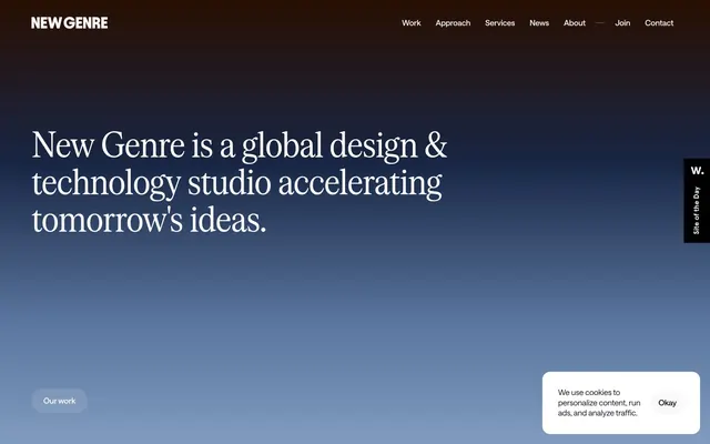
Shifting Gradual Horizon — a continuous, subtle color transition across surfaces, like watching a sunrise or sunset unfold.
Color palette
Primary page background, hero section — shifts from deep, burnt umber through cool blues to soft, pale gold, creating a dynamic, subtle backdrop that feels vast and atmospheric.
Decorative background gradient used for visual breaks — transitions from transparent through fiery oranges and reds to a deep, earthy brown, adding warmth and energy.
Rich, warm gradient for sections requiring strong visual presence — deep browns and oranges signifying grounding and energy.
Subtle accent for ephemeral elements, often with transparency — its soft luminosity is a counterpoint to the primary gradient.
Primary text, headers, prominent UI elements, icon fill — anchors the gradients with stark contrast.
Background for clean content sections, inverse text on dark backgrounds, active elements in navigation — creates clear content islands on the gradient canvas.
Darkest background for footer sections — grounds the site with a rich, almost black earth tone.
Main body text, input fields, prominent text — a very dark gray that provides high contrast without being pure black.
Subtle secondary text, border elements, placeholder text — used for less prominent information, allowing primary content to stand out.
Desaturated gray for some headings — provides a softer emphasis compared to Ebon Depth.
Typography
- Weights
- 400
- Sizes
- 64px, 72px
- Line height
- 1.05
- Letter spacing
- -1.44
- Fallback
- IBM Plex Serif
Display headlines and primary page titles — its condensed form and generous negative letter-spacing (-0.02em = -1.44px at 72px) create a distinctive, slightly formal and precise look.
- Weights
- 300, 400, 500
- Sizes
- 12px, 14px, 16px, 20px, 24px, 32px
- Line height
- 1, 1.1, 1.15, 1.4
- Letter spacing
- -0.12
- Fallback
- Inter Variable
Versatile all-purpose sans-serif for body text, subheadings, and UI elements — its variable nature and consistent negative letter-spacing (-0.01em = -0.12px at 12px) contribute to the compact, yet legible aesthetic.
- Weights
- 400, 570
- Sizes
- 16px
- Line height
- 1
- Letter spacing
- -0.16
- Fallback
- Inter Medium
Specific use for input fields, providing slight visual differentiation from other Saans weights. The subtle letter-spacing maintains consistency.
- Weights
- 380
- Sizes
- 16px
- Line height
- 1.3
- Letter spacing
- -0.16
- Fallback
- Inter Regular
Used for standard body text, featuring a slightly lighter weight and increased line height for enhanced readability in paragraphs.
Spacing & shape
Components
Text only, Saans Variable weight 400 at 12px, color Ebon Depth #000000. Underline appears on hover.
Background rgba(153, 161, 175, 0.06), text Ebon Depth #000000, 90px border-radius (pill shape). Padding 16px vertical, 24px horizontal. Typography Saans Variable, often weight 400.
Transparent background, text Mist Gray #9e9fa3, no explicit border-radius (inherits 0px), 0px padding. Typography Saans Variable, weight 400.
Background rgba(153, 161, 175, 0.06), text Onyx Shadow #0c1018, 50px border-radius. Padding 16px all sides. Typography Saans Medium, weight 570 or 400 at 16px.
Transparent background, text Onyx Shadow #0c1018, 0px border-radius. No explicit padding (likely inherited or minimal). Typography Saans Medium, weight 570 or 400 at 16px.
Serrif Condensed Regular, weight 400, sizes 64px or 72px, line-height 1.05, letter-spacing -1.44px. Color Ebon Depth #000000 on light backgrounds or Whisper White #ffffff on dark gradient sections.
White background, with Onyx Shadow #0c1018 text for headings and body. Features 16px border-radius. Vertical padding likely 32px, horizontal 24px. The primary text uses Saans Variable at 16px, weight 400 with -0.16px letter-spacing.
Background white, 8px border-radius. Text Onyx Shadow #0c1018, with body text Saans Variable 12px, weight 400. Contains an 'Okay' button with 50px radius and transparent background.
Guidelines
- Prioritize the Sky Gradient as the primary background for full-page or hero segments to establish the atmospheric and shifting visual identity.
- Use Serrif Condensed Regular with -0.02em letter-spacing for all significant headlines to emphasize precision and a slightly formal tone.
- Maintain a clear hierarchy with Ebon Depth #000000 or Onyx Shadow #0c1018 for primary text and Mist Gray #9e9fa3 for secondary information.
- Apply 90px border-radius for all primary action buttons ('pill buttons') and 50px radius for input fields, establishing a soft, approachable interaction style.
- Ensure consistent horizontal padding of 24px for all major content blocks and card elements to maintain a structured, spacious feel.
- Leverage the Saans Variable font family for all body, subheading, and UI text, ensuring its specific negative letter-spacing for a tight, refined look.
- Avoid harsh, solid background colors; instead, opt for gradients or Whisper White #ffffff to preserve the site's ethereal quality.
- Do not use overly bold or heavy font weights; the system relies on lighter weights like Saans Variable 300-500 and Serrif Condensed Regular 400.
- Refrain from using strong, single-color accents; instead, any accent should be subtle, transparent, or part of a larger gradient.
- Do not introduce sharp corners or small radii on interactive elements; all buttons and inputs should adhere to 50px or 90px border-radius.
- Avoid dense, information-heavy sections without adequate section gaps (48-52px) or element gaps (6-24px); maintain a compact yet breathable layout.
- Do not use default browser link styling; ensure all links use Saans Variable and are styled consistently with the navigation links or body text.
About this system
ShowHide
New Genre evokes a serene, almost academic atmosphere through subtle color gradients and precise typography. The core is a unique gradient background that shifts from deep, muted tones to soft, almost ethereal lightness, underpinning minimalist content blocks. Typography relies on custom fonts with generous letter-spacing, particularly noticeable in headlines, signaling thoughtfulness and understated authority rather than bold declarations. Interactive elements are sparingly defined, primarily through rounded shapes and light borders, maintaining a sense of quiet professionalism.
The site uses stylized, artistic product photography or conceptual imagery. These are not typical product shots but rather abstract representations — like the botanical images showing growth in the 'process' section. They are meticulously arranged against clean white or softly blurred backgrounds, often masked with subtle transparency or soft edges, focusing on visual metaphor rather than literal depiction. The style prioritizes atmosphere and sophisticated concept over direct product showcasing, reinforcing the studio's design and strategic capabilities. Icons, if present, are likely minimal and monochromatic, adhering to the restrained aesthetic.
Reminiscent of Huge Inc., Pentagram, AKQA.
# New Genre — Style Reference
> Shifting Gradual Horizon — a continuous, subtle color transition across surfaces, like watching a sunrise or sunset unfold.

**Theme:** light

**Site:** https://newgenre.studio

New Genre evokes a serene, almost academic atmosphere through subtle color gradients and precise typography. The core is a unique gradient background that shifts from deep, muted tones to soft, almost ethereal lightness, underpinning minimalist content blocks. Typography relies on custom fonts with generous letter-spacing, particularly noticeable in headlines, signaling thoughtfulness and understated authority rather than bold declarations. Interactive elements are sparingly defined, primarily through rounded shapes and light borders, maintaining a sense of quiet professionalism.

## Tokens — Colors

| Name | Value | Token | Role |
|------|------|------|------|
| Sky Gradient | `#280e01` | `--color-sky-gradient` | Primary page background, hero section — shifts from deep, burnt umber through cool blues to soft, pale gold, creating a dynamic, subtle backdrop that feels vast and atmospheric. |
| Sunset Gradient | `#f7f3f0` | `--color-sunset-gradient` | Decorative background gradient used for visual breaks — transitions from transparent through fiery oranges and reds to a deep, earthy brown, adding warmth and energy. |
| Earthfire Gradient | `#1e1310` | `--color-earthfire-gradient` | Rich, warm gradient for sections requiring strong visual presence — deep browns and oranges signifying grounding and energy. |
| Amber Glow | `#ffe600` | `--color-amber-glow` | Subtle accent for ephemeral elements, often with transparency — its soft luminosity is a counterpoint to the primary gradient. |
| Ebon Depth | `#000000` | `--color-ebon-depth` | Primary text, headers, prominent UI elements, icon fill — anchors the gradients with stark contrast. |
| Whisper White | `#ffffff` | `--color-whisper-white` | Background for clean content sections, inverse text on dark backgrounds, active elements in navigation — creates clear content islands on the gradient canvas. |
| Midnight Oil Stain | `#1e1310` | `--color-midnight-oil-stain` | Darkest background for footer sections — grounds the site with a rich, almost black earth tone. |
| Onyx Shadow | `#0c1018` | `--color-onyx-shadow` | Main body text, input fields, prominent text — a very dark gray that provides high contrast without being pure black. |
| Mist Gray | `#9e9fa3` | `--color-mist-gray` | Subtle secondary text, border elements, placeholder text — used for less prominent information, allowing primary content to stand out. |
| Steel Glimmer | `#6d7074` | `--color-steel-glimmer` | Desaturated gray for some headings — provides a softer emphasis compared to Ebon Depth. |

## Tokens — Typography

### Serrif Condensed Regular
- **Substitute:** IBM Plex Serif
- **Weights:** 400
- **Sizes:** 64px, 72px
- **Line height:** 1.05
- **Letter spacing:** -1.44
- **Role:** Display headlines and primary page titles — its condensed form and generous negative letter-spacing (-0.02em = -1.44px at 72px) create a distinctive, slightly formal and precise look.

### Saans Variable
- **Substitute:** Inter Variable
- **Weights:** 300, 400, 500
- **Sizes:** 12px, 14px, 16px, 20px, 24px, 32px
- **Line height:** 1, 1.1, 1.15, 1.4
- **Letter spacing:** -0.12
- **Role:** Versatile all-purpose sans-serif for body text, subheadings, and UI elements — its variable nature and consistent negative letter-spacing (-0.01em = -0.12px at 12px) contribute to the compact, yet legible aesthetic.

### Saans Medium
- **Substitute:** Inter Medium
- **Weights:** 400, 570
- **Sizes:** 16px
- **Line height:** 1
- **Letter spacing:** -0.16
- **Role:** Specific use for input fields, providing slight visual differentiation from other Saans weights. The subtle letter-spacing maintains consistency.

### Saans Regular
- **Substitute:** Inter Regular
- **Weights:** 380
- **Sizes:** 16px
- **Line height:** 1.3
- **Letter spacing:** -0.16
- **Role:** Used for standard body text, featuring a slightly lighter weight and increased line height for enhanced readability in paragraphs.

## Tokens — Type Scale

Augmented Fourth (1.414) from 16px base.

| Role | Size | Line height | Letter spacing |
|------|------|------|------|
| caption | 12px | 1.2 | — |
| body | 16px | 1.3 | -0.16px |
| subheading | 20px | 1.15 | -0.2px |
| heading | 32px | 1.15 | -0.32px |
| display-sm | 64px | 1.05 | -1.28px |
| display | 72px | 1.05 | -1.44px |

## Tokens — Spacing

- **Section gap:** 48-52px
- **Card padding:** 16-32px
- **Element gap:** 6-24px

## Tokens — Radius

- **Default:** 8px
- **Buttons:** 50px
- **components:** 16px
- **pillButtons:** 90px

## Imagery

The site uses stylized, artistic product photography or conceptual imagery. These are not typical product shots but rather abstract representations — like the botanical images showing growth in the 'process' section. They are meticulously arranged against clean white or softly blurred backgrounds, often masked with subtle transparency or soft edges, focusing on visual metaphor rather than literal depiction. The style prioritizes atmosphere and sophisticated concept over direct product showcasing, reinforcing the studio's design and strategic capabilities. Icons, if present, are likely minimal and monochromatic, adhering to the restrained aesthetic.

## Components

### Cookie Consent Banner

### Process Step Cards

### Subtle Accent Button Group

### Navigation Link
*Interactive text link*

Text only, Saans Variable weight 400 at 12px, color Ebon Depth #000000. Underline appears on hover.

### Subtle Accent Button
*Ghost button with subtle background*

Background rgba(153, 161, 175, 0.06), text Ebon Depth #000000, 90px border-radius (pill shape). Padding 16px vertical, 24px horizontal. Typography Saans Variable, often weight 400.

### Transparent Header Button
*Navigation button or inline action*

Transparent background, text Mist Gray #9e9fa3, no explicit border-radius (inherits 0px), 0px padding. Typography Saans Variable, weight 400.

### Round Input Field
*User input field*

Background rgba(153, 161, 175, 0.06), text Onyx Shadow #0c1018, 50px border-radius. Padding 16px all sides. Typography Saans Medium, weight 570 or 400 at 16px.

### Text Input Field
*Standard text input*

Transparent background, text Onyx Shadow #0c1018, 0px border-radius. No explicit padding (likely inherited or minimal). Typography Saans Medium, weight 570 or 400 at 16px.

### Work Section Header
*Primary section title*

Serrif Condensed Regular, weight 400, sizes 64px or 72px, line-height 1.05, letter-spacing -1.44px. Color Ebon Depth #000000 on light backgrounds or Whisper White #ffffff on dark gradient sections.

### Process Step Card
*Informational card outlining a step*

White background, with Onyx Shadow #0c1018 text for headings and body. Features 16px border-radius. Vertical padding likely 32px, horizontal 24px. The primary text uses Saans Variable at 16px, weight 400 with -0.16px letter-spacing.

### Cookie Consent Banner
*Small, bottom-right notification*

Background white, 8px border-radius. Text Onyx Shadow #0c1018, with body text Saans Variable 12px, weight 400. Contains an 'Okay' button with 50px radius and transparent background.

## Guidelines

### Do

- Prioritize the Sky Gradient as the primary background for full-page or hero segments to establish the atmospheric and shifting visual identity.
- Use Serrif Condensed Regular with -0.02em letter-spacing for all significant headlines to emphasize precision and a slightly formal tone.
- Maintain a clear hierarchy with Ebon Depth #000000 or Onyx Shadow #0c1018 for primary text and Mist Gray #9e9fa3 for secondary information.
- Apply 90px border-radius for all primary action buttons ('pill buttons') and 50px radius for input fields, establishing a soft, approachable interaction style.
- Ensure consistent horizontal padding of 24px for all major content blocks and card elements to maintain a structured, spacious feel.
- Leverage the Saans Variable font family for all body, subheading, and UI text, ensuring its specific negative letter-spacing for a tight, refined look.

### Don't

- Avoid harsh, solid background colors; instead, opt for gradients or Whisper White #ffffff to preserve the site's ethereal quality.
- Do not use overly bold or heavy font weights; the system relies on lighter weights like Saans Variable 300-500 and Serrif Condensed Regular 400.
- Refrain from using strong, single-color accents; instead, any accent should be subtle, transparent, or part of a larger gradient.
- Do not introduce sharp corners or small radii on interactive elements; all buttons and inputs should adhere to 50px or 90px border-radius.
- Avoid dense, information-heavy sections without adequate section gaps (48-52px) or element gaps (6-24px); maintain a compact yet breathable layout.
- Do not use default browser link styling; ensure all links use Saans Variable and are styled consistently with the navigation links or body text.

## Agent Prompt Guide

**Quick Color Reference:**
- Text (Primary): #0c1018
- Background (Sections): #ffffff
- Background (Hero/Page): #280e01 (start of Sky Gradient)
- Hint Text/Border: #9e9fa3
- Footer Background: #1e1310

**Example Component Prompts:**
1. Create a hero section: full-bleed background using the Sky Gradient. Place a heading in the center: Serif Condensed Regular, weight 400, 72px, line-height 1.05, letter-spacing -1.44px, color Whisper White #ffffff. Position a 'Our work' button 52px from the bottom-left edge, using the Subtle Accent Button style.
2. Design a 'Process Step Card': background Whisper White #ffffff, 16px border-radius, 32px vertical padding, 24px horizontal padding. Include a subheading: Saans Variable, weight 500, 24px, line-height 1.15, letter-spacing -0.24px, color Onyx Shadow #0c1018. Followed by body text: Saans Regular, weight 380, 16px, line-height 1.3, letter-spacing -0.16px, color Onyx Shadow #0c1018.
3. Implement a primary action button: text 'Sign me up', background rgba(153, 161, 175, 0.06), 90px border-radius, padding 16px vertical and 24px horizontal. Typography Saans Variable, weight 400, 16px, letter-spacing -0.16px, color Ebon Depth #000000.
4. Generate a clean input field: background rgba(153, 161, 175, 0.06), 50px border-radius, padding 16px all sides. Placeholder text in Mist Gray #9e9fa3, typography Saans Medium, weight 570, 16px, color Onyx Shadow #0c1018.
5. Create a standard link: text 'Artificial Intelligence', color Ebon Depth #000000, typography Saans Variable, weight 400, 14px, letter-spacing -0.14px. Underline on hover.
More like this









Keep what you find
A free account saves references to boards and can send you a weekly email of picks based on what you save.
To see every result, go Pro.