Preview image. Unlock full-res
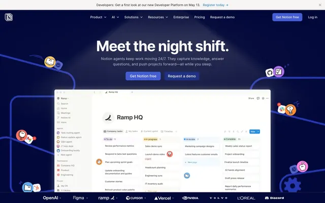
Midnight machine hum — a deep indigo backdrop with precise, glowing elements that guide action.
Color palette
Highlight elements, decorative accents, and subtle background fills. Evokes a cool, digital glow.
Primary Call-to-Action button background. A rich, saturated blue that stands out as the main interactive element.
Interactive link text, borders for ghost buttons, and secondary action calls. A vibrant blue for clarity.
Observed in heading backgroundColor, other backgroundColor. Semantic/state role was not supported by extracted badge/input evidence.
Accent backgrounds for features or categorization, offering a cool, composed highlight.
Accent backgrounds for highlighting features or new content. A cheerful, bright yellow.
Muted accent background for thematic categorization. Provides an organic contrast.
Vibrant accent background for highlights, providing warmth and energy.
Playful accent background for special features or decorative elements.
Vivid purple accent background for distinct categorization or decorative highlights.
Slightly deeper yellow accent background for secondary emphasis.
Intense red accent background for high-attention elements, more saturated than Alert Red.
Vivid green accent background for positive indicators or highlights.
Primary background for dark sections, elevated card surfaces, and navigation elements. Provides depth as a foundational dark tone.
Base page background, navigation borders, and primary text on light surfaces. Serves as the darkest neutral in the system.
Light background for sections or secondary buttons. Provides contrast against darker neutrals.
Text on dark backgrounds, interactive elements' text, and card backgrounds in light sections. Acts as the primary light element.
Dark text and borders on light surfaces, providing heavier visual weight than standard Canvas Dark.
Subtle border and text color for muted details. A soft, light gray.
Muted icon color and secondary text. A dark, slightly desaturated gray.
Border color specifically for input fields. Provides subtle definition.
Background for informational badges, offering a soft white tint.
Informational badges, active navigation states, and subtle decorative fills. Slightly brighter than Ocean Glimmer, for emphasis.
Typography
- Weights
- 400, 500, 600, 700
- Sizes
- 12px, 14px, 15px, 16px, 20px, 22px, 24px, 26px, 40px, 42px, 54px, 64px
- Line height
- 0.83, 1, 1.04, 1.14, 1.2, 1.23, 1.27, 1.33, 1.35, 1.4, 1.43, 1.5
- Letter spacing
- -0.036, -0.035, -0.033, -0.024, -0.011, -0.006, 0.01
- Fallback
- Inter
The primary workhorse typeface for all UI elements, body text, and most headings. Its varied weights and precise letter-spacing allow for distinct hierarchy and high legibility across all sizes, from tiny labels to prominent headlines. The 'lnum' (lining numerals) feature ensures consistent number alignment in tables and data displays.
- Weights
- 400
- Sizes
- 32px
- Line height
- 1.25
- Letter spacing
- normal
- Fallback
- Georgia
Used sparingly for specific, stylized headings, potentially for editorial or feature-focused content. Its serif nature offers a tactile, almost printed feel compared to the geometric NotionInter.
Spacing & shape
Elevation
Components
Solid background button for primary actions. Uses Action Indigo (#455dd3) as background, Paper White (#ffffff) text (NotionInter, weight 400). Has 8px border-radius and 12px vertical, 16px horizontal padding.
Transparent background button for navigation items in the header. Uses Paper White (#ffffff) text (NotionInter, weight 400) and a transparent background. Has an 8px border-radius, with 6px vertical and 15px horizontal padding.
Card with a deep background for featuring product capabilities. Uses Midnight Ink (#02093a) as background, 12px border-radius, and 24px padding on all sides. No shadow.
Card with a light background for various content blocks. Uses Paper White (#ffffff) as background, 12px border-radius, and 24px padding on all sides. No shadow.
Outlined button with Ghost White (#f6f5f4) text (NotionInter, weight 400), transparent background, and 4px border-radius. Padding is 5px vertical and 10px horizontal.
Subtle ghost button for secondary navigation or actions. Uses Deep Slate (#615d59) text (NotionInter, weight 400), transparent background, and 8px border-radius. Padding is 12px vertical and 16px horizontal.
A minimalist card variant, ideal for internal UI sections. Uses Paper White (#ffffff) as background, 12px border-radius, and no padding. No shadow.
Card for containing content in light sections, with a subtle off-white background. Uses Ghost White (#f6f5f4) as background, 12px border-radius, and no padding. No shadow.
Standard text input field. Uses Paper White (#ffffff) background, transparent text color (Canvas Dark #000000 at 90% opacity), Input Border Gray (#dddddd) border, and 4px border-radius. Padding is 6px on all sides.
Informational badge. Uses Off White (#f2f9ff) background, Sky Surge (#097fe8) text (NotionInter, weight 400), 9999px radius (pill shape), and 4px vertical, 8px horizontal padding.
Guidelines
- Prioritize NotionInter typeface (#000000 on dark, #ffffff on light) for all body text and UI labels, ensuring consistent letter-spacing from the type scale.
- Use Midnight Ink (#02093a) as the default background for large hero sections and prominent cards in dark mode interfaces.
- Implement Action Indigo (#455dd3) exclusively for primary call-to-action buttons, pairing it with Paper White (#ffffff) text.
- Apply 12px border-radius to all cards and larger container elements, and 8px border-radius for buttons for visual consistency.
- Utilize Ocean Glimmer (#0075de) for all interactive link text and subtle button outlines to indicate interactivity without distraction.
- Maintain a clear visual hierarchy by limiting saturated accent colors (like Alert Red, Team Teal, Sunny Yellow) to small background fills for content categorization or highlights.
- Do not use generic gray backgrounds; instead, leverage the nuanced shades of Midnight Ink (#02093a) and Canvas Dark (#000000) for visual depth in dark themes.
- Avoid using multiple vivid colors side-by-side without a clear functional purpose; accents should be deliberate and functional.
- Do not vary letter-spacing for NotionInter text unless it adheres strictly to the defined type scale's specific values for each role.
- Refrain from using Lyon Text for anything other than large, editorial-style headings, to preserve its distinct character.
- Do not introduce new border-radius values; stick to 12px for cards, 8px for buttons, 4px for inputs, and 9999px for pill-shaped elements.
- Avoid generic shadow effects; if elevation is needed, use the explicit box-shadow values provided, or rely on distinct background colors for depth.
About this system
ShowHide
Notion's design system feels like a high-tech control panel, favoring a deep, almost inky blue background that provides a sophisticated setting for its functional UI. A restrained use of bright, vivid accent colors, primarily blues and an array of warm hues, pop against this dark canvas, indicating interactive elements and feature highlights. Typography is crisp and highly legible, with a meticulous approach to letter-spacing that implies precision, while subtly rounded corners on cards and buttons soften the otherwise sharp technical aesthetic.
The page primarily uses a max-width contained layout, centering content within a defined horizontal space, though the hero section breaks this rule, creating a full-bleed dark backdrop. The hero features a large, centered headline with associated text and call-to-action buttons over a deep indigo background. Sections generally alternate between dark full-bleed bands and contained light or off-white content blocks, creating a distinct visual rhythm. Content within these sections often uses a text-left/image-right or text-over-image pattern, often in 2-column or 3-column grids for feature lists or interactive elements. Spacing between sections is generous, allowing breathing room, and navigation is a persistent top bar (sticky header).
The visual language is split between functional UI elements and playful, abstract illustrated mascots. Product screenshots are typically contained within a light surface on the dark background, clearly showcasing the UI without heavy styling. Illustrations feature a flat, vector style with organic shapes and bright, vivid brand colors (pinks, blues, yellows, reds, greens) that contrast sharply with the dark UI, serving a decorative and atmospheric role rather than explanatory. Icons follow a filled, colorful style that matches the illustrative assets, adding personality. Density is text-dominant, with imagery used strategically to break up sections and highlight features.
Reminiscent of Linear, Figma, GitHub (Dark Mode), Vercel.
# Notion — Style Reference
> Midnight machine hum — a deep indigo backdrop with precise, glowing elements that guide action.

**Theme:** dark

**Site:** https://notion.so

Notion's design system feels like a high-tech control panel, favoring a deep, almost inky blue background that provides a sophisticated setting for its functional UI. A restrained use of bright, vivid accent colors, primarily blues and an array of warm hues, pop against this dark canvas, indicating interactive elements and feature highlights. Typography is crisp and highly legible, with a meticulous approach to letter-spacing that implies precision, while subtly rounded corners on cards and buttons soften the otherwise sharp technical aesthetic.

## Tokens — Colors

| Name | Value | Token | Role |
|------|------|------|------|
| Blue Frost | `#62aef0` | `--color-blue-frost` | Highlight elements, decorative accents, and subtle background fills. Evokes a cool, digital glow. |
| Action Indigo | `#455dd3` | `--color-action-indigo` | Primary Call-to-Action button background. A rich, saturated blue that stands out as the main interactive element. |
| Ocean Glimmer | `#0075de` | `--color-ocean-glimmer` | Interactive link text, borders for ghost buttons, and secondary action calls. A vibrant blue for clarity. |
| Alert Red | `#f77463` | `--color-alert-red` | Observed in heading backgroundColor, other backgroundColor. Semantic/state role was not supported by extracted badge/input evidence. |
| Team Teal | `#2a9d99` | `--color-team-teal` | Accent backgrounds for features or categorization, offering a cool, composed highlight. |
| Sunny Yellow | `#ffc95e` | `--color-sunny-yellow` | Accent backgrounds for highlighting features or new content. A cheerful, bright yellow. |
| Warm Umber | `#b18164` | `--color-warm-umber` | Muted accent background for thematic categorization. Provides an organic contrast. |
| Coral Burst | `#ff8a33` | `--color-coral-burst` | Vibrant accent background for highlights, providing warmth and energy. |
| Fuchsia Flare | `#ff83dd` | `--color-fuchsia-flare` | Playful accent background for special features or decorative elements. |
| Grape Glow | `#ad6ded` | `--color-grape-glow` | Vivid purple accent background for distinct categorization or decorative highlights. |
| Harvest Gold | `#ffb110` | `--color-harvest-gold` | Slightly deeper yellow accent background for secondary emphasis. |
| Hot Chili | `#f64932` | `--color-hot-chili` | Intense red accent background for high-attention elements, more saturated than Alert Red. |
| Forest Green | `#1aae39` | `--color-forest-green` | Vivid green accent background for positive indicators or highlights. |
| Midnight Ink | `#02093a` | `--color-midnight-ink` | Primary background for dark sections, elevated card surfaces, and navigation elements. Provides depth as a foundational dark tone. |
| Canvas Dark | `#000000` | `--color-canvas-dark` | Base page background, navigation borders, and primary text on light surfaces. Serves as the darkest neutral in the system. |
| Ghost White | `#f6f5f4` | `--color-ghost-white` | Light background for sections or secondary buttons. Provides contrast against darker neutrals. |
| Paper White | `#ffffff` | `--color-paper-white` | Text on dark backgrounds, interactive elements' text, and card backgrounds in light sections. Acts as the primary light element. |
| Deep Graphite | `#0b0b0b` | `--color-deep-graphite` | Dark text and borders on light surfaces, providing heavier visual weight than standard Canvas Dark. |
| Cool Gray | `#c6c6c5` | `--color-cool-gray` | Subtle border and text color for muted details. A soft, light gray. |
| Deep Slate | `#615d59` | `--color-deep-slate` | Muted icon color and secondary text. A dark, slightly desaturated gray. |
| Input Border Gray | `#dddddd` | `--color-input-border-gray` | Border color specifically for input fields. Provides subtle definition. |
| Off White | `#f2f9ff` | `--color-off-white` | Background for informational badges, offering a soft white tint. |
| Sky Surge | `#097fe8` | `--color-sky-surge` | Informational badges, active navigation states, and subtle decorative fills. Slightly brighter than Ocean Glimmer, for emphasis. |

## Tokens — Typography

### NotionInter
- **Substitute:** Inter
- **Weights:** 400, 500, 600, 700
- **Sizes:** 12px, 14px, 15px, 16px, 20px, 22px, 24px, 26px, 40px, 42px, 54px, 64px
- **Line height:** 0.83, 1, 1.04, 1.14, 1.2, 1.23, 1.27, 1.33, 1.35, 1.4, 1.43, 1.5
- **Letter spacing:** -0.036, -0.035, -0.033, -0.024, -0.011, -0.006, 0.01
- **Role:** The primary workhorse typeface for all UI elements, body text, and most headings. Its varied weights and precise letter-spacing allow for distinct hierarchy and high legibility across all sizes, from tiny labels to prominent headlines. The 'lnum' (lining numerals) feature ensures consistent number alignment in tables and data displays.

### Lyon Text
- **Substitute:** Georgia
- **Weights:** 400
- **Sizes:** 32px
- **Line height:** 1.25
- **Letter spacing:** normal
- **Role:** Used sparingly for specific, stylized headings, potentially for editorial or feature-focused content. Its serif nature offers a tactile, almost printed feel compared to the geometric NotionInter.

## Tokens — Type Scale

Perfect Fourth (1.333) from 12px base.

| Role | Size | Line height | Letter spacing |
|------|------|------|------|
| caption | 12px | 1.5 | 0.01em |
| body-sm | 14px | 1.43 | -0.006em |
| subheading | 20px | 1.35 | -0.011em |
| heading-sm | 22px | 1.33 | -0.024em |
| heading | 26px | 1.27 | -0.033em |
| heading-lg | 40px | 1.23 | -0.035em |
| display | 64px | 0.83 | -0.036em |

## Tokens — Spacing

- **Section gap:** 32px
- **Card padding:** 24px
- **Element gap:** 8px

## Tokens — Radius

- **General:** 5px
- **Buttons:** 8px
- **Inputs:** 4px
- **Cards:** 12px
- **badges:** 9999px

## Tokens — Elevation

- **Elevated Component:** `rgba(0, 0, 0, 0.01) 0px 1px 3px 0px, rgba(0, 0, 0, 0.02) 0px 3px 7px 0px, rgba(0, 0, 0, 0.02) 0px 7px 15px 0px, rgba(0, 0, 0, 0.04) 0px 14px 28px 0px, rgba(0, 0, 0, 0.05) 0px 23px 52px 0px`

## Layout

The page primarily uses a max-width contained layout, centering content within a defined horizontal space, though the hero section breaks this rule, creating a full-bleed dark backdrop. The hero features a large, centered headline with associated text and call-to-action buttons over a deep indigo background. Sections generally alternate between dark full-bleed bands and contained light or off-white content blocks, creating a distinct visual rhythm. Content within these sections often uses a text-left/image-right or text-over-image pattern, often in 2-column or 3-column grids for feature lists or interactive elements. Spacing between sections is generous, allowing breathing room, and navigation is a persistent top bar (sticky header).

## Imagery

The visual language is split between functional UI elements and playful, abstract illustrated mascots. Product screenshots are typically contained within a light surface on the dark background, clearly showcasing the UI without heavy styling. Illustrations feature a flat, vector style with organic shapes and bright, vivid brand colors (pinks, blues, yellows, reds, greens) that contrast sharply with the dark UI, serving a decorative and atmospheric role rather than explanatory. Icons follow a filled, colorful style that matches the illustrative assets, adding personality. Density is text-dominant, with imagery used strategically to break up sections and highlight features.

## Components

### Primary Action Button
*Filled Button*

Solid background button for primary actions. Uses Action Indigo (#455dd3) as background, Paper White (#ffffff) text (NotionInter, weight 400). Has 8px border-radius and 12px vertical, 16px horizontal padding.

### Ghost Header Navigation Button
*Ghost Button*

Transparent background button for navigation items in the header. Uses Paper White (#ffffff) text (NotionInter, weight 400) and a transparent background. Has an 8px border-radius, with 6px vertical and 15px horizontal padding.

### Feature Card (Dark Background)
*Card*

Card with a deep background for featuring product capabilities. Uses Midnight Ink (#02093a) as background, 12px border-radius, and 24px padding on all sides. No shadow.

### Feature Card (Light Background)
*Card*

Card with a light background for various content blocks. Uses Paper White (#ffffff) as background, 12px border-radius, and 24px padding on all sides. No shadow.

### Ghost Link Button
*Ghost Button*

Outlined button with Ghost White (#f6f5f4) text (NotionInter, weight 400), transparent background, and 4px border-radius. Padding is 5px vertical and 10px horizontal.

### Muted Navigation Button
*Ghost Button*

Subtle ghost button for secondary navigation or actions. Uses Deep Slate (#615d59) text (NotionInter, weight 400), transparent background, and 8px border-radius. Padding is 12px vertical and 16px horizontal.

### White Card (No Padding)
*Card*

A minimalist card variant, ideal for internal UI sections. Uses Paper White (#ffffff) as background, 12px border-radius, and no padding. No shadow.

### Off-White Section Card
*Card*

Card for containing content in light sections, with a subtle off-white background. Uses Ghost White (#f6f5f4) as background, 12px border-radius, and no padding. No shadow.

### Basic Text Input
*Input*

Standard text input field. Uses Paper White (#ffffff) background, transparent text color (Canvas Dark #000000 at 90% opacity), Input Border Gray (#dddddd) border, and 4px border-radius. Padding is 6px on all sides.

### Info Badge
*Badge*

Informational badge. Uses Off White (#f2f9ff) background, Sky Surge (#097fe8) text (NotionInter, weight 400), 9999px radius (pill shape), and 4px vertical, 8px horizontal padding.

## Guidelines

### Do

- Prioritize NotionInter typeface (#000000 on dark, #ffffff on light) for all body text and UI labels, ensuring consistent letter-spacing from the type scale.
- Use Midnight Ink (#02093a) as the default background for large hero sections and prominent cards in dark mode interfaces.
- Implement Action Indigo (#455dd3) exclusively for primary call-to-action buttons, pairing it with Paper White (#ffffff) text.
- Apply 12px border-radius to all cards and larger container elements, and 8px border-radius for buttons for visual consistency.
- Utilize Ocean Glimmer (#0075de) for all interactive link text and subtle button outlines to indicate interactivity without distraction.
- Maintain a clear visual hierarchy by limiting saturated accent colors (like Alert Red, Team Teal, Sunny Yellow) to small background fills for content categorization or highlights.

### Don't

- Do not use generic gray backgrounds; instead, leverage the nuanced shades of Midnight Ink (#02093a) and Canvas Dark (#000000) for visual depth in dark themes.
- Avoid using multiple vivid colors side-by-side without a clear functional purpose; accents should be deliberate and functional.
- Do not vary letter-spacing for NotionInter text unless it adheres strictly to the defined type scale's specific values for each role.
- Refrain from using Lyon Text for anything other than large, editorial-style headings, to preserve its distinct character.
- Do not introduce new border-radius values; stick to 12px for cards, 8px for buttons, 4px for inputs, and 9999px for pill-shaped elements.
- Avoid generic shadow effects; if elevation is needed, use the explicit box-shadow values provided, or rely on distinct background colors for depth.

## Agent Prompt Guide

primary action: #ffffff (filled action)
Create a Primary Action Button: #ffffff background, #000000 text, 9999px radius, compact pill padding. Use this filled treatment for the main CTA.

Example Component Prompts:
Create a feature card: Paper White (#ffffff) background. 12px radius, 24px padding. Headline at 22px NotionInter weight 600, #000000, letter-spacing -0.0240em. Body text at 15px NotionInter weight 400, #0b0b0b, letter-spacing -0.0060em.
Create an informational badge: Off White (#f2f9ff) background. Sky Surge (#097fe8) text at 12px NotionInter weight 400, 9999px radius, 4px 8px padding.
More like this








Keep what you find
A free account saves references to boards and can send you a weekly email of picks based on what you save.
To see every result, go Pro.