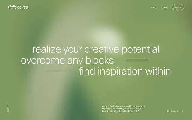
Preview image. Unlock full-res
Misty Forest Canvas — a serene, expansive background in soft green hues, grounding light, transparent elements.
Color palette
Primary action backgrounds, accented text, and interactive elements. Its moderate saturation provides a subtle yet distinct brand presence
Page backgrounds, light card surfaces, default UI elements like text and borders
Primary text, headers, and strong outlines
Secondary text, muted links, and soft UI borders for hierarchical separation
Subtle background accents, dividers and other low-prominence UI elements
Subtly darker backgrounds for layered surfaces or sections, indicated by `--color-lightGrey` token
Typography
- Weights
- 400
- Sizes
- 8px, 12px, 14px, 15px
- Line height
- 1.2, 1.25, 1.3, 1.5
space-regular — detected in extracted data but not described by AI
- Weights
- 400
- Sizes
- 34px, 45px, 75px, 90px
- Line height
- 1, 1.1
- Fallback
- Helvetica Neue
Display and prominent headings. The light weight of the sans-serif font creates a sense of airy sophistication and prevents headlines from feeling overbearing.
- Weights
- 400
- Sizes
- 12px, 14px, 15px
- Line height
- 1.2, 1.25, 1.3
- Fallback
- Helvetica Neue
Body text, footnotes, and supporting copy. It maintains clarity within dense blocks of information.
- Fallback
- Space Mono
Utility text, navigation labels, and small UI elements. The monospace nature adds a technical, precise undertone.
- Fallback
- system-ui
Fallback and minimal UI labels, ensuring consistent display across platforms.
- Weights
- 400
- Sizes
- 8px
- Line height
- 1.5
ui-sans-serif — detected in extracted data but not described by AI
Spacing & shape
Components
Transparent background with White text and 1px White border. No padding specified, suggesting inherited or minimal layout-driven spacing. Features 0px border-radius for sharp edges, contrasting with rounded filled buttons.
Transparent background with Charcoal Gray text and 1px Charcoal Gray border. No padding, 0px border-radius, maintaining a sharp and minimal appearance.
Solid Moss Green background with Canvas White text. Rounded corners at 22.5px, providing a softer, more inviting feel than ghost buttons. Padding is 11.25px vertical, 22.5px horizontal (11.25px 22.5px).
Background of rgba(255, 255, 255, 0.1) creates a subtle frosted effect. No shadow, 15px border-radius for gentle rounding. Internal padding of 30px on all sides.
Nearly opaque background of rgba(255, 255, 255, 0.9). No shadow, 15px border-radius, matches curve of transparent cards. Internal padding of 30px.
Guidelines
- Use Suisse Light for all primary headings (h1-h3) at 400 weight, emphasizing airy elegance.
- Apply a 15px border-radius to all cards and images for a consistent soft-edged aesthetic.
- Maintain generous section gaps of 30px to promote a spacious and uncrowded layout.
- Utilize Moss Green (#778643) sparingly for primary CTA buttons and critical interactive elements only.
- Default to transparent backgrounds and 1px borders for navigation and secondary actions, using Canvas White (#ffffff) or Charcoal Gray (#4e4e4e) for contrast.
- Ensure all body and supporting text uses Suisse Regular at 400 weight for readability and a consistent brand voice.
- Employ Space Mono for all small, utilitarian text elements, labels, and iconography to add a precise, technical detail.
- Avoid using multiple chromatic colors; restrict accent colors strictly to Moss Green (#778643) for interactive elements.
- Do not use harsh shadows or heavy borders; the design emphasizes lightness and subtle layering.
- Refrain from tight spacing; maintain a spacious feel by adhering to the established element and section gaps (15px and 30px respectively).
- Do not use dark backgrounds for full sections; the theme is predominantly light with transparent overlays atop a gradient background.
- Avoid over-styling text with bold weights or excessive letter-spacing beyond what is defined for headings, maintaining a subtle and restrained typographic hierarchy.
- Do not introduce new border-radius values; adhere to 15px for containers and 22.5px for buttons.
- Do not use solid-fill buttons for secondary or tertiary actions; use ghost buttons with appropriate border and text colors.
About this system
ShowHide
Oevra employs a muted, nature-inspired aesthetic, using a soft, desaturated green as its primary chromatic anchor against predominantly monochromatic backgrounds. The system is characterized by spacious layouts, delicate typography, and a subtle application of surface transparency and soft edge rounding, creating an ethereal yet grounded feel. Typefaces are intentionally varied, pairing a contemporary sans-serif for headings with a more classic system font for utilitarian elements, often with generous letter-spacing for visual airiness. Components are lightweight and favor borders or ghost styles over solid fills, contributing to the overall sense of understated presence.
The page maintains a centered, max-width layout of 1425px, creating structured content areas. The hero section is full-bleed, featuring a large, centered headline over a soft gradient background. Following sections typically alternate between a background gradient and a solid Canvas White, with consistent vertical spacing between major blocks. Content arrangement often employs large, visually distinct headings with smaller descriptive text below, or two-column layouts that balance textual information with implicit visual placeholders. Navigation is a minimal top bar with ghost links, becoming sticky on scroll. The overall density is spacious, with generous padding and margins defining elements.
The visual language relies heavily on subtle background gradients that mimic organic, mist-laden environments, providing a soft, atmospheric backdrop. Product imagery, where present, consists of clean, isolated screenshots of app interfaces, often framed within a device. Icons are minimalist, utilizing thin strokes or simple fills, primarily in achromatic tones. Imagery serves as decorative atmosphere rather than direct content, reinforcing the ethereal and calm brand identity. The density is text-dominant, with a clear focus on typography, and imagery is used sparingly to enhance mood rather than explain features.
Reminiscent of Calm, Headspace, Woven, Fathom Analytics.
# Oevra — Style Reference
> Misty Forest Canvas — a serene, expansive background in soft green hues, grounding light, transparent elements.

**Theme:** light

**Site:** https://oevra.com

Oevra employs a muted, nature-inspired aesthetic, using a soft, desaturated green as its primary chromatic anchor against predominantly monochromatic backgrounds. The system is characterized by spacious layouts, delicate typography, and a subtle application of surface transparency and soft edge rounding, creating an ethereal yet grounded feel. Typefaces are intentionally varied, pairing a contemporary sans-serif for headings with a more classic system font for utilitarian elements, often with generous letter-spacing for visual airiness. Components are lightweight and favor borders or ghost styles over solid fills, contributing to the overall sense of understated presence.

## Tokens — Colors

| Name | Value | Token | Role |
|------|------|------|------|
| Moss Green | `#778643` | `--color-moss-green` | Primary action backgrounds, accented text, and interactive elements. Its moderate saturation provides a subtle yet distinct brand presence |
| Canvas White | `#ffffff` | `--color-canvas-white` | Page backgrounds, light card surfaces, default UI elements like text and borders |
| Midnight Black | `#000000` | `--color-midnight-black` | Primary text, headers, and strong outlines |
| Charcoal Gray | `#4e4e4e` | `--color-charcoal-gray` | Secondary text, muted links, and soft UI borders for hierarchical separation |
| Whisper Gray | `#c8c8c8` | `--color-whisper-gray` | Subtle background accents, dividers and other low-prominence UI elements |
| Pale Mist | `#efefef` | `--color-pale-mist` | Subtly darker backgrounds for layered surfaces or sections, indicated by `--color-lightGrey` token |

## Tokens — Typography

### space-regular
- **Weights:** 400
- **Sizes:** 8px, 12px, 14px, 15px
- **Line height:** 1.2, 1.25, 1.3, 1.5
- **Role:** space-regular — detected in extracted data but not described by AI

### Suisse Light
- **Substitute:** Helvetica Neue
- **Weights:** 400
- **Sizes:** 34px, 45px, 75px, 90px
- **Line height:** 1, 1.1
- **Role:** Display and prominent headings. The light weight of the sans-serif font creates a sense of airy sophistication and prevents headlines from feeling overbearing.

### Suisse Regular
- **Substitute:** Helvetica Neue
- **Weights:** 400
- **Sizes:** 12px, 14px, 15px
- **Line height:** 1.2, 1.25, 1.3
- **Role:** Body text, footnotes, and supporting copy. It maintains clarity within dense blocks of information.

### Space Mono
- **Substitute:** Space Mono
- **Role:** Utility text, navigation labels, and small UI elements. The monospace nature adds a technical, precise undertone.

### System Sans-serif
- **Substitute:** system-ui
- **Role:** Fallback and minimal UI labels, ensuring consistent display across platforms.

### ui-sans-serif
- **Weights:** 400
- **Sizes:** 8px
- **Line height:** 1.5
- **Role:** ui-sans-serif — detected in extracted data but not described by AI

## Tokens — Type Scale

| Role | Size | Line height | Letter spacing |
|------|------|------|------|
| body-lg | 15px | 1.2 | — |
| heading-sm | 34px | 1 | — |
| heading | 45px | 1.1 | — |
| heading-lg | 75px | 1.1 | — |
| display | 90px | 1.1 | — |

## Tokens — Spacing

- **Max width:** 1425px
- **Section gap:** 30px
- **Card padding:** 30px
- **Element gap:** 15px

## Tokens — Radius

- **Buttons:** 22.5px
- **Cards:** 15px

## Layout

The page maintains a centered, max-width layout of 1425px, creating structured content areas. The hero section is full-bleed, featuring a large, centered headline over a soft gradient background. Following sections typically alternate between a background gradient and a solid Canvas White, with consistent vertical spacing between major blocks. Content arrangement often employs large, visually distinct headings with smaller descriptive text below, or two-column layouts that balance textual information with implicit visual placeholders. Navigation is a minimal top bar with ghost links, becoming sticky on scroll. The overall density is spacious, with generous padding and margins defining elements.

## Imagery

The visual language relies heavily on subtle background gradients that mimic organic, mist-laden environments, providing a soft, atmospheric backdrop. Product imagery, where present, consists of clean, isolated screenshots of app interfaces, often framed within a device. Icons are minimalist, utilizing thin strokes or simple fills, primarily in achromatic tones. Imagery serves as decorative atmosphere rather than direct content, reinforcing the ethereal and calm brand identity. The density is text-dominant, with a clear focus on typography, and imagery is used sparingly to enhance mood rather than explain features.

## Components

### Ghost Button (White)
*Header navigation links and secondary calls to action.*

Transparent background with White text and 1px White border. No padding specified, suggesting inherited or minimal layout-driven spacing. Features 0px border-radius for sharp edges, contrasting with rounded filled buttons.

### Ghost Button (Charcoal)
*Muted actions or tertiary navigation.*

Transparent background with Charcoal Gray text and 1px Charcoal Gray border. No padding, 0px border-radius, maintaining a sharp and minimal appearance.

### Primary Action Button
*Key interactions and calls to action.*

Solid Moss Green background with Canvas White text. Rounded corners at 22.5px, providing a softer, more inviting feel than ghost buttons. Padding is 11.25px vertical, 22.5px horizontal (11.25px 22.5px).

### Transparent Card
*Layered content containers over background sections.*

Background of rgba(255, 255, 255, 0.1) creates a subtle frosted effect. No shadow, 15px border-radius for gentle rounding. Internal padding of 30px on all sides.

### Light Card
*Prominent content containers requiring more visual weight.*

Nearly opaque background of rgba(255, 255, 255, 0.9). No shadow, 15px border-radius, matches curve of transparent cards. Internal padding of 30px.

## Guidelines

### Do

- Use Suisse Light for all primary headings (h1-h3) at 400 weight, emphasizing airy elegance.
- Apply a 15px border-radius to all cards and images for a consistent soft-edged aesthetic.
- Maintain generous section gaps of 30px to promote a spacious and uncrowded layout.
- Utilize Moss Green (#778643) sparingly for primary CTA buttons and critical interactive elements only.
- Default to transparent backgrounds and 1px borders for navigation and secondary actions, using Canvas White (#ffffff) or Charcoal Gray (#4e4e4e) for contrast.
- Ensure all body and supporting text uses Suisse Regular at 400 weight for readability and a consistent brand voice.
- Employ Space Mono for all small, utilitarian text elements, labels, and iconography to add a precise, technical detail.

### Don't

- Avoid using multiple chromatic colors; restrict accent colors strictly to Moss Green (#778643) for interactive elements.
- Do not use harsh shadows or heavy borders; the design emphasizes lightness and subtle layering.
- Refrain from tight spacing; maintain a spacious feel by adhering to the established element and section gaps (15px and 30px respectively).
- Do not use dark backgrounds for full sections; the theme is predominantly light with transparent overlays atop a gradient background.
- Avoid over-styling text with bold weights or excessive letter-spacing beyond what is defined for headings, maintaining a subtle and restrained typographic hierarchy.
- Do not introduce new border-radius values; adhere to 15px for containers and 22.5px for buttons.
- Do not use solid-fill buttons for secondary or tertiary actions; use ghost buttons with appropriate border and text colors.

## Agent Prompt Guide

### Quick Color Reference
- text: #000000
- background: #ffffff
- border: #000000
- accent: #778643
- primary action: #778643 (filled action)

### 3-5 Example Component Prompts
1. Create a header: Canvas White (#ffffff) background. 'About' link (Charcoal Gray #4e4e4e, Suisse Regular 400, 15px, 1.3 line height). 'Sign up' ghost button (1px Charcoal Gray #4e4e4e border, Charcoal Gray #4e4e4e text, 0px radius, no padding specified, font is Space Mono 400 at 15px).
2. Create a transparent card with content: Smoke Glass (rgba(255, 255, 255, 0.1)) background, 15px border-radius, 30px padding. Inside, include a heading (Midnight Black #000000, Suisse Light 400, 45px, 1.1 line height) and a paragraph (Midnight Black #000000, Suisse Regular 400, 15px, 1.3 line height).
3. Create a primary action button: Moss Green (#778643) background, Canvas White (#ffffff) text (Space Mono 400, 15px), 22.5px border-radius, 11.25px vertical padding, 22.5px horizontal padding.
4. Create a footer section: Canvas White (#ffffff) background. Text links (Charcoal Gray #4e4e4e, Suisse Regular 400, 14px, 1.2 line height) and copyright text (Charcoal Gray #4e4e4e, Suisse Regular 400, 12px, 1.2 line height). Maintain 30px section gap.
More like this








Keep what you find
A free account saves references to boards and can send you a weekly email of picks based on what you save.
To see every result, go Pro.