Preview image. Unlock full-res
Ordered command center
Color palette
Green action color for filled buttons, selected navigation states, and focused conversion moments
Page backgrounds, header, footer, deep surface accents, primary text on light backgrounds
Card backgrounds, navigation backgrounds, input fields, primary text on dark backgrounds
Subtle borders, secondary text, decorative fills, and inactive states
Input borders, subtle button backgrounds, and soft shadows indicating elevation
Secondary text on light backgrounds, input text, and card text
Hero section backgrounds, illustrative elements — indicating growth and expansiveness
Illustrative elements, UI highlights — conveying a soft, inviting depth
Typography
- Weights
- 400, 700, 800
- Sizes
- 13px, 16px, 18px, 21px, 24px, 32px, 43px, 57px, 76px
- Line height
- 1.05, 1.12, 1.18, 1.25, 1.33, 1.4, 1.48, 1.5, 1.64
- Letter spacing
- normal
- Fallback
- Montserrat
The primary typeface for all text elements. Its geometric sans-serif structure provides clarity and a modern, professional tone, supporting both compact UI labels and expressive marketing headlines.
Spacing & shape
Elevation
Components
Filled background in Olive Accent (#98e58e), text in Midnight Core (#040404), with a 6px border-radius, 8px vertical and 12px horizontal padding. Signals the primary interactive element on the page.
Transparent background, text in Canvas White (#ffffff), with a 0px border-radius and 16px padding on all sides. Used for less prominent actions, maintaining hierarchy against dark backgrounds.
Transparent background and text in Midnight Core (#040404), with a 0px border-radius and no padding, usually found in navigation or inline actions.
Canvas White (#ffffff) background, 16px border-radius, no shadow, with 24px padding on all sides. Used for presenting information blocks on dark backgrounds.
Midnight Core (#040404) background, 8px border-radius, no shadow, with 40px vertical and 32px horizontal padding. Highlights product features or integrations.
Canvas White (#ffffff) background, Slate Text (#162020) for text, Focus Silver (#cbcece) 1px border, 4px border-radius, with 8px padding on all sides. For prominent email capture in hero sections.
Inherits text color from parent context, typically Midnight Core or Canvas White. No background or padding. Hover states implied by color change or subtle underline.
Guidelines
- Prioritize text legibility by ensuring Midnight Core (#040404) on Canvas White (#ffffff) backgrounds, and Canvas White on Midnight Core backgrounds.
- Use Olive Accent (#98e58e) exclusively for primary calls-to-action or key success indicators; avoid decorative use.
- Apply a 16px border-radius to all primary content cards and navigation containers to maintain a consistent soft edge.
- Maintain a comfortable rhythm with 'elementGap': 16px between most interactive elements and 'sectionGap': 32px between major content blocks.
- All headings should use Proxima Nova weight 700 or 800, carefully selecting corresponding sizes from the typescale to establish a clear hierarchy.
- Employ the rgba(39, 51, 51, 0.24) 0px 4px 8px 0px shadow sparingly, primarily for the sticky navigation, to indicate subtle elevation without visual clutter.
- Ensure input fields have a 1px Focus Silver (#cbcece) border and a 4px border-radius for clear definition and soft containment.
- Do not introduce new chromatic colors outside of Olive Accent (#98e58e) for interactive elements.
- Avoid arbitrary changes in border-radius; adhere to 16px for cards, 6px for buttons/inputs, and 24px for badges.
- Do not use generic system fonts; only use Proxima Nova or its designated substitute.
- Do not use shadows on content cards directly; rely on background color changes for surface differentiation.
- Do not deviate from the established spacing units; avoid custom padding or margin values that aren't multiples of 4px.
- Avoid hero sections with busy imagery; prioritize gradients or a solid Midnight Core background to highlight text content and interactive elements.
- Do not use black (#000000) for primary text on default light backgrounds where Midnight Core (#040404) is available for better visual cohesion.
About this system
ShowHide
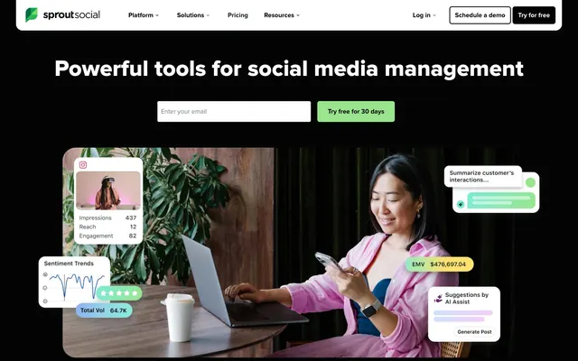
Sprout Social presents a commanding, professional digital environment with a strong dark foundation accented by clean white surfaces and precise typography. The design emphasizes clarity and direct interaction, utilizing a single vivid green as its primary action indicator to punctuate key user pathways. Components maintain a uniform, measured appearance with consistent corner radii, conveying stability and trustworthiness. The overall feel is one of a dense, feature-rich interface presented with visual order and an accessible rhythm.
The page primarily uses a full-bleed structure with content often contained within a maximum width section, likely centered. The hero section is full-bleed with a dark background, featuring a prominent centered headline and input fields. Subsequent sections alternate between dark (Midnight Core) and light (Canvas White) backgrounds, creating a clear vertical rhythm. Content within sections is often arranged in multi-column layouts, such as two-column text-left/visual-right patterns or three-column card grids for features and integrations. Navigation is a fixed top bar on a Canvas White background, while the header itself is initially on Midnight Core. The overall density feels comfortable, providing ample breathing room around content blocks.
The visual language relies heavily on product UI screenshots and stylized workflow diagrams, which are embedded within soft-edged white cards or presented within the primary content area. When photography is used, it features high-key, professional, and slightly staged images of individuals interacting with technology, often with a clear focus on the user. Illustrations are dimensional and gradient-filled, avoiding hard outlines, featuring organic shapes that blend into backgrounds. Icons are minimal, either solid-filled or slightly outlined, often monochrome. Imagery serves an explanatory and product-showcasing role, rarely decorative atmosphere, and is generally contained within defined spaces rather than full-bleed.
Reminiscent of Hootsuite, Buffer, Later, Mailchimp.
# Sprout Social — Style Reference
> Ordered command center

**Theme:** dark

**Site:** https://sproutsocial.com

Sprout Social presents a commanding, professional digital environment with a strong dark foundation accented by clean white surfaces and precise typography. The design emphasizes clarity and direct interaction, utilizing a single vivid green as its primary action indicator to punctuate key user pathways. Components maintain a uniform, measured appearance with consistent corner radii, conveying stability and trustworthiness. The overall feel is one of a dense, feature-rich interface presented with visual order and an accessible rhythm.

## Tokens — Colors

| Name | Value | Token | Role |
|------|------|------|------|
| Olive Accent | `#98e58e` | `--color-olive-accent` | Green action color for filled buttons, selected navigation states, and focused conversion moments |
| Midnight Core | `#040404` | `--color-midnight-core` | Page backgrounds, header, footer, deep surface accents, primary text on light backgrounds |
| Canvas White | `#ffffff` | `--color-canvas-white` | Card backgrounds, navigation backgrounds, input fields, primary text on dark backgrounds |
| Ghost Gray | `#d9d9d9` | `--color-ghost-gray` | Subtle borders, secondary text, decorative fills, and inactive states |
| Focus Silver | `#cbcece` | `--color-focus-silver` | Input borders, subtle button backgrounds, and soft shadows indicating elevation |
| Slate Text | `#162020` | `--color-slate-text` | Secondary text on light backgrounds, input text, and card text |
| Sky Spectrum Fade | `#59cb59` | `--color-sky-spectrum-fade` | Hero section backgrounds, illustrative elements — indicating growth and expansiveness |
| Magenta Mist Fade | `#ac44a8` | `--color-magenta-mist-fade` | Illustrative elements, UI highlights — conveying a soft, inviting depth |

## Tokens — Typography

### Proxima Nova
- **Substitute:** Montserrat
- **Weights:** 400, 700, 800
- **Sizes:** 13px, 16px, 18px, 21px, 24px, 32px, 43px, 57px, 76px
- **Line height:** 1.05, 1.12, 1.18, 1.25, 1.33, 1.4, 1.48, 1.5, 1.64
- **Letter spacing:** normal
- **Role:** The primary typeface for all text elements. Its geometric sans-serif structure provides clarity and a modern, professional tone, supporting both compact UI labels and expressive marketing headlines.

## Tokens — Type Scale

Major Third (1.25) from 16px base.

| Role | Size | Line height | Letter spacing |
|------|------|------|------|
| caption | 13px | 1.5 | — |
| body | 16px | 1.48 | — |
| subheading | 18px | 1.4 | — |
| heading-sm | 24px | 1.33 | — |
| heading | 32px | 1.25 | — |
| heading-lg | 43px | 1.18 | — |
| display | 57px | 1.12 | — |

## Tokens — Spacing

- **Section gap:** 32px
- **Card padding:** 16px
- **Element gap:** 16px

## Tokens — Radius

- **Buttons:** 6px
- **Inputs:** 6px
- **Cards:** 16px
- **badges:** 24px
- **largeElements:** 64px

## Tokens — Elevation

- **Sticky Navigation Bar:** `rgba(39, 51, 51, 0.24) 0px 4px 8px 0px`

## Layout

The page primarily uses a full-bleed structure with content often contained within a maximum width section, likely centered. The hero section is full-bleed with a dark background, featuring a prominent centered headline and input fields. Subsequent sections alternate between dark (Midnight Core) and light (Canvas White) backgrounds, creating a clear vertical rhythm. Content within sections is often arranged in multi-column layouts, such as two-column text-left/visual-right patterns or three-column card grids for features and integrations. Navigation is a fixed top bar on a Canvas White background, while the header itself is initially on Midnight Core. The overall density feels comfortable, providing ample breathing room around content blocks.

## Imagery

The visual language relies heavily on product UI screenshots and stylized workflow diagrams, which are embedded within soft-edged white cards or presented within the primary content area. When photography is used, it features high-key, professional, and slightly staged images of individuals interacting with technology, often with a clear focus on the user. Illustrations are dimensional and gradient-filled, avoiding hard outlines, featuring organic shapes that blend into backgrounds. Icons are minimal, either solid-filled or slightly outlined, often monochrome. Imagery serves an explanatory and product-showcasing role, rarely decorative atmosphere, and is generally contained within defined spaces rather than full-bleed.

## Components

### Primary Action Button (Filled)
*Call to action*

Filled background in Olive Accent (#98e58e), text in Midnight Core (#040404), with a 6px border-radius, 8px vertical and 12px horizontal padding. Signals the primary interactive element on the page.

### Ghost Button (Dark)
*Secondary action*

Transparent background, text in Canvas White (#ffffff), with a 0px border-radius and 16px padding on all sides. Used for less prominent actions, maintaining hierarchy against dark backgrounds.

### Ghost Button (Light)
*Secondary action*

Transparent background and text in Midnight Core (#040404), with a 0px border-radius and no padding, usually found in navigation or inline actions.

### White Information Card
*Content container*

Canvas White (#ffffff) background, 16px border-radius, no shadow, with 24px padding on all sides. Used for presenting information blocks on dark backgrounds.

### Dark Feature Card
*Feature showcase*

Midnight Core (#040404) background, 8px border-radius, no shadow, with 40px vertical and 32px horizontal padding. Highlights product features or integrations.

### Hero Input Field
*User input*

Canvas White (#ffffff) background, Slate Text (#162020) for text, Focus Silver (#cbcece) 1px border, 4px border-radius, with 8px padding on all sides. For prominent email capture in hero sections.

### Navigation Link
*Navigation element*

Inherits text color from parent context, typically Midnight Core or Canvas White. No background or padding. Hover states implied by color change or subtle underline.

## Guidelines

### Do

- Prioritize text legibility by ensuring Midnight Core (#040404) on Canvas White (#ffffff) backgrounds, and Canvas White on Midnight Core backgrounds.
- Use Olive Accent (#98e58e) exclusively for primary calls-to-action or key success indicators; avoid decorative use.
- Apply a 16px border-radius to all primary content cards and navigation containers to maintain a consistent soft edge.
- Maintain a comfortable rhythm with 'elementGap': 16px between most interactive elements and 'sectionGap': 32px between major content blocks.
- All headings should use Proxima Nova weight 700 or 800, carefully selecting corresponding sizes from the typescale to establish a clear hierarchy.
- Employ the rgba(39, 51, 51, 0.24) 0px 4px 8px 0px shadow sparingly, primarily for the sticky navigation, to indicate subtle elevation without visual clutter.
- Ensure input fields have a 1px Focus Silver (#cbcece) border and a 4px border-radius for clear definition and soft containment.

### Don't

- Do not introduce new chromatic colors outside of Olive Accent (#98e58e) for interactive elements.
- Avoid arbitrary changes in border-radius; adhere to 16px for cards, 6px for buttons/inputs, and 24px for badges.
- Do not use generic system fonts; only use Proxima Nova or its designated substitute.
- Do not use shadows on content cards directly; rely on background color changes for surface differentiation.
- Do not deviate from the established spacing units; avoid custom padding or margin values that aren't multiples of 4px.
- Avoid hero sections with busy imagery; prioritize gradients or a solid Midnight Core background to highlight text content and interactive elements.
- Do not use black (#000000) for primary text on default light backgrounds where Midnight Core (#040404) is available for better visual cohesion.

## Agent Prompt Guide

Quick Color Reference:
- text: #040404
- background: #040404
- border: #d9d9d9
- accent: #98e58e
- primary action: #98e58e (filled action)

Example Component Prompts:
- Create a Primary Action Button: #98e58e background, #000000 text, 9999px radius, compact pill padding. Use this filled treatment for the main CTA.
- Create a White Information Card: Canvas White (#ffffff) background, 16px border-radius, 24px padding. Headline 'Understand your audience' Proxima Nova weight 700, size 32px, Midnight Core (#040404). Body text 'Analyze demographics, interests, and activity patterns to tailor your content strategy.' Proxima Nova weight 400, size 16px, Slate Text (#162020).
- Create a Dark Feature Card: Midnight Core (#040404) background, 8px border-radius, 40px vertical/32px horizontal padding. Headline 'Seamless Integrations' Proxima Nova weight 700, size 24px, Canvas White (#ffffff). Body text 'Connect your favorite tools directly into your social workflow.' Proxima Nova weight 400, size 18px, Canvas White (#ffffff).
More like this









Keep what you find
A free account saves references to boards and can send you a weekly email of picks based on what you save.
To see every result, go Pro.