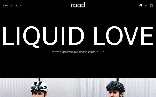
Preview image. Unlock full-res
Monochromatic Performance Canvas
Color palette
Dark borders and separators for elevated surfaces and inverted UI. Do not promote it to the primary CTA color
Surface backgrounds, body text (on dark backgrounds), ghost button text and borders, interactive highlights
Subtle borders for less prominent elements, disabled states
Dark borders and separators for elevated surfaces and inverted UI. Do not promote it to the primary CTA color
Secondary text, less prominent borders
Typography
- Weights
- 400
- Sizes
- 10px
- Line height
- 1.2
- Letter spacing
- normal
- Fallback
- Arial
Small functional text like captions, utility links, and system messages — designed for legibility at minimal sizes.
- Weights
- 400
- Sizes
- 12px, 13px, 16px, 18px, 50px, 54px
- Line height
- 1, 1.2, 1.4, 2.5
- Letter spacing
- 0.10em
- Fallback
- Montserrat
Primary brand typeface for headings, body text, navigation, and buttons. Its wide letter-spacing at all sizes gives it a distinct, technical feel, emphasizing clarity over density. It is the visual voice of the brand.
Spacing & shape
Components
Transparent background with Arctic White text and 1px borders. No border-radius. Padding of 6px vertical and 7px horizontal, using the brand's primary typeface. Hover state maintains white borders and text.
Arctic White text on Midnight Ink background, using the brand's primary typeface at 12px with 0.10em letter-spacing. Minimal padding (5px horizontal) and no distinct background or border.
Arctic White text on transparent background, bordered by Deep Gray. Uses the brand's primary typeface. No border-radius, with padding of 6px vertical and 7px horizontal.
Arctic White text on Midnight Ink backgrounds. Uses the brand's primary typeface at 13px, with a line height of 1.4 and 0.10em letter-spacing. Content is left-aligned within defined content areas.
Muted Stone text on Midnight Ink background. Rendered in Arial at 10px, with normal letter-spacing, providing clear but understated informational cues.
Guidelines
- Prioritize a strict achromatic palette using only Midnight Ink and Arctic White for backgrounds and primary text to maintain visual impact.
- Use wfont_8b8bfe_cd7287b5071a4785a78bba57128a74e2 with its inherent 0.10em letter spacing for all headlines, body text, and navigation to establish a technical, confident tone.
- Ensure all interactive elements and links have a 1px border in either Arctic White or Deep Gray, with no border-radius for a sharp, unadorned aesthetic.
- Structure sections with generous vertical spacing (120px between major blocks) to create breathing room around prominent product imagery.
- For all primary interactive elements, apply padding of 6px vertically and 7px horizontally, keeping text concise and visually balanced within its boundary.
- Reserve Arial at 10px for the smallest functional text such as captions and footer links, ensuring it remains legible for utility information.
- Avoid using any saturated colors unless for specific product photography, as they break the stark brand identity.
- Do not introduce rounded corners on any UI elements; maintain sharp, 0px border-radius across all components.
- Refrain from using drop shadows or complex elevation effects; the design relies on direct contrast and flat surfaces.
- Do not center-align body text or lengthy paragraphs; maintain left-alignment for optimal readability.
- Avoid dense UI elements or excessive information on a single screen; embrace ample white/black space around content.
- Do not deviate from the specified typefaces or letter-spacing values to preserve the distinctive typographic signature of the brand.
About this system
ShowHide
Raad Cycling embodies a stark, high-contrast aesthetic where pure black and crisp white define the visual landscape. Product imagery takes center stage, punctuated by minimal UI elements that recede until interaction. Typography is assertive yet restrained, utilizing a distinct, widened sans-serif for impact and readability. The overall impression is one of confident, unornamented directness, mirroring the functional ambition of performance cycling gear.
The page employs a max-width, center-aligned container for most sections, though the hero section and subsequent image grids are full-bleed. The hero features a large, centered headline over a dark background. Sections alternate between full-width product imagery/panels and content blocks, often arranged in simple two-column layouts with text on one side and a supporting visual on the other. A strong grid is evident in product showcase areas, presenting items in responsive 2-column or 3-column structures. The layout is spacious, with distinct vertical section gaps that create a clear visual rhythm. Navigation is a minimalist top bar, sticky on scroll, with clear, high-contrast links.
Photography is paramount, featuring tightly cropped product shots on stark backgrounds (either pure white or close-up textures like corrugated metal). There is a clear focus on the product itself, often worn by models in dynamic, staged poses, rather than lifestyle scenes. Images are full-bleed within their respective spatial divisions, maintaining sharp, unrounded edges. When used decoratively, images can occupy significant screen real estate, acting as visual anchors or section backgrounds. The style is crisp, high-resolution, and devoid of heavy filtering, presenting products transparently.
Reminiscent of A-COLD-WALL*, Y-3, Peloton.
# Raad Cycling — Style Reference
> Monochromatic Performance Canvas

**Theme:** dark

**Site:** https://www.raad.cc

Raad Cycling embodies a stark, high-contrast aesthetic where pure black and crisp white define the visual landscape. Product imagery takes center stage, punctuated by minimal UI elements that recede until interaction. Typography is assertive yet restrained, utilizing a distinct, widened sans-serif for impact and readability. The overall impression is one of confident, unornamented directness, mirroring the functional ambition of performance cycling gear.

## Tokens — Colors

| Name | Value | Token | Role |
|------|------|------|------|
| Midnight Ink | `#000000` | `--color-midnight-ink` | Dark borders and separators for elevated surfaces and inverted UI. Do not promote it to the primary CTA color |
| Arctic White | `#ffffff` | `--color-arctic-white` | Surface backgrounds, body text (on dark backgrounds), ghost button text and borders, interactive highlights |
| Ash Gray | `#333333` | `--color-ash-gray` | Subtle borders for less prominent elements, disabled states |
| Deep Gray | `#181818` | `--color-deep-gray` | Dark borders and separators for elevated surfaces and inverted UI. Do not promote it to the primary CTA color |
| Muted Stone | `#666666` | `--color-muted-stone` | Secondary text, less prominent borders |

## Tokens — Typography

### Arial
- **Substitute:** Arial
- **Weights:** 400
- **Sizes:** 10px
- **Line height:** 1.2
- **Letter spacing:** normal
- **Role:** Small functional text like captions, utility links, and system messages — designed for legibility at minimal sizes.

### wfont_8b8bfe_cd7287b5071a4785a78bba57128a74e2
- **Substitute:** Montserrat
- **Weights:** 400
- **Sizes:** 12px, 13px, 16px, 18px, 50px, 54px
- **Line height:** 1, 1.2, 1.4, 2.5
- **Letter spacing:** 0.10em
- **Role:** Primary brand typeface for headings, body text, navigation, and buttons. Its wide letter-spacing at all sizes gives it a distinct, technical feel, emphasizing clarity over density. It is the visual voice of the brand.

## Tokens — Type Scale

| Role | Size | Line height | Letter spacing |
|------|------|------|------|
| caption | 10px | 1.2 | — |
| heading | 18px | 1.4 | 1.8px |
| display-sm | 50px | 1 | 5px |
| display | 54px | 1 | 5.4px |

## Tokens — Spacing

- **Section gap:** 120px
- **Card padding:** 20px
- **Element gap:** 20px

## Tokens — Radius

- **Default:** 0px
- **pill:** 100px

## Layout

The page employs a max-width, center-aligned container for most sections, though the hero section and subsequent image grids are full-bleed. The hero features a large, centered headline over a dark background. Sections alternate between full-width product imagery/panels and content blocks, often arranged in simple two-column layouts with text on one side and a supporting visual on the other. A strong grid is evident in product showcase areas, presenting items in responsive 2-column or 3-column structures. The layout is spacious, with distinct vertical section gaps that create a clear visual rhythm. Navigation is a minimalist top bar, sticky on scroll, with clear, high-contrast links.

## Imagery

Photography is paramount, featuring tightly cropped product shots on stark backgrounds (either pure white or close-up textures like corrugated metal). There is a clear focus on the product itself, often worn by models in dynamic, staged poses, rather than lifestyle scenes. Images are full-bleed within their respective spatial divisions, maintaining sharp, unrounded edges. When used decoratively, images can occupy significant screen real estate, acting as visual anchors or section backgrounds. The style is crisp, high-resolution, and devoid of heavy filtering, presenting products transparently.

## Components

### Ghost Button
*Primary interactive element.*

Transparent background with Arctic White text and 1px borders. No border-radius. Padding of 6px vertical and 7px horizontal, using the brand's primary typeface. Hover state maintains white borders and text.

### Main Navigation Link
*Top-level navigation items.*

Arctic White text on Midnight Ink background, using the brand's primary typeface at 12px with 0.10em letter-spacing. Minimal padding (5px horizontal) and no distinct background or border.

### Product Category Link
*Product discovery links.*

Arctic White text on transparent background, bordered by Deep Gray. Uses the brand's primary typeface. No border-radius, with padding of 6px vertical and 7px horizontal.

### Body Text Block
*Informational paragraphs.*

Arctic White text on Midnight Ink backgrounds. Uses the brand's primary typeface at 13px, with a line height of 1.4 and 0.10em letter-spacing. Content is left-aligned within defined content areas.

### Footer Link
*Secondary navigation and legal links.*

Muted Stone text on Midnight Ink background. Rendered in Arial at 10px, with normal letter-spacing, providing clear but understated informational cues.

## Guidelines

### Do

- Prioritize a strict achromatic palette using only Midnight Ink and Arctic White for backgrounds and primary text to maintain visual impact.
- Use wfont_8b8bfe_cd7287b5071a4785a78bba57128a74e2 with its inherent 0.10em letter spacing for all headlines, body text, and navigation to establish a technical, confident tone.
- Ensure all interactive elements and links have a 1px border in either Arctic White or Deep Gray, with no border-radius for a sharp, unadorned aesthetic.
- Structure sections with generous vertical spacing (120px between major blocks) to create breathing room around prominent product imagery.
- For all primary interactive elements, apply padding of 6px vertically and 7px horizontally, keeping text concise and visually balanced within its boundary.
- Reserve Arial at 10px for the smallest functional text such as captions and footer links, ensuring it remains legible for utility information.

### Don't

- Avoid using any saturated colors unless for specific product photography, as they break the stark brand identity.
- Do not introduce rounded corners on any UI elements; maintain sharp, 0px border-radius across all components.
- Refrain from using drop shadows or complex elevation effects; the design relies on direct contrast and flat surfaces.
- Do not center-align body text or lengthy paragraphs; maintain left-alignment for optimal readability.
- Avoid dense UI elements or excessive information on a single screen; embrace ample white/black space around content.
- Do not deviate from the specified typefaces or letter-spacing values to preserve the distinctive typographic signature of the brand.

## Agent Prompt Guide

Quick Color Reference:
text: #ffffff
background: #000000
border: #ffffff
primary action: no distinct CTA color

Example Component Prompts:
Create a hero section with a Midnight Ink background. Headline uses wfont_8b8bfe_cd7287b5071a4785a78bba57128a74e2 at 54px, Arctic White text, and 0.10em letter-spacing. A subheading below it uses wfont_8b8bfe_cd7287b5071a4785a78bba57128a74e2 at 12px, Arctic White text, and 0.10em letter-spacing, centrally aligned.

Design a Ghost Button for 'DISCOVER': background transparent, border 1px solid Deep Gray (#181818), text Arctic White (#ffffff). Font is wfont_8b8bfe_cd7287b5071a4785a78bba57128a74e2 at 12px with 0.10em letter-spacing. Padding 6px top/bottom, 7px left/right. No border-radius.

Generate a navigation link for 'Collection': text Arctic White (#ffffff), font wfont_8b8bfe_cd7287b5071a4785a78bba57128a74e2 at 12px with 0.10em letter-spacing. No background or border. Horizontal padding is 5px.

Create a descriptive text block for 'Made with care': Midnight Ink background. Headline uses wfont_8b8bfe_cd7287b5071a4785a78bba57128a74e2 at 18px, Arctic White text, and 0.10em letter-spacing. Body paragraphs below it use wfont_8b8bfe_cd7287b5071a4785a78bba57128a74e2 at 13px, Arctic White text, 1.4 line-height, and 0.10em letter-spacing. Ensure ample padding around the text block.
More like this








Keep what you find
A free account saves references to boards and can send you a weekly email of picks based on what you save.
To see every result, go Pro.