Preview image. Unlock full-res
Digital Parchment, Subtle Authority
Color palette
Navigation active item backgrounds, 'Sign In' button text in inactive state, selected icon fills — indicates focus and interactivity without being overtly aggressive
Observed in other backgroundColor, card backgroundColor, nav fill. Extracted usage does not support a distinct primary control color.
Supporting palette color with insufficient usage evidence for a stronger role. Extracted usage does not support a distinct primary control color.
Secondary text, muted links, inactive icon fills
Subtle borders often for cards or input fields
Tertiary text or placeholder text color, subtle UI elements
Strong conversational text, headings, ensures high contrast on light backgrounds; Subtle shadow for card elevation, appears as rgba(0, 0, 0, 0.08)
Typography
- Weights
- 400, 500
- Sizes
- 12px, 14px, 16px
- Line height
- 1.25, 1.33, 1.43, 1.5, 2
- Letter spacing
- normal
- Fallback
- Inter
The primary typeface for all UI elements and body text. Its clean, sans-serif lines at multiple weights ensure clarity and approachability, supporting the AI's informational purpose.
Spacing & shape
Elevation
Components
Selected navigation items use Accent Teal (#016a71) for background, with Canvas Creme (#faf8f5) text. Inactive items use Text Charcoal (#27251e) on Canvas Creme (#faf8f5).
Canvas Creme (#faf8f5) background, Border Slate (#d1d1cd) border at 1px, and 12px border-radius. Placeholder text uses Subtle Gray (#92918b). Focused state likely increases border weight and changes color.
Text Charcoal (#27251e) text on a transparent background with an implied border using Border Slate (#d1d1cd) (rgba(39, 26, 0, 0.14)), 9999px border-radius. Padding is minimal to keep it compact.
Transparent background, Text Charcoal (#27251e) icon fill, 6px border-radius. Padding of 8px all around (e.g., audio input button).
Transparent background, Text Charcoal (#27251e) text, 6px border-radius. Examples include 'New', 'Computer', 'Spaces'.
Canvas Creme (#faf8f5) background, 16px border-radius, and a soft shadow (rgba(0, 0, 0, 0.08) 0px 1px 2px 0px). Inner padding is 12px vertical.
Deep Black (#000000) text (pplxSans, weight 400, 14px size), transparent background, no underline by default. Hover state likely changes color or adds underline.
Guidelines
- Use Canvas Creme (#faf8f5) as the primary background for all page sections and cards.
- Apply Text Charcoal (#27251e) for primary body text and main interface elements to ensure soft readability.
- Reserve Accent Teal (#016a71) exclusively for active navigation states, selected items, and high-priority interactive text.
- Utilize 9999px border-radius for all interactive tags and pill-shaped elements like search filters or small action buttons.
- Implement 16px border-radius for all higher-level containers and cards to maintain a consistent soft containment.
- Employ pplxSans with a weight of 400 for standard UI text, and 500 for subtle emphasis on titles or interactive elements.
- Maintain an 8px spacing unit for element gaps, ensuring consistent alignment and visual rhythm.
- Do not introduce strong, saturated colors beyond Accent Teal (#016a71); the palette is intentionally soft and restrained.
- Avoid using hard, sharp corners; all functional UI elements should have a minimum of 6px border-radius.
- Do not use shadows indiscriminately; restrict them to cards and elevated containers, using the specified rgba(0, 0, 0, 0.08) 0px 1px 2px 0px only.
- Refrain from using excessively bold or heavy typefaces; pplxSans weights 400 and 500 are sufficient for all hierarchy needs.
- Do not clutter layouts with excessive visual dividers; rely on background color changes and consistent spacing for section separation.
- Avoid using pure white (#FFFFFF) for backgrounds; Canvas Creme (#faf8f5) provides a warmer, softer base.
- Do not add outlines to text inputs unless specifically for a focus state; maintain a clean, border-only aesthetic for default states.
About this system
ShowHide
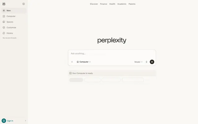
The Perplexity AI interface presents as a refined, subtly textured workspace, like a digital parchment infused with computational intelligence. A pervasive creamy off-white (#faf8f5) provides a soft visual foundation, allowing charcoal text (#27251e) to softly emerge, rather than starkly contrast. The single teal accent (#016a71) is used judiciously for active states and critical calls to action, providing a quiet spark of functionality without dominating the serene palette. Rounded corners, ranging from a subtle 6px to a more prominent 16px on cards, soften hard edges, while a distinctive 9999px pill shape is reserved for interactive tags and compact action elements, creating a visual rhythm between form and function.
The page adheres to a distinct two-column layout: a fixed-width left navigation sidebar and a flexible main content area. The main content area is centered and constrained, not full-bleed, accommodating an AI-focused interface with clear boundaries. The hero section prominently features a centered brand logo and a large, central input field, directing immediate user interaction. Section rhythm is consistent, separated by implied spacing and functional groupings rather than visual dividers. Content is arranged in centered stacks for primary interaction, with some components utilizing two-column structures. Navigation is a persistent, left-aligned sidebar containing both hierarchical and utility links.
The visual language is UI-dominant with minimal decorative imagery. When icons are present, they are monochromatic, filled, and primarily use Text Charcoal (#27251e) or Accent Teal (#016a71) for active states, conveying functional clarity rather than ornate design. No photography, illustrations, or complex graphics are present, emphasizing a utilitarian, information-focused experience. The density is text-dominant, with icons serving as supporting visual cues.
Reminiscent of Notion, Linear, ChatGPT, Apple UI (older versions).
# Perplexity AI — Style Reference
> Digital Parchment, Subtle Authority

**Theme:** light

**Site:** https://www.perplexity.ai

The Perplexity AI interface presents as a refined, subtly textured workspace, like a digital parchment infused with computational intelligence. A pervasive creamy off-white (#faf8f5) provides a soft visual foundation, allowing charcoal text (#27251e) to softly emerge, rather than starkly contrast. The single teal accent (#016a71) is used judiciously for active states and critical calls to action, providing a quiet spark of functionality without dominating the serene palette. Rounded corners, ranging from a subtle 6px to a more prominent 16px on cards, soften hard edges, while a distinctive 9999px pill shape is reserved for interactive tags and compact action elements, creating a visual rhythm between form and function.

## Tokens — Colors

| Name | Value | Token | Role |
|------|------|------|------|
| Accent Teal | `#016a71` | `--color-accent-teal` | Navigation active item backgrounds, 'Sign In' button text in inactive state, selected icon fills — indicates focus and interactivity without being overtly aggressive |
| Canvas Creme | `#faf8f5` | `--color-canvas-creme` | Observed in other backgroundColor, card backgroundColor, nav fill. Extracted usage does not support a distinct primary control color. |
| Text Charcoal | `#272510` | `--color-text-charcoal` | Supporting palette color with insufficient usage evidence for a stronger role. Extracted usage does not support a distinct primary control color. |
| Secondary Text | `#72706b` | `--color-secondary-text` | Secondary text, muted links, inactive icon fills |
| Border Slate | `#d1d1cd` | `--color-border-slate` | Subtle borders often for cards or input fields |
| Subtle Gray | `#92918b` | `--color-subtle-gray` | Tertiary text or placeholder text color, subtle UI elements |
| Deep Black | `#000000` | `--color-deep-black` | Strong conversational text, headings, ensures high contrast on light backgrounds; Subtle shadow for card elevation, appears as rgba(0, 0, 0, 0.08) |

## Tokens — Typography

### pplxSans
- **Substitute:** Inter
- **Weights:** 400, 500
- **Sizes:** 12px, 14px, 16px
- **Line height:** 1.25, 1.33, 1.43, 1.5, 2
- **Letter spacing:** normal
- **Role:** The primary typeface for all UI elements and body text. Its clean, sans-serif lines at multiple weights ensure clarity and approachability, supporting the AI's informational purpose.

## Tokens — Type Scale

| Role | Size | Line height | Letter spacing |
|------|------|------|------|
| caption | 12px | 1.25 | — |
| body-sm | 14px | 1.43 | — |
| body | 16px | 1.5 | — |

## Tokens — Spacing

- **Section gap:** 32px
- **Card padding:** 12px
- **Element gap:** 8px

## Tokens — Radius

- **Buttons:** 6px
- **Cards:** 16px
- **inputField:** 12px
- **pill:** 9999px

## Tokens — Elevation

- **Content Card:** `rgba(0, 0, 0, 0.08) 0px 1px 2px 0px`

## Layout

The page adheres to a distinct two-column layout: a fixed-width left navigation sidebar and a flexible main content area. The main content area is centered and constrained, not full-bleed, accommodating an AI-focused interface with clear boundaries. The hero section prominently features a centered brand logo and a large, central input field, directing immediate user interaction. Section rhythm is consistent, separated by implied spacing and functional groupings rather than visual dividers. Content is arranged in centered stacks for primary interaction, with some components utilizing two-column structures. Navigation is a persistent, left-aligned sidebar containing both hierarchical and utility links.

## Imagery

The visual language is UI-dominant with minimal decorative imagery. When icons are present, they are monochromatic, filled, and primarily use Text Charcoal (#27251e) or Accent Teal (#016a71) for active states, conveying functional clarity rather than ornate design. No photography, illustrations, or complex graphics are present, emphasizing a utilitarian, information-focused experience. The density is text-dominant, with icons serving as supporting visual cues.

## Components

### Primary Navigation Item
*Active state navigation item*

Selected navigation items use Accent Teal (#016a71) for background, with Canvas Creme (#faf8f5) text. Inactive items use Text Charcoal (#27251e) on Canvas Creme (#faf8f5).

### Text Input Field
*User input area*

Canvas Creme (#faf8f5) background, Border Slate (#d1d1cd) border at 1px, and 12px border-radius. Placeholder text uses Subtle Gray (#92918b). Focused state likely increases border weight and changes color.

### Search Query Pill
*Interactive tag within input*

Text Charcoal (#27251e) text on a transparent background with an implied border using Border Slate (#d1d1cd) (rgba(39, 26, 0, 0.14)), 9999px border-radius. Padding is minimal to keep it compact.

### Icon Button (Default)
*Subtle interactive icon*

Transparent background, Text Charcoal (#27251e) icon fill, 6px border-radius. Padding of 8px all around (e.g., audio input button).

### Call to Action (Ghost)
*Secondary action or link*

Transparent background, Text Charcoal (#27251e) text, 6px border-radius. Examples include 'New', 'Computer', 'Spaces'.

### Content Card
*Information container*

Canvas Creme (#faf8f5) background, 16px border-radius, and a soft shadow (rgba(0, 0, 0, 0.08) 0px 1px 2px 0px). Inner padding is 12px vertical.

### Utility Link
*Informational links in headers or footers*

Deep Black (#000000) text (pplxSans, weight 400, 14px size), transparent background, no underline by default. Hover state likely changes color or adds underline.

## Guidelines

### Do

- Use Canvas Creme (#faf8f5) as the primary background for all page sections and cards.
- Apply Text Charcoal (#27251e) for primary body text and main interface elements to ensure soft readability.
- Reserve Accent Teal (#016a71) exclusively for active navigation states, selected items, and high-priority interactive text.
- Utilize 9999px border-radius for all interactive tags and pill-shaped elements like search filters or small action buttons.
- Implement 16px border-radius for all higher-level containers and cards to maintain a consistent soft containment.
- Employ pplxSans with a weight of 400 for standard UI text, and 500 for subtle emphasis on titles or interactive elements.
- Maintain an 8px spacing unit for element gaps, ensuring consistent alignment and visual rhythm.

### Don't

- Do not introduce strong, saturated colors beyond Accent Teal (#016a71); the palette is intentionally soft and restrained.
- Avoid using hard, sharp corners; all functional UI elements should have a minimum of 6px border-radius.
- Do not use shadows indiscriminately; restrict them to cards and elevated containers, using the specified rgba(0, 0, 0, 0.08) 0px 1px 2px 0px only.
- Refrain from using excessively bold or heavy typefaces; pplxSans weights 400 and 500 are sufficient for all hierarchy needs.
- Do not clutter layouts with excessive visual dividers; rely on background color changes and consistent spacing for section separation.
- Avoid using pure white (#FFFFFF) for backgrounds; Canvas Creme (#faf8f5) provides a warmer, softer base.
- Do not add outlines to text inputs unless specifically for a focus state; maintain a clean, border-only aesthetic for default states.

## Agent Prompt Guide

Quick Color Reference:
- text: #27251e
- background: #faf8f5
- border: #d1d1cd
- accent: #016a71
- primary action: no distinct CTA color

Example Component Prompts:
- Create a left navigation item for 'History': pplxSans weight 400, 16px size, #27251e. On hover, background should be Accent Teal (#016a71) with text and icon as Canvas Creme (#faf8f5). Padding 8px vertical, 12px horizontal. Radius 6px.
- Create a central search input field: Canvas Creme (#faf8f5) background, Border Slate (#d1d1cd) 1px border, 12px border-radius. Placeholder text 'Ask anything...' in Subtle Gray (#92918b), pplxSans weight 400, 16px size. Inner content padding 8px.
- Create a functional 'Computer' tag within an input: pplxSans weight 400, 14px size, #27251e text, 9999px border-radius. Has a transparent background and an implied border of rgba(39, 26, 0, 0.14).
- Create a content suggestion card: Canvas Creme (#faf8f5) background, 16px border-radius, shadow of rgba(0, 0, 0, 0.08) 0px 1px 2px 0px. Internal padding of 12px vertical.
More like this









Keep what you find
A free account saves references to boards and can send you a weekly email of picks based on what you save.
To see every result, go Pro.