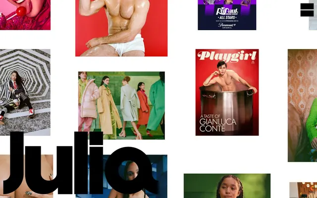
Preview image. Unlock full-res
Ever-shifting, vibrant canvas
Color palette
Dominant background color for sections, interactive elements, menu accents — drives a warm, energetic mood when present
Backgrounds for prominent sections and interactive element borders — creates a strong, urgent visual presence
Backgrounds for expansive sections and interactive element borders — invokes a calm, yet intense atmosphere
Section backgrounds and interactive element borders — provides a highly saturated, impactful accent
Backgrounds for large visual areas and interactive element borders — offers a bright, open feel
Distinct background for content sections and interactive element borders — introduces a fresh, natural tone
Background for bold content blocks and interactive element borders — a rich, earthy, yet vivid shade
Background color for impactful content areas and interactive element borders — offers a deep, passionate red
Background for specific visual features and interactive element borders — adds a touch of warmth and richness
Background for high-impact visual sections and interactive element borders — a vibrant and playful accent
Background surfaces and interactive element borders — a bold, spicy, and active tone
Backgrounds for energetic sections and interactive element borders — brings a bright, almost neon energy
Primary text, borders, button outlines, menu icons — provides stark contrast against the fluid color backgrounds
Typography
- Weights
- 700
- Sizes
- 10px, 18px
- Line height
- 1
- Letter spacing
- -0.0200em
- Fallback
- Arial
Primary UI text for menus, links, and button labels — its condensed, heavy weight provides maximum impact even at small sizes.
Spacing & shape
Components
Invisible button with an implied presence. When active, it uses Black Ink for its border and text. `backgroundColor: rgb(0,0,0)`, `color: rgb(0,0,0)`, `borderColor: rgb(0,0,0)`, `borderRadius: 0px`, `padding: 0px`.
Guidelines
- Use color washes from the 'brand' group as full-bleed section backgrounds, allowing one color to dominate a visual segment.
- Apply Black Ink (#000000) for all text and interactive element borders to maintain high contrast against varied backgrounds.
- Ensure all text, navigation, and menu items use Helvetica weight 700 at either 10px or 18px with -0.0200em letter spacing.
- Structure pages with a spacious feel, allowing large, uninterrupted blocks of color and imagery to dictate visual separation.
- Utilize the full page width without max-width constraints, allowing imagery and color to extend to the viewport edges.
- Frame all interactive elements and buttons with a 0px border radius for a sharp, angular aesthetic.
- Avoid using multiple chromatic colors within a single background section; stick to one dominant brand color per area.
- Do not introduce any border radii on buttons or interactive elements; maintain a strictly angular design.
- Never use text weights other than 700 (bold) for UI elements; text should always feel strong and direct.
- Do not constrain content to a fixed max-width; let the layout breathe to the edges of the screen.
- Avoid subtle gradients or soft shadows; the system relies on stark contrasts and flat, vibrant color fields.
About this system
ShowHide
Julia Johnson's design system screams 'Bold Portfolio, Ever-Shifting Canvas'. The visual identity is defined by highly contrasted imagery against a minimalist, almost stark background that frequently changes hue, making each section a distinct visual statement. Typography is aggressive and direct, using a single dominant font at high weights for immediate impact. The layout prioritizes large-scale images and maximal, fluid areas of color, creating a dynamic and immersive gallery experience where the content itself dictates the mood and palette.
The page model is full-bleed, with content extending to the edges of the viewport without a `max-width` container. The hero area often appears as a large, impactful photograph that sets the immediate tone. Section rhythm is created through abrupt shifts in background color, acting as distinct visual breaks rather than using traditional dividers or consistent vertical spacing. Content is arranged in alternating visual experiences, often one large image or a block of solid color per section. There's no visible grid system for organizing content, rather a free-flowing, asymmetrical composition that prioritizes individual visual statements. The density is spacious, allowing each image or color block ample room. Navigation is minimal, typically a small menu icon in a fixed corner, preserving the canvas for the main content.
The visual language is purely photographic and highly editorial, featuring high-quality portraiture and fashion shots. Images are full-bleed or large blocks, often without borders or explicit framing, creating an immersive, gallery-like experience. The treatment is direct and unvarnished, focusing on the subject within its environment. There's an absence of abstract graphics or typical icons; UI elements are minimal, allowing the photography to be the primary visual content. Imagery dominates the visual space, minimizing accompanying text.
Reminiscent of AIGA Journal, The New York Times Magazine, Dribbble (portfolio view), Artsy.
# Photographer — Style Reference
> Ever-shifting, vibrant canvas

**Theme:** light

**Site:** https://juliajohnson.com

Julia Johnson's design system screams 'Bold Portfolio, Ever-Shifting Canvas'. The visual identity is defined by highly contrasted imagery against a minimalist, almost stark background that frequently changes hue, making each section a distinct visual statement. Typography is aggressive and direct, using a single dominant font at high weights for immediate impact. The layout prioritizes large-scale images and maximal, fluid areas of color, creating a dynamic and immersive gallery experience where the content itself dictates the mood and palette.

## Tokens — Colors

| Name | Value | Token | Role |
|------|------|------|------|
| Sunset Orange | `#f2572c` | `--color-sunset-orange` | Dominant background color for sections, interactive elements, menu accents — drives a warm, energetic mood when present |
| Inferno Red | `#e21715` | `--color-inferno-red` | Backgrounds for prominent sections and interactive element borders — creates a strong, urgent visual presence |
| Deep Ocean | `#086392` | `--color-deep-ocean` | Backgrounds for expansive sections and interactive element borders — invokes a calm, yet intense atmosphere |
| Electric Red | `#f11216` | `--color-electric-red` | Section backgrounds and interactive element borders — provides a highly saturated, impactful accent |
| Sky Blue | `#2e99c9` | `--color-sky-blue` | Backgrounds for large visual areas and interactive element borders — offers a bright, open feel |
| Forest Green | `#5bc52c` | `--color-forest-green` | Distinct background for content sections and interactive element borders — introduces a fresh, natural tone |
| Terracotta Red | `#c34a3b` | `--color-terracotta-red` | Background for bold content blocks and interactive element borders — a rich, earthy, yet vivid shade |
| Firebrick | `#dd391c` | `--color-firebrick` | Background color for impactful content areas and interactive element borders — offers a deep, passionate red |
| Goldenrod | `#b3813c` | `--color-goldenrod` | Background for specific visual features and interactive element borders — adds a touch of warmth and richness |
| Magenta Burst | `#ed036d` | `--color-magenta-burst` | Background for high-impact visual sections and interactive element borders — a vibrant and playful accent |
| Chili Red | `#b43429` | `--color-chili-red` | Background surfaces and interactive element borders — a bold, spicy, and active tone |
| Hot Tangerine | `#fe4f08` | `--color-hot-tangerine` | Backgrounds for energetic sections and interactive element borders — brings a bright, almost neon energy |
| Black Ink | `#000000` | `--color-black-ink` | Primary text, borders, button outlines, menu icons — provides stark contrast against the fluid color backgrounds |

## Tokens — Typography

### Helvetica
- **Substitute:** Arial
- **Weights:** 700
- **Sizes:** 10px, 18px
- **Line height:** 1
- **Letter spacing:** -0.0200em
- **Role:** Primary UI text for menus, links, and button labels — its condensed, heavy weight provides maximum impact even at small sizes.

## Tokens — Spacing

- **Section gap:** 43px
- **Card padding:** 0px
- **Element gap:** 15px

## Tokens — Radius

- **Buttons:** 0px

## Layout

The page model is full-bleed, with content extending to the edges of the viewport without a `max-width` container. The hero area often appears as a large, impactful photograph that sets the immediate tone. Section rhythm is created through abrupt shifts in background color, acting as distinct visual breaks rather than using traditional dividers or consistent vertical spacing. Content is arranged in alternating visual experiences, often one large image or a block of solid color per section. There's no visible grid system for organizing content, rather a free-flowing, asymmetrical composition that prioritizes individual visual statements. The density is spacious, allowing each image or color block ample room. Navigation is minimal, typically a small menu icon in a fixed corner, preserving the canvas for the main content.

## Imagery

The visual language is purely photographic and highly editorial, featuring high-quality portraiture and fashion shots. Images are full-bleed or large blocks, often without borders or explicit framing, creating an immersive, gallery-like experience. The treatment is direct and unvarnished, focusing on the subject within its environment. There's an absence of abstract graphics or typical icons; UI elements are minimal, allowing the photography to be the primary visual content. Imagery dominates the visual space, minimizing accompanying text.

## Components

### Ghost Menu Button
*Navigation trigger*

Invisible button with an implied presence. When active, it uses Black Ink for its border and text. `backgroundColor: rgb(0,0,0)`, `color: rgb(0,0,0)`, `borderColor: rgb(0,0,0)`, `borderRadius: 0px`, `padding: 0px`.

## Guidelines

### Do

- Use color washes from the 'brand' group as full-bleed section backgrounds, allowing one color to dominate a visual segment.
- Apply Black Ink (#000000) for all text and interactive element borders to maintain high contrast against varied backgrounds.
- Ensure all text, navigation, and menu items use Helvetica weight 700 at either 10px or 18px with -0.0200em letter spacing.
- Structure pages with a spacious feel, allowing large, uninterrupted blocks of color and imagery to dictate visual separation.
- Utilize the full page width without max-width constraints, allowing imagery and color to extend to the viewport edges.
- Frame all interactive elements and buttons with a 0px border radius for a sharp, angular aesthetic.

### Don't

- Avoid using multiple chromatic colors within a single background section; stick to one dominant brand color per area.
- Do not introduce any border radii on buttons or interactive elements; maintain a strictly angular design.
- Never use text weights other than 700 (bold) for UI elements; text should always feel strong and direct.
- Do not constrain content to a fixed max-width; let the layout breathe to the edges of the screen.
- Avoid subtle gradients or soft shadows; the system relies on stark contrasts and flat, vibrant color fields.

## Agent Prompt Guide

Quick Color Reference:
text: #000000
background: #f2572c (or other brand colors)
border: #000000
accent: #f2572c
primary action: #e21715 (outlined action border)

Example Component Prompts:
1. Create a navigation menu: Black Ink (#000000) text, Helvetica weight 700 at 18px, letter-spacing -0.0200em. Positioned against a full-bleed #f2572c background.
2. Design a ghost button for a menu: Text 'Menu', Black Ink (#000000) for color and border, no background, 0px border radius, Helvetica weight 700 at 10px, letter-spacing -0.0200em.
3. Implement a section with an Inferno Red (#e21715) background: Text in Black Ink (#000000), Helvetica weight 700 at 18px. The section should span the full viewport width and be visually separated from the next section purely by color change.
More like this









Keep what you find
A free account saves references to boards and can send you a weekly email of picks based on what you save.
To see every result, go Pro.