Preview image. Unlock full-res
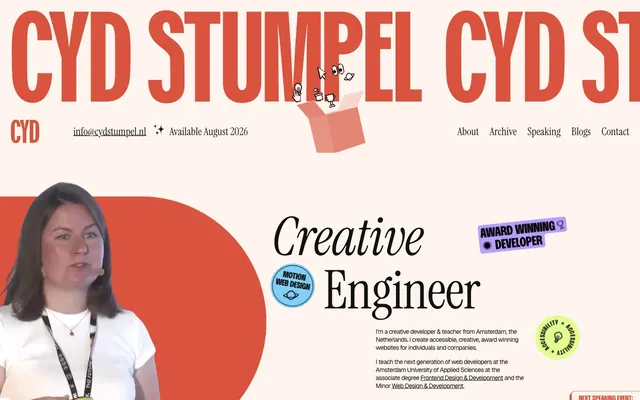
Warm, playful workshop.
Color palette
Primary brand accent, interactive elements like button borders and text, card shadows, and key information highlights
Decorative card borders and accents for tags. This vivid red contributes to the playful, energetic feel
Decorative card borders and accents for tags. This vivid blue provides a strong visual contrast
Decorative card borders, tag backgrounds, and accents. A vibrant, energetic hue
Decorative card borders and accents for tags. Adds a warm, earthy counterpoint
Highlight accent, used as a fill for decorative icons
Decorative card background for specific content blocks
Decorative card background for specific content blocks
Decorative card background for specific content blocks
Decorative card background for specific content blocks
Decorative card background for specific content blocks
Page background, card surfaces, ghost button backgrounds, default text color for buttons and links
Primary text, headings, icons, borders, and default link text
Secondary text, muted details, and some card borders
Subtle background for cards and featured sections, indicating content grouping
Typography
- Weights
- 400, 600, 700
- Sizes
- 14px, 16px, 18px, 24px, 32px, 40px, 52px, 80px, 201px
- Line height
- 1, 1.1, 1.2
- Letter spacing
- -0.0340em at 80px-201px, -0.0200em at 40px, normal at 14px-32px
- Fallback
- Georgia, serif
The primary workhorse typeface for body text, interactive elements, and general UI. Its friendly, legible characteristics make it suitable for a wide range of content sizes, with varied letter-spacing creating distinct visual weight for larger displays.
- Weights
- 400
- Sizes
- 24px, 26px, 32px, 40px, 52px, 120px
- Line height
- 1, 1.1, 1.2, 1.25
- Letter spacing
- -0.0190em at 52px-120px, -0.0150em at 24px-40px
- Fallback
- Playfair Display, serif
A decorative serif font used for prominent headings, creating a playful yet editorial tone. Its distinct character adds a handcrafted feel, especially at larger sizes.
- Weights
- 400, 700
- Sizes
- 48px, 64px, 201px
- Line height
- 0.8, 0.9, 0.91
- Letter spacing
- normal
- Fallback
- Georgia, serif
Primarily used for very large, dominant display headings and key brand text, often overlapping elements. Its variable font nature allows for expressive and dynamic typographic treatments.
- Weights
- 400
- Sizes
- 12px, 14px
- Line height
- 1.2
- Letter spacing
- -0.0580em at 14px, -0.0500em at 12px
- Fallback
- Inter, sans-serif
A compact, highly-tracked sans-serif used for small, functional text such as metadata, captions, and tags, where legibility at small sizes and a tight, modern feel are paramount.
- Weights
- 400
- Sizes
- 32px, 40px, 120px
- Line height
- 1, 1.1
- Letter spacing
- -0.0150em at all sizes
- Fallback
- Playfair Display Italic, serif
Used for specific stylized headings or emphasis where an italic serif is desired to convey a more artistic or personal touch.
Spacing & shape
Elevation
Components
Ghost button with Seashell Canvas background, Creative Red text and border. Uses 64px border-radius for pill shape. Padding: 8px top, 16px horizontal, 5.6px bottom. Font: Bueno, 16px.
Filled button with Creative Red background, Seashell Canvas text. Uses 28px border-radius. Padding: 9.8px top, 11.2px horizontal, 7px bottom. Font: Bueno, 14px.
Filled button with Electric Pink background, Seashell Canvas text. Uses 28px border-radius. Padding: 9.8px top, 11.2px horizontal, 7px bottom. Font: Bueno, 14px.
Filled button with Dusty Charcoal background, Seashell Canvas text. Uses 28px border-radius. Padding: 9.8px top, 11.2px horizontal, 7px bottom. Font: Bueno, 14px.
Card with no background, no border, no padding, no shadow, and 0px border-radius. Used for transparent content containers that integrate directly into the layout.
Card with Blush Pink background, 16px border-radius, and 16px padding on all sides. Used for visually distinct content blocks that appear as lifted surfaces.
Card with Blush Pink background, 8px 0px 0px 8px border-radius, and a Creative Red -4px 4px 0px 0px box-shadow. Padding: 8px top, 32px right, 8px bottom, 16px left. This asymmetrical shadow creates a pop-out effect.
Card with various accent backgrounds (e.g., Deep Plum, Dark Forest), 120px border-radius, no padding, no shadow. Used for profile images and media, creating unusual, organic shapes.
Text uses Geist, 12px, weight 400. Letter-spacing: -0.6px (-0.05em).
Guidelines
- Use Seashell Canvas (#fff5ee) as the primary page and surface background color.
- Apply Midnight Ink (#111111) for all main headings and body text to ensure contrast.
- Utilize Creative Red (#d9533f) as the core accent for interactive elements, primary button borders, and key visual highlights or shadows.
- Form button and tag shapes with a generous 64px or 28px border-radius for distinct, soft edges.
- Employ Geist font at 12px for small, functional text such as tags and metadata, with letter-spacing of -0.05em.
- Create visual hierarchy and playfulness using offset box-shadows, particularly the Creative Red -4px 4px 0px 0px variant for cards.
- Favor Bueno for general body text and UI elements, varying weights from 400 to 700 to establish internal hierarchy without changing font families.
- Avoid strictly symmetrical layouts; embrace slight misalignments and playful element positioning.
- Do not use generic gray borders; instead, use programmatic accent colors or offset shadows to delineate elements.
- Refrain from stark white backgrounds; maintain the warm, slightly tinted palette of Seashell Canvas and Blush Pink.
- Do not use subtle, soft drop shadows; instead, apply hard-edged, offset box-shadows or no shadows at all.
- Avoid excessive use of system default fonts; stick to Bueno, Instrument Serif, and Geist for all typographic needs.
- Do not create highly structured, rigid design components; allow for organic shapes and varied radii, like the 120px radius cards.
- Do not centralize elements by default; consider asymmetric compositions or subtle offsets for a more dynamic feel.
About this system
ShowHide
Cyd Stumpel's portfolio site evokes a whimsical, hand-crafted feel with its warm, off-white canvas and playful, misaligned elements. It balances robust typography with expressive, varied accent colors, creating an atmosphere that feels both professional and approachable. Borders and shadows are frequently used as decorative accents rather than functional separators, adding to a layered, almost scrapbook-like quality. The system prioritizes personality and visual delight over strict grid adherence or minimalist austerity.
The page structure features a full-bleed canvas of Seashell Canvas, with content primarily contained and centered, allowing for playful overlaps and asymmetrical elements. The hero section uses large, decorative typography overlapping an illustration and a headshot, establishing an immediate sense of personality. Sections often feature alternating visual patterns, such as a large text block alongside a column of custom-shaped media cards. The 'Latest blogs' section uses a strict 3-column grid for Blush Content Cards, breaking the organic flow with structured content. Navigation is a minimal, top-right header with text links, while the footer mimics this simplified approach. Overall density is balanced by generous line spacing and visual breathing room, counteracting the layered and sometimes overlapping nature of individual components.
The site uses a mix of dynamic, illustrative elements and high-quality photography/video. Illustrations are abstract and playful, such as the 'items in a box' graphic, adding whimsy. Photography features portraits and product-focused shots, often contained within irregularly shaped (120px radius) cards with solid color backgrounds like Deep Plum or Dark Forest, giving them a non-standard, artistic presentation. Icons are outlined, bold, and sometimes filled with accent colors like Lime Spritz, serving both decorative and explanatory roles. The density of imagery is balanced to break up text-heavy sections and add personality.
Reminiscent of AIGA, Frank Chimero, Jessica Hische.
# Portfolio Cyd Stumpel — Style Reference
> Warm, playful workshop.

**Theme:** light

**Site:** https://cydstumpel.nl

Cyd Stumpel's portfolio site evokes a whimsical, hand-crafted feel with its warm, off-white canvas and playful, misaligned elements. It balances robust typography with expressive, varied accent colors, creating an atmosphere that feels both professional and approachable. Borders and shadows are frequently used as decorative accents rather than functional separators, adding to a layered, almost scrapbook-like quality. The system prioritizes personality and visual delight over strict grid adherence or minimalist austerity.

## Tokens — Colors

| Name | Value | Token | Role |
|------|------|------|------|
| Creative Red | `#d9533f` | `--color-creative-red` | Primary brand accent, interactive elements like button borders and text, card shadows, and key information highlights |
| Tangerine Tango | `#f13e3e` | `--color-tangerine-tango` | Decorative card borders and accents for tags. This vivid red contributes to the playful, energetic feel |
| Vivid Cerulean | `#1e61bf` | `--color-vivid-cerulean` | Decorative card borders and accents for tags. This vivid blue provides a strong visual contrast |
| Electric Pink | `#e80055` | `--color-electric-pink` | Decorative card borders, tag backgrounds, and accents. A vibrant, energetic hue |
| Golden Rod | `#946800` | `--color-golden-rod` | Decorative card borders and accents for tags. Adds a warm, earthy counterpoint |
| Lime Spritz | `#e2fc91` | `--color-lime-spritz` | Highlight accent, used as a fill for decorative icons |
| Deep Plum | `#a382ff` | `--color-deep-plum` | Decorative card background for specific content blocks |
| Forest Green | `#87935b` | `--color-forest-green` | Decorative card background for specific content blocks |
| Dark Forest | `#152918` | `--color-dark-forest` | Decorative card background for specific content blocks |
| Espresso | `#3b323d` | `--color-espresso` | Decorative card background for specific content blocks |
| Vivid Red | `#d80a0a` | `--color-vivid-red` | Decorative card background for specific content blocks |
| Seashell Canvas | `#fff5ee` | `--color-seashell-canvas` | Page background, card surfaces, ghost button backgrounds, default text color for buttons and links |
| Midnight Ink | `#111111` | `--color-midnight-ink` | Primary text, headings, icons, borders, and default link text |
| Dusty Charcoal | `#6d6d6d` | `--color-dusty-charcoal` | Secondary text, muted details, and some card borders |
| Blush Pink | `#fee9e6` | `--color-blush-pink` | Subtle background for cards and featured sections, indicating content grouping |

## Tokens — Typography

### Bueno
- **Substitute:** Georgia, serif
- **Weights:** 400, 600, 700
- **Sizes:** 14px, 16px, 18px, 24px, 32px, 40px, 52px, 80px, 201px
- **Line height:** 1, 1.1, 1.2
- **Letter spacing:** -0.0340em at 80px-201px, -0.0200em at 40px, normal at 14px-32px
- **Role:** The primary workhorse typeface for body text, interactive elements, and general UI. Its friendly, legible characteristics make it suitable for a wide range of content sizes, with varied letter-spacing creating distinct visual weight for larger displays.

### Instrument Serif
- **Substitute:** Playfair Display, serif
- **Weights:** 400
- **Sizes:** 24px, 26px, 32px, 40px, 52px, 120px
- **Line height:** 1, 1.1, 1.2, 1.25
- **Letter spacing:** -0.0190em at 52px-120px, -0.0150em at 24px-40px
- **Role:** A decorative serif font used for prominent headings, creating a playful yet editorial tone. Its distinct character adds a handcrafted feel, especially at larger sizes.

### Bueno-VF
- **Substitute:** Georgia, serif
- **Weights:** 400, 700
- **Sizes:** 48px, 64px, 201px
- **Line height:** 0.8, 0.9, 0.91
- **Letter spacing:** normal
- **Role:** Primarily used for very large, dominant display headings and key brand text, often overlapping elements. Its variable font nature allows for expressive and dynamic typographic treatments.

### Geist
- **Substitute:** Inter, sans-serif
- **Weights:** 400
- **Sizes:** 12px, 14px
- **Line height:** 1.2
- **Letter spacing:** -0.0580em at 14px, -0.0500em at 12px
- **Role:** A compact, highly-tracked sans-serif used for small, functional text such as metadata, captions, and tags, where legibility at small sizes and a tight, modern feel are paramount.

### Instrument Serif Italic
- **Substitute:** Playfair Display Italic, serif
- **Weights:** 400
- **Sizes:** 32px, 40px, 120px
- **Line height:** 1, 1.1
- **Letter spacing:** -0.0150em at all sizes
- **Role:** Used for specific stylized headings or emphasis where an italic serif is desired to convey a more artistic or personal touch.

## Tokens — Type Scale

Augmented Fourth (1.414) from 16px base.

| Role | Size | Line height | Letter spacing |
|------|------|------|------|
| caption | 12px | 1.2 | -0.6px |
| body-sm | 14px | 1.2 | -0.81px |
| body | 16px | 1.2 | — |
| subheading | 24px | 1.2 | -0.36px |
| heading-sm | 32px | 1.1 | -0.48px |
| heading | 40px | 1.1 | -0.8px |
| heading-lg | 52px | 1.1 | -0.988px |
| display | 120px | 1 | -2.28px |

## Tokens — Spacing

- **Section gap:** 50px
- **Card padding:** 16px
- **Element gap:** 8px

## Tokens — Radius

- **Buttons:** 64px
- **Cards:** 16px
- **card-split:** 8px
- **hero-elements:** 120px
- **small:** 4px
- **tags:** 28px

## Tokens — Elevation

- **Button:** `rgb(217, 83, 63) -3px 3px 0px 0px`
- **Card:** `rgb(217, 83, 63) -4px 4px 0px 0px`

## Layout

The page structure features a full-bleed canvas of Seashell Canvas, with content primarily contained and centered, allowing for playful overlaps and asymmetrical elements. The hero section uses large, decorative typography overlapping an illustration and a headshot, establishing an immediate sense of personality. Sections often feature alternating visual patterns, such as a large text block alongside a column of custom-shaped media cards. The 'Latest blogs' section uses a strict 3-column grid for Blush Content Cards, breaking the organic flow with structured content. Navigation is a minimal, top-right header with text links, while the footer mimics this simplified approach. Overall density is balanced by generous line spacing and visual breathing room, counteracting the layered and sometimes overlapping nature of individual components.

## Imagery

The site uses a mix of dynamic, illustrative elements and high-quality photography/video. Illustrations are abstract and playful, such as the 'items in a box' graphic, adding whimsy. Photography features portraits and product-focused shots, often contained within irregularly shaped (120px radius) cards with solid color backgrounds like Deep Plum or Dark Forest, giving them a non-standard, artistic presentation. Icons are outlined, bold, and sometimes filled with accent colors like Lime Spritz, serving both decorative and explanatory roles. The density of imagery is balanced to break up text-heavy sections and add personality.

## Components

### Ghost Border Button (Creative Red)
*Secondary action button, tags, navigation items*

Ghost button with Seashell Canvas background, Creative Red text and border. Uses 64px border-radius for pill shape. Padding: 8px top, 16px horizontal, 5.6px bottom. Font: Bueno, 16px.

### Filled Tag Button (Creative Red)
*Primary action tag button*

Filled button with Creative Red background, Seashell Canvas text. Uses 28px border-radius. Padding: 9.8px top, 11.2px horizontal, 7px bottom. Font: Bueno, 14px.

### Filled Tag Button (Electric Pink)
*Accent tag button*

Filled button with Electric Pink background, Seashell Canvas text. Uses 28px border-radius. Padding: 9.8px top, 11.2px horizontal, 7px bottom. Font: Bueno, 14px.

### Filled Tag Button (Dusty Charcoal)
*Neutral tag button*

Filled button with Dusty Charcoal background, Seashell Canvas text. Uses 28px border-radius. Padding: 9.8px top, 11.2px horizontal, 7px bottom. Font: Bueno, 14px.

### Basic Content Card
*Content grouping, blog posts*

Card with no background, no border, no padding, no shadow, and 0px border-radius. Used for transparent content containers that integrate directly into the layout.

### Blush Content Card
*Informational content container*

Card with Blush Pink background, 16px border-radius, and 16px padding on all sides. Used for visually distinct content blocks that appear as lifted surfaces.

### Offset Shadow Card (Creative Red)
*Highlighting specific content, callout boxes*

Card with Blush Pink background, 8px 0px 0px 8px border-radius, and a Creative Red -4px 4px 0px 0px box-shadow. Padding: 8px top, 32px right, 8px bottom, 16px left. This asymmetrical shadow creates a pop-out effect.

### Geometric Media Card
*Image/video display with irregular shapes*

Card with various accent backgrounds (e.g., Deep Plum, Dark Forest), 120px border-radius, no padding, no shadow. Used for profile images and media, creating unusual, organic shapes.

### Small Text Input Label
*Form labels*

Text uses Geist, 12px, weight 400. Letter-spacing: -0.6px (-0.05em).

## Guidelines

### Do

- Use Seashell Canvas (#fff5ee) as the primary page and surface background color.
- Apply Midnight Ink (#111111) for all main headings and body text to ensure contrast.
- Utilize Creative Red (#d9533f) as the core accent for interactive elements, primary button borders, and key visual highlights or shadows.
- Form button and tag shapes with a generous 64px or 28px border-radius for distinct, soft edges.
- Employ Geist font at 12px for small, functional text such as tags and metadata, with letter-spacing of -0.05em.
- Create visual hierarchy and playfulness using offset box-shadows, particularly the Creative Red -4px 4px 0px 0px variant for cards.
- Favor Bueno for general body text and UI elements, varying weights from 400 to 700 to establish internal hierarchy without changing font families.

### Don't

- Avoid strictly symmetrical layouts; embrace slight misalignments and playful element positioning.
- Do not use generic gray borders; instead, use programmatic accent colors or offset shadows to delineate elements.
- Refrain from stark white backgrounds; maintain the warm, slightly tinted palette of Seashell Canvas and Blush Pink.
- Do not use subtle, soft drop shadows; instead, apply hard-edged, offset box-shadows or no shadows at all.
- Avoid excessive use of system default fonts; stick to Bueno, Instrument Serif, and Geist for all typographic needs.
- Do not create highly structured, rigid design components; allow for organic shapes and varied radii, like the 120px radius cards.
- Do not centralize elements by default; consider asymmetric compositions or subtle offsets for a more dynamic feel.

## Agent Prompt Guide

Quick Color Reference:
text: #111111
background: #fff5ee
border: #d9533f
accent: #d9533f
primary action: #e80055 (filled action)

Example Component Prompts:
1. Create a large display heading: 'Freelance Developer' using Instrument Serif, 120px, lineHeight 1.0, Midnight Ink text, letterSpacing -2.28px. Place it slightly overlapping an illustrative graphic.
2. Design a primary action tag button: 'JS Heroes' with Electric Pink background (#e80055), Seashell Canvas text (#fff5ee), 28px border-radius, and 9.8px top/7px bottom/11.2px horizontal padding. Font: Bueno, 14px.
3. Implement a Blush Content Card: Background Blush Pink (#fee9e6), 16px border-radius, 16px padding on all sides. Inside, display 'Why we teach our students progressive enhancement' using Bueno, 24px, Midnight Ink text, and Geist 12px tags in various accent backgrounds like Tangerine Tango (#f13e3e).
4. Build an Offset Shadow Card: Background Blush Pink (#fee9e6), border-radius 8px 0px 0px 8px. Apply a box-shadow: Creative Red (#d9533f) -4px 4px 0px 0px. Padding 8px top, 32px right, 8px bottom, 16px left. Content within should use Bueno, 16px, Midnight Ink text.
5. Assemble a Ghost Border Button: 'All Work' with Seashell Canvas background (#fff5ee), Creative Red text (#d9533f) and border (#d9533f). Use 64px border-radius. Padding: 8px top, 16px horizontal, 5.6px bottom. Font: Bueno, 16px.
More like this









Keep what you find
A free account saves references to boards and can send you a weekly email of picks based on what you save.
To see every result, go Pro.