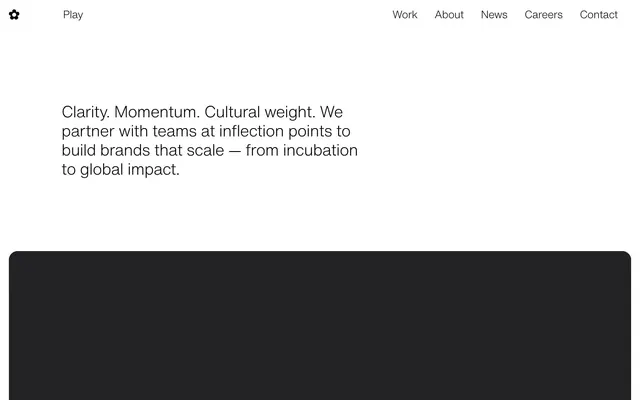
Preview image. Unlock full-res
High-contrast typographic canvas
Color palette
Accent for interactive links, outlined button borders, key headings, active categories – a powerful contrast against the monochrome
Page backgrounds, hero backgrounds, primary surface for content
Primary text, headers, default icon fills, default borders
Muted text for secondary information, card borders
Typography
- Weights
- 400, 700
- Sizes
- 10px
- Line height
- 1
- Fallback
- Times New Roman
Decorative and occasional body text, used sparingly for specific small information due to its limited size range in this system.
- Weights
- 200, 300
- Sizes
- 18px, 24px, 36px, 160px
- Line height
- 0.8, 1.2, 1.4
- Letter spacing
- -0.0700em at 160px, -0.0200em at 36px
- Fallback
- Helvetica Neue
The primary typeface for all headings, body copy, and interactive elements. Its variable weights emphasize a modern, clear voice. The lighter weights (200, 300) for large headings create an airy, architectural feel, distinct from traditional bold branding.
Spacing & shape
Components
Transparent background with Ink Black text (#000000). No border, no radius, but uses 40px right padding for visual separation.
Transparent background, Vivid Violet text (#4600ff), with a Vivid Violet (#4600ff) border-bottom interaction, maintaining a crisp, flat aesthetic. No radius. 40px right padding.
Transparent background, sharp 0px radius, no shadow, no padding.
Transparent background, 20px border-radius, no shadow, no padding. These cards frequently host imagery or media.
Guidelines
- Prioritize Ink Black (#000000) for all primary text and Canvas White (#ffffff) for backgrounds to maintain high contrast.
- Use HelveticaNow weight 300 for large headings to achieve an authoritative yet understated presence.
- Employ Vivid Violet (#4600ff) exclusively for interactive elements like links and buttons, or for significant categorical labels.
- Apply 20px border-radius to visual content cards while keeping most structural elements sharp (0px radius).
- Maintain generous section gaps of 118px to ensure ample white space and clear content separation.
- Utilize 40px right padding on text buttons and links to create a consistent interactive zone baseline.
- Incorporate Storm Gray (#808080) for secondary text or subtle borders when full contrast is not required.
- Do not introduce additional saturated colors; Vivid Violet (#4600ff) is the sole chromatic accent.
- Avoid heavy shadows or gradients; rely on contrast and white space for visual hierarchy.
- Do not use Times for prominent display text; its role is limited to small, specific informational elements.
- Do not deviate from the established type scale and letter spacing for HelveticaNow; precise typography is key.
- Do not add unnecessary borders or backgrounds to elements that are not explicitly defined as cards or interactive components.
- Avoid centered text blocks for body content; prefer left-aligned text for readability.
- Do not use small font sizes (e.g., 10px) for primary calls to action or critical information.
About this system
ShowHide
Play.studio employs a stark, high-contrast aesthetic with a minimalist canvas and precisely placed typographic elements. The design emphasizes sharp edges, though rounded corners appear selectively on content blocks, creating a subtle tension. A singular, vivid violet accent color provides strategic visual punctuation against a largely monochrome text and background palette, highlighting interactivity and specific content categories. The overall presentation is sparse, prioritizing clear typography and a clean data presentation to convey information directly.
The page maintains a centered, max-width contained layout, with no specific max-width detected but a strong sense of a confined content area. The hero section is characterized by a prominent centered headline over a white background, followed by sections with consistent vertical spacing of 118px. Content often alternates between text and visual blocks, incorporating a grid of 3-column rounded cards for displaying project previews or news items. The navigation is a minimalist top bar with text links, devoid of heavy interactive elements, reflecting the sparse UI.
This system primarily uses product-focused photography and abstract graphics contained within distinct content cards. Photography is often full-bleed within the card, cropped tightly and used to showcase the product or subject without lifestyle context. Illustrations appear to be flat, possibly abstract or geometric, serving a decorative atmosphere rather than technical explanation. Icons are minimal, outlined, and monochromatic (Ink Black or Vivid Violet). Imagery density is light, used to break up text-dominant sections, existing as isolated visual statements rather than overlapping or dynamic compositions.
Reminiscent of Stripe, Linear, Figma, Pitch.
# Play — Style Reference
> High-contrast typographic canvas

**Theme:** light

**Site:** https://play.studio

Play.studio employs a stark, high-contrast aesthetic with a minimalist canvas and precisely placed typographic elements. The design emphasizes sharp edges, though rounded corners appear selectively on content blocks, creating a subtle tension. A singular, vivid violet accent color provides strategic visual punctuation against a largely monochrome text and background palette, highlighting interactivity and specific content categories. The overall presentation is sparse, prioritizing clear typography and a clean data presentation to convey information directly.

## Tokens — Colors

| Name | Value | Token | Role |
|------|------|------|------|
| Vivid Violet | `#4600ff` | `--color-vivid-violet` | Accent for interactive links, outlined button borders, key headings, active categories – a powerful contrast against the monochrome |
| Canvas White | `#ffffff` | `--color-canvas-white` | Page backgrounds, hero backgrounds, primary surface for content |
| Ink Black | `#000000` | `--color-ink-black` | Primary text, headers, default icon fills, default borders |
| Storm Gray | `#808080` | `--color-storm-gray` | Muted text for secondary information, card borders |

## Tokens — Typography

### Times
- **Substitute:** Times New Roman
- **Weights:** 400, 700
- **Sizes:** 10px
- **Line height:** 1
- **Role:** Decorative and occasional body text, used sparingly for specific small information due to its limited size range in this system.

### HelveticaNow
- **Substitute:** Helvetica Neue
- **Weights:** 200, 300
- **Sizes:** 18px, 24px, 36px, 160px
- **Line height:** 0.8, 1.2, 1.4
- **Letter spacing:** -0.0700em at 160px, -0.0200em at 36px
- **Role:** The primary typeface for all headings, body copy, and interactive elements. Its variable weights emphasize a modern, clear voice. The lighter weights (200, 300) for large headings create an airy, architectural feel, distinct from traditional bold branding.

## Tokens — Type Scale

| Role | Size | Line height | Letter spacing |
|------|------|------|------|
| body | 18px | 1.4 | — |
| subheading | 24px | 1.2 | — |
| heading | 36px | 1.2 | -0.72px |
| display | 160px | 0.8 | -11.2px |

## Tokens — Spacing

- **Section gap:** 118px
- **Card padding:** 40px
- **Element gap:** 20px

## Tokens — Radius

- **Default:** 0px
- **Cards:** 20px
- **contentBlocks:** 20px

## Layout

The page maintains a centered, max-width contained layout, with no specific max-width detected but a strong sense of a confined content area. The hero section is characterized by a prominent centered headline over a white background, followed by sections with consistent vertical spacing of 118px. Content often alternates between text and visual blocks, incorporating a grid of 3-column rounded cards for displaying project previews or news items. The navigation is a minimalist top bar with text links, devoid of heavy interactive elements, reflecting the sparse UI.

## Imagery

This system primarily uses product-focused photography and abstract graphics contained within distinct content cards. Photography is often full-bleed within the card, cropped tightly and used to showcase the product or subject without lifestyle context. Illustrations appear to be flat, possibly abstract or geometric, serving a decorative atmosphere rather than technical explanation. Icons are minimal, outlined, and monochromatic (Ink Black or Vivid Violet). Imagery density is light, used to break up text-dominant sections, existing as isolated visual statements rather than overlapping or dynamic compositions.

## Components

### Ghost Text Button
*Interactive elements for navigation and content filtering.*

Transparent background with Ink Black text (#000000). No border, no radius, but uses 40px right padding for visual separation.

### Text Link - Vivid Violet
*Primary Call to Action for internal navigation or category selection.*

Transparent background, Vivid Violet text (#4600ff), with a Vivid Violet (#4600ff) border-bottom interaction, maintaining a crisp, flat aesthetic. No radius. 40px right padding.

### Content Card - Sharp
*Container for informational blocks without visual hierarchy.*

Transparent background, sharp 0px radius, no shadow, no padding.

### Content Card - Rounded
*Container for visual content like news items or project previews.*

Transparent background, 20px border-radius, no shadow, no padding. These cards frequently host imagery or media.

## Guidelines

### Do

- Prioritize Ink Black (#000000) for all primary text and Canvas White (#ffffff) for backgrounds to maintain high contrast.
- Use HelveticaNow weight 300 for large headings to achieve an authoritative yet understated presence.
- Employ Vivid Violet (#4600ff) exclusively for interactive elements like links and buttons, or for significant categorical labels.
- Apply 20px border-radius to visual content cards while keeping most structural elements sharp (0px radius).
- Maintain generous section gaps of 118px to ensure ample white space and clear content separation.
- Utilize 40px right padding on text buttons and links to create a consistent interactive zone baseline.
- Incorporate Storm Gray (#808080) for secondary text or subtle borders when full contrast is not required.

### Don't

- Do not introduce additional saturated colors; Vivid Violet (#4600ff) is the sole chromatic accent.
- Avoid heavy shadows or gradients; rely on contrast and white space for visual hierarchy.
- Do not use Times for prominent display text; its role is limited to small, specific informational elements.
- Do not deviate from the established type scale and letter spacing for HelveticaNow; precise typography is key.
- Do not add unnecessary borders or backgrounds to elements that are not explicitly defined as cards or interactive components.
- Avoid centered text blocks for body content; prefer left-aligned text for readability.
- Do not use small font sizes (e.g., 10px) for primary calls to action or critical information.

## Agent Prompt Guide

Quick Color Reference:
text: #000000
background: #ffffff
border: #000000
accent: #4600ff
primary action: #4600ff (outlined action border)

Example Component Prompts:
1. Create an Outlined Primary Action: Transparent background, #4600ff border and text, 9999px radius, compact pill padding. Use it for the main CTA instead of a filled button.
2. Create a content card for a project preview: Rounded Content Card (20px radius, transparent background). Inside, place "New Work LangChain" (HelveticaNow, 18px, weight 400, #000000) below a square image.
3. Create a navigation link: Ghost Text Button with text "Work" (HelveticaNow, 18px, weight 400, #000000, 40px right padding). Ensure it has no border or background.
4. Create a featured category link: Text Link - Vivid Violet with text "AI and technology" (HelveticaNow, 18px, weight 400, #4600ff, 40px right padding). Its hover state should show a Vivid Violet (#4600ff) bottom border.
More like this









Keep what you find
A free account saves references to boards and can send you a weekly email of picks based on what you save.
To see every result, go Pro.