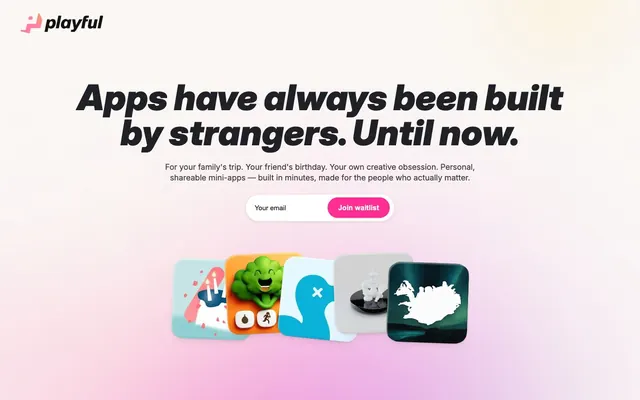
Preview image. Unlock full-res
Gradient Playground
Color palette
CTA buttons, accented links, and vibrant highlights — this vivid pink defines primary interactivity and branded elements
Primary text, deep neutrals for icons and borders. This near-black provides strong contrast against light surfaces
Primary page background, footer background, and subtle secondary button backgrounds. It provides a warm, soft base; Hero section and key visual backgrounds – a soft, multi-hued gradient establishing a playful and spacious atmosphere
Deepest text for headlines and critical user interface elements, providing absolute contrast. Also used for dark component backgrounds and shadows
Card backgrounds, section headers, and dark surface accents
Headline text for secondary sections
Subtle borders and dividers, providing visual structure without harsh lines
Input fields, content backgrounds within cards, and for text on dark backgrounds
Input field text, placeholder text, and muted body copy
Delicate borders and secondary structural elements
Darkest background for subtle overlays or components
Typography
- Weights
- 400, 500, 600, 700, 900
- Sizes
- 14px, 16px, 18px, 26px, 30px, 70px, 79px
- Line height
- 1, 1.15, 1.19, 1.2, 1.23, 1.33, 1.7
- Letter spacing
- -0.002
- Fallback
- system-ui, sans-serif
The primary typeface for all text. Its weights are used for impactful headlines at larger sizes and for clear, concise body text. The tight letter spacing for display sizes gives it a modern, compact feel.
- Weights
- 400, 600, 700
- Sizes
- 13px, 15px, 16px, 20px
- Line height
- 1.2, 1.4
- Fallback
- Helvetica Neue, Helvetica, sans-serif
Used for accessibility-focused elements like button labels and form inputs, providing robust legibility.
Spacing & shape
Elevation
Components
Transparent background, 'Midnight Ink' (0f172a) text, no border or explicit radius. Padding: 12px vertical, 32px horizontal.
Filled with 'Vivacious Pink' (ff2e95), 'Frost Canvas' (f6f2ee) text, 99px border-radius, giving it a pill shape. Padding: 14px vertical, 24px horizontal. Arial 600 at 15px.
Filled with 'Frost Canvas' (f6f2ee), 'Vivacious Pink' (ff2e95) text, 50% border-radius for a perfect circle. No padding specified (implied from 0px values).
Background 'Deep Graphite' (111111), 44px border-radius. Shadow: rgba(0, 0, 0, 0.22) 0px 32px 80px 0px, rgba(0, 0, 0, 0.08) 0px 2px 8px 0px.
Transparent background, 'Slate Gray' (414040) text, 'Slate Gray' (414040) border. No explicit border-radius (implied from 0px values). Arial 400 at 16px.
Guidelines
- Always use a generous `sectionGap` of 113px to maintain spaciousness between primary content blocks.
- Apply `border-radius: 44px` to article cards and larger UI containers to soften surfaces and align with the playful aesthetic.
- Utilize 'Vivacious Pink' (#ff2e95) exclusively for primary calls to action, active navigation states, and key interactive highlights.
- Ensure all primary headings use Inter font with `letter-spacing: -0.002em` to achieve a compact, signature appearance.
- Prioritize 'Frost Canvas' (#f6f2ee) for main page backgrounds to maintain a light and airy feel.
- Employ the dual shadow `rgba(0, 0, 0, 0.22) 0px 32px 80px 0px, rgba(0, 0, 0, 0.08) 0px 2px 8px 0px` for elevated cards.
- Use 'Midnight Ink' (#0f172a) for body text and secondary element borders for strong contrast and clarity.
- Do not use dark backgrounds for sections that contain extensive body copy; maintain a light background to preserve readability.
- Avoid arbitrary border radii; stick to the established system tokens: 44px for cards, 99px for buttons, 16px for images.
- Never introduce new chromatic colors outside of 'Vivacious Pink' (#ff2e95) and the brand gradient for UI elements.
- Do not use a default system font for any body text or headings; 'Inter' is paramount for brand identity.
- Avoid dense, information-heavy blocks without sufficient padding or `elementGap` of at least 10px.
- Do not add any additional box-shadows to elements other than cards; rely on the subtle elevation provided by background color differences.
About this system
ShowHide
Playful adopts a vibrant yet refined aesthetic with a spacious layout that emphasizes content clarity. Backgrounds feature subtle gradients, creating soft washes of color. Typography is predominantly dark and compact, giving a serious counterpoint to the playful accent colors. Interactive elements utilize a vivid pink, contrasting against a canvas dominated by off-white, imparting an energetic yet sophisticated feel.
The page adheres to a max-width of 1500px, centered on the screen. The hero section is full-bleed with a top custom gradient background, featuring a large, centered headline, subtext, and an input/button pair. Subsequent sections maintain consistent vertical spacing of 113px and alternate between centered text blocks and grids of feature cards. Navigation is a minimal top bar. Overall, the layout is spacious, allowing content to breathe.
The site uses a mix of playful, graphic-style illustrations for app icons and abstract, colorful gradients as hero and background elements. App icons are displayed as contained, rounded-corner elements, sometimes overlapping, showcasing a product-focused content. There are also simple, functional icons (like chevron arrows) that are outlined, and monochrome 'Midnight Ink' or 'Slate Gray'. Imagery serves primarily as decorative atmosphere and product showcase, with a medium density relative to text.
Reminiscent of Figma, Linear, Notion, Stripe.
# Playful — Style Reference
> Gradient Playground

**Theme:** light

**Site:** https://playful.software

Playful adopts a vibrant yet refined aesthetic with a spacious layout that emphasizes content clarity. Backgrounds feature subtle gradients, creating soft washes of color. Typography is predominantly dark and compact, giving a serious counterpoint to the playful accent colors. Interactive elements utilize a vivid pink, contrasting against a canvas dominated by off-white, imparting an energetic yet sophisticated feel.

## Tokens — Colors

| Name | Value | Token | Role |
|------|------|------|------|
| Vivacious Pink | `#ff2e95` | `--color-vivacious-pink` | CTA buttons, accented links, and vibrant highlights — this vivid pink defines primary interactivity and branded elements |
| Midnight Ink | `#0f172a` | `--color-midnight-ink` | Primary text, deep neutrals for icons and borders. This near-black provides strong contrast against light surfaces |
| Frost Canvas | `#f6f2ee` | `--color-frost-canvas` | Primary page background, footer background, and subtle secondary button backgrounds. It provides a warm, soft base; Hero section and key visual backgrounds – a soft, multi-hued gradient establishing a playful and spacious atmosphere |
| Pitch Black | `#000000` | `--color-pitch-black` | Deepest text for headlines and critical user interface elements, providing absolute contrast. Also used for dark component backgrounds and shadows |
| Deep Graphite | `#111111` | `--color-deep-graphite` | Card backgrounds, section headers, and dark surface accents |
| Coal Text | `#202126` | `--color-coal-text` | Headline text for secondary sections |
| Pale Ash | `#e8e5e0` | `--color-pale-ash` | Subtle borders and dividers, providing visual structure without harsh lines |
| Cloud White | `#ffffff` | `--color-cloud-white` | Input fields, content backgrounds within cards, and for text on dark backgrounds |
| Slate Gray | `#414040` | `--color-slate-gray` | Input field text, placeholder text, and muted body copy |
| Light Taupe | `#e2dcd6` | `--color-light-taupe` | Delicate borders and secondary structural elements |
| Light Graphite | `#353535` | `--color-light-graphite` | Darkest background for subtle overlays or components |

## Tokens — Typography

### Inter
- **Substitute:** system-ui, sans-serif
- **Weights:** 400, 500, 600, 700, 900
- **Sizes:** 14px, 16px, 18px, 26px, 30px, 70px, 79px
- **Line height:** 1, 1.15, 1.19, 1.2, 1.23, 1.33, 1.7
- **Letter spacing:** -0.002
- **Role:** The primary typeface for all text. Its weights are used for impactful headlines at larger sizes and for clear, concise body text. The tight letter spacing for display sizes gives it a modern, compact feel.

### Arial
- **Substitute:** Helvetica Neue, Helvetica, sans-serif
- **Weights:** 400, 600, 700
- **Sizes:** 13px, 15px, 16px, 20px
- **Line height:** 1.2, 1.4
- **Role:** Used for accessibility-focused elements like button labels and form inputs, providing robust legibility.

## Tokens — Type Scale

Augmented Fourth (1.414) from 16px base.

| Role | Size | Line height | Letter spacing |
|------|------|------|------|
| caption | 13px | 1.4 | — |
| body | 16px | 1.2 | -0.002em |
| subheading | 26px | 1.33 | -0.002em |
| heading-sm | 30px | 1.23 | -0.002em |
| heading | 70px | 1.15 | -0.002em |
| display | 79px | 1 | -0.002em |

## Tokens — Spacing

- **Max width:** 1500px
- **Section gap:** 113px
- **Card padding:** 12px
- **Element gap:** 10px

## Tokens — Radius

- **Buttons:** 99px
- **Cards:** 44px
- **Images:** 16px
- **tags:** 999px

## Tokens — Elevation

- **Feature Card:** `rgba(0, 0, 0, 0.22) 0px 32px 80px 0px, rgba(0, 0, 0, 0.08) 0px 2px 8px 0px`

## Layout

The page adheres to a max-width of 1500px, centered on the screen. The hero section is full-bleed with a top custom gradient background, featuring a large, centered headline, subtext, and an input/button pair. Subsequent sections maintain consistent vertical spacing of 113px and alternate between centered text blocks and grids of feature cards. Navigation is a minimal top bar. Overall, the layout is spacious, allowing content to breathe.

## Imagery

The site uses a mix of playful, graphic-style illustrations for app icons and abstract, colorful gradients as hero and background elements. App icons are displayed as contained, rounded-corner elements, sometimes overlapping, showcasing a product-focused content. There are also simple, functional icons (like chevron arrows) that are outlined, and monochrome 'Midnight Ink' or 'Slate Gray'. Imagery serves primarily as decorative atmosphere and product showcase, with a medium density relative to text.

## Components

### Ghost Button
*Navigational or secondary actions where visual weight should be minimal.*

Transparent background, 'Midnight Ink' (0f172a) text, no border or explicit radius. Padding: 12px vertical, 32px horizontal.

### Primary Action Button
*Main calls to action.*

Filled with 'Vivacious Pink' (ff2e95), 'Frost Canvas' (f6f2ee) text, 99px border-radius, giving it a pill shape. Padding: 14px vertical, 24px horizontal. Arial 600 at 15px.

### Circular Secondary Button
*Icon-only or small, focused interactive elements.*

Filled with 'Frost Canvas' (f6f2ee), 'Vivacious Pink' (ff2e95) text, 50% border-radius for a perfect circle. No padding specified (implied from 0px values).

### Feature Card
*Displaying product features or content blocks.*

Background 'Deep Graphite' (111111), 44px border-radius. Shadow: rgba(0, 0, 0, 0.22) 0px 32px 80px 0px, rgba(0, 0, 0, 0.08) 0px 2px 8px 0px.

### Input Field
*Collecting user data.*

Transparent background, 'Slate Gray' (414040) text, 'Slate Gray' (414040) border. No explicit border-radius (implied from 0px values). Arial 400 at 16px.

## Guidelines

### Do

- Always use a generous `sectionGap` of 113px to maintain spaciousness between primary content blocks.
- Apply `border-radius: 44px` to article cards and larger UI containers to soften surfaces and align with the playful aesthetic.
- Utilize 'Vivacious Pink' (#ff2e95) exclusively for primary calls to action, active navigation states, and key interactive highlights.
- Ensure all primary headings use Inter font with `letter-spacing: -0.002em` to achieve a compact, signature appearance.
- Prioritize 'Frost Canvas' (#f6f2ee) for main page backgrounds to maintain a light and airy feel.
- Employ the dual shadow `rgba(0, 0, 0, 0.22) 0px 32px 80px 0px, rgba(0, 0, 0, 0.08) 0px 2px 8px 0px` for elevated cards.
- Use 'Midnight Ink' (#0f172a) for body text and secondary element borders for strong contrast and clarity.

### Don't

- Do not use dark backgrounds for sections that contain extensive body copy; maintain a light background to preserve readability.
- Avoid arbitrary border radii; stick to the established system tokens: 44px for cards, 99px for buttons, 16px for images.
- Never introduce new chromatic colors outside of 'Vivacious Pink' (#ff2e95) and the brand gradient for UI elements.
- Do not use a default system font for any body text or headings; 'Inter' is paramount for brand identity.
- Avoid dense, information-heavy blocks without sufficient padding or `elementGap` of at least 10px.
- Do not add any additional box-shadows to elements other than cards; rely on the subtle elevation provided by background color differences.

## Agent Prompt Guide

Quick Color Reference:
text: #0f172a
background: #f6f2ee
border: #e8e5e0
accent: #ff2e95
primary action: #ff2e95 (filled action)

Example Component Prompts:
Create a Primary Action Button: #ff2e95 background, #000000 text, 9999px radius, compact pill padding. Use this filled treatment for the main CTA.

Create a Feature Card: Background 'Deep Graphite' (111111), 44px border-radius, shadow 'rgba(0, 0, 0, 0.22) 0px 32px 80px 0px, rgba(0, 0, 0, 0.08) 0px 2px 8px 0px'. Content inside should use Inter 16px weight 400 in 'Cloud White' (ffffff) for body, with 12px card padding.

Create a Ghost Button: Background transparent, 'Midnight Ink' (0f172a) text using Arial 16px weight 400. Padding: 12px vertical, 32px horizontal. Used for secondary navigation like 'When will it be available?'
More like this








Keep what you find
A free account saves references to boards and can send you a weekly email of picks based on what you save.
To see every result, go Pro.