Preview image. Unlock full-res
Soft-edged digital canvas
Color palette
Primary text, main CTAs, active states, important headings — establishes a strong, professional presence
Decorative illustration elements, secondary text that still needs good contrast
Accent in illustrations, occasional decorative highlights
Red wash for highlight backgrounds, decorative bands, and soft emphasis behind content. Do not promote it to the primary CTA color
Page backgrounds, section separators, underlaying a delicate blush
Card surfaces, button backgrounds, primary text for dark backgrounds, navigation elements
Muted text, inactive navigation items, subtle borders
Hairline borders, subtle dividers, less emphasized elements
Border for ghost buttons and card outlines
Strongest text contrast, decorative elements in illustrations when crisp contrast is needed
Typography
- Weights
- 400, 500, 600, 700
- Sizes
- 14px, 15px, 16px, 18px, 20px, 22px, 25px
- Line height
- 1, 1.13, 1.2, 1.57, 1.58, 1.67, 1.7, 1.88
- Letter spacing
- -0.1870em
- Fallback
- Inter
Provides a clean, geometric sans-serif for most UI elements, including body text, navigation, and buttons. Its compact tracking at smaller sizes gives it a modern, efficient feel, while larger text is more generously spaced.
- Weights
- 400, 700
- Sizes
- 21px, 27px, 40px
- Line height
- 1.44
- Letter spacing
- normal
- Fallback
- Lora
Used sparingly for headings, its seriffed elegance adds a touch of classic sophistication, contrasting with the geometric sans-serif to create hierarchical distinction.
Spacing & shape
Components
Solid Inkwell Indigo background with True White text. Sharp, square corners at 0px radius. Padding: 18px vertical, 20px horizontal. Strong visual call to action.
True White background with Inkwell Indigo text and a 1px Inkwell Indigo border. Sharp, square corners at 0px radius. Padding: 18px vertical, 20px horizontal. Less visually dominant than the primary.
A Firebrick Red background with a 0px border radius and 11px vertical, 14-20px horizontal padding. White text, typically Georgia Bold.
Ash Gray text for inactive states. When active, text shifts to Inkwell Indigo or uses a Firebrick Red background for button-style entries. No distinct background or border.
Transparent background with no box shadow or border, relying on Canvas Pink background for visual separation. Padding 75px vertical, 55px horizontal. Corners are sharp at 0px radius.
True White background with 8px border radius. Features a mix of Inkwell Indigo and Ash Gray text for instructions, and a specific Outline Gray border for internal action buttons.
Guidelines
- Use Inkwell Indigo (#090335) for primary action backgrounds and all major headings.
- Always apply a 0px border-radius to all buttons and cards, maintaining sharp, clean edges.
- Utilize Canvas Pink (#fff4f2) as the foundational background color for most page sections.
- Reserve Firebrick Red (#fc736c) sparingly for high-visibility navigation buttons or active states.
- Employ Gilroy for all body text, navigation items, and button labels, applying '-0.1870em' letter spacing for compact readability.
- Ensure all interactive elements like buttons and navigation links have a minimum vertical padding of 18px and horizontal padding of 20px.
- Structure pages with a maximum content width of 1105px, horizontally centered.
- Do not introduce rounded corners on any primary UI elements unless specifically for a modal or pop-up like the cookie consent (8px).
- Avoid using highly saturated, non-brand colors outside of illustrations, restricting the palette to Inkwell Indigo, Firebrick Red, and neutral tones.
- Do not deviate from the specified Gilroy and Georgia font families; introducing other typefaces will disrupt the brand's typographic consistency.
- Do not use generic gray tones for text. Instead, use Ash Gray (#434352) for muted text and Inkwell Indigo (#090335) for primary text.
- Avoid heavy drop shadows or complex gradients. The design relies on flat surfaces and clear color contrasts.
- Do not use smaller padding than 18px vertically / 20px horizontally for buttons. Maintain the generous button sizing.
- Do not place content that extends beyond the 1105px main content width.
About this system
ShowHide
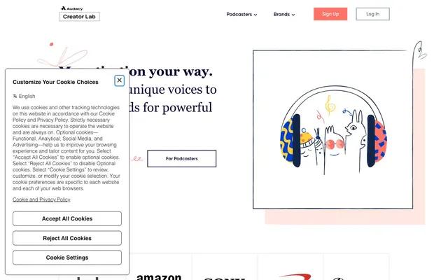
Podcorn's design system channels a playful yet professional aesthetic through a light, spacious canvas. Dominated by a soft coral-tinged white and deep indigo accents, the interface feels inviting while maintaining clear hierarchy. Typography is compact and confident, paired with a distinct rounded-corner treatment for button-like elements that softens edges. Decorative illustrations provide visual delight without distracting from content, ensuring a streamlined user experience.
The page primarily uses a contained, centered layout with a maximum width of 1105px for content. The hero section can be full-bleed with a large background illustration, featuring a prominent centered headline and action buttons. Vertical rhythm is established through consistent section gaps (around 75px), often with alternating background colors between True White and Canvas Pink. Content sections frequently employ a two-column layout with text on one side and an illustrative graphic on the other. Navigation is a sticky top bar with brand coloring and bold action buttons.
The site uses lively, playful line illustrations with bright, moderate, and vivid custom color palettes (Coral Sunset, Deep Ocean, Firebrick Red) set against a white or Canvas Pink background. Illustrations are used decoratively to add personality and visually segment content, rather than to convey specific product points. They typically feature outlined figures and abstract shapes, often enclosed within a simple square or rectangular frame, and sometimes integrate subtle brand color accents. Icons are generally minimalist and outlined, mirroring the illustration style.
Reminiscent of Airtable, Mailchimp, Webflow, Canva.
# Podcorn — Style Reference
> Soft-edged digital canvas

**Theme:** light

**Site:** https://podcorn.com

Podcorn's design system channels a playful yet professional aesthetic through a light, spacious canvas. Dominated by a soft coral-tinged white and deep indigo accents, the interface feels inviting while maintaining clear hierarchy. Typography is compact and confident, paired with a distinct rounded-corner treatment for button-like elements that softens edges. Decorative illustrations provide visual delight without distracting from content, ensuring a streamlined user experience.

## Tokens — Colors

| Name | Value | Token | Role |
|------|------|------|------|
| Inkwell Indigo | `#090335` | `--color-inkwell-indigo` | Primary text, main CTAs, active states, important headings — establishes a strong, professional presence |
| Deep Ocean | `#132645` | `--color-deep-ocean` | Decorative illustration elements, secondary text that still needs good contrast |
| Coral Sunset | `#ffb0a1` | `--color-coral-sunset` | Accent in illustrations, occasional decorative highlights |
| Firebrick Red | `#fc736c` | `--color-firebrick-red` | Red wash for highlight backgrounds, decorative bands, and soft emphasis behind content. Do not promote it to the primary CTA color |
| Canvas Pink | `#fff4f2` | `--color-canvas-pink` | Page backgrounds, section separators, underlaying a delicate blush |
| True White | `#ffffff` | `--color-true-white` | Card surfaces, button backgrounds, primary text for dark backgrounds, navigation elements |
| Ash Gray | `#434352` | `--color-ash-gray` | Muted text, inactive navigation items, subtle borders |
| Stone Grey | `#8993a2` | `--color-stone-grey` | Hairline borders, subtle dividers, less emphasized elements |
| Outline Gray | `#d8d8d8` | `--color-outline-gray` | Border for ghost buttons and card outlines |
| Charcoal Black | `#000000` | `--color-charcoal-black` | Strongest text contrast, decorative elements in illustrations when crisp contrast is needed |

## Tokens — Typography

### Gilroy
- **Substitute:** Inter
- **Weights:** 400, 500, 600, 700
- **Sizes:** 14px, 15px, 16px, 18px, 20px, 22px, 25px
- **Line height:** 1, 1.13, 1.2, 1.57, 1.58, 1.67, 1.7, 1.88
- **Letter spacing:** -0.1870em
- **Role:** Provides a clean, geometric sans-serif for most UI elements, including body text, navigation, and buttons. Its compact tracking at smaller sizes gives it a modern, efficient feel, while larger text is more generously spaced.

### Georgia
- **Substitute:** Lora
- **Weights:** 400, 700
- **Sizes:** 21px, 27px, 40px
- **Line height:** 1.44
- **Letter spacing:** normal
- **Role:** Used sparingly for headings, its seriffed elegance adds a touch of classic sophistication, contrasting with the geometric sans-serif to create hierarchical distinction.

## Tokens — Type Scale

Perfect Fourth (1.333) from 16px base.

| Role | Size | Line height | Letter spacing |
|------|------|------|------|
| caption | 14px | 1.58 | -0.19px |
| body | 16px | 1.67 | -0.19px |
| subheading | 18px | 1.57 | -0.19px |
| heading | 25px | 1.2 | -0.19px |
| heading-lg | 40px | 1.44 | — |

## Tokens — Spacing

- **Max width:** 1105px
- **Section gap:** 75px
- **Card padding:** 55px
- **Element gap:** 20px

## Tokens — Radius

- **Buttons:** 0px
- **Cards:** 0px
- **modal:** 8px

## Layout

The page primarily uses a contained, centered layout with a maximum width of 1105px for content. The hero section can be full-bleed with a large background illustration, featuring a prominent centered headline and action buttons. Vertical rhythm is established through consistent section gaps (around 75px), often with alternating background colors between True White and Canvas Pink. Content sections frequently employ a two-column layout with text on one side and an illustrative graphic on the other. Navigation is a sticky top bar with brand coloring and bold action buttons.

## Imagery

The site uses lively, playful line illustrations with bright, moderate, and vivid custom color palettes (Coral Sunset, Deep Ocean, Firebrick Red) set against a white or Canvas Pink background. Illustrations are used decoratively to add personality and visually segment content, rather than to convey specific product points. They typically feature outlined figures and abstract shapes, often enclosed within a simple square or rectangular frame, and sometimes integrate subtle brand color accents. Icons are generally minimalist and outlined, mirroring the illustration style.

## Components

### Filled Primary Button
*Primary action button*

Solid Inkwell Indigo background with True White text. Sharp, square corners at 0px radius. Padding: 18px vertical, 20px horizontal. Strong visual call to action.

### Outlined Secondary Button
*Secondary action button, ghost style*

True White background with Inkwell Indigo text and a 1px Inkwell Indigo border. Sharp, square corners at 0px radius. Padding: 18px vertical, 20px horizontal. Less visually dominant than the primary.

### Navigation Button
*Navigational link within the header*

A Firebrick Red background with a 0px border radius and 11px vertical, 14-20px horizontal padding. White text, typically Georgia Bold.

### Navigation Link
*Standard navigation text link*

Ash Gray text for inactive states. When active, text shifts to Inkwell Indigo or uses a Firebrick Red background for button-style entries. No distinct background or border.

### Content Card
*Container for content sections*

Transparent background with no box shadow or border, relying on Canvas Pink background for visual separation. Padding 75px vertical, 55px horizontal. Corners are sharp at 0px radius.

### Cookie Consent Modal
*Overlay for cookie preferences*

True White background with 8px border radius. Features a mix of Inkwell Indigo and Ash Gray text for instructions, and a specific Outline Gray border for internal action buttons.

## Guidelines

### Do

- Use Inkwell Indigo (#090335) for primary action backgrounds and all major headings.
- Always apply a 0px border-radius to all buttons and cards, maintaining sharp, clean edges.
- Utilize Canvas Pink (#fff4f2) as the foundational background color for most page sections.
- Reserve Firebrick Red (#fc736c) sparingly for high-visibility navigation buttons or active states.
- Employ Gilroy for all body text, navigation items, and button labels, applying '-0.1870em' letter spacing for compact readability.
- Ensure all interactive elements like buttons and navigation links have a minimum vertical padding of 18px and horizontal padding of 20px.
- Structure pages with a maximum content width of 1105px, horizontally centered.

### Don't

- Do not introduce rounded corners on any primary UI elements unless specifically for a modal or pop-up like the cookie consent (8px).
- Avoid using highly saturated, non-brand colors outside of illustrations, restricting the palette to Inkwell Indigo, Firebrick Red, and neutral tones.
- Do not deviate from the specified Gilroy and Georgia font families; introducing other typefaces will disrupt the brand's typographic consistency.
- Do not use generic gray tones for text. Instead, use Ash Gray (#434352) for muted text and Inkwell Indigo (#090335) for primary text.
- Avoid heavy drop shadows or complex gradients. The design relies on flat surfaces and clear color contrasts.
- Do not use smaller padding than 18px vertically / 20px horizontally for buttons. Maintain the generous button sizing.
- Do not place content that extends beyond the 1105px main content width.

## Agent Prompt Guide

Quick Color Reference:
text: #090335
background: #fff4f2
border: #434352
accent: #fc736c
primary action: #090335 (filled action)

Example Component Prompts:
Create a hero section with a centered headline: 'Monetization your way.' using Georgia weight 700 at 40px, #090335, normal letter spacing. Below it, a 'For Brands' button with #090335 background, #ffffff text, 0px radius, 18px vertical, 20px horizontal padding, and a 'For Podcasters' button with #ffffff background, #090335 text, #090335 border, 0px radius, 18px vertical, 20px horizontal padding. The background of the hero section is Canvas Pink (#fff4f2).

Create a content card for 'Monetize Effortlessly': no background (transparent), no border, no shadow, 0px radius. Inside, use a heading 'Monetize Effortlessly' at 25px Gilroy weight 700, #090335, letter spacing -0.1870em. The body text is Gilroy weight 400 at 16px, #090335, lineHeight 1.67, letter spacing -0.1870em. Card padding is 75px vertical, 55px horizontal.

Generate a top navigation bar: Canvas Pink (#fff4f2) background. Left aligned logo. Right aligned links for 'Podcasters', 'Brands' (Gilroy weight 400, 16px, #434352, letter spacing -0.1870em). A 'Sign Up' button with Firebrick Red (#fc736c) background, #ffffff text, 0px radius, 11px vertical, 14px horizontal padding. A 'Log In' button with #ffffff background, #090335 text, #d8d8d8 border, 0px radius, 11px vertical, 14px horizontal padding.
More like this







Keep what you find
A free account saves references to boards and can send you a weekly email of picks based on what you save.
To see every result, go Pro.