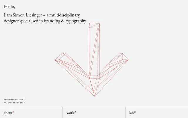
Preview image. Unlock full-res
Architectural blueprint on warm grey
Color palette
Orange outline accent for tags, dividers, and focused UI edges. Do not promote it to the primary CTA color
Page backgrounds, subtle surface elevation, text for subtle distinctions
Primary text, section backgrounds, strong surface accents
Headlines, strong body text, primary borders
Subtle borders, secondary text in specific contexts
Typography
- Weights
- 400
- Sizes
- 10px
- Line height
- 1.2
- Letter spacing
- normal
- Fallback
- serif
Captions, annotations, and subtle metadata text. Its classic feel grounds the starkness elsewhere.
- Weights
- 400
- Sizes
- 25px, 29px, 36px
- Line height
- 0.86, 1, 1.22, 1.28
- Letter spacing
- 0.016em
- Fallback
- Garamond
Headlines and prominent body text. The slightly generous letter-spacing provides an open, refined feel typical of editorial design.
- Weights
- 400
- Sizes
- 12px
- Line height
- 0.83, 1.2, 1.67
- Letter spacing
- 0.017em
- Fallback
- Helvetica Neue
Interactive links and compact body text. Specific font features enhance legibility for numerical and capitalized content, fitting for a portfolio site.
Spacing & shape
Components
Each navigation item appears as `HelveticaRg` 12px, Midnight Graphite text, with an `↗` icon in Navigation Ember. The active state or interaction reveals a 1px solid Navigation Ember border below, while the inactive state has a 1px solid Midnight Graphite border. The navigation section itself has a Canvas Fog background and generous vertical padding.
Contact information like email and phone number are displayed in `HelveticaRg` 12px, Midnight Graphite text, with the `↗` icon also in Midnight Graphite, distinguished only by its underline on hover rather than an accent color or border.
Content is often presented within distinct panels defined by 1px solid Midnight Graphite borders, with a Canvas Fog background. These panels use padding of 30px on left/right and 10px or 12px vertical padding where content is listed. The effect is one of contained modules on the page.
Each item within a list like 'services', 'awards', or 'partners' is rendered in `HelveticaRg` 12px Midnight Graphite, with a 1px solid Midnight Graphite border on its left edge and a 10-12px padding below. This creates a visually structured ledger effect.
Guidelines
- Use Deep Ink (#000000) for all headings to establish strong visual presence, with at least 30px left/right padding.
- Employ Canvas Fog (#f2f2f2) as the primary page background and for subtle, recessed content areas.
- Define clear content boundaries using 1px solid Midnight Graphite (#181818) borders, especially for section dividers and list elements.
- Reserve Navigation Ember (#fc523b) exclusively for the arrow icon within footer navigation links and their hover/active states.
- Maintain a spacious rhythm between content blocks by applying section gaps of 160px vertically.
- Apply `GaramondRg` with '0.016em' letter-spacing for all significant body text and subheadings to ensure a refined editorial aesthetic.
- Use `HelveticaRg` with its specific font features for all interactive links and compact informational text (e.g., contact info, small notes).
- Do not use Navigation Ember (#fc523b) for any purpose other than navigation directional cues or their associated borders.
- Avoid using drop shadows or heavy elevation; prefer flat surfaces and hairline borders for visual separation.
- Do not introduce new typefaces; rely solely on Times, GaramondRg, and HelveticaRg.
- Refrain from using strong, solid background colors other than Midnight Graphite (#181818) or Canvas Fog (#f2f2f2) for structural elements.
- Avoid decorative imagery; stick to minimalist wireframe-style graphics or pure UI elements.
- Do not use highly saturated colors for text or backgrounds outside of the defined accent color for navigation.
- Do not introduce rounded corners; maintain sharp, crisp edges for all UI elements to uphold the architectural aesthetic.
About this system
ShowHide
Simon Liesinger's design system evokes an architectural blueprint on a muted canvas, utilizing precise typography and a stark achromatic palette. It emphasizes clear visual boundaries and a spacious layout, highlighted by subtle hairline borders. A single vivid red accent is reserved exclusively for navigation cues, drawing attention without visual clutter. The overall effect is one of restrained precision, where information is carefully presented with minimal adornment.
The page primarily uses a full-bleed, vertically stacking layout. The hero section features large, centered text elements over the Canvas Fog background, with abstract graphics. Subsequent sections alternate between full-width content panes and structured grid-like displays (e.g., service/award lists) using the defined border patterns. The footer is a full-width Midnight Graphite bar. The overall rhythm is spacious with significant section gaps and consistent padding for encased content, creating a well-organized, almost grid-paper feel.
The site uses abstract, red-lined wireframe 3D graphics (like the down arrow) as the primary visual element, serving as decorative atmosphere rather than conveying content. Icons, such as the '↗' for external links, are minimalistic, either line-drawn in text color or the accent color for navigation. There are no photographs or complex illustrations, contributing to a text-dominant, clean interface where graphics serve as geometric punctuation.
Reminiscent of Awwwards, Build in Public, Bureau for Visual Affairs, Grilli Type.
# Simon Liesinger — Style Reference
> Architectural blueprint on warm grey

**Theme:** light

**Site:** https://www.liesingers.com

Simon Liesinger's design system evokes an architectural blueprint on a muted canvas, utilizing precise typography and a stark achromatic palette. It emphasizes clear visual boundaries and a spacious layout, highlighted by subtle hairline borders. A single vivid red accent is reserved exclusively for navigation cues, drawing attention without visual clutter. The overall effect is one of restrained precision, where information is carefully presented with minimal adornment.

## Tokens — Colors

| Name | Value | Token | Role |
|------|------|------|------|
| Navigation Ember | `#fc523b` | `--color-navigation-ember` | Orange outline accent for tags, dividers, and focused UI edges. Do not promote it to the primary CTA color |
| Canvas Fog | `#f2f2f2` | `--color-canvas-fog` | Page backgrounds, subtle surface elevation, text for subtle distinctions |
| Midnight Graphite | `#181818` | `--color-midnight-graphite` | Primary text, section backgrounds, strong surface accents |
| Deep Ink | `#000000` | `--color-deep-ink` | Headlines, strong body text, primary borders |
| Muted Slate | `#6e6e6e` | `--color-muted-slate` | Subtle borders, secondary text in specific contexts |

## Tokens — Typography

### Times
- **Substitute:** serif
- **Weights:** 400
- **Sizes:** 10px
- **Line height:** 1.2
- **Letter spacing:** normal
- **Role:** Captions, annotations, and subtle metadata text. Its classic feel grounds the starkness elsewhere.

### GaramondRg
- **Substitute:** Garamond
- **Weights:** 400
- **Sizes:** 25px, 29px, 36px
- **Line height:** 0.86, 1, 1.22, 1.28
- **Letter spacing:** 0.016em
- **Role:** Headlines and prominent body text. The slightly generous letter-spacing provides an open, refined feel typical of editorial design.

### HelveticaRg
- **Substitute:** Helvetica Neue
- **Weights:** 400
- **Sizes:** 12px
- **Line height:** 0.83, 1.2, 1.67
- **Letter spacing:** 0.017em
- **Role:** Interactive links and compact body text. Specific font features enhance legibility for numerical and capitalized content, fitting for a portfolio site.

## Tokens — Type Scale

Perfect Fifth (1.5) from 10px base.

| Role | Size | Line height | Letter spacing |
|------|------|------|------|
| caption | 10px | 1.2 | — |
| subheading | 25px | 1.28 | 0.4px |
| heading | 29px | 1.22 | 0.464px |
| display | 36px | 0.86 | 0.576px |

## Tokens — Spacing

- **Section gap:** 160px
- **Card padding:** 30px
- **Element gap:** 10-40px

## Tokens — Radius

- **Default:** 0px

## Layout

The page primarily uses a full-bleed, vertically stacking layout. The hero section features large, centered text elements over the Canvas Fog background, with abstract graphics. Subsequent sections alternate between full-width content panes and structured grid-like displays (e.g., service/award lists) using the defined border patterns. The footer is a full-width Midnight Graphite bar. The overall rhythm is spacious with significant section gaps and consistent padding for encased content, creating a well-organized, almost grid-paper feel.

## Imagery

The site uses abstract, red-lined wireframe 3D graphics (like the down arrow) as the primary visual element, serving as decorative atmosphere rather than conveying content. Icons, such as the '↗' for external links, are minimalistic, either line-drawn in text color or the accent color for navigation. There are no photographs or complex illustrations, contributing to a text-dominant, clean interface where graphics serve as geometric punctuation.

## Components

### Navigation Link
*Primary site navigation links at the footer.*

Each navigation item appears as `HelveticaRg` 12px, Midnight Graphite text, with an `↗` icon in Navigation Ember. The active state or interaction reveals a 1px solid Navigation Ember border below, while the inactive state has a 1px solid Midnight Graphite border. The navigation section itself has a Canvas Fog background and generous vertical padding.

### Contact Link
*Interactive contact information links.*

Contact information like email and phone number are displayed in `HelveticaRg` 12px, Midnight Graphite text, with the `↗` icon also in Midnight Graphite, distinguished only by its underline on hover rather than an accent color or border.

### Section Divider Panel
*Separating content sections and categories.*

Content is often presented within distinct panels defined by 1px solid Midnight Graphite borders, with a Canvas Fog background. These panels use padding of 30px on left/right and 10px or 12px vertical padding where content is listed. The effect is one of contained modules on the page.

### Work/Award List Item
*Displaying entries in lists of work or awards.*

Each item within a list like 'services', 'awards', or 'partners' is rendered in `HelveticaRg` 12px Midnight Graphite, with a 1px solid Midnight Graphite border on its left edge and a 10-12px padding below. This creates a visually structured ledger effect.

## Guidelines

### Do

- Use Deep Ink (#000000) for all headings to establish strong visual presence, with at least 30px left/right padding.
- Employ Canvas Fog (#f2f2f2) as the primary page background and for subtle, recessed content areas.
- Define clear content boundaries using 1px solid Midnight Graphite (#181818) borders, especially for section dividers and list elements.
- Reserve Navigation Ember (#fc523b) exclusively for the arrow icon within footer navigation links and their hover/active states.
- Maintain a spacious rhythm between content blocks by applying section gaps of 160px vertically.
- Apply `GaramondRg` with '0.016em' letter-spacing for all significant body text and subheadings to ensure a refined editorial aesthetic.
- Use `HelveticaRg` with its specific font features for all interactive links and compact informational text (e.g., contact info, small notes).

### Don't

- Do not use Navigation Ember (#fc523b) for any purpose other than navigation directional cues or their associated borders.
- Avoid using drop shadows or heavy elevation; prefer flat surfaces and hairline borders for visual separation.
- Do not introduce new typefaces; rely solely on Times, GaramondRg, and HelveticaRg.
- Refrain from using strong, solid background colors other than Midnight Graphite (#181818) or Canvas Fog (#f2f2f2) for structural elements.
- Avoid decorative imagery; stick to minimalist wireframe-style graphics or pure UI elements.
- Do not use highly saturated colors for text or backgrounds outside of the defined accent color for navigation.
- Do not introduce rounded corners; maintain sharp, crisp edges for all UI elements to uphold the architectural aesthetic.

## Agent Prompt Guide

Quick Color Reference:
text: #000000
background: #f2f2f2
border: #181818
accent: #fc523b
primary action: no distinct CTA color

Example Component Prompts:
1. Create a hero text section: Background #f2f2f2, 'Hello,' heading: GaramondRg 36px, #000000, 0.016em letter-spacing. Subheading 'I am Simon Liesinger…': GaramondRg 29px, #000000, 0.016em letter-spacing.
2. Design a footer navigation bar: Background #181818. Each link 'about' uses HelveticaRg 12px, #181818. The '↗' icon and bottom border for active links are #fc523b. Padding above and below navigation links is 25px and 29px respectively.
3. Implement a 'services' list item: Text 'Brand Design & Strategy' using HelveticaRg 12px, #000000, with a 1px solid #181818 left border and 12px bottom padding. This item should be contained within a panel with 30px horizontal padding.
4. Compose a paragraph: Text 'Design is ever evolving...' using GaramondRg 25px, #181818, 0.016em letter-spacing, with 40px margin bottom separating it from the next element.
More like this









Keep what you find
A free account saves references to boards and can send you a weekly email of picks based on what you save.
To see every result, go Pro.