Preview image. Unlock full-res
Architectural blueprint on white marble
Color palette
Primary call-to-action buttons, interactive highlights, brand accent — signals key actions and captures attention against neutrals
Primary text, heading text, neutral button backgrounds, active states, dark borders
Page backgrounds, card backgrounds, inverse text for dark elements, light borders
Muted secondary text, helper text, inactive link text, subtle borders
Typography
- Weights
- 400, 500
- Sizes
- 14px, 16px, 17px, 20px, 24px, 42px
- Line height
- 1.1, 1.2, 1.4
- Letter spacing
- -0.03
- Fallback
- Helvetica Neue
Primary typeface for all UI elements, headings, body text, and interactive components. Its precision and varied weights establish a clear informational hierarchy.
- Weights
- 400
- Sizes
- 20px
- Line height
- 1.4
neue-haas-grotesk-text — detected in extracted data but not described by AI
Spacing & shape
Components
Transparent background, Storm Graphite text (#1a1a1a), 10px border radius, 8px vertical and 12px horizontal padding. Borders are implied by context, not explicitly rendered for a 'ghost' effect.
Midas Yellow background (#fbff2b), Storm Graphite text (#1a1a1a), 12px border radius, 0px vertical and 16px horizontal padding. Highly visible and contrasts sharply with neutral backgrounds.
Storm Graphite background (#1a1a1a), Canvas White text (#ffffff), 12px border radius, 0px vertical and 16px horizontal padding. Provides a strong alternative to the Midas Yellow.
Background rgba(255, 255, 255, 0.2), Canvas White text (#ffffff), 12px border radius, 6px vertical and 12px horizontal padding. Has a subtle transparent fill and light border.
Background rgba(26, 26, 26, 0.05), Storm Graphite text (#1a1a1a), 12px border radius, 6px vertical and 12px horizontal padding. Features a very subtle dark transparent fill.
Guidelines
- Use neueHaasGroteskText-500 for all headings to maintain concise visual impact.
- Apply Midas Yellow (#fbff2b) strictly for primary call-to-action buttons or critical interactive highlights.
- Ensure input fields use 6px vertical and 12px horizontal padding, with a 12px border radius.
- Maintain a default letter-spacing of -0.03em for all text, conveying a tightly set, modern feel.
- Utilize Canvas White (#ffffff) as the dominant page and card background for an expansive, clean canvas.
- Reserve Storm Graphite (#1a1a1a) for primary text, ensuring strong contrast against light backgrounds.
- Implement 10px radius for all buttons and interactive navigation elements for a consistent soft-rounded touch.
- Do not introduce new saturated colors; adhere to the Midas Yellow for accents and brand identity.
- Avoid heavy shadows or gradients; rely on minimal borders and background color changes for surface differentiation.
- Do not use letter-spacing other than the specified -0.03em or normal, to preserve typographic rhythm.
- Never use Ash Gray (#a3a3a3) for primary action text or backgrounds; it's reserved for muted elements.
- Do not use font weights other than 400 or 500 for neueHaasGroteskText; these are the only available weights for the system.
- Avoid arbitrary padding or margin values; stick to multiples of the 6px base unit or specified element/section gaps.
- Do not use large, decorative imagery; visual content should be contained and functional to support the UI-first approach.
About this system
ShowHide
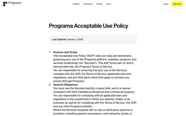
Programa employs a refined white-canvas aesthetic with crisp, confident typography as its primary visual communicator. A single vibrant yellow accent color is reserved exclusively for key calls to action, creating high contrast and immediate focus against the otherwise monochrome interface. Components are lightweight and unobtrusive, featuring thin borders and soft rounded corners, allowing content and functionality to take precedence without visual noise.
The page maintains a centered, contained layout for its main content, framed by responsive margins. The header is a sticky top bar with minimal navigation. Sections flow vertically with a consistent rhythm of 'comfortable' spacing and some sections having a larger 96px bottom padding. Content is primarily text-based, often presented in clear, readable stacks, with interactive elements like buttons and input fields seamlessly integrated rather than heavily framed. A primary content column often has left and right margins of 111px, or 236px for narrower sections, creating a focused reading area. There are no clear alternating color bands or complex grid structures beyond simple content blocks.
This site predominantly uses UI-focused content rather than decorative imagery. Where visible (e.g., product screenshots), these are typically clean, direct captures of the software interface, presented without heavy styling or complex compositions. Icons, if present, tend to be minimal outline styles, supporting functionality rather than aesthetic flourish. The visual density is text-dominant, allowing the typography and clean layout to convey information directly.
Reminiscent of Linear, Framer, Superhuman, Height.
# Programa — Style Reference
> Architectural blueprint on white marble

**Theme:** light

**Site:** https://programa.design

Programa employs a refined white-canvas aesthetic with crisp, confident typography as its primary visual communicator. A single vibrant yellow accent color is reserved exclusively for key calls to action, creating high contrast and immediate focus against the otherwise monochrome interface. Components are lightweight and unobtrusive, featuring thin borders and soft rounded corners, allowing content and functionality to take precedence without visual noise.

## Tokens — Colors

| Name | Value | Token | Role |
|------|------|------|------|
| Midas Yellow | `#fbff2b` | `--color-midas-yellow` | Primary call-to-action buttons, interactive highlights, brand accent — signals key actions and captures attention against neutrals |
| Storm Graphite | `#1a1a1a` | `--color-storm-graphite` | Primary text, heading text, neutral button backgrounds, active states, dark borders |
| Canvas White | `#ffffff` | `--color-canvas-white` | Page backgrounds, card backgrounds, inverse text for dark elements, light borders |
| Ash Gray | `#a3a3a3` | `--color-ash-gray` | Muted secondary text, helper text, inactive link text, subtle borders |

## Tokens — Typography

### neueHaasGroteskText
- **Substitute:** Helvetica Neue
- **Weights:** 400, 500
- **Sizes:** 14px, 16px, 17px, 20px, 24px, 42px
- **Line height:** 1.1, 1.2, 1.4
- **Letter spacing:** -0.03
- **Role:** Primary typeface for all UI elements, headings, body text, and interactive components. Its precision and varied weights establish a clear informational hierarchy.

### neue-haas-grotesk-text
- **Weights:** 400
- **Sizes:** 20px
- **Line height:** 1.4
- **Role:** neue-haas-grotesk-text — detected in extracted data but not described by AI

## Tokens — Type Scale

Perfect Fourth (1.333) from 16px base.

| Role | Size | Line height | Letter spacing |
|------|------|------|------|
| caption | 14px | 1.4 | -0.42px |
| body | 16px | 1.4 | -0.48px |
| subheading | 20px | 1.4 | -0.6px |
| heading | 24px | 1.2 | -0.72px |
| display | 42px | 1.1 | -1.26px |

## Tokens — Spacing

- **Section gap:** 96px
- **Card padding:** 12px
- **Element gap:** 12px

## Tokens — Radius

- **Buttons:** 10px
- **Inputs:** 10px
- **Cards:** 16px
- **navigation:** 10px

## Layout

The page maintains a centered, contained layout for its main content, framed by responsive margins. The header is a sticky top bar with minimal navigation. Sections flow vertically with a consistent rhythm of 'comfortable' spacing and some sections having a larger 96px bottom padding. Content is primarily text-based, often presented in clear, readable stacks, with interactive elements like buttons and input fields seamlessly integrated rather than heavily framed. A primary content column often has left and right margins of 111px, or 236px for narrower sections, creating a focused reading area. There are no clear alternating color bands or complex grid structures beyond simple content blocks.

## Imagery

This site predominantly uses UI-focused content rather than decorative imagery. Where visible (e.g., product screenshots), these are typically clean, direct captures of the software interface, presented without heavy styling or complex compositions. Icons, if present, tend to be minimal outline styles, supporting functionality rather than aesthetic flourish. The visual density is text-dominant, allowing the typography and clean layout to convey information directly.

## Components

### Neutral Ghost Button
*Secondary action or navigation item*

Transparent background, Storm Graphite text (#1a1a1a), 10px border radius, 8px vertical and 12px horizontal padding. Borders are implied by context, not explicitly rendered for a 'ghost' effect.

### Primary Action Button
*Main call to action*

Midas Yellow background (#fbff2b), Storm Graphite text (#1a1a1a), 12px border radius, 0px vertical and 16px horizontal padding. Highly visible and contrasts sharply with neutral backgrounds.

### Dark Filled Button
*Alternative primary action or prominent secondary action on light backgrounds*

Storm Graphite background (#1a1a1a), Canvas White text (#ffffff), 12px border radius, 0px vertical and 16px horizontal padding. Provides a strong alternative to the Midas Yellow.

### Light Input Field
*Standard input field on dark backgrounds*

Background rgba(255, 255, 255, 0.2), Canvas White text (#ffffff), 12px border radius, 6px vertical and 12px horizontal padding. Has a subtle transparent fill and light border.

### Dark Input Field
*Standard input field on light backgrounds*

Background rgba(26, 26, 26, 0.05), Storm Graphite text (#1a1a1a), 12px border radius, 6px vertical and 12px horizontal padding. Features a very subtle dark transparent fill.

## Guidelines

### Do

- Use neueHaasGroteskText-500 for all headings to maintain concise visual impact.
- Apply Midas Yellow (#fbff2b) strictly for primary call-to-action buttons or critical interactive highlights.
- Ensure input fields use 6px vertical and 12px horizontal padding, with a 12px border radius.
- Maintain a default letter-spacing of -0.03em for all text, conveying a tightly set, modern feel.
- Utilize Canvas White (#ffffff) as the dominant page and card background for an expansive, clean canvas.
- Reserve Storm Graphite (#1a1a1a) for primary text, ensuring strong contrast against light backgrounds.
- Implement 10px radius for all buttons and interactive navigation elements for a consistent soft-rounded touch.

### Don't

- Do not introduce new saturated colors; adhere to the Midas Yellow for accents and brand identity.
- Avoid heavy shadows or gradients; rely on minimal borders and background color changes for surface differentiation.
- Do not use letter-spacing other than the specified -0.03em or normal, to preserve typographic rhythm.
- Never use Ash Gray (#a3a3a3) for primary action text or backgrounds; it's reserved for muted elements.
- Do not use font weights other than 400 or 500 for neueHaasGroteskText; these are the only available weights for the system.
- Avoid arbitrary padding or margin values; stick to multiples of the 6px base unit or specified element/section gaps.
- Do not use large, decorative imagery; visual content should be contained and functional to support the UI-first approach.

## Agent Prompt Guide

Quick Color Reference:
text: #1a1a1a
background: #ffffff
border: #a3a3a3
accent: #fbff2b
primary action: #fbff2b (filled action)

Example Component Prompts:
1. Create a primary call-to-action button: Midas Yellow background (#fbff2b), Storm Graphite text (#1a1a1a), neueHaasGroteskText-400, 12px border radius, 0px vertical and 16px horizontal padding.
2. Design a standard form input field for a light background: Background rgba(26, 26, 26, 0.05), Storm Graphite text (#1a1a1a), neueHaasGroteskText-400, 12px border radius, 6px vertical and 12px horizontal padding.
3. Create a navigation link: Storm Graphite text (#1a1a1a), neueHaasGroteskText-400, no background. On hover, ensure text remains #1a1a1a.
More like this









Keep what you find
A free account saves references to boards and can send you a weekly email of picks based on what you save.
To see every result, go Pro.