Preview image. Unlock full-res
Midnight gradient with neon accents.
Color palette
Primary action buttons, active navigation items — a vivid, electric blue
Background for hero sections, creating a dynamic, immersive entry point
Background for feature cards, adding a vibrant and modern touch
Outlined button borders, text for secondary actions and highlights — vibrant violet
Outlined button borders, text for tertiary actions — a lighter, softer violet
Green accent for outlined action borders, linked labels, and lightweight interactive emphasis. Use as a supporting accent, not as a status color
Page background, primary surface for text and core content
Elevated card surfaces, provides depth against Canvas Deep
Shadow tint for elevated cards, adding a subtle indigo glow
Primary text, button text on colored backgrounds, navigation links
Secondary body text, helper text, subtle outlines
Tertiary body text, supporting information
Input field placeholder text, some link text
Input field borders
Outlined button borders and text on light backgrounds
Typography
- Weights
- 300, 400, 700
- Sizes
- 14px, 16px, 18px, 20px, 25px, 28px, 35px, 45px, 59px, 60px, 64px
- Line height
- 1.07, 1.11, 1.17, 1.25, 1.36, 1.39, 1.4, 1.43, 1.5, 1.57, 1.69
- Letter spacing
- -0.067em at 64px, -0.051em at 60px, -0.050em at 59px, -0.047em at 45px, -0.031em at 35px, 0.014em at 20px, 0.018em at 14px
- Fallback
- Avenir Next, Lato
Primary typeface for all headings, body text, and UI elements. Its clean sans-serif nature provides clarity against dark backgrounds, with a range of weights supporting hierarchy. Tighter tracking on larger headings enhances their presence without overwhelming.
- Weights
- 700
- Sizes
- 18px
- Line height
- 1.5
- Letter spacing
- normal
- Fallback
- Montserrat, Open Sans
Used for specific button labels, adding a slightly more assertive, block-like feel to calls to action.
Spacing & shape
Elevation
Components
Filled with Primary Blue Neon (#3898ec), text in Content White (#ffffff), rounded corners at 12px. Padding is 12px vertical, 24px horizontal. Uses Poppins Bold for text.
Transparent background, text in Outlined Button Dark (#222222), no border, 0px radius. Minimal padding of 5px vertical, 10px-30px horizontal, adapting to content. Uses Avenir.
Transparent background, border in Accent Violet Neon (#755eff), text in Accent Violet Neon. 12px rounded corners, 12px vertical and 24px horizontal padding. Uses Avenir.
Transparent background, border in Highlight Violet (#aa57ff), text in Highlight Violet. 12px rounded corners, 12px vertical and 24px horizontal padding. Uses Avenir.
Background is Midnight Indigo (#040723), with a 25px border-radius. Features a glow shadow: rgba(102, 77, 255, 0.2) 0px 4px 100px 0px.
Background is Canvas Deep (#000000), text in Input Text Dark (#333333). Border is 1px solid Input Border Gray (#cccccc), with 12px rounded corners. Padding is 8px vertical, 12px horizontal.
Guidelines
- Always use Canvas Deep (#000000) as the primary page background.
- Apply 25px border-radius to card elements and 12px to buttons and inputs.
- Headlines should use Avenir with negative letter-spacing for sizes above 35px to maintain a refined appearance.
- Accentuate key calls to action with Primary Blue Neon (#3898ec) for filled buttons.
- Utilize the Midnight Indigo (#040723) background for elevated content cards, distinct from the main canvas.
- Maintain a clear visual hierarchy by using Content White (#ffffff) for primary text and Muted Gray (#808080) for secondary details.
- Ensure consistent Comfortable density spacing, with 20px as a common element gap and a section gap of 88px.
- Avoid using bright, un-branded colors for large background areas; maintain the dark theme.
- Do not use generic square corners for cards or buttons; adhere to the specified radii of 25px and 12px.
- Refrain from using thin weights for body text without sufficient contrast; use Avenir 400 for general readability.
- Do not introduce additional shadow styles beyond the provided card elevation.
- Avoid deviating from the established letter-spacing values, especially for larger text, to preserve typographic character.
- Do not use a solid background color for hero sections; leverage the Gradient Hero Violet to Black.
- Do not use more than one distinct color for button fills; confine fills to Primary Blue Neon unless for semantic states.
About this system
ShowHide
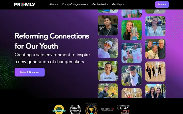
Promly uses a dark, immersive canvas with vibrant violet and blue accents that cut through the deep background like neon. Typography is direct and purposeful, maintaining legibility against the dark, gradient-infused surfaces. Components feature soft, rounded corners and subtle elevation, contributing to an approachable yet impactful aesthetic driven by energetic gradients and photography.
The page uses a maximum content width of 1196px, centered on the screen, creating a structured and comfortable reading experience. The hero section is full-bleed, blending a linear gradient from violet to black with a large, inviting headline and a collage of rounded-corner participant photos that visually 'pop' off the dark background. Subsequent sections alternate between full-width blocks and contained content. Text+image sections frequently use a side-by-side layout. Vertical spacing between sections is relatively generous, with an 88px section gap contributing to a comfortable density. Navigation is a sticky top bar, accommodating essential links and a 'Donate' button, ensuring actions are always accessible.
This site predominantly features photography and product screenshots. Photography is diverse, showing young people in various settings, often with a casual, authentic feel. Images for cards frequently feature rounded corners (20px or 30px) and appear as a grid or scattered collage within hero sections. Product screenshots are typically high-fidelity and contained within UI elements, showcasing app interfaces directly. Icons are used sparingly and seem to be simple, outlined, and monochromatic, with occasional green accents for success-oriented elements. The imagery serves to both establish atmosphere and provide visual evidence of community and product functionality, without being overly decorative or heavy.
Reminiscent of Discord, Figma, Notion (dark mode), Spotify.
# Promly — Style Reference
> Midnight gradient with neon accents.

**Theme:** dark

**Site:** https://promlyapp.com

Promly uses a dark, immersive canvas with vibrant violet and blue accents that cut through the deep background like neon. Typography is direct and purposeful, maintaining legibility against the dark, gradient-infused surfaces. Components feature soft, rounded corners and subtle elevation, contributing to an approachable yet impactful aesthetic driven by energetic gradients and photography.

## Tokens — Colors

| Name | Value | Token | Role |
|------|------|------|------|
| Primary Blue Neon | `#3898ec` | `--color-primary-blue-neon` | Primary action buttons, active navigation items — a vivid, electric blue |
| Gradient Hero Violet to Black | `#a755fb` | `--color-gradient-hero-violet-to-black` | Background for hero sections, creating a dynamic, immersive entry point |
| Gradient Card Violet to White | `#9e58fe` | `--color-gradient-card-violet-to-white` | Background for feature cards, adding a vibrant and modern touch |
| Accent Violet Neon | `#755eff` | `--color-accent-violet-neon` | Outlined button borders, text for secondary actions and highlights — vibrant violet |
| Highlight Violet | `#aa57ff` | `--color-highlight-violet` | Outlined button borders, text for tertiary actions — a lighter, softer violet |
| Success Green | `#0be014` | `--color-success-green` | Green accent for outlined action borders, linked labels, and lightweight interactive emphasis. Use as a supporting accent, not as a status color |
| Canvas Deep | `#000000` | `--color-canvas-deep` | Page background, primary surface for text and core content |
| Midnight Indigo | `#040723` | `--color-midnight-indigo` | Elevated card surfaces, provides depth against Canvas Deep |
| Ghost Shadow Indigo | `#140f33` | `--color-ghost-shadow-indigo` | Shadow tint for elevated cards, adding a subtle indigo glow |
| Content White | `#ffffff` | `--color-content-white` | Primary text, button text on colored backgrounds, navigation links |
| Muted Gray | `#808080` | `--color-muted-gray` | Secondary body text, helper text, subtle outlines |
| Secondary Text Gray | `#999999` | `--color-secondary-text-gray` | Tertiary body text, supporting information |
| Input Text Dark | `#333333` | `--color-input-text-dark` | Input field placeholder text, some link text |
| Input Border Gray | `#cccccc` | `--color-input-border-gray` | Input field borders |
| Outlined Button Dark | `#222222` | `--color-outlined-button-dark` | Outlined button borders and text on light backgrounds |

## Tokens — Typography

### Avenir
- **Substitute:** Avenir Next, Lato
- **Weights:** 300, 400, 700
- **Sizes:** 14px, 16px, 18px, 20px, 25px, 28px, 35px, 45px, 59px, 60px, 64px
- **Line height:** 1.07, 1.11, 1.17, 1.25, 1.36, 1.39, 1.4, 1.43, 1.5, 1.57, 1.69
- **Letter spacing:** -0.067em at 64px, -0.051em at 60px, -0.050em at 59px, -0.047em at 45px, -0.031em at 35px, 0.014em at 20px, 0.018em at 14px
- **Role:** Primary typeface for all headings, body text, and UI elements. Its clean sans-serif nature provides clarity against dark backgrounds, with a range of weights supporting hierarchy. Tighter tracking on larger headings enhances their presence without overwhelming.

### Poppins
- **Substitute:** Montserrat, Open Sans
- **Weights:** 700
- **Sizes:** 18px
- **Line height:** 1.5
- **Letter spacing:** normal
- **Role:** Used for specific button labels, adding a slightly more assertive, block-like feel to calls to action.

## Tokens — Type Scale

Minor Third (1.2) from 18px base.

| Role | Size | Line height | Letter spacing |
|------|------|------|------|
| caption | 14px | 1.43 | 0.252px |
| body-sm | 16px | 1.39 | — |
| body | 18px | 1.5 | — |
| subheading | 20px | 1.4 | 0.28px |
| heading-sm | 25px | 1.25 | — |
| heading | 28px | 1.17 | — |
| heading-lg | 35px | 1.11 | -1.085px |
| display | 45px | 1.07 | -2.115px |

## Tokens — Spacing

- **Max width:** 1196px
- **Section gap:** 88px
- **Card padding:** 20px
- **Element gap:** 20px

## Tokens — Radius

- **Buttons:** 12px
- **Inputs:** 12px
- **Cards:** 25px
- **Images:** 20px

## Tokens — Elevation

- **Floating Card:** `rgba(102, 77, 255, 0.2) 0px 4px 100px 0px`

## Layout

The page uses a maximum content width of 1196px, centered on the screen, creating a structured and comfortable reading experience. The hero section is full-bleed, blending a linear gradient from violet to black with a large, inviting headline and a collage of rounded-corner participant photos that visually 'pop' off the dark background. Subsequent sections alternate between full-width blocks and contained content. Text+image sections frequently use a side-by-side layout. Vertical spacing between sections is relatively generous, with an 88px section gap contributing to a comfortable density. Navigation is a sticky top bar, accommodating essential links and a 'Donate' button, ensuring actions are always accessible.

## Imagery

This site predominantly features photography and product screenshots. Photography is diverse, showing young people in various settings, often with a casual, authentic feel. Images for cards frequently feature rounded corners (20px or 30px) and appear as a grid or scattered collage within hero sections. Product screenshots are typically high-fidelity and contained within UI elements, showcasing app interfaces directly. Icons are used sparingly and seem to be simple, outlined, and monochromatic, with occasional green accents for success-oriented elements. The imagery serves to both establish atmosphere and provide visual evidence of community and product functionality, without being overly decorative or heavy.

## Components

### Primary Filled Button
*Main call to action.*

Filled with Primary Blue Neon (#3898ec), text in Content White (#ffffff), rounded corners at 12px. Padding is 12px vertical, 24px horizontal. Uses Poppins Bold for text.

### Ghost Navigation Button
*Navigation links or secondary actions that sit directly on the dark canvas.*

Transparent background, text in Outlined Button Dark (#222222), no border, 0px radius. Minimal padding of 5px vertical, 10px-30px horizontal, adapting to content. Uses Avenir.

### Violet Outline Button
*Accentuating secondary actions on dark backgrounds.*

Transparent background, border in Accent Violet Neon (#755eff), text in Accent Violet Neon. 12px rounded corners, 12px vertical and 24px horizontal padding. Uses Avenir.

### Highlight Outline Button
*Tertiary interactive elements, often within cards.*

Transparent background, border in Highlight Violet (#aa57ff), text in Highlight Violet. 12px rounded corners, 12px vertical and 24px horizontal padding. Uses Avenir.

### Floating Card
*Container for content sections, featuring subtle elevation.*

Background is Midnight Indigo (#040723), with a 25px border-radius. Features a glow shadow: rgba(102, 77, 255, 0.2) 0px 4px 100px 0px.

### Standard Input Field
*User input for form elements.*

Background is Canvas Deep (#000000), text in Input Text Dark (#333333). Border is 1px solid Input Border Gray (#cccccc), with 12px rounded corners. Padding is 8px vertical, 12px horizontal.

## Guidelines

### Do

- Always use Canvas Deep (#000000) as the primary page background.
- Apply 25px border-radius to card elements and 12px to buttons and inputs.
- Headlines should use Avenir with negative letter-spacing for sizes above 35px to maintain a refined appearance.
- Accentuate key calls to action with Primary Blue Neon (#3898ec) for filled buttons.
- Utilize the Midnight Indigo (#040723) background for elevated content cards, distinct from the main canvas.
- Maintain a clear visual hierarchy by using Content White (#ffffff) for primary text and Muted Gray (#808080) for secondary details.
- Ensure consistent Comfortable density spacing, with 20px as a common element gap and a section gap of 88px.

### Don't

- Avoid using bright, un-branded colors for large background areas; maintain the dark theme.
- Do not use generic square corners for cards or buttons; adhere to the specified radii of 25px and 12px.
- Refrain from using thin weights for body text without sufficient contrast; use Avenir 400 for general readability.
- Do not introduce additional shadow styles beyond the provided card elevation.
- Avoid deviating from the established letter-spacing values, especially for larger text, to preserve typographic character.
- Do not use a solid background color for hero sections; leverage the Gradient Hero Violet to Black.
- Do not use more than one distinct color for button fills; confine fills to Primary Blue Neon unless for semantic states.

## Agent Prompt Guide

Quick Color Reference:
text: #ffffff
background: #000000
border: #cccccc
accent: #755eff
primary action: #3898ec (filled action)

Example Component Prompts:
1. Create a Primary Action Button: #3898ec background, #222222 text, 9999px radius, compact pill padding. Use this filled treatment for the main CTA.
2. Design a 'Floating Card': Midnight Indigo (#040723) background, 25px radius, with 'Ghost Shadow Indigo' for elevation. Inside, place a heading 'Find Your Voice' in Avenir Bold, 45px, Content White, letter-spacing -0.047em, and a paragraph of text in Content White at 18px Avenir Regular.
More like this








Keep what you find
A free account saves references to boards and can send you a weekly email of picks based on what you save.
To see every result, go Pro.