Preview image. Unlock full-res
Digital sanctuary on white canvas
Color palette
Primary heading text, emphasized links, branding elements, navigation text – a deep, authoritative violet
Primary call-to-action buttons (filled background), active state indicators, highlighted links, interactive icon accents
Gray wash for highlight backgrounds, decorative bands, and soft emphasis behind content. Do not promote it to the primary CTA color
Atmospheric background wash, used as a counterpoint to Sunset Gradient for visual interest in large areas
Page background, primary elevated surfaces, button text in filled buttons
Secondary background color, subtly elevated sections, card backgrounds. Forms the lighter part of atmospheric gradients; Atmospheric background wash, used beneath hero sections or to define large contextual areas, transitioning from light gray to lavender
Hairline borders, dividers, subtle outlines for ghost buttons
Secondary body text, navigation labels, and subdued headings. Do not promote it to the primary CTA color
Muted text, placeholder text, disabled states, ghost button text
Typography
- Weights
- 400
- Sizes
- 20px, 30px, 36px, 48px, 60px
- Line height
- 1.06, 1.11, 1.13, 1.16, 1.2
- Letter spacing
- -0.0300em
- Fallback
- Georgia
Headlines and prominent display text, lending a classic, authoritative air to key messaging.
- Weights
- 400, 600, 700
- Sizes
- 12px, 14px, 16px, 18px, 20px
- Line height
- 1, 1.5, 1.55, 1.57, 1.63
- Letter spacing
- normal
- Fallback
- Inter
Body text, navigation, buttons, and most UI elements – a clean, readable sans-serif for functional content.
Spacing & shape
Components
Solid 'Action Violet' background, 'Canvas White' text, 9999px (pill) border-radius, with 4px vertical and 12px horizontal padding. On focus, an inset 'Action Violet' shadow appears.
Transparent background, 'Action Violet' text, 9999px (pill) border-radius, with 4px vertical and 12px horizontal padding. Borders are very subtle 'Stone Gray' initially.
Transparent background, 'Privacy Violet' text, 0px border-radius, with 0px padding. Used for text-based navigation or inline actions.
Subtly tinted 'Ash Gray' background with 'Ash Gray' text, 9999px (pill) border-radius, with 0px padding. Often used for discrete controls like carousels.
'Cloud Gray' background, 24px border-radius, with 0px vertical and 64px horizontal padding. Used for distinct content blocks without heavy shadows.
Guidelines
- Use 'Privacy Violet' (#372580) for all primary headline text, leveraging its authoritative depth.
- Apply a 9999px (pill) border-radius to all buttons for a consistent soft, approachable shape.
- Define interactive elements clearly with 'Action Violet' (#6d4aff) for filled backgrounds or text, and use Stone Gray (#e5e7eb) for subtle ghost button borders.
- Structure large negative spaces with 'Canvas White' (#ffffff) and 'Cloud Gray' (#f6f7f9) to create clear content separation and visual breathing room.
- Employ ProtonSerif for all major headings to establish a distinct, traditional brand voice.
- Implement consistent internal padding of 20px for cards and 64px for section side-padding to maintain visual alignment and density.
- Utilize the Lavender Glow (#e2dbff) and Cloud Gray (#f6f7f9) gradients to provide subtle background depth without resorting to heavy drop shadows.
- Avoid using harsh or dark shadows; instead, rely on subtle background gradients and color shifts for layering and depth.
- Do not introduce new saturated hues outside of the defined violet brand colors unless for specific semantic purposes (e.g., success, error).
- Avoid arbitrary border-radius values; adhere strictly to 9999px for buttons, 24px for cards, and 6px for navigation items.
- Do not deviate from the ProtonSerif and ProtonSans font families; maintain the established typographic hierarchy.
- Refrain from tight, compressed layouts; ensure generous 'sectionGap' (64px) and 'elementGap' (4px) values are maintained.
- Do not use generic blue for links; all interactive text links should default to 'Action Violet' (#6d4aff) for consistency.
- Avoid unnecessary decoration or heavy visual elements; the system prioritizes clarity and a lightweight feel.
About this system
ShowHide
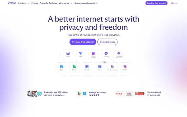
Proton's design system evokes a digital sanctuary: a crisp, bright base accented by deep, protective purples. The layout emphasizes clear information hierarchy with ample whitespace, using soft gradients for depth without heavy shadows. Typography is precise and confident, balancing a strong sans-serif for UI with a traditional serif for prominent headlines. Interactive elements are clearly defined by vibrant violet cues rather than subtle hover states.
The page primarily uses a full-bleed layout, particularly in the hero section where atmospheric gradients extend edge-to-edge. Content within sections adheres to a comfortable max-width, centrally aligned. The hero features a large, centered headline from 'ProtonSerif' over a soft gradient background. Section rhythm is visually distinct but not harsh, often defined by subtle background color shifts between 'Canvas White' and 'Cloud Gray' or atmospheric gradients. Content often alternates between left-aligned text blocks and right-aligned product visuals or vice-versa, with clear vertical spacing provided by the 'sectionGap' of 64px. Minimalistic header navigation remains at the top, consistent across pages.
This system primarily uses product screenshots and abstract graphic elements. Product screenshots are typically tightly cropped within device frames, showcasing clean, focused interface details. Abstract graphics feature soft, organic shapes and translucent overlays in the brand's violet and gray palette, creating a sense of depth and atmosphere. Icons are filled, featuring moderate stroke weights and are either 'Iron Gray' or 'Action Violet'. Imagery functions decoratively to set a secure, professional mood or explain product features, often balancing text-heavy sections. Imagery density is moderate, integrated thoughtfully without dominating the page.
Reminiscent of DuckDuckGo, Brave Browser, Notion, Linear.
# Proton — Style Reference
> Digital sanctuary on white canvas

**Theme:** light

**Site:** https://proton.me

Proton's design system evokes a digital sanctuary: a crisp, bright base accented by deep, protective purples. The layout emphasizes clear information hierarchy with ample whitespace, using soft gradients for depth without heavy shadows. Typography is precise and confident, balancing a strong sans-serif for UI with a traditional serif for prominent headlines. Interactive elements are clearly defined by vibrant violet cues rather than subtle hover states.

## Tokens — Colors

| Name | Value | Token | Role |
|------|------|------|------|
| Privacy Violet | `#372580` | `--color-privacy-violet` | Primary heading text, emphasized links, branding elements, navigation text – a deep, authoritative violet |
| Action Violet | `#6d4aff` | `--color-action-violet` | Primary call-to-action buttons (filled background), active state indicators, highlighted links, interactive icon accents |
| Lavender Glow | `#e2dbff` | `--color-lavender-glow` | Gray wash for highlight backgrounds, decorative bands, and soft emphasis behind content. Do not promote it to the primary CTA color |
| Twilight Gradient | `#c5b7ff` | `--color-twilight-gradient` | Atmospheric background wash, used as a counterpoint to Sunset Gradient for visual interest in large areas |
| Canvas White | `#ffffff` | `--color-canvas-white` | Page background, primary elevated surfaces, button text in filled buttons |
| Cloud Gray | `#f6f7f9` | `--color-cloud-gray` | Secondary background color, subtly elevated sections, card backgrounds. Forms the lighter part of atmospheric gradients; Atmospheric background wash, used beneath hero sections or to define large contextual areas, transitioning from light gray to lavender |
| Stone Gray | `#e5e7eb` | `--color-stone-gray` | Hairline borders, dividers, subtle outlines for ghost buttons |
| Iron Gray | `#4b5563` | `--color-iron-gray` | Secondary body text, navigation labels, and subdued headings. Do not promote it to the primary CTA color |
| Ash Gray | `#9ca3af` | `--color-ash-gray` | Muted text, placeholder text, disabled states, ghost button text |

## Tokens — Typography

### ProtonSerif
- **Substitute:** Georgia
- **Weights:** 400
- **Sizes:** 20px, 30px, 36px, 48px, 60px
- **Line height:** 1.06, 1.11, 1.13, 1.16, 1.2
- **Letter spacing:** -0.0300em
- **Role:** Headlines and prominent display text, lending a classic, authoritative air to key messaging.

### ProtonSans
- **Substitute:** Inter
- **Weights:** 400, 600, 700
- **Sizes:** 12px, 14px, 16px, 18px, 20px
- **Line height:** 1, 1.5, 1.55, 1.57, 1.63
- **Letter spacing:** normal
- **Role:** Body text, navigation, buttons, and most UI elements – a clean, readable sans-serif for functional content.

## Tokens — Type Scale

Minor Third (1.2) from 16px base.

| Role | Size | Line height | Letter spacing |
|------|------|------|------|
| caption | 12px | 1.55 | — |
| body-sm | 14px | 1.5 | — |
| body | 16px | 1.5 | — |
| subheading | 18px | 1.63 | — |
| heading-sm | 20px | 1.2 | — |
| heading | 30px | 1.16 | -0.48px |
| heading-lg | 36px | 1.13 | -0.6px |
| display | 48px | 1.11 | -0.72px |
| display-lg | 60px | 1.06 | -0.96px |

## Tokens — Spacing

- **Section gap:** 64px
- **Card padding:** 20px
- **Element gap:** 4px

## Tokens — Radius

- **General:** 2px
- **Buttons:** 9999px
- **Cards:** 24px
- **navItems:** 6px

## Layout

The page primarily uses a full-bleed layout, particularly in the hero section where atmospheric gradients extend edge-to-edge. Content within sections adheres to a comfortable max-width, centrally aligned. The hero features a large, centered headline from 'ProtonSerif' over a soft gradient background. Section rhythm is visually distinct but not harsh, often defined by subtle background color shifts between 'Canvas White' and 'Cloud Gray' or atmospheric gradients. Content often alternates between left-aligned text blocks and right-aligned product visuals or vice-versa, with clear vertical spacing provided by the 'sectionGap' of 64px. Minimalistic header navigation remains at the top, consistent across pages.

## Imagery

This system primarily uses product screenshots and abstract graphic elements. Product screenshots are typically tightly cropped within device frames, showcasing clean, focused interface details. Abstract graphics feature soft, organic shapes and translucent overlays in the brand's violet and gray palette, creating a sense of depth and atmosphere. Icons are filled, featuring moderate stroke weights and are either 'Iron Gray' or 'Action Violet'. Imagery functions decoratively to set a secure, professional mood or explain product features, often balancing text-heavy sections. Imagery density is moderate, integrated thoughtfully without dominating the page.

## Components

### Filled Action Button
*Primary call-to-action button*

Solid 'Action Violet' background, 'Canvas White' text, 9999px (pill) border-radius, with 4px vertical and 12px horizontal padding. On focus, an inset 'Action Violet' shadow appears.

### Ghost Button
*Secondary call-to-action or navigational button*

Transparent background, 'Action Violet' text, 9999px (pill) border-radius, with 4px vertical and 12px horizontal padding. Borders are very subtle 'Stone Gray' initially.

### Navigation Link Button
*Tertiary action, internal navigation*

Transparent background, 'Privacy Violet' text, 0px border-radius, with 0px padding. Used for text-based navigation or inline actions.

### Muted Ghost Button
*Inactive or low-emphasis secondary button*

Subtly tinted 'Ash Gray' background with 'Ash Gray' text, 9999px (pill) border-radius, with 0px padding. Often used for discrete controls like carousels.

### Feature Card
*Container for product features or illustrative content*

'Cloud Gray' background, 24px border-radius, with 0px vertical and 64px horizontal padding. Used for distinct content blocks without heavy shadows.

## Guidelines

### Do

- Use 'Privacy Violet' (#372580) for all primary headline text, leveraging its authoritative depth.
- Apply a 9999px (pill) border-radius to all buttons for a consistent soft, approachable shape.
- Define interactive elements clearly with 'Action Violet' (#6d4aff) for filled backgrounds or text, and use Stone Gray (#e5e7eb) for subtle ghost button borders.
- Structure large negative spaces with 'Canvas White' (#ffffff) and 'Cloud Gray' (#f6f7f9) to create clear content separation and visual breathing room.
- Employ ProtonSerif for all major headings to establish a distinct, traditional brand voice.
- Implement consistent internal padding of 20px for cards and 64px for section side-padding to maintain visual alignment and density.
- Utilize the Lavender Glow (#e2dbff) and Cloud Gray (#f6f7f9) gradients to provide subtle background depth without resorting to heavy drop shadows.

### Don't

- Avoid using harsh or dark shadows; instead, rely on subtle background gradients and color shifts for layering and depth.
- Do not introduce new saturated hues outside of the defined violet brand colors unless for specific semantic purposes (e.g., success, error).
- Avoid arbitrary border-radius values; adhere strictly to 9999px for buttons, 24px for cards, and 6px for navigation items.
- Do not deviate from the ProtonSerif and ProtonSans font families; maintain the established typographic hierarchy.
- Refrain from tight, compressed layouts; ensure generous 'sectionGap' (64px) and 'elementGap' (4px) values are maintained.
- Do not use generic blue for links; all interactive text links should default to 'Action Violet' (#6d4aff) for consistency.
- Avoid unnecessary decoration or heavy visual elements; the system prioritizes clarity and a lightweight feel.

## Agent Prompt Guide

Quick Color Reference:
text: #4b5563
background: #ffffff
border: #e5e7eb
accent: #e2dbff
primary action: #6d4aff (filled action)

Example Component Prompts:
Create a hero section: 'Canvas White' background fading to 'Lavender Glow' with 'Sunset Gradient'. Centered 'ProtonSerif' heading display-lg: 'Privacy Violet' text. Below, create a 'Filled Action Button': 'Action Violet' background, 'Canvas White' text, 9999px radius, 4px vertical / 12px horizontal padding. Next to it, a 'Ghost Button': 'Action Violet' text, 9999px radius, 4px vertical / 12px horizontal padding, 'Stone Gray' border.

Create a feature card: 'Cloud Gray' background, 24px radius, 0px vertical / 64px horizontal padding. Inside, 'ProtonSans' heading-sm in 'Privacy Violet', followed by 'ProtonSans' body text in 'Iron Gray'.

Create a navigation bar: 'Canvas White' background, top level 'ProtonSans' body text in 'Iron Gray'. Highlight active item with 'Lavender Glow' background and 'Privacy Violet' text. Inner links use 'Navigation Link Button' style with 'Privacy Violet' text. Ensure 6px radius for dropdowns.
More like this








Keep what you find
A free account saves references to boards and can send you a weekly email of picks based on what you save.
To see every result, go Pro.