Preview image. Unlock full-res
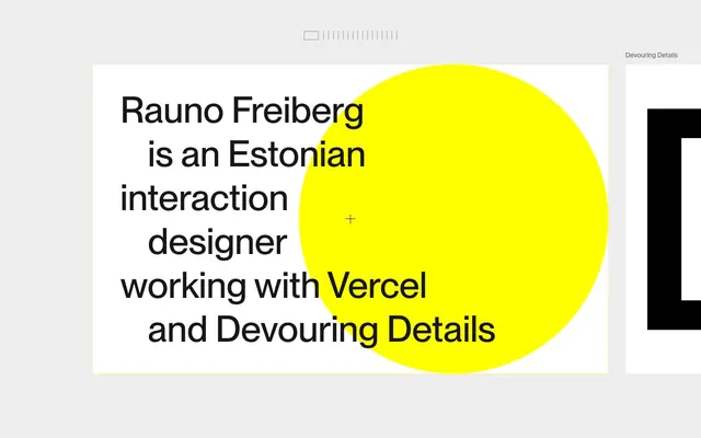
Vivid color-block canvas
Color palette
Primary accent background for hero elements, large graphical blocks, card backgrounds
Secondary accent background for cards and prominent graphical elements
Decorative SVG fills and strokes, highlight elements, icon accents
Primary text, critical borders, dark accents
Dark borders and separators for elevated surfaces and inverted UI. Do not promote it to the primary CTA color
Page backgrounds, some component backgrounds
Typography
- Weights
- 400, 700
- Sizes
- 16px, 18px, 24px, 32px, 48px
- Line height
- 1.3
- Fallback
- Inter
The primary font for all text, from body copy to large headlines. Its clean, geometric forms support the graphic, high-contrast aesthetic. It’s used primarily at 700 for headings, imparting a strong, bold statement, and at 400 for body for readability.
Spacing & shape
Components
Text in Deep Graphite (#171717) with a 1px border in Midnight Ink (#000000). Background is transparent. Border radius is 12px. Padding is 0px, suggesting the primary interaction is implied by text size and hover, not a visible button box.
Circular card with a solid Vivid Yellow (#ffff02) background. Border radius 9999px. Used as large, impactful graphical elements that act as visual anchors on the page without internal padding.
Circular card with a solid Dynamic Orange (#ff5800) background. Border radius 9999px. Similar to the Vivid Yellow Circle Card, providing an alternative accent color for large graphical elements.
Guidelines
- Prioritize high-contrast color pairings using Midnight Ink (#000000) or Deep Graphite (#171717) on Canvas White (#ffffff) or accent colors.
- Use Vivid Yellow (#ffff02) and Dynamic Orange (#ff5800) for large, unpadded circular or full-bleed background elements to create high visual impact.
- Adopt a maximalist approach to typography: use Inter weight 700 for headlines and primary text, letting it dominate the layout.
- Apply specific border radii: 12px for interactive elements like buttons and links, and 9999px for large accent 'card' elements to create perfect circles.
- Maintain generous vertical spacing between sections, primarily using the 64px sectionGap and 8px elementGap for overall spaciousness.
- Keep components visually lightweight, relying on bold typography and color blocking rather than complex styling like shadows or gradients.
- Employ Electric Blue (#0000ff) sparingly for decorative SVG elements or very specific icon accents, not for primary interface elements.
- Avoid subtle color variations; stick to the defined high-contrast palette.
- Do not use shadows or complex elevation; the design system favors flat, bold surfaces.
- Refrain from using small, delicate text; typography should be confident and prominent.
- Do not introduce intermediate border radius values; adhere strictly to 12px for interactive elements and 9999px for circular elements.
- Under no circumstances should any primary action button be filled; only ghost-like buttons with border and text colors are used.
- Avoid using gradients; the aesthetic is built on solid, block colors.
- Do not introduce new decorative imagery or illustrations; rely on bold shapes and impactful typography with accent colors.
About this system
ShowHide
Rauno.me employs a playful, high-contrast aesthetic, utilizing vibrant, unmodulated primary colors for a bold, graphic presence. The design leans into stark black typography on white or vivid colored backgrounds, creating a sense of directness. Components are minimalist, often represented by large, rounded shapes or text with subtle hover effects, avoiding complex gradients or shadows. The overall feel is one of confident simplicity and visual impact through color blocking and clear typographic hierarchy.
The page operates on a full-bleed layout for its primary content areas, not constrained by a max-width. The hero section often features large, bold text centrally aligned over a prominent color block. Sections alternate between white backgrounds and vivid accent color backgrounds, creating a clear visual rhythm without explicit dividers. Content is arranged in a fluid, flexible manner, often with large display typography as a central element, surrounded by minimal supporting text and interactive elements. Navigation is minimal, likely restricted to a top-level textual list. Density is spacious, emphasizing individual elements and text blocks through size and contrast.
Imagery is minimal and highly abstract, primarily consisting of large, vivid circular color blocks (Vivid Yellow and Dynamic Orange) that serve as decorative elements rather than displaying content. There are no photographs, realistic illustrations, or product screenshots. Icons are used sparingly and are likely line-based with Electric Blue (#0000ff) fills or strokes, functioning as small, functional or decorative accents. The visual density is image-light and text-dominant, with color blocks providing atmosphere.
Reminiscent of Huge Inc., Active Theory, Brutalist Websites, Build with Us (by Vercel).
# Rauno Freiberg — Style Reference
> Vivid color-block canvas

**Theme:** light

**Site:** https://rauno.me

Rauno.me employs a playful, high-contrast aesthetic, utilizing vibrant, unmodulated primary colors for a bold, graphic presence. The design leans into stark black typography on white or vivid colored backgrounds, creating a sense of directness. Components are minimalist, often represented by large, rounded shapes or text with subtle hover effects, avoiding complex gradients or shadows. The overall feel is one of confident simplicity and visual impact through color blocking and clear typographic hierarchy.

## Tokens — Colors

| Name | Value | Token | Role |
|------|------|------|------|
| Vivid Yellow | `#ffff02` | `--color-vivid-yellow` | Primary accent background for hero elements, large graphical blocks, card backgrounds |
| Dynamic Orange | `#ff5800` | `--color-dynamic-orange` | Secondary accent background for cards and prominent graphical elements |
| Electric Blue | `#0000ff` | `--color-electric-blue` | Decorative SVG fills and strokes, highlight elements, icon accents |
| Midnight Ink | `#000000` | `--color-midnight-ink` | Primary text, critical borders, dark accents |
| Deep Graphite | `#171717` | `--color-deep-graphite` | Dark borders and separators for elevated surfaces and inverted UI. Do not promote it to the primary CTA color |
| Canvas White | `#ffffff` | `--color-canvas-white` | Page backgrounds, some component backgrounds |

## Tokens — Typography

### Inter
- **Substitute:** Inter
- **Weights:** 400, 700
- **Sizes:** 16px, 18px, 24px, 32px, 48px
- **Line height:** 1.3
- **Role:** The primary font for all text, from body copy to large headlines. Its clean, geometric forms support the graphic, high-contrast aesthetic. It’s used primarily at 700 for headings, imparting a strong, bold statement, and at 400 for body for readability.

## Tokens — Spacing

- **Section gap:** 64px
- **Card padding:** 0px
- **Element gap:** 8px

## Tokens — Radius

- **Buttons:** 12px
- **Cards:** 9999px
- **links:** 12px

## Layout

The page operates on a full-bleed layout for its primary content areas, not constrained by a max-width. The hero section often features large, bold text centrally aligned over a prominent color block. Sections alternate between white backgrounds and vivid accent color backgrounds, creating a clear visual rhythm without explicit dividers. Content is arranged in a fluid, flexible manner, often with large display typography as a central element, surrounded by minimal supporting text and interactive elements. Navigation is minimal, likely restricted to a top-level textual list. Density is spacious, emphasizing individual elements and text blocks through size and contrast.

## Imagery

Imagery is minimal and highly abstract, primarily consisting of large, vivid circular color blocks (Vivid Yellow and Dynamic Orange) that serve as decorative elements rather than displaying content. There are no photographs, realistic illustrations, or product screenshots. Icons are used sparingly and are likely line-based with Electric Blue (#0000ff) fills or strokes, functioning as small, functional or decorative accents. The visual density is image-light and text-dominant, with color blocks providing atmosphere.

## Components

### Ghost Border Button
*Interactive element (button/link)*

Text in Deep Graphite (#171717) with a 1px border in Midnight Ink (#000000). Background is transparent. Border radius is 12px. Padding is 0px, suggesting the primary interaction is implied by text size and hover, not a visible button box.

### Vivid Yellow Circle Card
*Feature showcase, visual accent*

Circular card with a solid Vivid Yellow (#ffff02) background. Border radius 9999px. Used as large, impactful graphical elements that act as visual anchors on the page without internal padding.

### Dynamic Orange Circle Card
*Alternative feature showcase, visual accent*

Circular card with a solid Dynamic Orange (#ff5800) background. Border radius 9999px. Similar to the Vivid Yellow Circle Card, providing an alternative accent color for large graphical elements.

## Guidelines

### Do

- Prioritize high-contrast color pairings using Midnight Ink (#000000) or Deep Graphite (#171717) on Canvas White (#ffffff) or accent colors.
- Use Vivid Yellow (#ffff02) and Dynamic Orange (#ff5800) for large, unpadded circular or full-bleed background elements to create high visual impact.
- Adopt a maximalist approach to typography: use Inter weight 700 for headlines and primary text, letting it dominate the layout.
- Apply specific border radii: 12px for interactive elements like buttons and links, and 9999px for large accent 'card' elements to create perfect circles.
- Maintain generous vertical spacing between sections, primarily using the 64px sectionGap and 8px elementGap for overall spaciousness.
- Keep components visually lightweight, relying on bold typography and color blocking rather than complex styling like shadows or gradients.
- Employ Electric Blue (#0000ff) sparingly for decorative SVG elements or very specific icon accents, not for primary interface elements.

### Don't

- Avoid subtle color variations; stick to the defined high-contrast palette.
- Do not use shadows or complex elevation; the design system favors flat, bold surfaces.
- Refrain from using small, delicate text; typography should be confident and prominent.
- Do not introduce intermediate border radius values; adhere strictly to 12px for interactive elements and 9999px for circular elements.
- Under no circumstances should any primary action button be filled; only ghost-like buttons with border and text colors are used.
- Avoid using gradients; the aesthetic is built on solid, block colors.
- Do not introduce new decorative imagery or illustrations; rely on bold shapes and impactful typography with accent colors.

## Agent Prompt Guide

Quick Color Reference:
- text: #000000
- background: #ffffff
- border: #000000
- accent: #ffff02
- primary action: no distinct CTA color

Example Component Prompts:
- Create a section with a Vivid Yellow (#ffff02) background, spanning full width. Place a large headline: 'Rauno Freiberg is an Estonian Interaction Designer' using Inter weight 700, 48px, #000000 text. Above the headline, add a Ghost Border Button with text 'Email Copied' using Inter weight 400, 16px, #171717 text, and a #000000 border, 12px radius, no background.
- Design a textual link 'Devouring Details DD' using Inter weight 400, 18px, #171717 text, with an underline. On hover, the link should transition to #000000 text with a 1px #000000 border.
- Produce a full-bleed page section with Canvas White (#ffffff) background. In the center, place a large circular element filled with Dynamic Orange (#ff5800), with 9999px radius. Overlay this circle with display text 'Craft' using Inter weight 700, 48px, #000000 text.
More like this









Keep what you find
A free account saves references to boards and can send you a weekly email of picks based on what you save.
To see every result, go Pro.